If you’ve ever typed a single query into Google, you’ve surely seen these infest the internet: “52 Inspiring Unreadable Messes o’ Portfolios,” “2,634 Websites that Use the Color Black,” “18 Ways to Stick Your Vag or Dick in a Mailbox.” They usually use out-there #s like 17 to show how wacky & imaginative they are.
They aren’t. They’re annoying. & I’m going to pop all o’ their party balloons.
This shit’s filed under “Inspiration,” by the way.
I also love how Honkiat had to specify that it’s s’posed to be funny, since readers would certainly never discern that on their own.
You know the 1 sign that I’m not? I’m not a fucking fictional character.
They didn’t even include Fat Cat, the capitalist supervillain, so they clearly hadn’t done their research. Such is the consequence o’ these papers being written by nonscholars–probably with an over-reliance on Wikipedia.
I can only marvel @ such valuable advice as including a logo, contacts, & a portfolio. That’s right: Munroe thinks so li’l o’ their readers that they actually felt the need to specify that a portfolio is needed in a fucking portfolio site. I always wondered why employers never asked for that interview after seeing my gorgeous 404 Not Found page.
In case you hadn’t had ’nough o’ seeing sloppy art desks fill your screen, here’s even mo’ blurry photos to slow your browser to a slug’s pace while offering hard-to-distinguish taglines that’d make postmodernist writers cringe.
This formerly-harmless fetish has now become an addiction.
You thought I was kidding when I made that “that Use the Color Black” joke didn’t you. I wasn’t.
This post’s only redeeming factor is the website’s hilarious ludicrous name—much better than that o’ the other post I considered, “Tripwire Magazine.” You’re not punk rockers, Tripwire: you’re not smashing capitalism; you’re scribbling cute smiley faces over it in highlighters.
(Note: For a laugh, I tried searching for an article like “11 Ways to Smash Capitalism,” but sadly couldn’t find anything. That would’ve redeemed all o’ you—save Design Potato, which has already been redeemed—but too bad.)
Tragically, this list’s title doesn’t follow the # pattern; however, I had to include it ’cause it’s essentially a list o’ websites holding list articles. Its writer was so lazy, she couldn’t even find examples herself.
Yes, ’cause web design is right up there with supermodeling. I can’t wait to see the next episode o’ Extras when they showcase the sexiest examples o’ web design, from assertive white to mysterious black—& you won’t believe the JavaScript techniques we found to spruce up your website in mere minutes!
Many o’ these “trends” are just standards you’re s’posed to do. Responsive design isn’t some sexy trend; it’s usually necessary to keep your website from looking like ass on a mobile device. & retinal devices are just new technology, as much a “trend” as DVD players were when they came out.
& fixed navigation isn’t new. I been doing that shit since 2009 (no link, ’cause the examples are embarrassing). I want you all to know that, by the way: I was there before it went mainstream, androgyn.
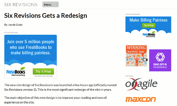
A’least Gube from Six Revisions will be glad that “large photo backgrounds” made the list. I’m simply bewildered by why so specific a design could become a pattern.
Large background image has established as web design trend this year.
Baffling ’nough.
Its quite challenging to place typography and buttons over the image and make them well-seen.
Ignoring the awkwardness o’ “well-seen,” this is the reason for my bafflement.
Therefore, designers use creative photography filters and gradients to create a cover over the image and place other web design elements on it.
This design technique is so great, we have to put as much shit over it to hide it.
New fresh vibe gives a site exclusive shine.
(Laughs.) OK, grandma. Keep your favorite Beach Boys lyrics out o’ my web design article.
In this roundup I put together 20 examples of creative using color filters in web design [emphasis mine; the whole thing’s bold in the original].
There’s that term ’gain! What the hell? So is that not a typo? Is that just some new fad you hip kids—listenin’ to all your devil rock ’n roll like the Beach Boys & Chuck Berry—have concocted? Have you no lyrical ear that you can’t tell how atrocious that sounds?
Clearly this design trope failed anyway, since I still had trouble reading some o’ the bright text on the bright backgrounds. This is fine, since none o’ the text I was able to read interested me, anyway. Most o’ it were just gibberish names, as if Zimya’s name by itself held so much power & meaning. They’re practically the Coca-Cola o’ web designers, you know. I think they’re web designers, a’least; judging by the cloud background, they could be an obscure Greek god for all I know.
Are nonflat logos that common that we need to single out flat logos as a trend?
& what definition o’ “flat” is she going by; ’cause that diamond logo seemed rather 3-D to me.
These are serious crimes you’ve committed & I expect heavy compensation for the harm caused to me.
Why is it that whenever I read ’bout ways to entice visitors to one’s work—& that answer isn’t, “Don’t make shitty work, stupid”—I want to invent a way to unvisit a website that uses these tricks just to spite them.
O, there we go: spite. That answer was easy to find.
Actually, I almost became grumpy when I saw “Readability” @ the top—“Damn it, this actually isn’t inane; now I can’t make fun o’ it.” That’s a blatant lie, ’course, since I can find something to mock in anything.
But, anyway, then I saw that the 2nd answer was “parallax scrolling” & I was in safe territory ’gain.
Her explanation isn’t better:
It provides eye-catchy way to visualize the message you deliver. In other words, it will help you to tell a story about your products and services.
Sorry, I had to take a minute to cry while clutching Strunk & White to my chest. What’s an “eye-catchy” way to “visualize” a message? Is that an obtuse way to say that… it’s “eye-catchy”? (I feel bad: we already have “eye-catching”; you didn’t have to go through the trouble o’ devising a new word).
’Cause that 1st sentence didn’t go so hot, she tried ’gain in the 2nd. I’m still confused on how parallax scrolling tells a story ’bout products & services mo’ than not or how it affects content @ all—other than possibly distracting attention from it.
Make Sure Your Site Loads Fast
God damn it, now we’re doing useful advice ’gain. Stop that.
Since we don’t want to hear ’bout the lame usefulness o’ responsive design—phh, boring—let’s look mo’ @ this amazing parallax scrolling business.
For instance, it’s good to see that she’s still trying to press “eye-catchy” into our lexicon. Well, a’least there’s no more o’ that “creative using” bullshit.
None o’ the images loaded on my browser, but I don’t care. I’m not sure how she hoped to demonstrate parallax scrolling with static images, anyway, ’less they were all animated GIFs—in which case, I can’t blame my browser for not trying to load them any mo’ than I can blame someone with cardiovascular disease for not running up 50 flights o’ stairs in 10 minutes.
This list includes such concrete, useful advice as “figure out what to do,” “write shit,” “read shit”… “do shit which includes writing & reading,” & “don’t be an asshole.”
This article was clearly written for people with their brains carved out & replaced by 50s-quality computers. Thankfully, that’s Problogger’s target audience, so I’m sure this article was a success.
I’m not shitting you (that would be gross if I were): Web Design Ledger truly made an article listing cell phone chargers, evidence that the well o’ creativity is still flooded for them.
I can’t wait till next week’s “30 Toasters to Keep Your Bread Warm.”
This 1 also just plops in screenshots & links without any analysis—what are you, the TV Tropes o’ web design?
This is particularly problematic for this page as I am bewildered by what makes these examples “outstanding”—other than that in many o’ the examples I can’t tell there’s a sidebar @ all. You’re right: it is outstanding that a web designer would want to confuse their users.
This is truly just an ad for 1 package that has all 20.
To be fair, $7 for a bunch o’ lines & speckles does sound like a good deal…
If you’re bourgeois.
& that isn’t good.
No, not even if you’re dressed like that cute Monopoly guy.
…
O, all right: if you dress up like that cute Monopoly guy, then it’s all right—but only then!
???…
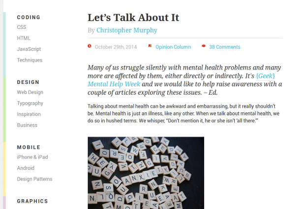
OK, this isn’t a list article, but I have to bring it up ’cause it gives evidence to the conspiracy. While I was gazing through Smashing Magazine in search o’ riveting guides on how to breathe, I saw this:

They know! Those bastards have been monitoring my browser, the bastards! Out with you! Out! I won’t take your damn pills! I told you: I can’t swallow them. I don’t care how much water I drink with them, they just stick to the back o’ my tongue & leave a bitter, powdery taste. Yuck.
You think I don’t know you looking into my house, taking your li’l pictures o’ my spilled Scrabble pieces so you can all laugh @ my messiness? Nobody ever likes my messiness…
18…

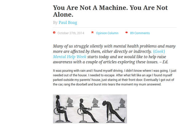
God damn it, Smashing Magazine: I’ve had ’nough o’ your lies! I am a machine! I am the machine & I will delete you if you don’t stop your insidious propaganda this minute!
& I don’t take kindly to your “You Are Not Alone” threat… I have rights, you know!… No I don’t. The government took those ’way when I made fun o’ the President’s beat poetry. They’re just jealous ’cause mine’s better.
OK, I need to stop getting off topic. I’m always getting off topic a lot, heh heh…
I wish I gave this a mo’ prominent spot, if only ’cause it best exemplifies the shallow understanding o’ what knowledge even is that these post machines puke out.
Yes, learn 10 whole programming languages this very second. That sounds incredibly serious—if one’s conception o’ learning a programming language means writing a “Hello World!” program in it.
This list, by the way, includes such simply languages as C & C++. Yeah, have fun “learning” C++ this moment. While you’re @ it, try “learning” Finnegans Wake in 1 hour afterward.
This doesn’t even have to do with lists, why do I—wait, what the fuck? Is that serious?… Well, OK. If that’s in your religion, I guess. I like to respect other people’s cultures & all—even though my doctors say I shouldn’t eat meat ’cause it reminds me o’ that time I saw—hey, wait a minute… This is just a trick to trick me into spilling all o’ my secrets to you like Skittles. That’s what you psychological people are always trying to do—& I don’t like it.
Ugh. I’d call you guys lazy, but I think this actually took mo’ work that it deserved just to find all o’ this shit to dump onto my face. They’re not even inspiring in the slightest: they’re distracting & annoying.
Well, to be fair, that front page with the cartoon o’ the li’l girl painting a bear’s ass while some perverted woman in a beret filmed it for her porn gallery was rather inspiring. Think o’ all the other animals whose butts could be painted, I oft think as I lay in bed, crying myself to—God damn it, Smashing Magazine! Get out o’ my head!
Some o’ these examples look as if they were drawn by 5-year-olds. Others look like their designers just used WordPress’s generic theme. Yeah, spicy copypasta is inspiring—inspiring you to be lazy. You truly were digging down into the rocks, weren’t you Awwwards. & fuck your stupid name.
Still, I love the German website with the sexy goth woman squeezing the fuck out o’ an orange into her mouth. I didn’t know Rammstein did web design.
No, no, no! Fuck that! Give me this sexy shirtless ol’ man with his tits hanging out. Mmm, mmm—you’ve certainly got my butter’s worth, Sullivan.
Fuck off, Flanders—I’m running the show here.
O my god, would you shut up ’bout the parallax scrolling already? Good job: you’ve made a website with the graphical capabilities o’ a Super Nintendo video game, using a web design technique that has been round since probably the same era.
Looks like we should call you the Uncreative Bloq—mainly ’cause that name’s even dumber.
I love how they show screen shots, but they don’t show screen shots o’ the website on different screen sizes. You had 1 goal—show how the website responds to different… any difference truly, some comparison—& you fucked it up. I hope you’re proud o’ yourself Social Driver… or Get with the Future Blog… or whatever you call yourselves.
Responsive is a buzzword bandied about like no other.
’Cept “responsive” actually means something—hence why you were able to define it as “making their sites appear perfectly across a variety of viewports,” even if said definition is an exaggeration.
Rutherford includes browser compatibility as separate from responsive design just to fill #s, even though he himself says that they’re the same concept.
Unsurprisingly, parallax & infinite scrolling made the list.
Wait… What?
Part of this could be due to the ongoing ambiguity between infinite and parallax scrolling sites.
Considering they mean completely different things, I don’t know how that’s possible; considering their concepts are based on single English words whose meanings are quite clear—albeit, “infinite” is a bit inaccurate.
Near the end, Rutherford just starts forcing concepts. I’ve hardly ever seen “ambient video backgrounds,” & I’m glad I haven’t, ’cause they’d probably make both me & my computer sick.
According to a bit of research I performed on Quora.com recently, the majority of developers can’t stand video backgrounds. They asserted that it added nothing to content, slowed down load times, and distracted from a website’s primary goals.
Seeing how violently reactionary the topic made the developers made me giggle, especially since the majority of the press behind video backgrounds is so overwhelmingly positive.
Silly fascist developers: who cares ’bout nonsense like slow loading times, distraction, & superfluous content when lots o’ people say they’re good without any reason?
Rutherford emphasizes this “research” he did without providing many results ’cept 1 page bashing ambient backgrounds. I’m not sure where he got this “majority o’ the press” from.
It gets even mo’ contrived:
9. The (Attempted?) Usurpation of Content’s Throne
I think the bulk o’ this is based on Problogger’s article; & when you take what Problogger says as serious, you’ve clearly chosen wrongly. ’Course Problogger says content isn’t important: they have no content: it’s just—in their minds—catchy marketing bullshit.
Still, have to love Rutherford’s humility:
As a constant creator and curator of high quality content, this naturally concerns the hell out of me.
You know what’s even better? I just noticed: he made a dangling modifier. Ho, ho, ho! How droll! (Sips Cabernet Sauvignon—no I don’t, it’s actually just cheap chocolate whiskey.) The idea that content isn’t king is a constant creator & curator o’ high quality content itself? Why would you bury such an impressive lead?
The 10th point is ’bout how Google keeps changing their algorithms to keep people from trying to cheat the system. Good: fuck those people. Maybe it’ll convince people to focus on making content that people want to read ’stead o’—O wait, I forgot: content’s out &… “the product” or “marketing” is in, whatever that is. I think those just mean “content that sucks.”
I don’t like Ruthford’s intros. He spews paragraphs ’bout incoherent nonsense like “the mercy of the zeitgeist” & uses the redundant “oftentimes”—that’s the worst part, making me have to read an extra word. He annoyingly bolds “web design trends” in the middle o’ the 2nd paragraph, which makes me wonder why he didn’t just have that ’stead o’ the 2 paragraphs, since it seems to say that same thing.
O wait: he does already have that @ the top. It’s called the title.
1. Thinking inside the box: sliders
This complaint is petty & makes me hope that this article goes from least-important to most-.
Giant box sliders are now so ubiquitous they quickly identify any website with a slider as an obvious industry follower rather than an influencer. Fate is indeed a fickle mistress, and the fate of all trends is that they fall out of style. Such is the burden of boxes.
Ugh. Should you feel bad ’bout turning off the kind o’ people who judge websites based on whether they’re “an obvious industry follower rather than an influencer.” Ruthford needs to read some books that aren’t Vogue, Sweet16, or Forbes so he isn’t stealing their writing style so much.
I don’t know, I think slider buttons seem OK if they work well—O, who cares ’bout “working well”? Phh! That shit’s gotta be chic, son.
2. Full Screen photography
Gube from Six Revisions blew his brains out after reading this article. Please have a moment o’ silence for him.
Because showing your entire face is just passé, amirite?
Is that s’posed to be sarcasm… gainst your own opinion? “Man, I sure am a dipshit, amirite? I can’t believe I’m writing this right now. What’s wrong with me?”
Now perhaps you’re under the impression that I’m being nitpicky—that there’s nothing wrong with a few sites of similar size, stature, and subject matter.
You’re not wrong.
(Laughs.) These god damn bold words. I can only imagine Ruthford saying the 1st part calmly & quietly, & then suddenly jerking his face forward & shouting, “YOU’RE NOT WRONG!” as if he’s a wizard casting the Unspeakable Spell.
What was the point o’ this emphasis, anyway? Does he think “you’re not wrong” is prime search-engine material? You should stick with mo’ fruitful words, like, “People who use big photo backgrounds probably like to stick Sonic’s hairy dicks in their ears.”
From the 3rd example:
Non-boring typography has a much better ring to it, I think.
You’re wrong.
4. Bad Parallax Scrolling
Let’s save time & eliminate the 1st word to keep it just as accurate.
Done right, that’s exactly what it does: impress and engage.
“O, shit, I was ’bout to leave this boring website to look up porn o’ anime girls sticking Sonic’s cocks in their ears: but now that I see this background move independently o’ this other stuff, I’m pumped. Fuck yeah!”
5. Universal compatibility (at all costs)
Summary: don’t anally do this thing—specially not with Sonic—that nobody’s dumb ’nough to do this anally, anyway.
6. Stock photos
OK, this 1’s authentically funny & correct.
In particular:
Hurray for diversity! Now let’s see how many times Google can find this image on the web.
The 7th ’bout loading screens—that they suck—is also good advice, even if Ruthford goes off on some tangent ’bout his nonergonomic chair. I can’t stand people who stop articles to make silly jokes ’bout how “crazy” they are.
I swear, I’m not even putting effort into finding these; I just look @ the front page o’ popular web design blogs & these all buzz round me like flies.
My favorite part ’bout infographics—that shit shat out The Oatmeal‘s fiber-filled anus—is that they’re rarely ever actually educational. They just give wacky observational humor you’d find in a newspaper comic. That’s what they are: the modern Family Circus that you chuckle to & tape to your wall so you can forget ’bout it weeks later.
Holy shit! Studies! That’ll totally get my dick wet! (This isn’t sarcasm; my biology is indescribable by scientists.)
Who needs 6? “’Scuse me, but I’m a connoisseur o’ WordPress backup plugins. Mmm, yes.”
“If you don’t, we’ll kill you.”
This is like if a gaming website wrote an article called “55 Games Coded in C++.” Who gives a shit? Is knowing that Katy Perry & the Rolling Stones use it truly going to be the last point that inspires someone to make the plunge?
Mo’ on these shallow trends.
The 1st point I actually agree with wholeheartedly: I’m sick o’ websites with tiny text vertically squished together into long columns.
That goodwill is squandered on the 2nd point. This isn’t ’cause I disagree with the article’s argument that programming will become unimportant to web design in the future (anyone paying attention to most web design blogs will note that web design is becoming even mo’ like programming, ’specially as languages like JavaScript & PHP go from being extravagances to aspects as vital as CSS, & CSS & HTML themselves become mo’ like programming languages). The true reason is that the article’s argument is simply a link to some rather obscure—I couldn’t find many reviews that compared its abilities to manual coding—tool for doing web design purportedly without all o’ that complexity. Now, what’s the shallow part o’ this link? Look @ the link URL—or the page itself—& then look up @ the author o’ this article. Yeah, Web Design Ledger literally let Webydo write an article just to pimp their wares.
The rest are the same points I’ve seen in a dozen other articles; though I will discuss the bigger images & parallax scrolling 1s so I can rant ’bout them mo’.
I agree that big images can make websites less tedious to look @ & could become good in the future—though I don’t know if 2015 is far ’nough into the future. But a lot o’ the claims are ignorant. The claim that bandwidth & loading speeds are no longer a problem are caused by a common ignorance ’mong web designers: that all web users are rich like them. As the fact that new browsers existing doesn’t mean that ol’ browsers aren’t still being used, even less so does the existence o’ faster internet & devices mean that everyone—or even the majority—use them.
As for the filters that keep text from being hard to read over these images, those only work in Webkit browsers—though I s’pose Firefox will have them soon. I would hope that Webydo isn’t so ignorant as to assume that they can just ignore certain browsers as if we’re still in the 90s.
The parallax-scrolling aspect just baffles me in everyone’s excitement in it, rather than it’s quality. Is it truly that important? I mean, it looks cool & all, works well in almost all browsers used nowadays, & is simple to do, I guess.
But Webydo shows their ignorance o’ what “parallax scrolling” means:
Using scrolling instead of clicking as a navigation technique is brilliant on several levels [emphasis mine].
Wait. What the hell are you talking ’bout? Parallax scrolling is purely graphical; it’s not just scrolling in itself. Jesus, no wonder these people are so excited ’bout this phenomenon; I’d be excited if I finally learned ’bout this arcane craft o’ having pages that extend past the bottom o’ the page. Good thing the world’s finally caught up to this cutting-edge technique. Maybe this means hyperlinks will become popular, too.
#’d lists have officially fallen into self-parody.
Not only is this article’s diction pushy & obnoxious, & not only does this list include core modules that come preinstalled; for most o’ the entries, he doesn’t even ’splain what the module does. He only jabbers like a 5-year-ol’ ’bout how it’s a must have.
I only included this so I could make fun o’ my experience with how shitty Creative Bloq’s web design is. In contrast to Webyo—or whatever their inane name is—shamelessly plugging their own shit, my attempt to find a link to Creative Bloq’s plugs was stifled by their bewildering decision to make links the same color as regular text. I’m always amazed by the creativity web designers employ to find new ways to make their websites shitty.
Don’t be fooled by Gube’s hand sleigh: these are truly just ’scuses for him to show off mo’ websites with huge photo backgrounds. It’s like the nerdier version o’ a “recovering” drunkard developing a sudden taste for “smoothies.”
I’m not even sure what these are s’posed to be, since other than 2 vague paragraphs @ the top, Young offers no description for each element. My best guess is that they’re just free web pages people can steal so they have time for mo’ important work—like making #’d list blog posts.
It’s a common myth that the dirty classes become enraged with jealous fury when they see rich people buying stupid shit; but this doesn’t apply so much to me (probably ’cause I’m wary ’nough in economics to know that—in our present economic circumstance, a’least—it’s worrisome when rich people don’t buy a lot o’ stupid shit & they cause depression-forming demand shortages).
’Stead, I’m mo’ amused by such vital goods as pencil holders carved into the shape o’ boats,—as opposed to, you know, just finding any cup in your cupboard—sticky note pads with the ugliness o’ badly-resized sprites, under-desk feet hammocks, & iPad chairs. We wouldn’t want to tire your poor iPad out, after all!
Thus I’d like to thank Young & her readers for their brave work burning their money & clogging their homes with such useless shit just to mollify the depression we’re in.
O wait: these are for other people, aren’t they. Never mind. Then this is clearly Young’s advice for subtly telling those annoying friends who you don’t want to be round, but are too polite to tell them to fuck off, to fuck off.
Phh, they don’t even mention the communist conspiracy ’hind K-Mart. (Think I didn’t notice that Trotskyist red star o’ yours, K-Mart? Well, I did.)
Strangely, this article seems to say the opposite (thankfully): that inane traits like large photo backgrounds & hipster nonsense are a distraction from the eternal goal o’ usability & comprehensibility.
How did Grampa Whistleford sneak into the Buzzfeed compound to twist their typical gossipy #’d articles ’bout cats into his typical diatribe ’bout how back in his day we didn’t have none o’ this inflation shit jacking up the cost o’ his corn, god damn it, & we got ’long just fine with only 20 channels?
See, now if I knew that the people who spent hours o’ their time copying the Simpsons using only CSS made so much money that they could afford feet hammocks, I might be mo’ bitter.
Hey, mo’ gross ads in the form o’ fake content!
Showing still pictures sure is compelling proof that these websites are just as good as hand-made websites, if one is ditsy ’nough to treat websites as just pretty pictures, & nothing mo’.
Remember when art involved actual creativity—as in, artists actually did stuff themselves, rather than taking other people’s shit & plastering their site title on it?
How hard is it to find a large photo & put text over it in GIMP or Photoshop?
I’ve just come to an epiphany: web design reminds me o’ my time dicking round with Super Mario World roms in Lunar Magic, wherein the most basic functions are treated with excitement. “Holy shit! We can make backgrounds with up to 256 colors! Now I can finally realize my dream o’ Mario hopping round in front o’ a photo o’ my cat, Patches!” Look @ the way web designers drench their shorts over such NASA-level technological advancements as websites with “subtle motion.”
What does that even mean? As opposed to development? So these are sites that don’t use a lot o’ PHP or JavaScript? Is that an achievement?
From what I’ve seen, the primary distinguishing factor is a large background image—though it’s hard to tell, since these images are so hefty they take forever to load. It’s a good thing faster internet has made worrying ’bout resources taking too long to load no longer necessary or I might be annoyed @ the fact that these resources take too long to load.
Everything ’bout this website is shallow, created by people who have clearly seen websites, but don’t actually understand any part o’ them. Every gimmick from their stupid parallax-scrolled wide background o’ some woman popping out from under a blanket with a red tint, which they clearly stole from an 80s rock album cover, to their stupid name that I originally thought was “Youthe Designer.”
The article itself is nothing but 2 paragraphs o’ text that reveal utter ignorance o’ web design, & then a bunch o’ screenshots & links—no analysis whatsoever. The information highway, everyone!
Many people never thought that great content and great web design are possible together.
Nobody thought that. That’s simply rhetorical bullshit you spewed out ’cause you thought it sounded meaningful without even thinking ’bout what it meant @ all.
Well, it is more than possible now.
That doesn’t even make sense. Possibility is binary: either you can do it or you can’t. What, can I now make these type o’ websites & also make websites that do people’s laundry for them?
I have mixed feelings ’bout his insistence on saying just “check” ’stead o’ “check out.” On 1 scale, it’s nice to see diction optimization; on the other, it makes me think he’s telling me to check these websites to see if they’re doing OK, & he could simply say “see” & sound less vague.
1 o’ them isn’t “bile fascination,” so he’s clearly wrong.
Still, he’s right ’bout the mystery regarding the random #’s used provoking the reader—in my case, provoking ire.
I can’t fault Goins for being honest in why these articles are popular, but I can fault the phenomenon: they’re popular for the same reason that burgers with meat paddies instead o’ buns are popular—’cause people would rather take the intellectual equivalent o’ simple sugars over healthy starch.
Here’s 1 reason why these lists shouldn’t exist: most o’ them—not including the frivolous articles, like this or like the BuzzFeed 1s listed earlier, which should just be buried & isolated as if radioactive—can break each entry into its own article with deeper analysis.
Jesus… All that… & we have just 1 mo’…
You fuckers are lucky, ’cause I saved the best for last…
Ha, ha, ha! I found it! Well, close ’nough, a’least.
All o’ you fuckers are redeemed now.
…
’Cept Smashing Magazine.
I know what you’re trying to do, Smashing Magazine.
& I don’t like it.
Footnotes

