The Mezunian

Die Positivität ist das Opium des Volkes, aber der Spott ist das Opium der Verrückten

Unpopular Opinions: Wario Land: Shake It! vs. Wario: Master of Disguise

Yet ’nother case o’ popular opinion contrasting my own, & ’nother wherein I could ne’er read much o’ a reason given for why the popular game is so great. It’s simply entered into popular canon that Wario: Master of Disguise was a bad game, for unexplained reasons, while Wario Land: Shake It! is underrated. ( In the market — which one should ne’er be so silly as to use as a yardstick for quality, since the market isn’t e’en consistent, the minimum criteria for a logical measurement, as EarthBound’s rocket from an infamous flop to 1 o’ the most-bought Virtual Console games proves — neither was successful ).

There is 1 fundamental divergence ’tween me & most o’ the people who talk ’bout these things online that may ’splain it: I’m quite fond o’ creativity, while most people online seem to want to spend mo’ money on the same game with the most minimal o’ changes.

Indeed, what I loved most ’bout the Wario Land series was how much it switched things up. Wario Land II wasn’t ’fraid to completely o’erhaul physics & general gameplay, turning the series from an awkward copy o’ classic Mario to its own puzzle platformer with a focus on exploration & puzzle-solving o’er action ( which is good, as the physics for all the 1st Wario Lands, including the 1st, weren’t good for fast-paced action, being wonky & bumpy as all hell ). Wario Land 3 made up its own cool key & treasure gimmick that made it sort o’ a hybrid o’ Super Mario 64 & Super Metroid; Wario Land 4 gave you freedom to play through worlds in any order, added multiple collectibles per level, changing the nature o’ what “beating” a level meant, & gave full emphasis to what that guy who wrote that pretentious book ’bout it called “folded design”, which was used quite a bit already in Wario Land 3 & in 1 level in Wario Land II.

Wario: Master of Disguise, which as a kid I always considered to be ’nother Wario Land game & was confused why they didn’t just call it “Wario Land 5”, furthers that trend by replacing the Wario Land II4 status effects with disguises which you collect throughout the game & put on & use through the touch screen. For instance, you draw a circle round Wario’s head to turn him into a space man who can shoot lasers @ where you touch the screen; you can turn Wario into a painter by drawing a box with a line through it o’er him & draw things onto the screen, including hearts to reheal yourself, blocks to reach certain places or push switches, & li’l walking dookies that appear if you try drawing anything else. This last 1 seems like a silly li’l joke to patch up any unforeseen uses o’ this tool, but it’s actually used in a clever puzzle boss who has a phase that turns their head into a toilet & must drop a dookie in to attack it. It’s clever ’cause it challenges you to rethink a mechanic that seems like just a patch or an easter egg that has no game significance into a useful game mechanic — a “Magikarp Power”, as they call it in the mean streets, chili dog.

Contrast that with Wario Land: Shake It!, which heavily copies Wario Land 4, but without the clever design that made Wario Land 4 great. While every Wario game before it had a unique core level mechanic, — find the exit, complete some goal using status effects, get the key & chest using status effects, hit the switch & return to the start using status effects, get to the boss room using disguises — Wario Land: Shake It!’s mostly just Wario Land 4’s “return to the start using status effects” ’gain, but with less emphasis on status effects & nothing interesting to replace status effects. Whereas Wario: Master of Disguise has its clever disguises, Wario Land: Shake It! has a litany o’ well-worn platformer cliches controlled through motion controls: swinging on vines, shooting cannons, conveyor belts with switches, submarine controls, things that make you go fast like Sonic. Most o’ these have been used many times by Donkey Kong Country games — & in much better ways, too ( face it: Wario Land: Shake It! couldn’t come close to competing with Donkey Kong Country Returns ).

Now, Master of Disguise needed touch controls for its gimmick. The only way you could draw a circle round Wario’s head would be to move a cursor with a control pad, & that would be wretched. Using button combinations or a select screen would sap any fun out o’ it. Meanwhile, Wario Land: Shake It! doesn’t need motion controls for anything it has. We know this ’cause, as I established, every mechanic it has was taken from games that didn’t have motion controls. Games have had aiming cannons with buttons for years, & they were mo’ accurate & less wobbly; having to slam the Wiimote down to do some earthquake move is annoying & the Wii’s typical use o’ motion control simply as a simple button.

Don’t get me started on the submarine, which falls into the classic case o’ fake difficulty in easy games through limiting you by making you cumbersomely slow. Contra’s known for being a hardcore game with true difficulty, & yet it didn’t need to slow you down; Super Meat Boy made the main character1 move swiftly, making the game feel action-packed, while still making the game challenging. It amuses me that a much easier game felt the need to fake difficulty through bad physics when much harder games for those who want high difficulty didn’t feel the need to do such. All it does is make the former just as easy, just less fun, while the latter attain both difficulty, & fun & games that don’t do such, like Master of Disguise2, are both easy & fun. Shake It! gave something up & gained nothing.

In general, the Wii’s motion controls were inferior to the DS’s touch controls ( which ’splains why touch controls are the standard for mobile devices, while motion controls are still rightfully treated as a gimmick; e’en the Switch still has touch controls for basic menu manipulation, but only uses motion controls as a rare supplement for some games3 ). Wario Land: Shake It! suffers from this. But then, to be fair, Wario Land: Shake It! might’ve been better if it actually made a game mechanic ’hind its motion controls as Master of Disguise did; ’stead, it just slaps on motion controls onto a bootleg Wario Land 4.

The only notable innovation Shake It! makes are the extra level challenges, which are lame & annoying & it’d be a cold day in hell before I e’er bother to try them. They involve dumb shit like “don’t touch some random block” in a level that happens to have that block fall down on you from offscreen. Most levels have a challenge wherein you must get to the end within a certain time limit, which requires going a certain path that you won’t know till you go through it. It’s just a ’scuse to make you play the same level repeatedly till you memorize the level & don’t get gotchaed, like many games o’ the Wii era ( looking @ you, Donkey Kong Country Returns ). That would be fine if the levels were short & sweet, like a good action game ( like Super Meat Boy ) would have, but they’re not: they’re rather long levels that clearly expect you to explore, & yet punish you for making li’l mistakes, which you’d naturally do in exploring, since the whole point o’ exploring is trying things out & seeing what happens. This is yet ’nother example in this gaming era ( looking @ Super Mario Galaxy ) in which developers couldn’t see what made action platformers like Super Meat Boy good with their short, pixel-perfect expectations & what made puzzle platformers like Wario Land 3 good with their complex levels that expected you to explore & try things out without punishing you & making you redo entire levels ’cause something fell on you from offscreen.

To be fair, Wario Land 4 had this problem sometimes, such as a collectible in “Doodle Woods”, which gave you 1 chance to time your jumps just right while rolling unstoppably through some platforms. However, those were scarce & oft only important on Super Hard difficulty. On the other hand, a’least Wario Land: Shake It! gave you a checkpoint right before unlocking the exit, unlike Wario Land 4, so a’least you could just kill yourself if you screwed up the 2nd half. But then, this creates the conundrum that a game that leads you to intentionally kill yourself so you can accomplish something is probably a badly designed game. @ the very least, Wario: Master of Disguise ( nor Super Meat Boy, which outright gave you a suicide button ) ne’er had this problem ’cause they understood what genre they were trying to be.

People praise Shake It! for aesthetic & writing reasons, which is shallow & baffling. Though I like Shake It!’s cutscene animation, I find its attempt to use hand-drawn animation in gameplay looks stiff & awkward. This is usually the case with these attempts, as the stiff genericism o’ programming doesn’t work with the fluidity & spontaneity o’ good animation. To this day, I still usually find video game graphics that look like video game graphics look better than attempts to make video games look like animated cartoons, & Master of Disguise vs. Shake It! is no exception.

While people praise Shake It! for its music, I prefer Master of Disguise’s. Shake It! has good variety & better instrumentation ( being on a mo’ powerful console ), but many o’ its melodies are forgettable. Some o’ the jazzier songs, like “Gurgle Gulch”, “Mt. Lava Lava”, & “Glittertown”, sounded somewhat catchy; but most o’ the songs sound like cliché soundtrack music. “Wreck Train”, which also has a lazily stupid name, sounds so trite, it must’ve been stolen, same goes for “Derailed Express” & “Bad Manor”, which also has an awful name. A few o’ the songs seem to remix “Greenhorn Forest” from Wario World, but unfortunately don’t do so with the energy that makes that song so fun.

Many will surely disagree, but I found the melodies to songs such as “Cannoli’s Theme”, & the remix, his e’en better boss battle theme, to be mo’ memorable, & in the latter case, exciting. “Head Honcho Carpaccio” & “Terrormisu” ( way to be a spoiler, song name ), other boss themes, also sounds mo’ exciting & energetic than anything Shake It! had. The final level theme, “Allergia Gardens”, is also memorable & has a nice mix o’ sadness & excitement to work well with a final level. The final level o’ Shake It! is “Bad Manor”, which I’ve already established is utterly forgettable.

To be fair, Master of Disguise had some forgettable songs, too. The song for its own spooky mansion level, “Blowhole Castle” ( which is a better name for a level than either o’ Shake It!’s & has a much mo’ memorable boss ) is as bland as the 2 songs in Shake It!. “Poobah the Pharaoh’s Pyramid” is generic desert music.

& Master of Disguise does have what Shake It! doesn’t have: absolutely obnoxious songs. Listen to this delicious file selection music. The minigame music can also get annoying after the 20th time you’ve heard it.

Wario Land: Shake It!’s level themes are as generic as its level design: it’s the same grasslands, volcanos, caves, & lakes as every platformer, with a casino or train level thrown in. E’en the pirate ship level wasn’t memorable — probably ’cause ’twas a tutorial. Master of Disguise had some generic level themes, like the aforementioned pyramid, but it also had museum, a cruise ship, a laboratory, & a mushroom-filled sunset garden that sort o’ reminds me o’ “Angel Island Zone” from Sonic 3, which are much mo’ exotic for platformers.

People praise Wario Land: Shake It! for bringing back Cap’n Syrup, but ignore the way they messed with her characterization & how insignificant she is to the game. Rather than fighting directly gainst Wario, as in all previous games, she acts sweetly toward him, — e’en calling him handsome @ some points, which doesn’t fit her previous characterization @ all — all for a twist it, ironically, ripped off from Master of Disguise. Indeed, Cap’n Syrup’s new characterization in general is a rip-off o’ Master of Disguise’s Tiramisu, ’cept Tiramisu’s makes sense, since she’s a new character whose whole character is established this way, whereas Cap’n Syrup’s personality is changed to fit this new character’s personality. It’s worse written, a rip-off, & a letdown: ¿wouldn’t it have been better if you actually fought gainst Cap’n Syrup ’stead o’ some generic monster villain? Or hell, if they were going to make Cap’n Syrup a hero ( a’least temporarily ), they should’ve let you play as her.

She’s the only character you could maybe call interesting. The villain, as mentioned, is a generic monster. The princess & other characters you save are just cute creatures. Honestly, I can barely remember any o’ them.

To be fair, Wario Land 4 didn’t have — actually, Wario Land 4 had that cool cat & that hilarious prospector, so I take that back: e’en Wario Land 4 had better character design than Shake It! & was a far superior game in… every other respect that makes Shake It!’s blatant attempt to copy it that much mo’ pathetic.

In addition to Tiramisu, who also tries to suck up to Wario to ( try to, a’least ) backstab him in the end, Master of Disguise has 2 other antagonists, Count Cannoli, a Victorian-style chap in a dark cape & cartoonishly long top hat who was the original owner o’ the wand, using it to pull off his clever gentleman-thief stunts on his TV show, & who’s now bitter that Wario has stolen his wand that gives him his disguise powers & who tries to take it back from you throughout the game, & Carpaccio, a smug pretty boy with shining shades who likes to snap his fingers & who also tries to steal the wand. There’s a twist ‘mong these 2 & the wand @ the end, but you can look that up yourself if you’re interested in such spoilers. They’re not exactly Shakespearean… actually, now that I think ’bout it, Shakespeare wrote some caricature characters, so maybe they are. OK, they’re not exactly Tolstoyan; but they’re a’least memorable to the point that I wished they’d bring them back into ’nother game.

Master of Disguise’s enemies also have far mo’ character than Shake It!’s, who look like Wario Land II rejects. Nothing Shake It! has will e’er come close to “Buffy the Dolphin”, a buff dolphin with phat pex & a speedo who flexes his muscles to shoot electric balls out o’ his armpits; “Blow Globe”, a giant water ball with an eyepatch worthy o’ a James Bond villain who, ’pon being shot to death with lasers, turns into a water drop that can feed beanstalks to make them grow; or “Puffy the Dolphin”, a dolphin with an afro that shoots dangerous fur balls @ you.

Ironically for me, Master of Disguise has mo’ writing; but its writing actually isn’t that bad, & is better than Shake It!’s. Shake It!’s just a bland story o’ rescuing a princess from a villain, while collecting money; Master of Disguise has Wario make a device that puts him in a TV & becomes a superhero after stealing some famous guy named Cannoli’s wand &, in his quest to collect money, gets embroiled in a mythic plot while trying to avoid falling to Cannoli’s revenge to take back his wand, laced with allusions to The Scarlet Pimpernel & Arsène Lupin, Gentleman Burglar.

But the best writing in Master of Disguise is its treasure flavor text, which you can read when looking through the treasures in the menu. ¡What a collection o’ fascinating microstories o’ Hemingway-level succinctness!

Take, for example, the epic story o’ the “Infield Diamond Dirt”:

Infield dirt from a minor league baseball field. Drenched with the tears and sweat of disappointed players, it is rumored that eating this dirt will make your favorite team win the pennant.

Or how ’bout the tragic story o’ the “Scones of Sadness”:

These scones were baked with loving care for that special someone…who ended up being allergic to scones. How very tragic.

Or the fascinating story o’ the “Brilliant Bug”:

A weirdly beautiful bug that glows in 16,777,216 colors. If you stare at it, it shows the color you wish most to see. If you stare too long, you go color-blind.

( Note that 16,777,216 isn’t a random # they pulled out o’ their bums, but the # o’ colors in 24-bit color spaces common on computers. )

Or the “Crazy Delicious Bamboo”:

This is the tastiest bamboo you’ve ever had. Even the panda, mightiest and most cold-hearted of all creatures, will weep with delight when he samples it.

E’en if you don’t play this game, I recommend reading all the treasure descriptions, which I think might be the best part o’ the game.

Granted, neither game is perfect. Master of Disguise’s controls can get wonky. So the game works with people o’ both hands, the 4 face buttons do the same thing as the control pad; & thus up is jump, as well as the way to climb a ladder. This can lead to conflicts when trying to jump near ladders or trying to grab ladders while jumping. It can also make jumping while moving wonky, since you need to hit but up & left or right. I don’t see why they couldn’t make L & R be jump, since they’re not used for anything else. This gets particularly frustrating in the parts where the game forces you to race places. Thankfully, the vast majority o’ that is postgame & most o’ the game is puzzle platforming, where such wonky controls & physics are mo’ tolerable.

Shake It!, meanwhile, despite heavily ripping off Wario Land 4, makes its controls & physics worse. ¿What genius decided to make it so you can’t duck while charge-attacking to slide under alcoves? It took me a while to figure out why ground pounding half the time didn’t register till I realized you have to completely let go o’ left or right & just press down to ground pound in the air, a flaw also not present in Wario Land 4.

In short, Shake It!’s fatal flaw is its attempt to copy Wario Land 4 too much, as opposed to Master of Disguise’s wise decision to do its own thing. Shake It! simply couldn’t come close to Wario Land 4, & this futile attempt only left Shake It! as a redundant haphazard bootleg, while Master of Disguise a’least had some independent quality that made it useful for someone who wants something different. You could compare them to Yoshi’s Story vs. Yoshi’s Island DS. People generally rightfully prefer the former to the latter ’cause for all its shortcomings a’least the former was its own game, whereas Yoshi’s Island DS was inferior to a 2nd playthrough o’ the original Yoshi’s Island in every way.

This was a common pattern o’ the Wii & 3DS generation, sadly — probably inspired by the success o’ New Super Mario Bros. From New Super Mario Bros. to Donkey Kong Country Returns to New Yoshi’s Island to A Link Between Worlds, Nintendo was obsessed with trying to relive their former success with inferior bootlegs that only emphasized what has-beens they were. It’s clear that Wario Land: Shake It! fit that pattern: ’twas essentially “New Wario Land 4”, & unsurprisingly, Nintendo fans with eat it up for that same reason. Like I said, I haven’t heard any reason for why Shake It! is s’posedly good other than that it has Cap’n Syrup ’gain & that it’s yet ’nother Wario Land game. That these s’posed fans o’ Wario Land forgot that a big part o’ what made the Wario Land series stand out was that each game felt like its own game. Nowadays, no one tolerates that in games: a new game needs to be a carbon copy o’ its predecessor like any non-art product so coddled middle-class nerds don’t have to do something slightly outside o’ their soulless routine.

Wario Land’s a particularly potent example ’cause its era allowed for mo’ kookie but obscure gems. You know, I always got annoyed when people complained ’bout how there were no 2D Mario games ’tween Yoshi’s Island & New Super Mario Bros. ¿What ’bout Mario vs. Donkey Kong? “That’s not a classic Mario game”. What they mean is, “That’s not a bootleg”. This is ’cause back then, for the most part, the idea o’ just making a copy o’ an ol’ classic was rarer, & rightfully criticized when it happened. This was when people rightfully bashed Capcom for puking out Mega Man after Mega Man. Now people whine asking for Mega Man 11, ignoring the fact that only the 1st 3 Mega Man games were any good. I can only imagine how much worse the world would be if Capcom hadn’t made Mega Man X ’cause it wasn’t a “classic Mega Man” game or didn’t make Wario Land II ’cause it wasn’t a “classic Wario Land game” or Wario Land 3 ’cause it wasn’t a “classic Wario Land II” game, & so on.

So despite Wario Land games being some o’ my favorites, I’m going to disagree with those calling for ’nother Wario Land game. My request, ’stead, is, “Nintendo, please give me a new Wario game — & surprise me”.
Posted in Video Games

Sucky Stages: World 5-9 o’ Super Mario Bros. 3

Since I mentioned my favorite level from Super Mario Bros. 3 yesterday, ¿how ’bout I write ’bout my least favorite level today?

I’m sure I’ve mentioned in the my big “Super Mario Bros. 3 vs. Super Mario World” article how much I hate autoscrollers, or a’least those that don’t let you scroll ’head o’ them. They’re almost ne’er timed so that you don’t have to wait round most o’ the time. General rule: if I have to wait round doing nothing, your level’s not paced well.

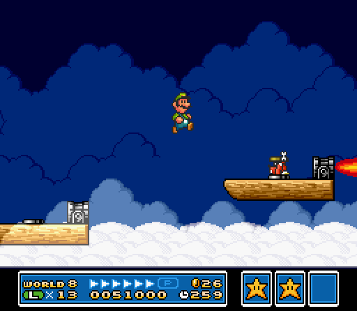
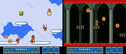
Sadly, Super Mario Bros. 3 & Super Mario World have plenty o’ autoscrollers, & I don’t think any o’ them were hardly good or were improved by being autoscrollers. The 1 exception I can think o’ is the airship in World 8 o’ Super Mario Bros. 3, which is the only autoscroller that didn’t scroll @ the speed o’ slugs. That’s the 1 level ’mong both these games that uses autoscrollers how they, presumably, should be used: to force you to keep pace, which is the opposite o’ “wait round doing nothing”. & if ’twere the only level to have it, perhaps “autoscroller” would’ve been a fresh special gimmick rather than a cliché so trite we already have a well-known name for it. You have to admit, this is 1 thing the 1st Donkey Kong Country & almost all o’ Diddy’s Kong Quest ( “Castle Crush” is the only exception ) did better than classic Mario games.

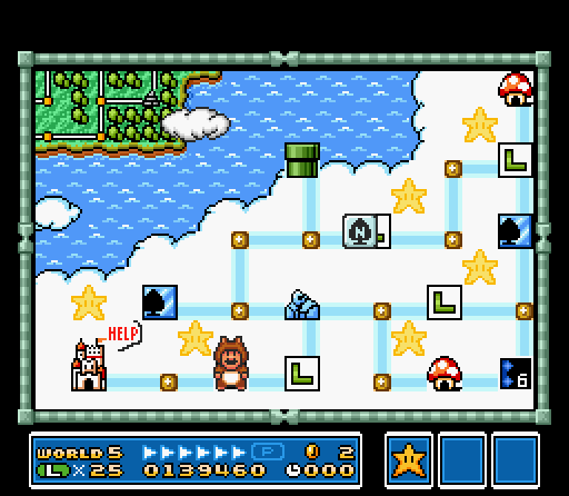
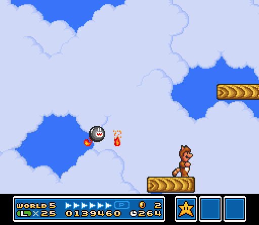
The absolute nadir for Super Mario Bros. 3 autoscrollers is unquestionably World 5-9. ¡Just look @ its map & see for yourself! ¡It’s literally just “Wooden platform, wooden platform, wooden platform, wooden platform, wooden platform — ¡Ooo! ¡Now there’s a Fire Chomp with a janky hitbox!”! That must’ve taken, like, a minute to design. I praised Super Mario Bros. 3 for having mo’ focused levels than Super Mario World, but sometimes it took it too far into the realm o’ monotony.

But the map, which a’least looks short, doesn’t show how unbearably slow it moves. I guess the actually difficulty was s’posed to be surviving the Fire Chomps for a certain amount o’ time. So it’s a diagonal elevator level — ’cause everyone loves those.

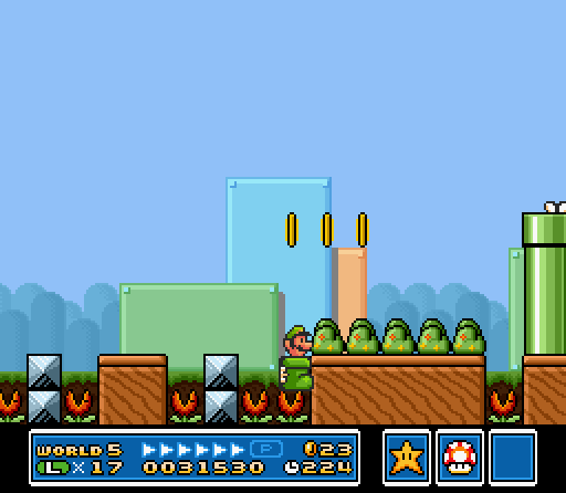
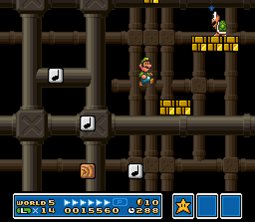
In general, World 5 is a bit o’ a weak point o’ Super Mario Bros. 3 — with only World 8 as possibly worse, due to having a full 4 autoscrollers, 2 o’ which are impossible to distinguish ( though the real levels it does have are good ’nough to almost undo that ). A’least the upper sky part o’ World 5’s quite weak. Yeah, the lower part has that Kuribo’s Shoe level; but that level’s only truly good ’cause o’ Kuribo’s Shoe & the slightly funny joke o’ taking a pipe down into the sky o’ ’nother outside area; otherwise, it’s just a bunch o’ pipes & Piranha Plants. I guess that works @ demoing Kuribo’s Shoe & its ability to stomp on Piranha Plants.

To be fair, the upper area has some good levels, like 5-5 & it’s subtly clever brick & donut-block puzzles, & 5-4 makes a decent introduction to those fucking mental 2D fidget spinners, mate; but then you have 5-6, which is just a copypasta swarm o’ Para-Beetles, 5-8, which is just “Here’s Lakitu”, with level design as advanced as that you’d find in the original Super Mario Bros., & the 2nd fortress, which is just a bunch o’ simple jumps with Podoboos & magical ceiling lava that’s e’en less advanced than every castle level in the the original Super Mario Bros. — ¿& what the hell does a red, hot lava fortress have to do with the sky?

Now that I’m looking through World 5’s maps: 5-2 is a good level, but it’s an underground level. ¿What the hell is an underground level doing in sky world? That’s the exact opposite o’ the sky. The 1st part o’ this level, where you can skip the rest o’ the level with careful jumps o’er note blocks, is so memorable; but I thought I remembered it from World 7, where it fucking belongs.

Posted in Sucky Stages, Video Games

Great Stages: World 6-5 o’ Super Mario Bros. 3

Introduction

I’ve always been interested in appraising level design for various reasons:

  1. Levels were always my favorite part o’ video games & level design was the part o’ game development that interested me the most.

  2. It’s not focused on as much by most reviewers as what seems to me much mo’ shallow elements o’ a game, such as story or aesthetics ( ne’er mind the fact that the average video game praised for its story comes nowhere close to the storytelling quality o’ great literature, while literature can’t come close to doing what well-designed levels can ).

  3. A lot o’ the work I find online is, not to poison the well to make my own pitiful work look good, not good. I don’t mean that they have bad opinions — that their conclusions are “wrong” — but that they don’t bother to go into detail on the “why” — the most important part. Most just say their favorite or least favorite levels & leave it @ that; others give shallow reasons like “too hard / too easy”.

The problem is, whenever I try to make some grand series appraising every level o’ a game, I can ne’er finish it. Mainly ’cause, honestly, most levels in every game aren’t worth writing ’bout. ¿What’s there to say ’bout that 2nd tank level in Super Mario Bros 3.?

Thus, I’m cadging a chip from some random YouTuber & just writing ’bout particular levels worth writing ’bout, ’cept with words ’stead o’… words o’er video, ’cause video-editing is ’bout as palatable as having my wisdom teeth yanked out. Technically, I already did that with my hyperbolic article ’bout that terrible level, C-3 o’ Lost Levels, eons ago. So let’s balance that out with a good level.

Super Mario Bros. 3 – World 6-5

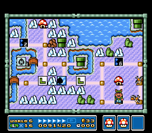
Map courtesy o’ KingKuros @ The Video Game Atlas.

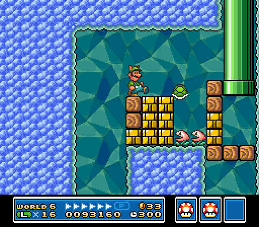
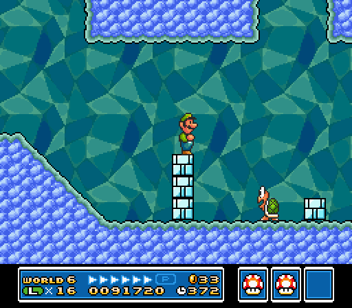
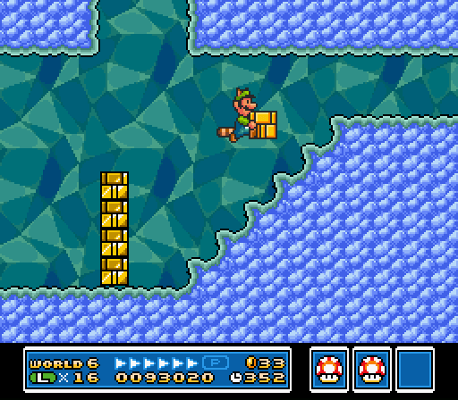
I’ll start by defending an oft-criticized level. World 6-5 is that infamous cave level wherein you have to get a Raccoon Leaf ( if you don’t already have 1 ), grab a Koopa shell, & fly up into an alcove & throw the shell to kill some Nipper Plants blocking the way to the pipe to the end o’ the level. This is 1 o’ those levels that’s “bad” ’cause it’s challenging. Worse: it’s not challenging in the typical “keep trying pixel-perfect jump till you robotically learn it through muscle memory”, but a puzzle that requires creative thought.

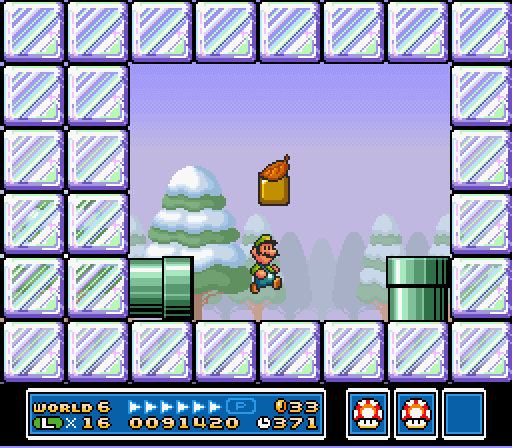
But it’s 1 that’s perfectly fair & intuitive. Once you find out the level wraps round, you know there’s an alternate way to win. There’s also a high chance that just before it loops, you’ll get a Raccoon Leaf; if not, there’s ’nother respawning ?-block with a Raccoon Leaf just after where the pipe drops you off @ the start o’ the cave. The game has consistently taught you that you can reach different areas by flying; ¿why shouldn’t it finally expect you to have to fly to beat a level by now? Eventually, flying round, you’ll find the alcove with that tantalizing other pipe, blocked by Nipper Plants. Whether you already realize you can’t attack them with your tail from ’bove or learn it the hard way, you’ll ’ventually run out o’ options up here & ’ventually have to go back down to search for mo’ answers, & ’ventually you’ll notice that conspicuous lone Koopa in a sea o’ Buster Beetles.

This Koopa lived a cruelly monotonous existence ’fore Luigi took him out o’ his misery.

Despite this level’s challenge, it’s nice ’nough to ne&rs

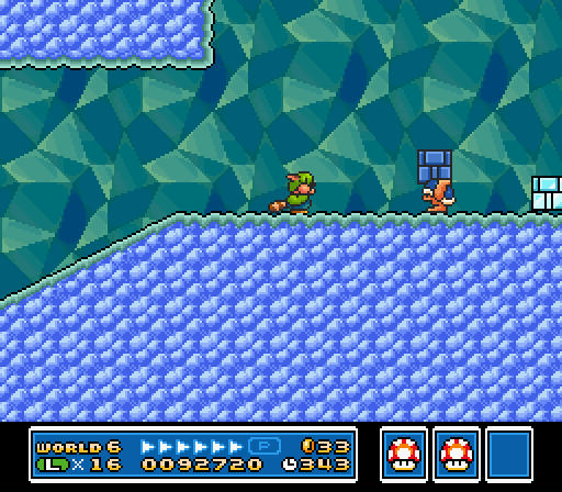
Actually, e’en the many Buster Beetles & the weirdly special throwable bricks they toss @ you work well. In addition to providing many ways for them to make you lose your Raccoon Leaf, challenging you to defend 1 o’ the keys to victory, they focus the level on the issue o’ throwing, which hints to you that throwing something @ the Nipper Plants is the answer. You may e’en try flying up with a throw block & fail, — or maybe succeed: I’ve ne’er tried, actually — only to later stumble ’pon the lone Koopa.

Despite this level’s challenge, it’s nice ’nough to ne’er completely screw you out o’ it — ’less you die, ’course: @ the end o’ the main path there’s a perpetually-respawning ?-block with a Raccoon Leaf before a pipe that leads back to the start. So e’en if you get hit & lose a Raccoon Leaf, you can always get ’nother. Koopa shells, ’course, also respawn ’pon entering & exiting a pipe, in case you accidentally kill the only Koopa.

I think this level shows a prototype for Super Mario World’s generally superior puzzle-based level design. It feels right up there with the kind o’ memorable puzzles like Yoshi-jumping under the goal post o’ “Cheese Bridge Area” or bringing a Yoshi to the end o’ “Valley of Bowser 4” so you can lick the key through the solid blocks. But it also has Super Mario Bros. 3’s brevity & focus, whereas Super Mario World levels sometimes had a tendency to be o’erly long & have jarring, unfocused, irrelevant extra parts — you know, those side rooms that don’t fit, like that pointless coin snake in “Donut Ghost House”, that P-balloon cave section in the underwater level, “Donut Secret 1”, or that outside section with the single flying Hammer Bro in the otherwise underground level, “Chocolate Secret”. Thus, this level combines the best elements o’ Super Mario Bros. 3 & Super Mario World’s level design.

It can also be rather fast-paced if you know what you’re doing. E’en if you start small, you can pop in the pipe near the beginning to grab a Mushroom, & then grab a Raccoon Leaf in the ?-block in the cave. Then just dodge all the enemies to the Koopa & fly up to win. Super Mario World, & some levels in Super Mario Bros. 3, infamously had a tendency to have ploddingly slow levels, as Sonic ads relished pointing out, ’specially Super Mario World’s puzzle levels. The fact that the aforementioned puzzles from World required you to get to the end o’ relatively long levels a 2nd time to get the 2nd exit doesn’t help. I almost mentioned the secret exit to “Valley of Bowser 2”, with its subtle clue that you can stay on the edge o’ 1 o’ the rising blocks you’re s’posed to be running from to reach a secret area ’bove the room… but that exit requires you to go through a direly long & slow autoscroll section, which should ne’er be encouraged. That this level was able to have a creative puzzle without needing to bog down the player’s momentum makes it deserve extra puntos.

If this level has anything you could call a flaw, it’s that, other than the graphics, it doesn’t truly fit the icy theme o’ its world. I guess the throw bricks look kind o’ icy… but these have appeared since World 3, & they don’t make sense as ice blocks. ¿What ’bout ice makes it mo’ susceptible to being picked up & thrown? & if they’re s’posed to be ice, ¿why aren’t they affected by fire when other ice blocks are?

But that’s the most anal-retentive o’ complaints, & there’s something to be recommended in a li’l mid-world variety. It’s not as if this level is jarringly contradictory to the ice theme; it’s just theme-neutral & could fit in any world.

I probably mentioned it already in my big article comparing Super Mario Bros. 3 & Super Mario World, but I consider World 6, ’long with 7, to be the high point o’ Super Mario Bros. 3’s level design, with tricky, clever block arrangements, so it does fit in that way. A’least it fits better than the 2 underground water levels in this world ( whose existence admittedly undermines my “high point” point before ).

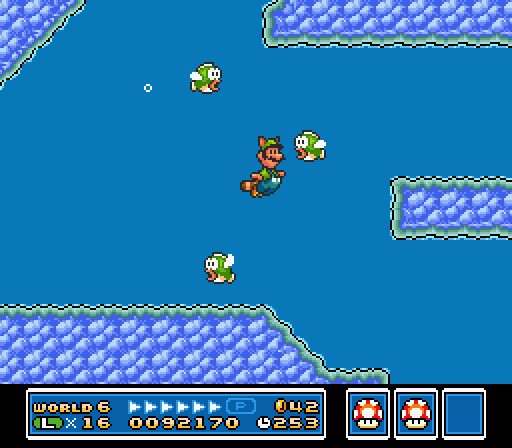
Swimming while taking pictures is bad for your health.

Posted in Great Stages, Video Games

The Nostalgic Double-Standard o’ Difficulty

After o’er a decade o’ ne’er truly playing a Wii1, I got 1, & having tried the Wii Mario games, — the Super Mario Galaxys & New Super Mario Bros.: Wii Bootleg Ourselves — I’m amused by the indignant scoffing o’ grown-adult Mario fans who grew up with the series & feel the need to measure their own dick by criticizing these games for being “pathetically difficult” all throughout el entrered2. I would agree that these games are, indeed, pathetic, but not due to any lack or non-lack o’ difficulty.

There are a few reasons I find this amusing. 1, I thought society evolved past the ideas that a game’s quality came from its difficulty. ( Mario Paint is absolute shit: you can’t e’en lose. ¿What kind o’ liberal everyone-wins garbage is this? )

But the most amusing part is something I thought everyone knew, but apparently everyone forgets: Mario games have always been “baby-easy”. Super Mario World lets you just ’bout fly o’er everything with a cape, or if not, usually a blue Yoshi; Super Mario Bros. 3 drowns you with so many lives & powerups that you’ll run out o’ room before you finish the game, & throws fire flowers & raccoon leaves @ you throughout levels. E’en the original Super Mario Bros. was easy for its time. I can think o’ literally only 6 NES games I can beat, & Mario games make up a full 4 o’ those.

Mario fans apparently forget this ’cause they still remember playing those games as, well, babies, while now as grown-ass adults they whine that the games still aim for that target demographic.

E’en Miyamoto apparently forgot this, as he “admitted” that he regretted making the 1st New Super Mario Bros. “too easy”, when he should regret intentionally sabotaging it & the whole series ’cause he hates 2D games & doesn’t want to work on them. Seriously: nobody who directed Super Mario Bros. 3 makes games these bad on accident.

But ’cause I’m a scientist in game-hipster-dialectical-analysis o’ the highest caliber, I shall prove to you, objectively, that those ol’ “hardcore” games that Mario fans are talking ’bout — Super Mario Bros. 3, Super Mario World, Super Mario 64 — e’en the original Super Mario Bros. — are, in fact, easier than these shitty not-new-anymo’ Wii Mario games & that these games are shitty for completely different reasons.

For New Super Mario Bros.: Wii Have No Artistic Value this’ll be easy, thanks to the fact that it rips off Super Mario Bros. 3 so much ( without understanding what made those elements it stole work in its own context — i.e. fucking up ripping them off ).

A few comparisons:

Super Mario Bros. 3 has its ice world world 6; New Super Mario Bros. Wii Put Mo’ Thought into these Belittling Subtitles than they Did in the Actual Game has it in world 3.

New Super Mario Bros. Wii Are Tired o’ these Subtitles has a wind-based level in world 2. The only classic Mario game with wind is Lost Levels — & it’s 1 o’ the most controversial aspects o’ that game. ¿What drugs were Nintendo on when they put a wind section in world 2?

Harder enemies appear generally earlier in NSMBW than earlier Mario games. Hammer Bros. & Bullet Bills, which were a formidable late-game enemy in the original Super Mario Bros., & which appear a bit later in Super Mario Bros. 3, 1st appear by world 3 @ the latest in NSMBW.

¿Remember those infamously “hard” levels in Super Mario Bros. with the hopping fish o’er bridges in World 2-3 & 7-3? Well, NSMBW is such a pansy game that it has a level like that in World 4, but with falling donut blocks ’stead o’ a sturdy bridge. Meanwhile, that hardcore game, Super Mario World, had you hopping o’er slowly hopping dolphins that can’t hurt you o’er safe water with a spiky fish giving itself a heart attack chasing you @ the speed o’ snail.

NSMBW randomly decides that waggling the Wii dick doesn’t do anything, making it impossible to pick up propeller blocks or frozen Dry Bones, ’cause the Wii is an amazing system & Nintendo was too braindead to figure out how to make a basic fucking button do that e’en though every classic Mario game was able to; all classic Mario games have actually functioning controls. To be fair, the original New Super Mario Bros., & presumably its sequel with its Golden Fire Flower that wrecks economies & makes Ron Paul commit sepeku, also had fully-functioning controls, so this was probably just a Wii problem. I don’t know ’bout the Wii-U, since I ne’er bought 1, & apparently hardly anyone else did, so we can chock up New Super Mario Bros. Wii-U & its millions o’ Luigi-fueled rom hacks & Super Mario 3D World as “games nobody cared ’bout”3.

Also, admittedly, I didn’t play past World 4, ’cause Zzzzz… So maybe the game becomes ridiculously easy afterward. I wouldn’t put it past them. Look, I try to be comprehensive, but I just spent hours trudging through the 2 Galaxies & almost doing Galaxy 1 twice ’cause o’ its dumbass 100% bullshit. Demanding I play New Super Mario Bros. Wii comprehensibly is like saying I have to play every game on the Jaguar to know it sucks: we all know that game sucks. It’s not like New Super Mario Bros. Wii suddenly starts revolutionizing gaming in World 5. Also, I’ve watched entire gameplays o’ this game, so I kinda know it doesn’t.

Literally the only thing I could think o’ that NSMBW did that was easier than Super Mario World was that it saved the amount o’ lives you have. I was e’en shocked to remember that they actually e’en kept the 90s-era save-game limits, which is funny, ’cause Donkey Kong Country Returns & Super Meat Boy didn’t need that, e’en though those games are actually good hard games. It’s almost as if using save-game limits as an attempt to create “difficulty” is pathetic & stupid.

Some may defend these with the idea that NSMBW is for people used to the classic Mario games, which is why it uses late-game elements earlier. This is basically a way to say that NSMBW is a romhack. 1: this doesn’t contrast my point, only argues that it’s a “good thing” that NSMBW is harder, which is irrelevant; 2: ¿why didn’t Super Mario Bros. 3 or Super Mario World, which came nearer after their predecessors, need to aim for creating an “extra challenge” ( without the “extra” part ) for “Mario veterans”, as if playing Mario games is anything close to fighting in war-torn countries.

Saying that New Super Mario Bros. Wii Still Can’t Believe We Put a Fucking Wind Section in World 2 sucks ’cause it’s not mo’ like some dumb kaizo rom hack makes no sense. It doesn’t suck ’cause they didn’t put in mo’ Hammer Bros.; it sucks ’cause it doesn’t have hardly anything “new” in it.

& then we have the Super Mario Galaxies vs. Super Mario 64, where I’ve read throughout the internet that Galaxy is s’posedly the “easiest” o’ the 3D games for such sane reasons as 1 guy not being able to waggle his N64 controller to give Mario a bit mo’ air in Super Mario 64 &… most who just don’t give a reason, it’s just received “wisdom” spread onward like STDs. Like before, I can objectively prove this wrong:

People criticize Super Mario 64 for the 100-coin stars being too “hard” to get; but name 1 star in which you had to not only collect 100 coins, but do so within a time limit while every floor crumbles under you or starts flipping its shit.

Name a single star in Super Mario 64 ( or Sunshine ) that didn’t allow you to get hit a single time.

Name a single time holding downward makes you go forward in Super Mario 64 or Sunshine or any game, actually. Seriously: they were drunk when they programmed the controls for the Galaxy games.

For fuck’s sake, Super Mario 64 lets you heal yourself fully just by jumping in water.

Granted, you could say that the Super Mario Galaxy games are simpler than 64 & Sunshine in that its just a dumb action game that makes you go straight ( just shown @ a stupid angle, ’cause o’ wacky gravity cinematics ), while 64 & Sunshine actually had puzzles & exploration & depth. That’s a mo’ accurate explanation for why the Galaxy games suck — but it wasn’t ’cause they didn’t make you collect every purple coin in Luigi’s Purple Coin Catastrophe or didn’t have lava rocks randomly fall everywhere… Which they did do in a star in Super Mario Galaxy 2 & in a level in the 1st New Super Mario Bros.

Stupidly ’nough, Super Mario Odyssey actually is easy ( & yet is actually good, unlike just ’bout every Mario game made for the Wii ), but Miyamoto claimed that it’s for the “hardcore” players, unlike Galaxy. It’s a good thing Miyamoto clearly designs games based on his intuition & not his analytical skills.

Posted in Video Games

UPDATE: Grumpy Ol’ Mezun Rants ‘Bout these New Remakes & the Glory Days o’, like, a Couple Years Ago

Actually, in my defense, from what I’ve seen, Super Mario Odyssey looks so good it might e’en rival Super Mario 64, which is god-tier — something I’m writing a huge article ’bout, which you should expect sometime within the next 5 years maybe. So Nintendo has shown that they can not fuck things up when they actually make new things. I say “from what I’ve seen” ’cause o’ an ol’ policy I’ve followed my whole life, & shall continue to do — a policy I’ve tried to teach my young nephew when the bourgeosie’s crafty sugary candy o’ consumerism consumes him himself: ne’er buy a system less than a year after it comes out. Shit, I just recently tried out the original Wii last month for a mere $60 — & you suckers paid a couple hundred for it a mere decade ago.

But our subject isn’t that, but shitty remakes — to be specific, shitty remakes that I haven’t actually played, but are shitty in terms o’ aesthetics — & I’m reasonably sure they’re just the same games ’neath the new paint.

See, I love remakes that somehow manage to be aesthetically worse than their originals, since the 1 thing you’d expect new technology to add is better graphics & higher-quality sound. I don’t know if I’ve mentioned it yet, but I oft laughed @ how pitiful those new Yoshi’s Island games — the DS 1 with its utterly forgettable music & cheap graphics or that 3DS 1 with the fucking kazoos. I marveled @ how these new-fangled games sucked so hard, they looked worse & sounded much worse than a game that came out in 1995 for a system that had a mere 3.58 megahertz & a mere 128 kilobytes. It made me wonder why they e’en bothered to make a new version o’ a game that, clearly, is perfectly good as it is. If Yoshi’s Island looks better & sounds better than games that pass the condiments today, ¿how could it be called “outdated” in any way?

The same applies to 2 recent Mario remakes: Mario & Luigi: Superstar Saga + Bowser’s Minions ( ’nother example o’ Nintendo’s newfound love for awkward game titles ) & Mario Party: the Top 100.

The former replaced the original Mario & Luigi’s expressive & beautiful cartoon graphics — a surprising rarity in Mario games, which are usually either pixelated or polygonal — that made the series stand out with cheap polygonal graphics that look like ripoffs from New Super Mario Bros. I can’t wait till they finally remake Paper Mario with its shabby, outdated flat graphics so that it’ll be mo’ consistent with modern Mario games — i.e. look just like all the others with no heart or personality o’ its own.

Lots o’ people, e’en up to reviewers like @ Destructoid ( when they can pull themselves ’way from talking ’bout wanting to fuck Shantae — ne’er live it down ), have noted that character expressions are mo’ generic: Toads’ eyes no longer pop out when they become frightened in the opening cutscene, Peach’s tears are mo’ generic…

Now, the thing is, they could’ve improved this game’s graphics by actually keeping to the heart o’ the game’s aesthetics. ¿Imagine how this game’s graphics would look if it had high-resolution handdrawn graphics? What we got is just a sad rehash o’ an ol’ argument I thought had died: “Duh, it’s polygons, so it’s better ’cause that’s mo’ ‘advanced”’.

But I do have to ask, ¿did we truly need a remake o’ Superstar Saga? ¿When did this game come out? ¿2003? ¿Do we truly need to remake a game every 15 years, ’specially when the technological increases that s’posedly warrant them are getting diminishing returns? ¿What was wrong with the orignal Superstar Saga? It’s just seemed like such a strange decision that came out o’ nowhere.

Mario Party: the Top 100’s different in that it’s not necessarily a remake so much as a greatest hits compilation o’ minigames, a celebration o’ Mario Party’s long history just a year before its 20-year anniversary o’ the 1st game’s December 1998 release ( maybe I should do a retrospective on that series next year ). They apparently e’en brought back Minigame Island, which was a mechanic they dropped since the 2nd game for reasons I can’t comprehend.

That said, Metacritic gives it middling scores ( granted, I question how selective their “critic” choices are, as many o’ them I’ve ne’er heard o’, & quite a few can’t write coherent English ) & I saw some obnoxious Game Grumps ripoffs say it’s not good, & it seems like they have good reasons. Also, the game costs $40, which is hilariously ridiculous in a world where I can get games with much mo’ depth off Steam for $10 – $20.

But I’m mostly aiming my ire @ the remixed music. Since this game remakes minigames from all the ol’ Mario Partys ( ’cept DS & Advanced, which is bullshit, as the latter was awesome & the former a’least had good minigames ), logically it remixes the songs that played in those minigames. Well, not truly “logically”, since they came from N64 & after systems, which had perfectly good sound quality. Nintendo were wise when they didn’t change Super Mario 64 or Ocarina of Time’s music in their remakes: they were perfect the way they were.

What amazes me ’bout the remixed music is that they usually sound technologically inferior, as if from a less powerful system than the N64. The music in the 1st 2 Mario Partys sounded like natural music — no beeps or bips. But the new music makes it sound mo’ technoish — that generic technoish sound that’s infected most modern cheap Mario games.

Let’s look @ the 1st abomination I saw: “Blue Skies Yonder” — the original & the modern version. The original sound like real instruments & evokes a slightly country feeling with its whistles. It’s the kind o’ song you play when you’re, say, riding up a mountain on train tracks. ¿You know what goes great with that mood? Fucking techno. & yet, that’s precisely what the modern version added. I want to emphasize ’gain: the original sounds like real instruments. The modern legit sounds like a MIDI version. ¿How the hell does a remake on a much mo’ powerful console make a song sound mo’ like a MIDI?

Other songs are mo’ mixed. In the modern version o’ “Going for Coins”, I like the bass, but the horns are so pathetically tepid.

Also, it’s probably pointless to bring this up, since the change happened games ago, but the parrot announcer from the original games is far better than the hokey new voice actor they have, who sounds like just some executive working @ the company.

Posted in Video Games

Luigi’s Mansion — Original vs. Dark Moon

Dark Moon is an anomaly o’ a sequel for me: most sequels fall into 3 categories:

  1. Is very similar to its predecessor, but much better or worse.
  2. Is very similar to its predecessor, but hardly different.
  3. Is completely different from its predecessor & much better or much worse.

Dark Moon is odd in that it feels like a Luigi’s Mansion — it doesn’t depart too much — but doesn’t feel too derivative, nor does it feel like it’s much better or much worse. It just feels different, but while still keeping to the main formula.

Gameplay

I’m bewildered by the main point made by those who prefer the original, not ’cause I don’t share the sentiment — I do — but ’cause it’s hypocritical, as the issues they claim Dark Moon has are also in the original.

The main complaint is that Dark Moon worsens the nonlinear, exploratory feeling by making it mission-based. The problem with this is that the original didn’t do a great job o’ that either. People complain ’bout the missions ruining exploration in Dark Moon ’cause they interrupt your exploration to push you back to E. Gadd’s & make you start back @ the start ’gain. They also complain ’bout how Dark Moon has each mission o’ a mansion generally focus on a different part o’ the mansion, making it feel linear. ’Cept the original does the same thing: it splits the game into 4 “missions” that focus on 4 different parts o’ the mansion: the 2nd floor, the 1st floor, the 3rd floor, & the basement. After the boss o’ each “mission”, you’re forced to return to E. Gadd’s, & then you’re sent back to the start, which is mainly a hub to the other parts o’ the mansion. This isn’t an exaggeration, either, as the length o’ the entire 1st game is ’bout as long as each level in Dark Moon — so each part pretty much is like a mission.

Nor was the mansion in the original as nonlinear as some blinded with nostalgia claim: while there were a small few o’ portrait ghosts you could skip, & a few secret areas, you had to explore most o’ the areas & fight most o’ the portrait ghosts, & you usually always did them in the same order as you usually needed to beat a portrait ghost to get a key to get to the next, & so on.

Thus, I agree with the sentiment, but disagree with the conclusion, & am still mixed: while we could say that Dark Moon wasted potential by not improving on the original’s weakly-done exploration, those who prefer the original forget that it failed @ being all that exploratory itself.

There are a few ways in which Dark Moon was inferior to the original, but none o’ them are as big as the nonlinear problem, nor inherent in the mission system. The 1st is that you can only save ’tween missions, while the original let you save any time you caught a boo or encountered a Toad, a bewildering decision for a handheld game. I blame the recent unfortunate fad o’ creating “difficulty” by borrowing bad design decisions from ol’ games. People complained ’bout games during the N64 & GameCube era being too easy, & such games also generally saved all the time ( Mario 3D games would save after every star or shine, for example, making game o’er borderline pointless ), & then games started to turn toward becoming much harder, & 1 o’ the “techniques” was trying to make game o’er threatening ’gain by limiting saves, such as in New Super Mario Bros. ’Cept like most challenge techniques from the NES era, this is a lazy, cheap attempt @ difficulty that was only done back then ’cause it wasn’t as practical to have easy saving ( or saving @ all )1.

The 2nd problem is the way the game constantly interrupts you so E. Gadd can tell you exactly what to do, insulting your intelligence. This is a bit mo’ linked to the exploration problem, as it constantly takes you out o’ the game & tries to micromanage what you’re doing. It is also, sadly, a fad that has been burgeoning in the last decade or so. However, it’s not intrinsically linked to the mission system.

Sometimes the portrait ghosts had mo’ creative puzzles for defeating them than the ghosts in Dark Moon, but Dark Moon had some interesting puzzles o’ its own, & we’ll save most o’ our discussion on the portrait ghosts for the “aesthetics” section.

Dark Moon improves on the original in other ways. It has collectible jewels that actually improves exploration o’er the original. 1 o’ the problems with the original is that there’s not much to do other than to fight ghosts & maybe get money — & most o’ the money is in annoyingly rare & sometimes random golden ghosts. A’least Dark Moon’s golden ghosts are consistent. Unfortunately, Dark Moon’s jewels fall into “Super Mario Sunshine Syndrome” & have some jewels only appear on certain missions, which forces you to explore most places many times just to make sure the game doesn’t jape you. I’d recommend trying to explore a while, & then once you get bored, just read a walkthrough; nobody will care whether or not you found them on your own, since nobody cares whether or not you can do well in a baby game like Luigi’s Mansion — this isn’t a competitive game like Super Smash Bros. Melee or Fire Emblem.

Dark Moon is also less harsh on punishing you for mistakes. In Dark Moon you can permanently fuck up a mission, but you can always retry it. In the original, you can easily permanently fuck up the entire game, forcing you to restart the entire game if you’re going for a good score. Granted, getting the best score in the original is mo’ a bonus, whereas the rankings in Dark Moon are right in your face.

I also thought Dark Moon handled Boos better. Finding them is actually a puzzle, whereas in the original they were just in some random thing in almost every room. Having only 1 Boo per mission is also less repetitive & boring than the original’s whopping 50 Boos, with 1 in almost every room.

Dark Moon also has that weird rainbow flashlight thing that reveals secret things, which is cool. It’s unfortunate that it doesn’t have the fire, water, & ice shots that are in the original, but Dark Moon does still make clever use o’ fire, water, & ice, & I think the rainbow flashlight’s better.

Dark Moon also had better bosses, though the original’s weren’t bad. Fake Bowser is a lame cock-tease compared to the fight gainst King Boo in Dark Moon, divided with races through a twisted hallway. Boolossus, though they got his name wrong in Dark Moon, was also better in Dark Moon, ’cause he had a train. The spider boss had clever scenery puzzles, the clock-based boss was a creative idea, & then you have the possessed armor. In general, the original’s bosses were mostly just dodging & attacking, while Dark Moon’s had mo’ a puzzle aspect to them. Luigi’s Mansion was always better @ puzzles & exploration, not action, so that’s definitely an improvement.

Dark Moon also has escort missions with Toads, which many people predictably criticize, but I didn’t think they were that bad. That Toads aren’t that hard to bring ’long, & unlike most escorts, they actually do give you abilities you don’t otherwise have, such as being able to shoot them places. Plus, I love the squeakiness o’ their shoes. I’ve ne’er been a huge fan o’ Toad, so I was surprised that I actually found them endearing in this game.

In general, I must say that Dark Moon probably had the best gameplay, which isn’t a rare belief. However, I agree with the sentiment that those few who defend the original’s gameplay & think that a 3rd Luigi’s Mansion could easily best both if it truly did the “1 big mansion, lots o’ freedom & exploration” thing. The original was simply too small & short & simply limited you too much to succeed @ that any better than Dark Moon.

Aesthetics

This is where most people agree… but not so much with me. E’en people who prefer the gameplay o’ Dark Moon lament its s’posedly inferior atmosphere & aesthetics.

The original was a bit mo’ horror, while Dark Moon is mo’ cartoony. The original is much darker & everything looks mo’ dusty & grayer, while Dark Moon is very colorful, with lots o’ neon colors. & while Dark Moon mostly has cute, cartoony ghosts, the original had freakier, mo’ human-shaped portrait ghosts.

I’m mo’ mixed than most people. I actually think Dark Moon looks gorgeous & like how colorful it is. It sort o’ reminds me o’ Scooby Doo: it’s not scary, but it’s stylish.

That said, I do prefer the portrait ghosts to the generic Pac-Man ghosts in Dark Moon — ’cept Ghost Dog: Ghost Dog is a great new pet & I write fan fiction ’bout it & Luigi’s further adventures all the time. I’m not sure how someone couldn’t, since, I mean, c’mon — they’re generic Pac-Man ghosts, while the portrait ghosts have a variety o’ strange designs.

This ties into the original being mo’ “horror” than Dark Moon. The original is somewhat creepy, not only in its general look, but also in the implications for how some o’ the portrait ghosts became ghosts — including babies & young children. The original dealt with the subject o’ death much mo’, including a clever point where a portrait ghost that had been on your side for most o’ the game finally just lets you suck her up in what must be 1 o’ the easiest portrait ghosts to beat ’cause she wants to rest in peace. Meanwhile, Dark Moon doesn’t deal with the subject o’ death much & nobody truly thinks ’bout where the Pac-Man ghosts came from ’cause they’re too cartoony. It also has a lot, lot mo’ slapstick, which isn’t truly all that funny, but not truly all that bad, either.

But the main focus is the area. In this case, I may have to prefer Dark Moon. The original doesn’t look bad, but there’s just not as much variety: that’s the advantage Dark Moon had by having multiple mansions, a chance to mix the o’erall haunted theme with jungles, sand, & snow.

Ironically, though, I feel like Dark Moon becomes mo’ horror near the end while the original becomes mo’ cartoony. King Boo becomes strikingly angry for revenge @ the end o’ Dark Moon, while the Fake Bowser fight in the original where you make it lose its head — including it sometimes putting it on backward & running round crazy — is just silly.

& this is going to sound silly, ’specially from me, but Dark Moon had better writing & a better story. Granted, neither are Kafka, & Dark Moon does lose points for constantly interrupting gameplay with E. Gadd’s gabbing; but Dark Moon’s plot made mo’ sense & actually had character development.

The original’s plot didn’t make much sense: Luigi wins a contest he didn’t enter & doesn’t suspect a trap, e’en though he knows he has enemies. Then, while he’s there, he learns that King Boo kidnapped Mario… ¿& then tricked Luigi into coming so he can save him? ¿Why not just trick Mario into coming & capturing him? ¿& why was it so easy to capture Mario, but not Luigi?

King Boo’s motive in Dark Moon made mo’ sense, albeit relied on the original a bit: he wanted revenge gainst the 2. In this case, it makes sense for him not to just capture Luigi as easily as Mario ’cause he wants to prove himself gainst Luigi. & Luigi isn’t just dicking round in a mansion ’cause he won it in a contest, but is trying to fix some moon thing to stop ghosts from wrecking terror on the world.

Luigi also has character development in Dark Moon: you can see him gradually become braver as the game goes on, & becomes mo’ comfortable with ghosts, ending with Luigi e’en adopting Ghost Dog as a pet @ the end. Meanwhile, Luigi doesn’t change @ all throughout the original: he’s stick scared shitless by what appears to be Bowser @ the end, which makes no sense, since he fought Bowser a million times. If anything, the sight o’ Bowser should’ve assured him since it ’splains everything mo’ than anything else why ghosts would be going after them.

Both games have great main themes, which are o’erused. I think I found Dark Moon’s a bit mo’ memorable, but prefer the original’s soundtrack as a whole. While Dark Moon has some good remixes — I recommend “Old Clockwork” & “Secret Mine” the most for both the main theme & “Old Clockwork” for the “Outlanding Interruption” theme — o’ its 2 good songs… I only remember those 2 good songs & the latter still sounds similar to the 1st, whereas the original has that wicked but sadly underused song that plays while tallying up ghosts after an act, that other great, underused song, the song that plays when the portrait ghosts 1st talk to you, the song for catching a boo, Bogmire’s theme, &, ‘course, the credits theme.

But that’s all minor. In general, I’d consider Dark Moon slightly better in terms o’ gameplay & the original slightly better in terms o’ aesthetics; & ’mong the 2, I’d consider Dark Moon slightly better, but not by much.

What’s mo’ interesting is that there’s still room for expanding on the goal that both were s’posed to serve — a huge mansion rife for free, nonlinear exploration — in a 3rd game.

Posted in Video Games

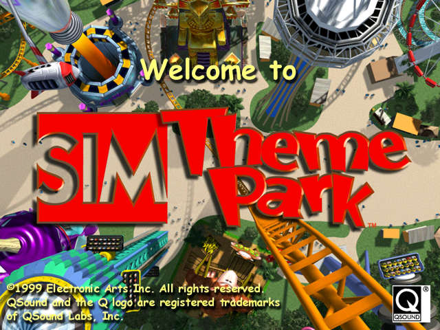
Sim Theme Park

( Or Theme Park World to Europeans ).

Nostalgia has a strange way o’ making games look better than they probably were. For instance, as I’ve mentioned in previous articles, while I have nostalgia for games like Sonic 3D Blast & Sim Tower, I wouldn’t find playing them much fun. What’s stranger, though, is when nostalgia seems to both make a game fun in remembrance & fun in still playing it now, e’en when one can’t figure out why.

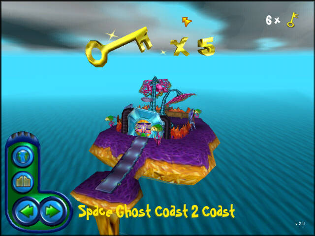
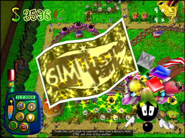
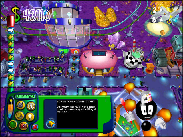
Much like Sim Tower, there’s not much to Sim Theme Park. You have 4 levels, 2 unlocked @ the start, 1 unlocked by getting 3 keys, & the last unlocked by getting 5 keys ( unlike many games, these keys don’t magically disappear after unlocking a level, so that’s 2 mo’ after unlocking the 3rd level ). Keys are unlocked by getting 3 Golden Tickets, which are gotten by “DOING GREAT THINGS”, as your personal Navi tells you.

I should talk ’bout your personal Navi. I ne’er knew his name, though Bullfrog Productions Wiki says it’s “Buzzy” in parentheses. All I know is that I always thought he looked like a black ant & that he sounds kind o’ like Dick van Dike. He pops in on the bottom right corner every second you breathe to tell you info that’s either useful or useless, so he’s actually better than Navi. He’s all right. Be prepared to hear a lot ’bout how “she’s ’bout to blow” or how you could get a golden ticket if you could “squeeze just a few mo’ customers in”, though.

European fans apparently have high regard for the European version’s British voice actor, since he’s apparently somewhat well-known, but I have nostalgia for the American version & his hammy “YOU CAN GET GOLDEN TICKETS BY DOING GREAT THINGS”.

Back to the levels, since they’re some o’ the most interesting part o’ the game. In truth, the gameplay changes ’tween levels aren’t that different. There’s just slight changes, like a few types o’ stores & sideshows that appear & don’t appear, which you start out with & how soon others can be unlocked, & how many & how few o’ different types & sizes o’ rides & “features” there are. Most differences are cosmetic.

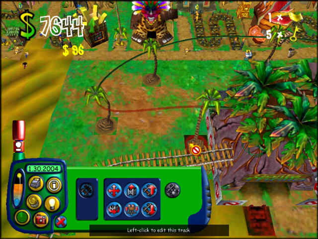
The 2 you start with are “Lost Kingdom” & “Halloween World”. Though the former is the 1 the game starts you on on the menu, I remember playing the latter 1st, & generally play it 1st, ’cause, ¿who would rather play some dumb green & brown dinosaur land when you could play a spooky night halloween theme park?

The 1st new level you unlock is “Wonderland”, which is also grassy, but with a bit more o’ a focus on nature & with a bit mo’ whimsy. It’s basically a superior version o’ “Lost Kingdom”, & I oft go far as to play it before “Lost Kingdom” as well, since it’s not too hard to get 3 keys in 1 level.

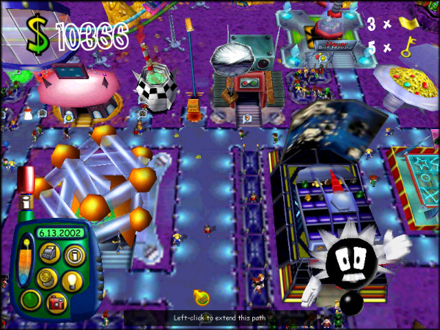
The last level is “Space Zone”, which is the most different, taking place on a purple planet, with an obvious focus on space & technology. This difference makes it mo’ exciting to finally unlock — a’least when you’re still a li’l kid & that feels like an accomplishment.

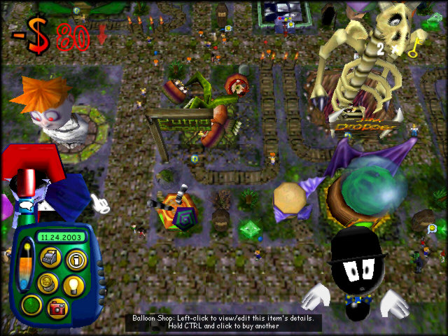
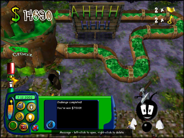
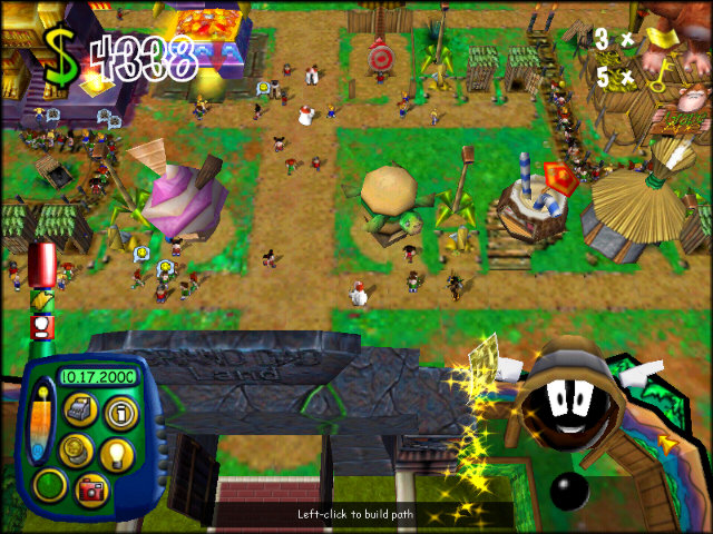
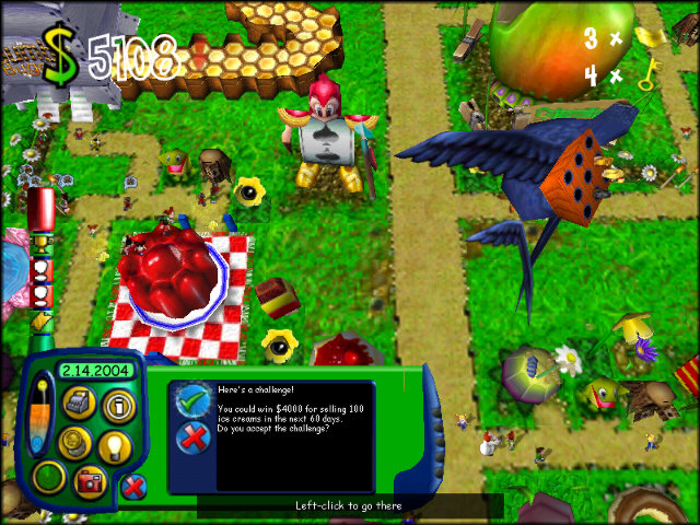
Most o’ the game is as you’d expect from a sim game: you go round building rides, shops, & other attractions, trying to balance customers’ fun with your funds. You also have staff you need to hire: janitors to keep the place clean; entertainers to be useless; security guards to stop the li’l shits from being li’l shits; mechanics to fix rides that break every second & cause Dick Ant Dike to tell me, “UH O. LOOKS LIKE A RIDE BROKE DOWN. BUT DON’T WORRY: A MECHANIC’S ON THE WAY”. Sometimes the ant guy will give you challenges, usually to sell a certain # o’ products before a certain # o’ days transpire, which usually means building a few more o’ those shops & lowering the price $10 or so.

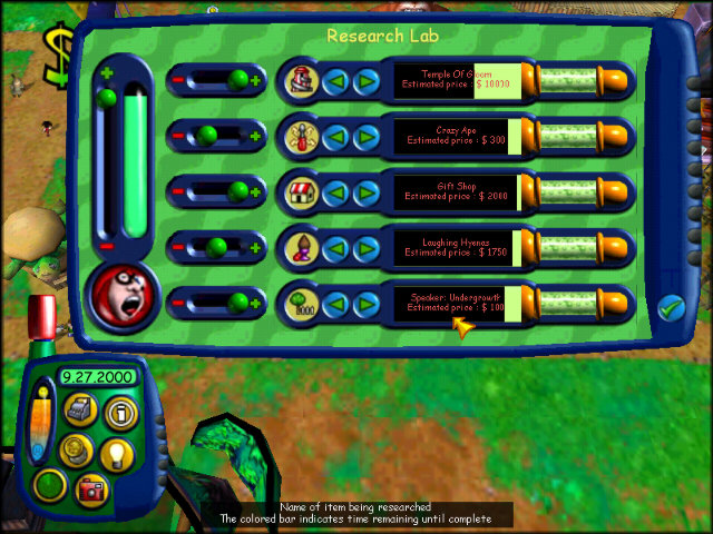
It’s through researchers that we get the most interesting part o’ the game. Rather than starting out with everything you could buy, the game forces you to research most o’ it. This involves hiring researchers & waiting. You get some choice o’er what to research & what to prioritize, but not much else. Most o’ it is just waiting. Still, it’s quite exciting when you get a new thing to build.

Honestly, building all the stuff’s the only part interesting ’bout this game. They did make the aesthetics interesting in this game. It’s fun to see the different looks o’ the shops in different levels — from Dracula to a bumble bee for the balloon shop — or the different rides they have, such as a ladybug spinner or 1 o’ those bouncy rides that’s a brain or a plate o’ Jello. In fact, the game gives you a ticket for building everything, which is when I’d always consider the level “beaten”, since like most sim games, a level only “ends” when you choose to return to the level select.

You could say the simplicity is 1 o’ its bonuses. I actually just recently tried Rollercoaster Tycoon 2, since everyone says it’s the best, but it’s just a clusterfuck o’ confusing, terrible UI. Nothing better than starting by building a burger shop & putting a path right up to its front, only for the game to tell me no one can reach it — though on-screen you could see visitors walking under it by some alien magic. I also hated how it tried to force objectives on me.

Anyway, the greater focus on rollercoasters is a loss for me, since I always found them to be the most annoying thing to build in Sim Theme Park, while Rollercoaster Tycoon 2 made building the entrance & exit o’ any ride annoying, much less anything mo’ complicated.

Then ’gain, maybe Sim Theme Park is confusing for new players, too. Plus, I have to admit it seems like Sim Theme Park ripped off Rollercoaster Tycoon heavily. It e’en seemed to have researching new attractions & e’en mo’ customization options than Sim Theme Park’s already hefty customizations. The Rollercoaster Tycoon games also have far mo’ level themes. I can see why someone mo’ experienced with these games would prefer the Rollercoaster Tycoon games & would find Sim Theme Park underwhelming in the same way a SimCity 4 fan may find the original SimCity boring.

Sim Theme Park actually had a game that came out before it, just Theme Park, which I’ve ne’er played, & the only thing I know ’bout it is its creepy game o’er screen. It also had a sequel, Sim Coaster ( Theme Park Inc. in Europe, Theme Park Manager in Australia ), which I did play, but don’t remember too much. All I remember was that it had a snow level, & only had 3 levels.

O yeah, & it has some pretty good music, though damn long. I’d recommend Halloween World’s & Wonderland’s.

Posted in Video Games

The Legend o’ Legend of the Four Switches: Part 9 – The Warped Void

World J: The Warped Void

Music: “Main Menu”, WarioWare, Inc.: Mega Microgame$!

“It’s just an empty void”. What a great ’scuse to not put any effort into map graphics, like I did throughout this whole hack. The only interesting part is how a lot o’ the level tiles are ?s, making the player figure out how many exits each level has.

I do really like this map song, though.

Easiest Level Ever

Music: “Green Greens”, ’bout every Kirby game

Laziest, too.

Originally this spot held “Let’s Abuse Yoshi”, a level much mo’ clever & fun. I think I replaced it ’cause a few parts were janky — specifically a part where you had to get through a corridor clogged by Chargin’ Chucks using Yoshi’s extra hit point & retrieve him ’fore he goes past the next Chuck. I shouldn’t have; jankiness is better than boring, ’specially for the last world.

  • P-Switch level count: 30 / 50
  • Levels with mo’ than 1 switch: 15
  • Levels with mo’ than 1 o’ the same switch: 8

Stratus Travesty

Music: “Green Greens”, ’bout every Kirby game

Message box: best way to deal with flaws isn’t to fix them, but to point them out so people know I made their experience less enjoyable on purpose & hate me e’en mo’.

See, the trick ’bout the end is that you have to not get hit with the feather the level gives you or you can’t fly & are screwed.

There’s nothing interesting to say ’bout this level. It’s mere OK.

  • P-Switch level count: 30 / 51
  • Levels with mo’ than 1 switch: 15
  • Levels with mo’ than 1 o’ the same switch: 8

Goomba Path

Music: “Enemy Battle”, Super Mario All-Stars: Super Mario Bros. 3 ( Same )

I don’t know what inspired it, but for some reason this world has a bunch o’ levels revolving round a certain enemy. This level focuses on Goombas & resources I ripped off from Super Mario Bros. 3, the 2nd o’ which is a tradition that continues to today in the bosom o’ Boskeopolis Land.

In particular, the “boss” rooms @ the end are a waste o’ time: I just copypastaed so many Goombas that the sprite engine slows to slime, ’cause repetition & slowness are always fun.

I seemed to like puzzles wherein you have to make small jumps under flat platforms to avoid getting stuck in a higher place & having to go back to go back down. I apologize for that.

In my defense, some o’ the running & jumping sections in the low corridors actually looked neat if you knew when to jump. But its been years since then & I’ve lost all my Super Mario World skills & memory for when to jump, so I make it look like shit.

  • P-Switch level count: 30 / 52
  • Levels with mo’ than 1 switch: 15
  • Levels with mo’ than 1 o’ the same switch: 8

Jungle of the Ninji

Music: “Overworld”, New Super Mario Bros.

Replace “Goomba” with “Ninji” & Super Mario Bros. 3 with Super Mario Bros. 2.

¿Did I truly need to make this key require Yoshi, & then force you to ditch him & bring the key all the way to the end? Great: every time I died, I had to go all ’cross the map to get ’nother. ’Nother reason cutting “Let’s Torture Yoshi” was a bad idea.

’Specially since that waterfall jump to the lower mushroom is bullshit. I think I remember adding that midpoint specifically to make that jump less bullshit. ’Cept it’s still bullshit — ’specially for the secret exit — & I should’ve just made it less bullshit. That “Ho, ho, don’t go to high or you have to go back & try ’gain” shit got ol’.

The Ninji “boss” is the dumbest, most trivial fight e’er. & this was a hack wherein a “boss” was a single Goomba as a joke.

  • P-Switch level count: 31 / 53
  • Levels with mo’ than 1 switch: 15
  • Levels with mo’ than 1 o’ the same switch: 8

Killer’s Fun House

Music: “Shy Guy’s Toy Box”, Paper Mario

The strangest time to insist on using Bullet Bill’s Japanese name. I guess I thought it sounded mo’ ironic.

A’least this level is short ’nough to not get annoying. If you only have 1 trick or 2, you should keep your level to 1 trick or 2.

¿What does a fun house with Alfred Chicken & Wario Land 4 bonus tiles have to do with Bullet Bills?

I think this was 1 out o’ quite a few levels wherein I discovered that making you drag the P-switch back to the start was ridiculous, so I made the switch cause some blocks to make the race back after hitting the switch easier. I think it’s better that way.

The saddest part is that this Warped Void enemy “boss” is the best ’mong them — & it’s puzzle is just going in a loop.

  • P-Switch level count: 32 / 54
  • Levels with mo’ than 1 switch: 16
  • Levels with mo’ than 1 o’ the same switch: 9

Lunaria

Music: “Title Theme”, SimCity ( SNES )

This was originally going to be the 1st level o’ the scrapped space world, the remnants o’ which can be seen in the map on the 1st post. The other planned levels, scrapped ’cause they sucked unbelievably, were a level where you had to swim through thin shafts ’tween walls o’ lava with a glowing rocky background called “Helios”, a lablike level with lots o’ shitty layer-2 shenanegans involving lava walls repainted green called “Cryogian”, whatever that’s s’posed to mean, & what would’ve been a haunted, darker-tinted moon level if I’d been able to think o’ mo’ than a straight path with a boo here & there called “Hades”.

I don’t know why I e’en bothered to keep “Lunaria”, since it sucks too — just not as hard as the others. The only original idea was having the secret exit in the Yoshi-wings section, & e’en that had the hitbox jank o’ totally-not-munchers & Yoshi caused by the programmers only intending for them to be used on the ground & not realizing that hacky rom hackers would want to spread them everywhere like weeds. Precise jumps o’er totally-not-munchers is hardly new, nor are Lotus Plants & Baseball Charlies, which are all o’er this world. This is, I believe, the only level in this hack that uses Monty Mole, simply ’cause I hadn’t thought to use them till then ( it’s funny how I took the time to look up patches & custom blocks on SMW Central for new gimmicks, but neglected a bunch o’ sprites, blocks, & general features already in the vanilla game ); but I don’t do anything with them, ¿so who cares?

Extra note: as noted ’bove, this level uses the title screen music from SimCity ( ’twas ’tween that & “The Moon” from Duck Tales; I figured this was the less cliché choice ). I was thinking how I should’ve chosen the SimCity menu theme for the title screen o’ this game ’stead o’ that metal Super Mario Bros. remix popularized by ASMT. It’s not as if the title screen needs to long a song, anyway. In my defense, I chose to use that song before that hack came out ( though the hack that rendition was actually made for, Cool or Cruel, which didn’t get nearly as much attention, already was ).

  • P-Switch level count: 32 / 55
  • Levels with mo’ than 1 switch: 16
  • Levels with mo’ than 1 o’ the same switch: 9

Autumn Hills

Music: “Enemy Battle”, Super Mario All-Stars: Super Mario Bros. 3 ( Same )

Actually, you’d probably see brown grass in summer mo’ than autumn.

Speaking o’ neglected sprites, here’s those Chocolate Island dinos, used nowhere else. ( To be fair, ¿didn’t the real Super Mario World only use them in 2 levels? )

This level bugs me, ’cause its gimmick is ruined by its placement. Its gimmick is that, ’less you’re great with the cape, you need a blue Yoshi to get through, as there’s only a Yellow Koopa… but you’re guaranteed to have a blue Yoshi to get here ’cause the route to here is that Yoshi-wings secret exit that turns Yoshi blue.

This is also why my hack in general has so many bugs: I refused to make limiting choices, like making Yoshis & capes not stay with you after levels, which many hack makers recommend: I wanted to exploit as many stupid weird things as possible, including having a level wherein you needed to get a Yoshi from a totally different level.

  • P-Switch level count: 32 / 56
  • Levels with mo’ than 1 switch: 16
  • Levels with mo’ than 1 o’ the same switch: 9

Attic Antics

Music: “No Eating Crackers in the Theater”, Mother 3 / “Shy Guy’s Toy Box”, Paper Mario

That’s some Rareware level naming there.

Didn’t know ’bout this horrendous game-breaking glitch with the midpoint. For those who don’t know, Super Mario World can easily kill you don’t put the camera’s vertical starting position near where you start. This is a common glitch in Super Mario World hacking. Now with a greater understand o’ game development & just looking @ how you die, I’d guess it’s not caused just by the camera not being where you are but probably caused by your character or the blocks below them not having collision detection while offscreen, causing your character to fall into the ground; when the camera catches up to them they’re already embedded in the ground. Now that they’re on-camera, collision detection resumes; but since you’re inside the ground, the game kills you, as it usually does when you’re smashed in solid blocks.

The 1st half o’ this level’s quite lame. The Piranha Plant section’s nothing new; & the part after that is full o’ filler & enemies that can fall on your head from offscreen. I love how I bothered to put all those blocks on the street in that middle area in some futile attempt to prevent flying, when you can easily fly from the very beginning & fly o’er the whole room.

I actually didn’t know ’bout the trick o’ jumping off Yoshi to reach the goal to skip the entire 2nd room all throughout development; I only learned ’bout it while watching a Let’s Play o’ this hack.

The 2nd portion’s all right. I like the idea o’ using grabbable items to reach a vine — I just wish I did mo’ with it. Also, ¿why’s there a vine in an attic? ¿Mold? ¿Why are some o’ the walls infested with Munchers? Obviously ’cause everything else in Dinosaur World is.

  • P-Switch level count: 32 / 57
  • Levels with mo’ than 1 switch: 16
  • Levels with mo’ than 1 o’ the same switch: 9

Also, while we leave the mainland for good, I need to finally address some weird glitch wherein Luigi’s palette delays changing when returning to the o’erworld from a dark level…

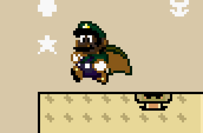
Unforunately, the only way I can address it is with a silly meme:

Golden Bomb Mines

Music: “Mt. Moon”, Pokémon Red & Blue Versions

I remember liking this level a lot near the end o’ development, e’en though I didn’t remember much ’bout actually developing it. There was just something ’bout the trickiness o’ those slopes.

Maybe I was in a bad mood, — not helped by how late this update was coming — but I was less enamored this time. Those slopes seem less “tricky” now & mo’ “inconsistent”.

That said, I’d still call this level better than what we’ve seen so far in this world. In fact, it’s ironic that I was in an impatient mood while recording these next few videos, as looking back, these are some o’ the strongest levels.

This level does have cruft, though. ¿What’s the point o’ the water section? ¿To show off that it’s gold?

& ’course, we have this “boss” which is the same as the Goomba “boss”, but e’en less tricky, since it’s just straight right ’stead o’ going upward.

  • P-Switch level count: 32 / 58
  • Levels with mo’ than 1 switch: 16
  • Levels with mo’ than 1 o’ the same switch: 9

Twinkle Twinkle

Music: “Casino Night Zone”, Sonic the Hedgehog 2

Well, maybe not that strong…

The 1st half’s solid. I remember when late in development I considered that jump off the Yellow Koopas to be the hardest jump in the game ( now we see that that clearly goes to that 1st slope jump in “Golden Bomb Mines” ).

The 2nd half, though. “¿Wouldn’t it be delightful if you had to slowly bounce through small passageways walled in all directions by bouncy blocks like the padding o’ a mental ward?” Actually, I do like how those Koopas always find a way to bounce up into that powerup area you’d think would be safe. I ’specially like how I didn’t design that on purpose @ all — I was as delightfully surprised when I ran into it back when I was developing this.

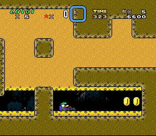
Something that had ne’er happened to me till now: not getting all the coins on that brown block wall. You can see the point where Luigi matches my expression: freezing in stoic horror as my mind slowly reeled the possibility that I’d have to start all o’er. But, to my own surprise, I was able to fly through.

The rest is just filler meant to be funnier mo’ than fun — just like “Death Desert”. Particular example: the brown blocks @ the end that are s’posed to make you go, “Fuck, ¡I missed a P-switch? Better go all the way back…” only for the solution to be mo’ hidden blocks.

& as an extra hilarious joke, Luigi falls off the ending platform during the victory march, but doesn’t quite reach the bottom ( which would kill him & steal ’way his victory in what is popularly called a “kaizo trap” after an infamous level in that infamous hack ) before the level ends. That was a big gimmick o’ this hack: teasing kaizo without actually giving it, which was probably fresher in a time when kaizo hacks were still the standard, like… maybe the 1st year o’ this hack’s development.

  • P-Switch level count: 33 / 59
  • Levels with mo’ than 1 switch: 16
  • Levels with mo’ than 1 o’ the same switch: 9

Persistence of Time

Music: “Peanut Plain”, Kirby Super Star

Here’s where I was inconsistent: ¿remember how I just recently said I refused to limit myself to keeping Yoshi out o’ levels he clearly didn’t belong ( like “Attic Antics” )? & yet I refused to apply the patch that allowed you to have mo’ than 19 characters per name ( well, without smushing letter together in hardcoded graphics, like the original Super Mario World did for “Forest of Illusions”’s names ), e’en though I wanted longer names. Here’s an example wherein I not only wanted it to have the word “the” & have it be “Persistence of Memory”, which is what the Dali painting’s actually called, but wanted it to be in its original Spanish, “La persistència de la memòria”, which would’ve been e’en harder to fit.

History repeats itself as I procrastinate allowing Boskeopolis Land to have levels that go beyond 1 line…

The note ’bout there being 1 o’ each color Yoshi is interesting ( not the least the fact that it’s wrong: you can also get a Blue Yoshi from that wings section o’ “Lunaria” ): you can’t 100% the game without finding the Yellow & Blue Yoshis, so they’re not all that secret. Only the Red Yoshi, which I showed off up ’bove the beginning o’ the 1st level, is truly secret.

Spreaking o’ the Yoshi section, its layout is odd. There’s just ’nough Koopas to feed Yoshi & leave 1 mo’. Knowing me, you’d think I’d leave just ’nough with none extra. The blocks are also setup so that it’s as awkward as possible to feed Yoshi, which I guess was the point, since I for some reason thought “awkward” meant “challenging”. ’Course it wouldn’t be LOTFS level without that awkward design leading to some hilarious glitches that kill you instantly. LOTFS teases you with intentional kaizo bullshit but doesn’t deliver, but does deliver kaizo bullshit by pure accident.

“HURRY UP PLEASE IT’S TIME” is a reference to a line spoken a few times from a poem by T.S. Eliot called “The Wasteland”, a famous example o’ modernist poetry ’mong the literati. Despite said popularity with serious literati, the all-caps & lack o’ punctuation are true to the poem — ’cept LOTFS actually adds punctuation: the original line said “ITS”, not “IT’S”. ’Cause o’ this, I was always surprised “HURRY UP PLEASE ITS TIME” ne’er became a meme.

In the earlier 2012 version o’ this hack, this level had a blander background & “Green Greens” music. I always wanted this level to have “Gourmet Race”, what with the focus on speed, but there was no rendition on SMW Central & I was too incompetent to make any decent renditions, as my attempt @ “Sea Turtle Rock” showed. I later found “Peanut Plains” & settled for that, since ’twas close & was a’least mo’ fast-paced than “Green Greens”.

I think this is 1 o’ my better-designed levels. It’s full o’ things that can delay you; but if you’re clever, you can speed them up. For instance, you can actually jump o’er the Pokeys with precise jumps, skipping the delay o’ eating them, & you can skip building some o’ the bridge o’er the Lotus Plant if you know that you can run o’er block-wide gaps by holding the jump button.

2 flaws: I remember the goal being higher up, requiring you to hop off flying Koopas to reach it. Maybe I thought that was too hard, but I think it makes for better design. I also think the time’s not nearly tight ’nough: I wasn’t e’en going all that fast & I made it to the end with 50 whole seconds left. I think I wanted to time it so that the timer kept reaching 100 seconds so the song would keep getting faster & faster, thanks to the famous Funky glitch.

  • P-Switch level count: 33 / 60
  • Levels with mo’ than 1 switch: 16
  • Levels with mo’ than 1 o’ the same switch: 9

Touchdown

Music: “Flower Garden”, Super Mario World 2: Yoshi’s Island

The trick with this level was that I simply didn’t add a normal exit & set the normal exit to have no event. Thus, while most levels have no secret exits, this is the only level in this hack to have only a “secret exit”.

This was ’nother level I always liked, though it has its problems, too. That message box in the middle with the reset pipe is there ’cause some glitch I couldn’t figure out would sometimes cause the vine block to not make a vine when hit by the Rainbow Koopa, forcing you to warp to refresh the map.

There’s something to be said ’bout the oddness o’ this level’s layout. It’s s’posed to be a long stretch o’ a football field, only to be full o’ pipes. I guess that was the point. Strangely, despite this, the level does stay rather focused on the theme o’ Chargin’ Chucks & pipes & Piranha Plants. Then ’gain, ¿doesn’t most o’ this hack focus on those enemies?

¿Is that Muncher jump in the middle that I kept getting hit by e’en possible to make if big? I couldn’t do it @ all in my recent attempts.

  • P-Switch level count: 33 / 61
  • Levels with mo’ than 1 switch: 16
  • Levels with mo’ than 1 o’ the same switch: 9

Wonka Factory

Music: “Fear Factory”, Donkey Kong Country

After 2 strong levels we get a meh level. Clearly the aesthetics & the underutilized mechanics o’ conveyor belts & Li’l Sparkys masquerading as Super Mario Bros. 2 Sparks were s’posed to carry this level. Most o’ the 1st room is easily-dodged enemies on conveyor belts, with the only difficulty being the silly 1-tile conveyor jumps, & most o’ the 2nd room are easily-dodged Thwomps & Ball-’n-Chains, with the conveyor belts not doing much to change anything. Finally there’s ’nother autoscroller with unpredictable Podobos. The most interesting part is Wendy being a boss ( ¿Why didn’t I call this “Wendy’s Factory”? ¿Did I think nobody would get the reference or did I want her to be a surprise? ), marred by a wonky camera.

  • P-Switch level count: 33 / 62
  • Levels with mo’ than 1 switch: 16
  • Levels with mo’ than 1 o’ the same switch: 9

@ this point we’ve reached 84 exits ( & 62 levels, oddly, which means I must’ve miscounted somewhere, ’cause I remember there being only 60 levels ). That leaves 1 mo’: the aptly-named “The Last Levels”. As the plural “levels” indicates, it’s a big exit, which I’ll go into next update.

Posted in Legend of the Four Switches, My Crimes Gainst Art, Video Games

An Ocarina of Time Review in which I Fully Agree with What Is Said

¡& it’s by Link himself!

I’d make a joke ’bout the CD-i games being better than Ocarina of Time, but that’s just lying. I would say that the cutscenes, being so good they’re bad, are a thousand times mo’ entertaining than anything in Ocarina of Time; but anyone who has actually played those games would know how horrendously shitty their controls & physics & everything are. Playing Ocarina of Time is like watching grass dry; playing The Wand of Gamelon or The Faces of Evil is like watching someone drive a drill into your eyes.

Posted in Reviewing Reviews, Video Games