The Mezunian

Die Positivität ist das Opium des Volkes, aber der Spott ist das Opium der Verrückten

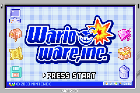
WarioWare, Inc.: Mega Microgame$! (& Twisted!)

While there are some games—like Earthbound &, rather recently, Wario Land 3—from my childhood for which there seem to be many who share my oddly high sentiments, this doesn’t seem to be the case for WarioWare, Inc.: Mega Microgame$!. While everyone else seems to chuck it off as a mindless game to play during brief breaks1, I remember it blowing my mind, artistically, when I 1st played it.

This is probably ’cause it reminded me so much o’ the aforementioned coffee can that changed my destiny fore’er. There was just so much ’bout WarioWare that felt creative & surreal, but would feel like such a loss if missing. ‘Twas as if each microgame were an isolated game piece thrown with a bunch o’ other, unrelated game piece.

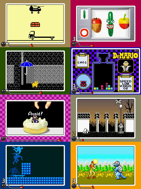
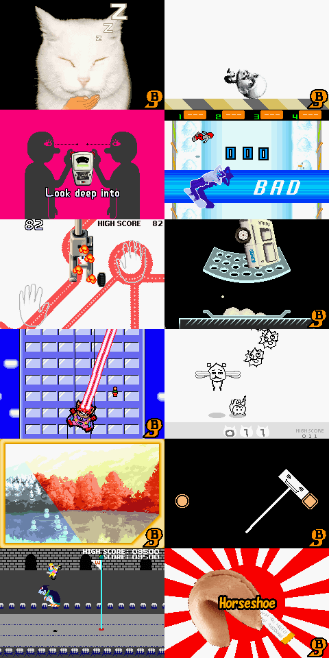
& the art styles would vary wildly: a black & white lineart game wheerin you aim a finger into some disembodied nose would be followed by a photorealistic game wherein you crush an apple with an uncanny-valley real-life Wario hand, & then followed by a game wherein you lead a lightning bolt from a cartoon fish through a maze in a black void to a flat, abstract city, & then followed by 8 seconds o’ Balloon Fight. The 8 second ditties that acted as music were similarly varied, & full o’ strange noises. (I have a collection o’ minigfs files for all o’ Mega Microgame$‘s ditties in a folder that I like to play on shuffle sometimes). WarioWare just felt like 1 o’ those games that was hard to experience fully: there was always some strange detail lurking in some obscure corner. For instance, ¿you e’er notice how when you highlight Kat & Ana’s story mode level that sometimes—only sometimes—it’ll play this weird whispering sound? ¿What was up with that?

I think WarioWare: Twisted! is probably best o’ the series, since its gimmick seemed to have the fewest bugs—save a few times when the gyro sensor would get misaligned—& had the most content, with a ton o’ souvenirs that are probably the closest a game could e’er get to the game-pieces-in-the-coffee-can experience I had before. ¿Who wouldn’t enjoy being able to spin one’s Game Boy Advance to slice carrots, cakes, & cars into shreds on a grater? It’s too bad Twisted! was ne’er released in Europe, nor has it yet been released on the Virtual Console—which is especially a shame, since it should work perfectly with the screen controller.

That said, Mega Microgame$! was the 1st I played & thus had the greatest impact on me. This was especially the case since, like many o’ these Game Boy Advance games, I 1st played a Japanese rom before it came out in the US, & thus had the added confusion o’ not e’en knowing what the action commands meant. It’s important to note that when I 1st started playing it, I wasn’t e’en sure what the game was. I remember that beforetime I only read some brief mention o’ it having minigames on TMK2 without e’en seeing a single screenshot yet.

The only downside is that once one has gone through the experience o’ 1st discovering each microgame, one can ne’er experience it ‘gain. I s’pose that applies to every game; but this one seemed to exemplify that mo’ to me than any other.


Footnotes:

[1] Perhaps this was ’cause, in fairness, WarioWare sold quite well & was well known, whereas Wario Land 3 was mostly forgotten & Earthbound famously bombed. The latter 2 needed bones to be thrown.

[2] Holy shit, ¿can you believe that site’s already 19 years ol’ & still running?

Posted in GBA Tribute, Video Games

Wario Land 4

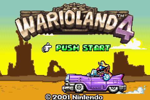
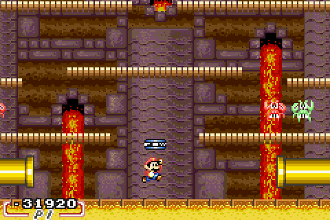
Wario Land 4 is 1 o’ those games I’ll admit I love mo’ for its atmosphere than its gameplay, though its gameplay is certainly great—albeit, the game is rather short @ only 18 levels. It had a dark, urban strangeness that reminds me o’ a less heartfelt Earthbound. I think the fact that I 1st witnesses it @ round 4 AM influenced my association, for I don’t think any game captures that feeling I may have only made up myself o’ a groggy early waking in the late after-midnight1.

In fact, I consider its soundtrack full o’ samples o’ strange voices shouting, “¡HURRY UP!” traffic noises, cat meows, & childish laughs to be more o’ a spiritual successor o’ Earthbound‘s than Mother 3′s, & to be probably the best o’ all the GBA soundtracks. Like Earthbound‘s music, these songs seem to be full o’ so many strange details that it’s impossible to keep track o’ them all, lending it a mysterious feel.

The map theme demonstrates this the most. It’s such a long & complicated song for a song that’ll only play ‘tween choosing levels. A mash o’ low grungy music & rather high-pitched spacey sounds, this song isn’t e’en consistent on whether it wants to have a catchy melody or being a jarring cacophony o’ strange noises that makes it e’en mo’ disjointed than consistent cacophony.

Crescent Moon Village” I love for being the best representation o’ urban nights, mixing the high-pitched weal o’ nighttime wind with the heavy bass rock you’d faintly hear from a passing car.

Toy Block Tower”: Much like Earthbound, Wario Land 4 balanced its soundtrack’s dark songs with very chipper songs, & this is the most chipper ‘mong Wario Land 4‘s, fitting the most chipper o’ levels. This level & its music are like walking out o’ the hushed night into a brightly-lit 24-hour store that ne’er seemed to tire.

“Hotel Horror” is a jazzy song on the surface; but like most WL4 songs, it has those strange sound effects that make it eerier—in this case, mainly the noises from what can only be described as a windy drum, starting as an elongated blow that sounds somewhat like an airplane passing by, & then becoming chopped up into mo’ forceful beats.

Soft Shell” is soothing mall music that plays in soothing bonus areas. I change what I said ’bout “Toy Block Tower”: this is the brightly-lit 24-hour shop.

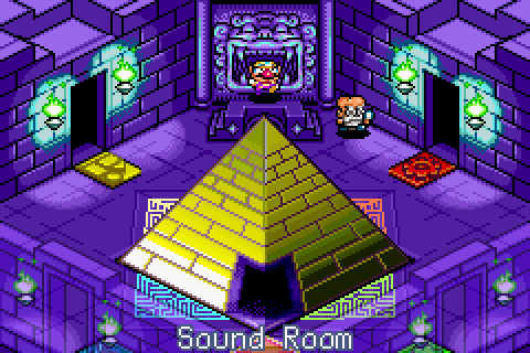
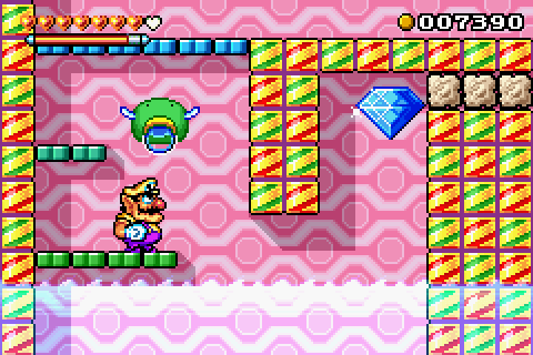
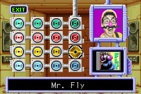
But we can’t talk ’bout Wario Land 4‘s soundtrack without mentioning the “sound test,” unlocked song-by-song by collecting CDs from each level. Those who have read much o’ this blog (I’m sorry) would probably guess that I’d love such a disarray o’ irrelevant sound experiments—visualized through a neon-backdropped screen flashing ‘tween random images, such as the Game & Watch guy with headphones, a photorealistic strawberry zooming in & out, & some real human cosplaying as Wario. Some o’ them are actually songs, such as the aforementioned “Soft Shell,” & “Mr. Ether & Planetaria”; but most are just collections o’ noises, such as 1 which is just a buzzing fly that is finally smitten, a sleeping guy snoring, heavy mechanical heartbeats, hushed whispers, &, my favorite, an epic o’ some guy waking up to go out & walk to the store to buy something, & then walking back home, all depicted through speechless noises.

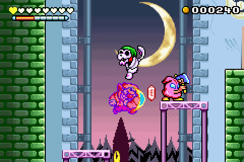
The graphics were similarly strange, though mo’ in a cartoony grotesque way than in a “¿What the hell is this?” way. Zombie Wario wasn’t just a stereotypical dark blue version o’ himself with tattered clothes & dark eyes, but was made up o’ neon rainbow goop that splashed all o’er. Puffy Wario had mo’ exaggerated cheeks than in the previous entries. The animation was also quite smooth.

How level progress was measured was also rather creative: rather than a simple goal @ the end, one’s goal was to collect various objects, hit a switch, & then race back to the start before time (& then one’s coins) ran out. The key ghost named Keyzer was needed to unlock the next level & all 4 corners o’ the gem is needed for all 4 levels per zone were needed to unlock that zone’s boss. It’s interesting ’cause most games have levels wherein “beating” it is plain, black & white; but here it’s messier. Obviously we can’t say that just hitting the switch & returning to the beginning warp “beats” the level, ’cause it creates no progress: you’re right back where you started. ¿But is getting the Keyzer sufficient? It is for the 1st few levels; but if one wants to fight the boss—& therefore progress to the end o’ the game—one must collect all o’ the gem corners. Since it’s required to beat the game—rather than the CD, which is just useful for hearing the aforementioned weird-ass music in the “sound test,” or any money—one could argue that the level’s not truly beaten—as opposed to completed, which would require the CD & collecting 10,000 coins for the golden crown—’less the gems are collected, too.

Wario Land 4 also lets one try all o’ the zones but the last in any order one wants, including going back & forth ‘mong zones. This is hardly the 1st game to do something like this; but it’s still a plus, nonetheless.

That said, though its music, graphics, & general atmosphere are better than its predecessors, it’s gameplay is inferior to Wario Land 3‘s. It’s much shorter & its levels are much less complex than 3’s, which had a much funner goal system derived from 4 different colored pairs o’ keys & chests per level, which unlock items that unlock other chests & so on.


Footnotes:

[1] WarioWare, inc.: Mega Microgame$!, which I shall discuss soon & I 1st discovered @ a similar time o’ day & in Japanese, as well as having a similar soundtrack (some songs & sound effects are flat-out taken from this game, & the whole soundtrack’s done by the same guy), comes to a close 2nd.

Posted in GBA Tribute, Video Games

Mario Kart: Super Circuit

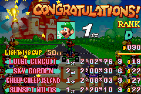
My opinion on Mario Kart: Super Circuit has flipflopped o’er the years: @ 1st I remembered it fondly, then I played it ‘gain round the late 2000s & realized how shitty the controls were, & now I’ve gotten round to not disliking it so much. I still can’t comprehend this game’s controls, no matter how much I’ve practiced & no matter how many defenders online claim that it’s great once you get used to them.

That said, I do have to acknowledge that it was a precursor to many o’ the things that made Mario Kart DS so great, like retro courses & rankings. It also does have great music & memorable race tracks, like “Ribbon Road,” “Sunset Wilds,” “Sky Garden,” the rainy “Luigi Circuit,” & “Cheese Land.” & e’en if the graphics are so blurry that they look like a drunk-driving stimulator & Luigi’s voice sounds as if he’d taken helium (apparently this was his original Japanese voice in Mario Kart 64), there’s a charm to them. Also, it’s not as if he’s any less annoying in Mario Kart 64 (I still have “¡BINGO! ¡HO-HO-HO!” & “¡MAMAMIIAAAAA!” lodged in my god damn head). I only wish it had “¡LUIGI IS THE POPE!” like in the Japanese Mario Kart 64.

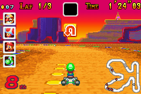
An example o’ my tremendous skill @ this game.

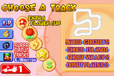
The retro courses were just all o’ the tracks from Super Mario Kart, but with updated graphics & divided into 5 cups o’ 4 courses ‘stead o’ the original 4 cups o’ 5 courses, which ‘splains the addition o’ the “Lightning Cup.” However, many o’ the obstacles that were in the original aren’t in these, which is lame, & the graphics are mostly just the same as the main tracks’, making me think these were sort o’ shoved in @ the last second.

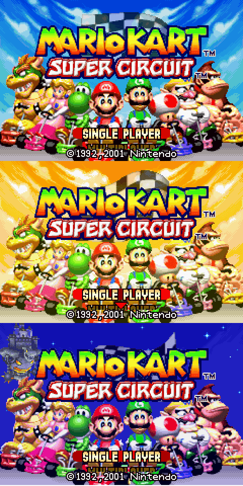
To unlock them, one must get a star ranking on a cup after getting gold on every 150cc cup. Other than that, the only unlockables are 2 different title screens: the sunset title screen, which one also gets for getting gold on all 150cc cups & is quite easy, & the night title screen with new music, which requires getting a 3 star ranking on every regular cup, which is borderline impossible. I doubt hardly anyone has done this, since I can’t find any screenshots or YouTube videos o’ it (though I was able to find a save file online, I guess). Then ‘gain, maybe it’s just that nobody gave a shit ’bout Mario Kart: Super Circuit & just ne’er bothered.

¿Have you gotten the night title screen in Mario Kart: Super Circuit? Nobody cares, you narcissistic braggart.

Posted in GBA Tribute, Video Games

The Super Mario Advance Series

Throughout this article I’ll mainly refer to these remakes by their original names, since those are easier to identify than just #s, & writing out both each time would be tedious. For reference, here are the full names o’ each remake (parentheses are my own notes):

  • Super Mario Advance (Super Mario Bros. 2)
  • Super Mario World: Super Mario Advance 2
  • Yoshi’s Island: Super Mario Advance 3
  • Super Mario Advance 4: Super Mario Bros. 3

Don’t ask me why they randomly switched the order o’ terms ‘tween Advance 3 & Advance 4, or why they don’t e’en mention in the game title @ all that the 1st 1 is Super Mario Bros. 2.

What I remember from the Super Mario Advance remakes:

They were babied down in terms o’ difficulty

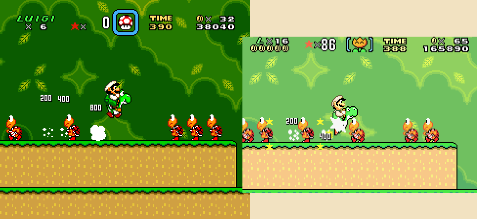
Which was ‘specially egregious for Super Mario World, since that game already was easy. I think this became less prevalent later in the series, though your character still reverts to their big form when hit as anything better than big in Super Mario Bros. 3. I don’t think they babied Yoshi’s Island @ all, though–just an extra midpoint in 1 level, I think. Then ‘gain, I barely played that 1, so maybe I just don’t remember anything.

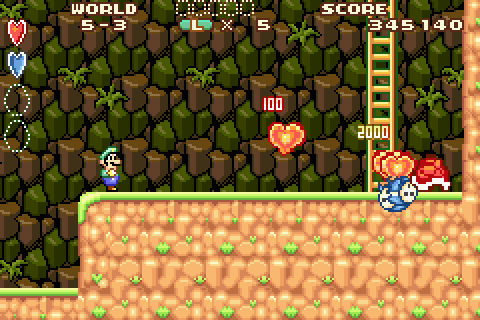
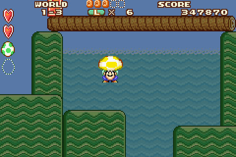
I was ne’er good @ Super Mario Bros. 2, nor have I played it much nor remember much ’bout it, so I only just noticed this recently, but they truly baby that game down, filling it with hearts, 1-ups, & giant enemies that act as infinite repositories for hearts. It seems that checkpoints are mo’ plentiful, too.

Their controls always felt mo’ waggly to me than the originals

I don’t think this was just ’cause I used Luigi or ’cause I mainly used an emulator, since the waggliness applied just as much to Mario or Yoshi in Yoshi’s Island, & they still feel waggly in VBA-RR, which was made to be frame-consistent for speedruns, nor do, say, the remakes o’ the Donkey Kong Country games have such waggliness.

The graphics & music were worse than the SNES versions

This was the most infamous aspect. Apparently Nintendo’s solution to the original Game Boy Advance’s lack o’ lighting was to make their games look so bad that you wouldn’t want to look @ them. ‘Course, when later models that did have backlit lighting came out, these games looked like whitewashed messes. Great future planning.

Super Mario Bros. 3 was an exception in terms o’ graphics, since the newer models were already out by then. However, all GBA models had inferior sound capabilities to the SNES, & so they all had shoddy sound.

Bonus Content

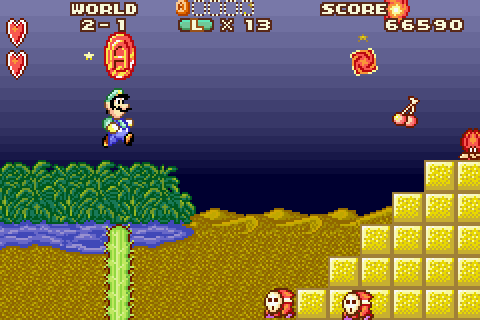
  • Super Mario Bros. 2 had 5 red A coins in every level. Collecting all o’ them in every level & beating every level, I think, unlocked some mode where you have to find a Yoshi egg in every level, & completing that probably just got you a star on your title screen or something.

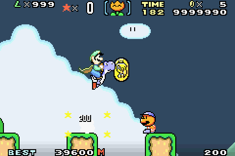
  • Super Mario World actually cared whether you collected all o’ the dragon coins in every level & added some spiffy level menu that made moving round the map mo’ convenient.

  • Note: totally not from an anally-retentive perfect save file downloaded off the internet.

  • Yoshi’s Island added a new level to every world, all o’ which were unlocked after beating the game.

  • Other than giving players the ability to replay any level or world they want after beating the game, adding some spify world-selection map, & actually caring whether the player beats every level, Super Mario Bros. 3 only gave extra content in the form o’ e-reader cards that nobody bought ’cause nobody bought the e-reader & Nintendo didn’t e’en release all o’ the cards outside o’ Japan ’cause nobody bought the e-reader—what was essentially a clunky, quaint form o’ DLC.

I remember @ the time I 1st played Super Mario Advance 1 that I was actually disappointed by how much less bonus content it had compared to the Game Boy Color Super Mario Bros. Deluxe, which was the logical comparison (after all, that was the 1st Super Mario Bros. game & this following remake was the 2nd1). While Deluxe had a photo album with pictures you’d unlock for doing various things (killing each Bowser with fireballs, killing each type o’ enemy, & such); a “Challenge Mode” giving medals for each level for collecting 5 red coins, finding a hidden Yoshi egg, & getting a certain score in every level; a mode for racing Boo in various levels; & a (shitty) remake o’ Lost Levels, Super Mario Advance 1 only had the red coin & Yoshi egg part.

Hilariously awful voice acting

This is ‘specially the case for Super Mario Bros. 2. Just listen to these gems o’ Oscar-worthy performances. For some reason somebody @ Nintendo decided that their games became funner when Mario & Luigi constantly spout words & grunts (Luigi for some reason channels Donkey Kong when he gets hit in Super Mario Bros. 2) as you play. They were wrong—’less their concept o’ “fun” is being driven mad by the constant “¡LUCKY! ¡LUCKY! ¡LUCKY!” spouted every time you collect a cherry.

That Mario Bros. remake in every entry

E’en Yoshi’s Island, which doesn’t e’en let you play as Luigi.

The voice acting in this was e’en worse, too: both characters (who had the same voice) sounded as if they’d inhaled cartons o’ helium.

Conclusion

If I had to recommend which to play, I’d say maybe the 1st 2, Super Mario Bros. 2 & Super Mario World, & maybe just see if you can find a save o’ Yoshi’s Island that’s already beaten so you can just play the new levels. If you play the Virtual Console version or have some way to mess round with the e-reader content, maybe Super Mario Bros. 3 would be worth it. But other than these bonuses, the SNES versions are generally superior, with better graphics, sound, & controls, & without as much dumbing down.

Actually, though this probably doesn’t fit with this subject, I’d recommend Super Mario Bros. Deluxe, since that’s the best o’ the Mario remakes, with lots o’ bonus content without nearly as much gameplay losses, & no sound inferiority, a’least compared to the NES version. The only flaw is that the smaller screen makes some parts a li’l harder & that the remake o’ Lost Levels is, as I said, shitty. Hell, maybe I’ll write mo’ ’bout that game later—or e’en do a series ’bout the Game Boy Color.


Footnotes:

1 ‘Nother point o’ interest: I don’t remember where this info came from, since ’twas years ago, but I remember some list o’ the following Super Mario Advance games before they came out that claimed that Super Mario Bros. 3 would be Super Mario Advance 2, but either it kept being pushed back, or this info was just some fan’s assumption.

Posted in GBA Tribute, Video Games

Game Boy Advance Tribute

While the Super Nintendo gets the most love for being the height o’ 2D, pixelated games, & I have a lot o’ nostalgia for it as well, I remember the Game Boy Advance just as fondly, e’en though it doesn’t get nearly as much credit.

15 years ago the Game Boy Advance was released in Japan—& in June that will apply to Europe & the US. Thus in following months or so I’ll be writing articles on the games for which I have the greatest nostalgia1. While I’ll sometimes have analyses o’ the games themselves, the main focus will be my initial impressions o’ these games upon 1st playing them in the early 2000s, thereby proving this is a true blog—i.e. an exercise in narcissism.

Games I’ll be examining (not necessarily exhaustive):

  • The Super Mario Advance games
  • Mario Kart: Super Circuit
  • Wario Land 4
  • WarioWare, Inc.: Mega Microgame$! & Twisted!
  • Game & Watch Gallery 4
  • Kirby & the Amazing Mirror
  • The Donkey Kong Country remakes

1This should make up for my scandalous neglect o’ finishing & posting my 15-year tribute to Wario Land 3, civilization’s greatest achievement, May 2015.

O well, I guess there’s always the 20-year tribute for 2020 (& a much-mo’ in-depth fan site I already made).

Posted in GBA Tribute, Video Games

When that Ol’ Curmudgeon Mezun isn’t Ranting ‘Bout All Bananas Being “Socially-Necessary Labor Time,” He’s Babbling On ‘Bout the Good Ol’ Days o’ those there Pokémons

Though it seems both a lot o’ fans agree with me, I’ll admit that my preference for generation 2 probably stems from nostalgia, as ’twas the 1st Pokémon game I e’er played, when I was 9. I’ll admit that my preference for the original Game Boy Color versions o’er the DS versions, which fans seem to prefer, probably does, too.

For the latter comparison, this mainly stems from aesthetics. Call it shallow, but I’m an artsy type & consider aesthetics to be as integral a part to a video game as to any painting or movie, as integral as style & diction are to literature. Gold, Silver, & Crystal were probably some o’ the most gorgeous 8-bit graphics e’er, save for maybe Kirby’s Adventure or some o’ the Mega Man games; generation 4 had early-N64-quality 3D graphics. I may be making this all up in my head, but I always felt that the 2nd generation games had a sort o’ watercolor look to them—probably ’cause the official art @ that period had that look. You know, wherein everything didn’t look perfectly colored-in. Take this official art for Feraligatr. ¿See the way Feraligatr’s highlights were smudgy whites?

& don’t get me started on the music; the remakes utterly butchered most o’ them. Songs that were mostly simple & melodic in tone became jangling messes o’ bell notes. Listen to what they did to “Goldenrod City”1: if you listen closely, you can kinda hear the original song buried in the mountain o’ notes. Or how ’bout “Dark Cave”: the original’s crunchy riffs become washed-out generic sounds. It’s like watching your favorite maple tree from your childhood home be chopped down & replaced by cheap office plants. Fuck Mother 3‘s or any o’ those games’ “sad” storylines; if you truly want me to cry @ a video game, make me listen to HGSS “Dark Cave.” In general, the remake’s music is washed-out messes o’ what were originally clear & focused songs, with only maybe the “Kanto Wild Pokémon” theme being an improvement. That’s probably why they put in a way to listen to the original soundtrack: they knew they fucked up. But in order to use that, you have to pretty much beat the whole game, ¿so what’s the point, ‘less you’re anal ‘nough to fuck round with collecting Pokémon or creating Pokémon with perfect IVs & Evs & all that shit.

The 1st generation games’ remakes also had inferior music to the originals’. Oddly, the 1st generation games’ music, when it wasn’t obnoxious nursery-rhyme shlock that makes me need an aspirin, like “Celadon City,” it’s actually rather menacing music for children’s games. I mean, it’s not frightening or anything; but it’s certainly not happy. While I remembered the infamous “Lavender Town” & “Pokémon Tower,” which are ghostly places, so it’s expected, I didn’t remember till much older that “Viridian Forest,” the song that plays in 1 o’ the earliest areas, where you catch Pikachu & fight Metapods that can’t e’en do shit to your Pokémon, goes “DUN DUN DUN DUN, DUN DUN DUN DUN” like the soundtrack to some countdown to mass destruction.

In general, the 1st generation games seemed eerier, probably due to their old aesthetics that bordered on awkward. I don’t know why, but ’cause the graphics & music were less complicated they felt dimmer. Granted, the fact that the graphics were so ghastly that most o’ the Pokémon looked like eldritch abominations & that the official sound track had an echo effect to it (as well as the stranger fight sounds & Pokémon cries added in) helped. Strangely, this didn’t apply to the 2nd generation games, which felt much brighter & softer in tone.

Still, like the 2nd generation (though not as much), the 1st generation’s original music matched the right tone better than the remakes’. The remakes felt brighter & cleaner, & its music felt softer. I’m sorry, but the remakes’ “Lavender Town” will ne’er be as eerie as the originals’. That said, it’s not as bad a butchering as Heart Gold & Soul Silver. The mo’ jangling songs, like “Cerulean & Fuscia Cities” actually sound better. Hell, e’en their remixes o’ 2nd generation songs “Violet City” & “Azalea Town” sound better in Leaf Green & Fire Red than Heart Gold & Soul Silver.

I will admit, however, that I have some nostalgia for the 1st generation remakes, though I’m not sure if it’s any mo’ than the originals (or a’least Yellow). I think I’d still prefer the aesthetics o’ the original. In addition to the music fitting the tone better, I rather like the effect o’ the changing monochrome in Game Boy Color Yellow or Super Game Boy Red & Blue.

Interestingly, while I have huge nostalgia for generation 2 due to being so fond & familiar with it, I’ve become somewhat sick o’ generation 1 ’cause o’ how familiar I am with it. Whereas generation 2’s Pokémon, music, towns, gym leaders, & graphics are rare ‘nough in general Pokémon media to still feel somewhat fresh, the originals, due to being the originals, are all o’er. ¿Who isn’t already immensely familiar with all o’ the 1st 150 Pokémon, or the towns, or the music, & all that? ¿Who’s mo’ familiar with Silver & his lustuous long red hair than Blue or mo’ familiar with that whiny asshole Whitney & her Mootank than Brock or Misty.

1 thing the 1st generation did better than the 2nd generation, & both did better than most o’ their followers, was give the player mo’ control o’er how they proceed through the game. Sure, you have to beat Brock & Misty @ the beginning if you don’t cheat or screw with glitches, but other than beating Koga before Blane (so you can surf to Cinnabar) & beating Giovanni last, you can fight the gym leaders in any order. The 3-by-3 grid layout o’ the heart o’ Kanto probably was the best layout o’ any Pokémon game. You could get to most towns through multiple directions, with mo’ opening up as you progress further—mainly after you get the guards their lemonade or tea. I believe the 2nd generation games did allow one to go rightward after Goldenrod ‘stead o’ leftward, but I ne’er went that way, since it’s less convenient. Still, it’s sad that the later generations didn’t allow players nearly as much creativity in how they can progress through the game, ‘specially since the looseness o’ Pokémon’s difficulty (e’en Pokémon who are dozens o’ levels ‘bove yours can easily be beaten if one has a good team) would make this easier than in an action game.

Apparently the generation 3 games are viewed as a low point in the series, but though I do remember feeling rather bummed out ’bout not being able to trade ‘tween it & the previous generations & not being able to go to previous regions, I don’t remember e’en letting that influence my opinion o’ the games that much. Ironically, I remember when I 1st saw screenshots for Ruby & Sapphire I was awestruck by how much better they looked than the previous generations—¡actual backgrounds in battles! ¡No mo’ fighting in white voids!

While people harangue this generation for not bringing back day & night changes from generation 2 (¿why don’t they complain ’bout generation 6 not bringing back seasons from generation 5?), they ignore the many improvements generation 3 made. This was where abilities originated & where the berry, Pokémon stats, Pokémon box, & item systems were rehauled into something less simplistic & tedious. Also, while not as cheesily fun as Team Rocket or the odd mix o’ cheesiness & actual threat as Team Plasma, Teams Aqua & Magma were probably the best-written villains o’ the series (they were also the most subtle). Their goal was the most believable & they weren’t nearly as strawmanned as any o’ the other villains. Team Rocket outright calls themselves evil; Team Galactica have stupid motivations & are otherwise forgettable as the rest o’ that generation; Team Plasma & Team Flare are too ludicrous to take seriously, & the latter’s motivations were also silly (the closest I could comprehend was that Lyssandre believed in a lot o’ outdated economics, like some Malthusian shit & the ol’ myth that the world is o’erpopulated & that that’s bringing economies down).

The generation that I feel is the low point is the 4th generation, which infects my view o’ the Gold, Silver, & Crystal remakes mentioned ‘bove. I don’t know, Diamond, Pearl, & Platinum just felt bland—like Game Freak were just phoning it in. Whereas I feel as if all o’ the other generations had some freshness—like Game Freak were making a new Pokémon game with new elements that made them feel different—the 4th generation felt sterile. Yeah, they brought back day-&-night cycles, & added internet & a touch screen as practically mandatory for a DS game; but what did generation 4 truly contribute, save for mostly forgettable Pokémon & the physical/special divide that technically had already been implemented in Pokémon XD. I didn’t feel as if these games had a personality @ all. The 2nd generation games had the intermeshing o’ modernity & tradition, with the contrast o’ the glitzy cities like Goldenrod gainst the ol’ towns like Ecruteak & Kanto, which was both familiar & changed @ the same time. I’ve heard many who discuss the game describe it as feeling closer to the previous generation than any other generation did to any other; but that closeness seems to make the differences feel stronger. Generation 6 also seemed to have something like this, which I’ll discuss later. Meanwhile, the 3rd & 5th generations felt like reboots that seemed to jolt life into the series. Generation 4 doesn’t seem to have any o’ that, though: it somehow doesn’t feel particularly different or similar to any o’ the other generations.

But worse than that, Diamond & Pearl just feel clunky. They’re so slow that it’s almost intolerable to play. Pokémon balancing is terrible: there’s only 2 fire Pokémon lines in the entire main game, & 1 o’ those are 1 o’ the starters. If you don’t pick the fire monkey (see, I don’t e’en remember this generation’s Pokémon names), you’re stuck with Ponyta or no fire Pokémon @ all. This despite the fact that 1 o’ the Elite Four trainers specializes in fire Pokémon—’cept since there are so few fire Pokémon, he’s stuck with a bunch o’ irrelevant Pokémon. You’d think @ that point they’d realized they fucked up, but they apparently didn’t. I don’t know: I feel as if there was less attention put into this generation—that they were just filling in #s rather than creating a game they actually cared ’bout. I guess Platinum apparently fixed some o’ these; but the 3rd game o’ a generation shouldn’t fix a game. Yellow, Crystal & Emerald didn’t have to fix their originals ’cause the originals were still good.

To show that this isn’t just ’cause I’m an ol’ curmudgeon who hates anything new (I just realized that the 4th generation is almost a decade ol’), I actually remember being excited ’bout generation 5 when ’twas coming out & finding that it mostly met that hype. Unlike generation 4, which did li’l interesting for the franchise & was barely playable—seriously, it’s that sluggish—I remember generation 5 improved a lot o’ elements that many were clamoring for: making TMs not disappear after being used, changing that awful beeping when a Pokémon’s life is low, talking ’bout the ethical issues o’ Pokémon raising & the idea o’ someone trying to dominate the world by monopolizing all Pokémon (maybe this latter was just what I was clamoring for). Its Pokémon designs also seemed mo’ memorable, but I guess most people have mixed views ’bout that. I hear many complain ’bout how they hate Pokémon who are inanimate objects & are simple, whereas I like these Pokémon & hate the Pokémon they like: that same dog- or beast-shaped design they use for almost every modern legendary with a million seemingly random spikes (the primary legendary for the 4th & 5th generations are ample examples). I don’t know ’bout you, but I thought the trash bag & snowcone Pokémon were hilariously awesome. ¿& how could anyone hate those jangling keys, Klefki?

Speaking o’ generation 6, it’s OK. 1 interesting thing ’bout it is the counterpoint it makes to generation 5’s treatment o’ Pokémon inclusion: whereas the 5th generation had the most new Pokémon since the 1st generation & only used those new Pokémon, generation 6 has the least & focuses on mixing together the Pokémon from all the earlier generations, with a li’l mo’ focus on some o’ the ignored Pokémon, like Mareep (granted, there are still a lot o’ Pidgey & Zubats). I guess Mega Evolutions are fun & they improved a lot o’ tedious stuff, like having to use Max Repels manually each time 1 runs out & letting one ask for Pokémon one hasn’t seen yet on GTS. Pokécommunism (Exp. Share) makes the game a joke, difficulty-wise, though: ’twas the 1st time my Pokémon were higher levels than all o’ the Elite Four, e’en the champion. The story was also forgettable, other than maybe the cheesy Matrix-bad-ass style Team Flare’s going for.

As for the aesthetics… (yawns). Other than Lyssandre’s battle theme & maybe Laverre City, the music is so bland & boring. It almost makes me fall asleep. The UI—mainly the text prompts—also looks like some cheap schlock I could make in Photoshop in a few minutes—you know, like they have in those cheap cellphone remakes, like those heinously anus Final Fantasy remakes.

It’s still better than Diamond & Pearl, though. Those games’ gameplay makes me fall asleep.


Footnotes:

[1] It’s so bad that e’en these simple fan remixes are 1,000 times better.

Posted in Video Games

Video Game Music Review: The SimCitys

SimCity (SNES)

Composer: Soyo Oka

The PC version has no music, if I recall; but the SNES version’s superior, anyway, & it has amazing music.

While the latter games had mo’ jazzy tunes, this 1’s were symphonic; & I must confess, I prefer this game’s to the later iterations’, e’en if there’s not as big a variety.

Title:

The game starts with the most beautiful song in the game, which later in is mixed with some o’ the harshest beats in the game: what sounds like thwacking wood. It certainly fits the visuals o’ the starry city @ night.

It could also be thought o’ as the game rising into action: think those scenes o’ nature where that serene music plays, & then everything comes to life with noises. This is the urban version.

Menu:

The deep, guttural beats mixed with the ticking beats like clock arms going into a solo clearly mean to give a businesslike mood to a boring-but-practical businesslike game mode.

Level Themes:

The songs seem to rise in energy the higher one gets, from the laid-back, almost country-like Village theme to the bombastic Megatropolis theme.

I’m also not sure if my brain’s making this up ’cause it wants to, but it seems that each theme fits the theme o’ their level:

Village:

As I mentioned, it has a village-like twang to it, like just waking in the morn.

Town/City:

Similar—so similar that I sometimes have trouble differentiating them. They both seem to have the calm atmosphere o’ the average day walking down the street. I think I think this ’cause they sound almost like elevator music & ’cause some o’ their sounds are similar to the kind o’ beeps you’d hear in traffic. ‘Gain, I don’t know if my mind’s manufacturing the association or if it’s intentional.

1 difference I noticed ‘tween these 2 is that the City song has that rapid “dee-dee-dee-doo-doo-doo” that sounds mo’ modern & mechanized, like a slot machine. This will continue to the next level…

Capital

This song takes the modern, mechanized sound from City all the way. While actually slower than the previous 2—’specially @ the beginning, where it seems to lose the laid back nature, only to regain it for the rest o’ the song—this seems to have mo’ strum to it in a somewhat awkward mix o’ heavy modernity & slow serenity. This is the major transition point in the game, & thus where the music starts getting heavier. This is also where the last remnants o’ the past songs’ serenity will lie.

Metropolis

Fuck yeah. This is where the heaviness engulfs the entire music so that it’s almost a rock song with heavy beats & that strange metallic scratch sound that sounds almost like a guitar riff.

& it fits the mood: this is the climax o’ the game, the last song before the end o’ the game (or rather, when you’ve accomplished as much as you can). One could think o’ this as the final boss o’ the game. Oddly, it’s almost likely the longest part, too, so a’least they picked the strongest song as the 1 you’ll hear the most.

Megatropolis

After Metropolis’s strum, it may be a surprise to fall back into a calmer, though also mo’ hyper, song. But it does make sense when one considers that this is pretty much the end o’ the game—& it sounds almost like credits music, vacillating ‘tween bouncy & slow, melancholic falling.

Good Night:

Here’s a beautiful melody with bellows so thick they sound like they’re underwater, just for the people who for some reason use this option, e’en though most could probably just shut the system off anytime.

Then ‘gain, maybe that can damage the battery; that might ‘splain why my copy loses its saves all o’ the time.

SimCity 2000

Composers: Brian Conrad, Sue Kasper, & Justin McCormick

All o’ SimCity 2000‘s versions have near the same kind o’ music, just with different instruments in some versions. (I generally prefer the PlayStation’s to the PC’s bland MIDI.)

An anomaly, SimCity 2000‘s music is much jokier than its bretheren’s jarringly serious music. Though they sound somewhat jazzy, they’re much mo’ short, catchy li’l ditties than the long, complex jazz solos that comprise the later games.

Virtual Village

Fuck yeah, this is the greatest song e’er. I almost prefer the MIDI version, actually, only ’cause its cliché beachlike instruments only add to its humor.

Sadly, the full version o’ this song is actually hidden in the PC version. I only know ’bout it ’cause I loved this game’s music so much as to dig round this game’s files to find the songs themselves & found it in there.

The short version happens usually when you place a park down, for some reason. ‘Cause o’ this, when I was li’l, I’d put them down all o’ the time.

Harbor Hymn, Traffic Trouble, City Shimmy, Disaster Decision

Actually, some o’ these songs can be rather melancholic. That songs called “Traffic Trouble” & “City Shimmy” can be so down is amusing. I’m not sure if it’s artificial associations ‘gain, but I believe “City Shimmy” usually plays after a disaster, like a fire. It sounds like a disaster has just hit, that’s for sure.

Then ‘gain, maybe it’s “Disaster Decision”; but I swear I remember it being “City Shimmy.” That, or my songs have their names mixed up for some reason.

Mayor Mambo

Was this truly associated with good events, or is that my mind ‘gain? Did this game psychologically manipulate me through its music?

Subway Song, Railroad Rap

For some reason, “Subway Song” sounds mo’ like a rap song—an early 90s rap song, like Fresh Prince, which is fitting, since that’s when this game came out.

SimCity 3000

Composers: Jerry Brown, with Kirk Casey, Kent Jolly, Anna Karney, Robi Kauker, & Marc Russo

Though a lot o’ these songs are unremarkable, a few are gems; & e’en then, the unremarkable songs a’least add atmosphere—well, ‘cept for “Desert Sand,” which doesn’t seem to fit @ all.

Though I read many emphasis the title song, “SimCity,” I always found it 1 o’ the least memorable songs. If I were to name a song that 1st comes to mind when thinking o’ this game, it’d probably be “South Bridge,” “Updown Town,” or “Central Park Sunday,” all o’ which have a lazy-Sunday1 tone that I always thought fit the laid-back game itself.

I don’t remember if this game had day-&-night cycles as 4 did, but I’m led to think it did thanks to the music, which seem to bring out the mood o’ day & night. The 3 songs I mentioned earlier depicting morn or early afternoon, & “Night Life” & “Magic City” depicting night.

I think 1 reason these 2 sound so much like night—other than the former having “night” in the name—is that they have a contrasting mix o’ deep, low background music with mo’ high-pitched music popping in & out, which feels like the audible equivalent o’ the bright light o’ streetlamps or windows popping in & out in an otherwise dark city. ‘Gain, I can’t pretend to know if this was intentional on Jerry Martin’s part.

1 difference ‘tween these 2 songs is that “Night Life” has a consistent laid-back, but peppy mood, while “Magic City” goes back & forth ‘tween low & lazy & rising & bright, making the former feel mo’ like prime time & the latter feel mo’ like near midnight, the final song before going off to sleep. That it has mo’ noises o’ city ambiance heightens this effect, as the quiet night is when such noises usually come to attention.

Then ‘gain, I’ve associated other songs that rely e’en mo’ on such ambiance, such as “Illumination” & “Sixth Floor,” with afternoon, so perhaps my mind made up these associations out o’ nowhere. Maybe it’s cause they seems to have higher-pitched sounds than “Magic City.” But then ‘gain, “City Lights” is rather on the higher end, & I always associated it with night. “Magic City” & “City Lights” do seem to have a softer, mo’ modern sound, while “Illumination” & “Sixth Floor” seem harsher & dirtier. When I imagine the former 2, I imagine elevators or swanky hotels, while the latter 2 make me imagine rusty subway walls.

SimCity 4

Composers: Jerry Martin, with Andy Brick & the Humble Brothers

4‘s music seems less remarkable than 3000‘s, though that may be nostalgia bias. Then ‘gain, I also feel nostalgia for 4, so maybe not so much.

Its music seems mo’ techno-based than 3000‘s, which was mo’ jazz-based, which may ‘splain part o’ that. Much o’ the ambiance sounds less like ordinary city sounds & mo’ like weird alien sounds, which seems to make it lose some o’ the urban tone that 3000 had. On the other hand, it does make the music stranger, making it better fit the game’s tone. 3000 almost sounded weird with its touching music applies to a rather silly game.

It’s not that it’s music is bad. I particularly find “Night Owl” to be catchy, the way it mixes deep beats with higher-pitched sounds & ambiance. & “The New Hood,” “Crosswalk Talk,” & “Transit Angst” practically sound like hip-hop songs, which gives them an urban flavor that some o’ the other songs lack.

In a way, it’s sort o’ a bridge ‘tween 2000‘s catchy silliness & 3000‘s jazzy seriousness.

SimCity Societies

Man, nobody e’en cares ’bout this game.

SimCity 2013

Composer: Chris Tilton

I’ve ne’er played this game, so I fear I may be unable to do it the justice I give the others.

& unsurprisingly, I didn’t find its music as interesting. This 1 goes kilometers past 3000 in seriousness; but whereas 3000 still maintained a brisk energy to its music, 2013‘s, to be honest, makes me want to fall asleep. It sounds too much like generic Hollywood music—the kind o’ ambiance that’s impossible to pay mo’-than-subconscious attention to. You’re building a city; not saving the planet from aliens, for god’s sake (though, now that I think ’bout it, I’m not sure if you don’t do that).

A few songs I did kind o’ like:

Clean Build o’ Health

This is probably the closest it gets to 3000-like music, with the bulk o’ this music coming from city-like ambiance, like in “Illumination.”

Living in Infrastructure / Town & Out / Urban Sprawler

1 thing I do kind o’ like ’bout 2013‘s music that’s different is the acoustic guitar, which sort o’ reminds me o’ a much mo’ cheerful version o’ Diablo music.

What “Town & Out” & “Urban Sprawler” seem to have that I like is this sort o’ drawn-out, echoing guitar twang.

Cities of Tomorrow / November 2019

These have a nice deep bass beat matches with a rising symphonic beat—it’s the same bass beat in both o’ them, though “Cities of Tomorrow’s” brisker—to them, slowly rising & falling. Sounds mo’ like space music, though, which is odd for a city-builder.


Footnotes:
1 The musical reference is unintentional. I thought o’ this before I e’er heard o’ the Lonely Island song.

Posted in Video Game Music Reviews, Video Games

Mother 4’s Great Web Design

The Earthbound/Mother series is 1 o’ those cult classics that nobody cared ’bout when it came out ’cept a few, those few became fanatics with a fervor rivaling political groups, till it spread so far that now the internet’s full o’ people praising it, including the creators o’ South Park.

I would say that I mentioned my inclusion in this group in my review o’ Earthbound Zero, ’cept I’ve just realized that I failed to publish that article ’cause I’m apparently mo’ lazy ’bout publishing content than actually writing it (still working on that immensely-groundbreaking article analyzing Donkey Kong Country levels, by the way). You could’ve also looked through the sidebar, which includes some Earthbound website, I guess—as well as many websites I haven’t been to in years, since my interests are as fleeting as the seasons.

Anyway, some fans are working on an unauthorized 4th game, & if you’ve seen their previews on their site, you were probably as excited as I was: look @ that amazing web design!

The Strengths o’ Mother 4’s Web Design

I. The Font’s Readable

Though it could be bigger, it’s much bigger than most websites, which for some reason take microscopic text that’s impossible to read without pressing your face right into the monitor as the apex o’ quality design.

They’re wrong. Letting Grampa Mezun read your text without squinting & raising his monocle is.

Also, Mother 4’s site uses Roboto & I like Roboto. That’s 1 o’ those things you can’t truly ’splain. I mean just look @ that font! How can you not love Roboto?

II. The Color Scheme’s Simple

The site mainly just uses white, dark gray, & red—hardly the most original colors. However, they’re used in a way that still heighten contrast. Usually by trading them back & forth as backgrounds & text colors for different sections.

It also makes rare use o’ subtle texture, such as the faded earth @ the top & the crosshatches for the music section. This is better than a big, colorful background that distracts attention.

Granted, a lot o’ websites go the other way & have just gray & white, which is why the red is necessary, like strawberries dabbled on a vanilla cake.

III. Objects are spaced out well.

A web design fad developing recently that I actually like is the turn toward bigger sites—bigger in that the text is bigger & the content takes up mo’ space, rather than trying to cram a bunch o’ tiny elements into 1 screen. By spacing out content, web designers make it easier for users to parse content & less likely to have to hunt it down, since it’s set down piece by piece.

The only downside is that it creates a greater need for scrolling; but as plenty o’ research has shown, this is hardly a problem—much simpler to scroll straight downward through content than trying to wander all round a screen packed together in many directions.

Ironically, ’nother pattern that’s emerged does the opposite: putting a ton o’ social media & links that stay with the screen as one scrolls. This site only has the slim navigation & small return-to-top button stay on-screen, both o’ which are actually useful.

Other websites put that crap all over the screen, which can oft get in the way o’ the text when one resizes their tiny text ’cause apparently they never thought that one might do that, even though said functionality is in every browser.

IV. Other

The way the top links change based on your position on the page—the links actually go to anchors on the same page, not different pages—& the smoth way it glides up & down are neat.

Actually, that 1st point reminds me o’ something else:

V. Doesn’t cut content into a million pages.

In the 90s ’twas common to see websites all mashed together in 1 huge page. I think those crazy ideology websites like Jesus is Savior & Rense are the most infamous, as well as whatever this site’s s’posed to be.

This has unfortunately led the web in the other direction: splitting content into as many pages as possible. I’m always bewildered when I read a newspaper article & see it split into pages. Why? Do they think I’ll only want to read half o’ it?

The problem is, while putting all content into 1 page is a processing—& thus time—burden ’cause it forces 1 to get all content @ once, splitting it too much can, too, since it forces 1 to load a whole ’nother page & wait ’gain.

I joked to myself when comparing David Wonn’s amazing glitch website that you should definitely read, which hasn’t been updated since 2006, & a newer glitch wiki—whose design can’t be blamed on its creator, since it just uses a Wikidot default. Though the former packs half o’ an entire system’s glitches into single pages, they still load mo’ quickly than going through each individual page for each individual glitch in the wiki.

Consequently, the former’s mo’ enjoyable to read, even if it looks like a book written in neon signs. It may be due to my relatively slow internet, but the wiki’s like reading a book & having to wait minutes before each page. Wouldn’t that be annoying to read?

’Course, Wonn had full control over his site’s design, whereas I doubt the wiki’s creator had any. Furthermo’, I suspect the reason for splitting content so much may have to do with economics—mo’ ad views—than design. But this still confuses me, as there should be a way to have both. After all, couldn’t you make the ad stay on-screen no matter how long an article is? Couldn’t you automatically make the ad change without changing the page? & wouldn’t the ad still steal as much attention as on page load?

Conclusion

The 1 flaw I’d say is the way the blog is a totally different website, lacking the navigation o’ the original, thus making one go back in one’s browser history to go back. Perhaps there was something ’bout Tumblr’s… social whatever? I don’t know. Something ’bout Tumblr that they wanted & couldn’t get from a blog included directly into their website.

O yeah, & I guess the graphics & the music are neat & I remember some gameplay mechanic someone said they were adding that I can’t find info for anymo’ that I thought sounded interesting.

Posted in Video Games, Web Design

The Donkey Kong Country Trilogy – A Comparison

Although the first game is by far the best known, I always viewed the other two as superior. This is especially so for the second game, Diddy’s Kong Quest, (though that’s not too surprising, as it seems to be most people’s favorite) but for the controversial third game, Dixie Kong’s Double Trouble!, as well.

The Atmosphere

Since scenery and exploration are what I, for some reason, find most appealing in video games, I’ll start there. What is most remarkable about Diddy’s Kong Quest is its original level themes, compared to the trite themes of jungle, cave, forest, and ice of the first and third games (in fairness, the factory setting was somewhat original). This is especially the case for the original Donkey Kong Country, which has barren-looking levels compared to its sequels (save the forest levels with the three layers of tree graphics and the snowy levels with that cool mountain in the background). The fact that it had essentially two cave-themed worlds did not help. The fact that the second cave-themed world, “Chimp Caverns,” was an anticlimactic last world and had a name that didn’t even have authentic alliteration makes it worse.

Dixie Kong’s Double Trouble! is a little better, at least making the scenery look a little better (except for the cave levels, which were the ugliest levels in all three games), while having some interesting themes, such as the mill, waterfall, and drainpipe levels.

Diddy’s Kong Quest, however, blew these games away by not relying so heavily on the cliché forest, cave, and water themes—in fact, it hardly even had any water levels, which was an accomplishment itself. Instead, it had levels on pirate ships, in cloudy bramble pits, in bee hives, and on rollercoasters. Even when it did indulge in the less original level themes, it did it in a more original way: Cave levels were located in industrialized mine shafts instead of the usual barren brown underground; the lava world was the second world, instead of being near the end, as in most games; and even the forest world at least added a haunted theme to it to make it a little more original. Hell, even the castle themed world, while trite for most games, was unique for this series, at least.

Level Design

But Diddy’s Kong Quest’s levels were better not just in the atmosphere of the levels, but their designs as well. It had a good balance between the original’s, which has mostly unremarkable levels, and Dixie Kong’s Double Trouble!, which erred a little too much toward gimmicks—especially those that were cumbersome. The original did have some interesting gimmicks, such as the barrel-throwing Orangutans, levels where you need to continually flip the lights on to keep from being attacked, levels where you are chased by giant wheels with Gnawties in them, and—especially—the mine cart levels; but these were rather pedestrian compared to Diddy’s Kong Quest’s more interesting gimmicks. For instance, it took the mine cart levels and added a race element to two of them; it mixed both lava and water levels together with the gimmick of the seal who cools the lava, allowing one to temporarily swim through it. However, unlike its sequel, Diddy’s Kong Quest seemed to focus more on making actual game mechanics than mere one-level gimmicks. And while Dixie Kong’s Double Trouble! had some fun gimmicks, like “Fish Food Frenzy,” where you had to continually feed the fish following you other fish (while avoiding moving it into spiky fish, which would only irritate it), some of them were less so: “Lightning Lookout” combined unpredictable lightning and level design to make it somewhat luck based; “Rocket Run” was so hastily made that it was missing one of the KONG letters and controlled like garbage; and “Poisonous Pipeline’s” gimmick—backward controls—were so stupid and went so far against proper game design that it’s just heartbreaking that it is the final main level—the ultimate anticlimax of any game, probably. The original Donkey Kong Country didn’t really have any broken gimmicks, but it did have more unfair enemy and camera placement that could kill you blindly in some places. This is especially prevalent in water levels, which seemed intent on keeping your character right up close to the edge of the screen so you could smack blindly into a shark secretly in front of you.

To some extent, bonuses improved later on. In the two sequels they’re certainly better than the original, in which the bonuses served to add even more meaningless items and lives. Moreover, the manner in which they were hidden improved; the placement of bonuses in the original were just flat-out bullshit. I am curious if anyone could possibly discover the bonus hidden within a bonus in “Oil Drum Alley” by oneself, which involves arbitrarily deciding to get three single bananas in the revolving barrels—something you pretty much have to do intentionally, even though there’s no logical reason to do so. That a barrel falling from the sky has absolutely no relevance to a single banana makes this puzzle even stupider—it’s just random guesswork. Diddy’s Kong Quest never got as bad as the original, but it did have some rather stupid items hidden behind move-through walls in “Bramble Scramble” and “Chain Link Chamber.” On the other hand, some of the secrets were cleverly hidden, such as the bonus above the bonus in “Haunted Hall” (that is all that’s required; no bullshitting around with single banana jackpots necessary) or the DK coin hidden within a bonus in “Kannon’s Claim” (and is hinted at by suspiciously unused space in the bottom right corner). I can’t think of any bullshit obscure secrets in Dixie Kong’s Double Trouble!, though I don’t think the bonuses you had to complete themselves were much more interesting. Some were very uncreative, such as collecting stars—but over round platforms!—in “Squeaks on Wheels.” Then again, some of the secrets in that game were downright tedious, such as the fetch quests with the insipid bears or finding all the banana birds in the trite Simon Says minigames.

Bosses

Bosses are a low point among all three games, though they’re a little more interesting in the sequel—where else can you fight a giant possessed pirate sword, the ghost of a pirate bird you killed earlier, or fight a pirate crocodile by throwing his own cannon-ball bullets into his own gun, causing it to blow up through cartoon logic? The original’s were never interesting or difficult; it didn’t help that two are just slightly harder copies of the first two bosses—the second, a refight with Necky, having no relevance to its surroundings, a cavern—and one was essentially just killing a bunch of enemies and dodging a falling heavy object. Dixie Kong’s Double Trouble!’s could get obnoxious, though—especially the final bonus boss. While Diddy’s Kong Quest had a marathon weapon dodge ending with one hit against the boss that didn’t last too long, the third game’s revolved around tedious waiting, finicky hit detection, and obscure solutions halfway through. You must wait as K. Rool makes balls of electricity from the sky, all in the same spots, requiring you to do the arduous action of standing in one spot for about a minute. Afterward, a steel keg appears, which you must throw up in a vacuum and time so that it hits a particular part of his back. Sometimes this will bounce off, even if it does hit his back. Later he adds conveyer belts to the mix, which are just an mild inconvenience. However, it gets worse when he starts shooting both lightning beams on the ground, forcing you to set a steel keg between the bottom beam and you, which is difficult when you can’t run, else you’ll pick the keg up and get zapped.

The music in all three games was excellent, and it would be easier to find which songs in each game were most amazing that it would be to decide which game had overall superior music. The first and third games had much more atmospheric music—especially the underground and forest songs—whereas Diddy’s Kong Quest had more melodic music. This certainly makes its songs generally more memorable—though I do prefer the atmospheric forest songs from the first and third games over “Forest Interlude” from the second.

Music

The classical “Stickerbush Symphony” usually gets the most attention in Diddy’s Kong Quest, but there are plenty of superior songs: The rocking “Mining Melancholy” and “Snakey’s Chantey”; the foreboding “Welcome to Crocodile Isle,” “Lockjaw’s Saga,” and “Krook’s March”; and the wonderful mix of heavy beats and melodies that is “Hot Head Hop.”

Much as the original is the most well-known among the trilogy, its music is more popular, too. No need to talk about “DK Island Swing,” which everyone knows, but “Bonus Room Blitz,” “Aquatic Ambience,” and “Fear Factory,” and “Gangplank Galleon” have gained quite a lot of popularity, too. Personally, I prefer the jazzy map song, “Simian Segue” and the dark beats of “Forest Frenzy.”

The third game’s music is the least memorable, but has quite a few good tracks, too. I already mentioned the wonderfully dark forest music (“Treetop Tumble”), but the rocking “Nuts and Bolts” and “Rockface Rumble” are also enjoyable—both the SNES and GBA versions. “Bonus Time” and “Jungle Jitters” from the GBA remake are even better than the less memorable SNES versions.

First Addendum: On Donkey Kong Country Returns

Due to financial issues that cause me to only afford decades-old games I have unfortunately not been able to play this game, and thus cannot judge it beyond what I have watched from YouTube videos. Graphically, it looks beautiful, of course; and from what I’ve witnessed it’s apparently even harder than the original three, though without frustrating bullshit, such as having to replay whole worlds.

If there is one complaint I have about Returns it’s that it takes a little too much inspiration from the first game and barely any from the other two. Much of the music is simply rehashed from the original, which is not bad, but becomes a little too derivative (though one new song, “Mine Menace” is excellent, and I approve of the thematic remixes of “Simian Swing”). Returns certainly could have benefitted from borrowing a little more from Diddy’s Kong Quest which is sadly underrated compared to its inferior predecessor. It would have been nice to have a bramble level with Squawks or a carnival level or to hear a “Hot Head Hop Returns” or “Mining Melancholy Returns.”

I see good signs from Tropical Freeze, however, as it does see the return of Dixie Kong, but from the looks of it, it will likely branch off into something far more different than all three original games, which is good as well—indeed, probably for the best.

Second Addendum: The Game Boy Advance Remakes

The Game Boy Advance remakes are oft criticized, and for good reason: They look like shit, sound like shit (except the third game, which had new music that better fit the handheld’s tinny sound), and played like shit. Watching the gorgeous graphics turned into the washed-out, solar-flare bright mess of pixels these remakes showed was heartbreaking. The way the screen was resized added artificial difficulty—especially in the aforementioned water levels in the first game, which had even worse camera problems.

The only decent remake is the first one, due to three additions: The photo album; the one-hit, no-midway-points Hero Mode; and the hilarious sound DK made when he fell in a hole. Also, its minigames, though rather trite, were at least tolerable, whereas Espresso Race and Funky’s Flights from the sequel and Cranky’s Dojo from the third game are god awful. The sequel did have a photo album, too, and the third game even had a new world, “Pacifica,” though. However, it replaces the amazing foreboding forest music with some happy shit; and how can you seriously run from a ripsaw with that kind of music playing?

I suppose if one truly loves these three games, one might want to try them. Admittedly, I did (though not very far in Dixie Kong’s Double Trouble!).

Posted in Video Games

World C-3 of Lost Levels is the Worst Level Ever Created Ever

3. It’s a Copy of Another Level

It is understandable that Nintendo had to repeat some levels, considering the technical limitations of the time; but why pick 7-3, which was a horrible level already? Why not pick an actual good level?

2. It Mixes Three Luck-Based Mechanics for Optimal Bullshit

Namely, wind, springs, and Lakitu—the first of which Miyamoto himself agreed was an unfair mechanic. The springs cause your character to leap so high that you can’t see him, meaning you have to predict where he’ll land when he inevitably does. If you don’t magically predict well, expect him to land in the abyss. Sometimes you may land on a Spiny egg Lakitu just-so-happened to throw.

Actually, the best part about this level is that the existence of Lakitu is the only difference between C-3 and 7-3—and yet he barely makes a difference at all, considering you spend most of your time in the air. He’s just a rare, random fuck-you sometimes.

1. Glitches Are Great! (Famicom version only)

Oh yeah, and sometimes a spring won’t spawn, making the level literally impossible.

Posted in Sucky Stages, Video Games