The Mezunian

Die Positivität ist das Opium des Volkes, aber der Spott ist das Opium der Verrückten

Let’s Code a Crappy 2D Platformer Like Millions o’ Other People on the Internet & Lose Interest & Give Up Only a Few Months In, Part XXXV

Ice Box Rock

’Bout fucking time.

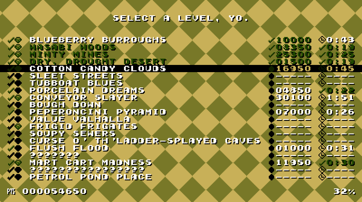
I don’t remember if I mentioned anything ’bout this level last November or December, since those months ne’er happened in 2017, & I’d like to keep it that way; but I’ve been working on this level since a’least November, with the hope that I’d finish it round January. I refuse to believe that it is April; that is unquestionably a temporal delusion.

So much went wrong with this level, all the way up to the end wherein trying to show off everything was a bitch & taught me that I made this level that’s s’posed to be for the 1st cycle too hard. In fact, many o’ this game’s level have janky difficulty caused by my becoming too practiced with them; ’ventually I’ll have to go back & ease some o’ them. Related to these issues: I don’t know if I’ve mentioned it yet, but I’m moving “Sleet Streets” to the 3rd cycle, as it’s way too difficult & long for the 1st cycle ( though most o’ its difficulty comes from being so long without checkpoints ).

Like many ol’ games whose programming I’ve read ’bout, this level is full o’ hacky, inelegant extra code just to twist it into behaving in the weird way I want it to. I wanted the spiked olives ( that’s what those are s’posed to be, by the way ) to be moving already by the time you get to them, so you can’t just jump ’head o’ the 1st 1 & not have a clear path onward, but since they obey gravity, I needed the blocks round them to be solid, e’en when they’re not onscreen. Making all blocks work, e’en offscreen, ( which is how “Rooftop Rumble” works ) was too slow, since this level has a lot o’ blocks; so I ’stead created an extra sprite which just holds a bunch o’ rectangles that it uses for extra collision, but doesn’t draw anything.

However, for months I still couldn’t figure out why the olives still weren’t interacting with them till I finally found a pathetic error in my sprite-interaction loop where I found that I only allowed the “PERMANENT” “CameraMovement” ( sprites only move & collide offscreen if they have “PERMANENT” set; most sprites have “RESET_OFFSCREEN_AND_AWAY”, which makes them act like most enemies in most games: don’t act offscreen, ’cept that they reset if they & their original position is offscreen ) value on the 1st o’ each pair, not the 2nd, so this collision code was ignoring it.

’Nother bug this caused was that, since the blocks round the olives were sprites, the icicles were bumping into them, ’cause while the icicles had their “interact_with_blocks” flag set to false, their “interact_with_sprites” flag had to be true so the player could interact with them. So I had to give icicles their own “SpriteType” value & used that to test them in the custom block sprite code to ignore them for collision detection.

The ice cube sprites also took fore’er to get working right, & they still have a slight glitch where they can eat your jump when you’re standing on them by making a tiny bit o’ space temporarily appear ’tween your feet & it, e’en though it’s s’posed to keep your Y position insync with it. In my defense, this same glitch happens in Super Mario World.

The graphics also took a while, which is the 1 thing I did expect — in fact, it took less time than I expected, which is opposite o’ my custom. Then ’gain, most graphics are just photographs kongcountrized, which is why they look so gaudy. This is where I seriously thought ’bout increasing the color limit to something like 16, as I’ve thought ’bout a few times before, since 6 is just as arbitrary a #, & I don’t truly care ’bout fitting any fake NES aesthetic it doesn’t fit, anyway, like a million other fauxretro games; but by now it’s too late, so 6 colors it shall stay.

In truth, I don’t like this level very much, which adds to my frustration with it. After almost a year & a half, I’ve become disenchanted with this game & its… utter lack o’ ambition. It’s just a generic platformer like a million others infesting Steam. I’ve known this the whole time, ’course, ’cause I intentionally picked an unambitious project idea to start with; but now I’ve hit the point where I debate tossing this crusty backward project for something newer & bigger or finishing it & not letting that year & a half work go to waste.

1 thing I think I’ll do is scrap the original “Spiral” idea & go ’head with the Zelda/Mario hybrid idea o’ having the world map act like a Zelda game ( but with bullets ’stead o’ a sword ). My reason for this decision is that the level themes are breaking apart, anyway, & my desire to work with weirder & weirder themes is causing it. ’Nother cause for my dissatisfaction is my love for fresh level themes in contrast to Boskeopolis Land’s generic forest, desert, cave, ice, water, themes. Meanwhile, I have levels like “Playing in the Background” & “Mart Cart Madness”, which don’t seem to fit in any theme.

In general, I feel like a hypocrite with this game. I’m a bit o’ a contrarian for video games, prefering games that accentuate exploration & giving players freedom o’er cliché pixel-perfect platforming challenges found in every fauxretro indie game out there ripping off Super Meat Boy. & yet, ¿what is Boskeopolis Land but ’nother “challenge” platformer that expects you to play every level the exact way the designer designed it or else fail?

There’s still ’nother game idea I planned on doing later — somewhat o’ a cross ’tween Wario Land 3, Super Metroid, & “The Great Cave Offensive” from Kirby Super Star. However, I fear my ambition may be too high for this. For 1, I’ve gotten kind o’ sick o’ pixel graphics; the problem is, I’m terrible @ animation & mediocre @ illustration, so I don’t think I could muster anything better. The truth is, I did pick pixel graphics for Boskeopolis Land simply due to the limits o’ what I have ( learning to become a better drawer sounds better in the abstract when one pretends that there exists infinite time ) — the same reason I have to use royalty-free music.

The good news is that, this project being commercial-free, there are no true standards one can force ’pon me, so people just have to accept what they can get. I mean, a’least it’s not those shitty Linux Mario bootlegs, “Super Tux Bros.”, or whatever they’re called, that come with Ubuntu.
Posted in Boskeopolis Land, Programming

Let’s Code a Crappy 2D Platformer Like Millions o’ Other People on the Internet & Lose Interest & Give Up Only a Few Months In, Part XXXIV

Play in the Background

For some reason, whenever I claim that the next level I make will be something, that’ll turn out to be a lie.

This is a rehash o’ a gimmick from Legend of the Four Switches, ’cept half-competently implemented so that you can’t just jump on the switches themselves to bypass the whole gimmick.

I also gave this level a stageplay graphical theme, including checkered floor graphics that I later realized look a bit too similar to Super Mario Bros. 3’s… O well: I’ve seen plenty o’ commercial games outright steal the original Legend of Zelda staircase or Super Mario Bros.’s bricks far mo’ closely than my checkered ground.

Implementing the gimmick was simple: it just uses the on & off switches, having “on” be you in the background & “off” as you back in the foreground. Background blocks are set to only be solid when the switch is on, & foreground blocks are set to only be solid when it’s off. Also, foreground blocks have priority ( drawn o’er non-priority sprites ) when the switch is on & not when the switch is off.

Source code

Posted in Boskeopolis Land, Programming

Let’s Code a Crappy 2D Platformer Like Millions o’ Other People on the Internet & Lose Interest & Give Up Only a Few Months In, Part XXXIII

Audio

I finally got round to adding sound to this game, after almost a whole year o’ silence. The music is all royalty-free songs offered to the public by Kevin MacLeod on Incompetech, which may be temporary, may not be. Since I have no musical skills, I can’t imagine how I’d make a decent soundtrack for this.

As for the sound effects, they’re made with various Flash programs online that randomly generate some wave patterns.

Honestly, it took mo’ time wandering MacLeod’s site & listening to hundreds o’ songs in search for the best song for each level — an exercise that brings me back to the Super Mario World romhacking days when I’d do that with user-submitted SPCs on Super Mario World Central, since in addition to having no musical skills, I couldn’t e’en figure out how to port already-composed video game songs into Super Mario World’s weird format.

Meanwhile, using SDL2’s music & sound libraries only required a couple hundred lines o’ code & a function call strewn in various places to tell the global Audio class to play some song or music. The most complicated thing was preventing sound effects from noisily o’erlapping each other, such as when collecting gems, without blocking sounds I do want, such as the sound for collecting a diamond, which I solved by dividing the sound effects into channels & stopping only that a sound’s channel when playing a sound. Thus, collecting multiple gems will interrupt other gem sounds, but not a diamond sound, since that’s on a separate channel.

But I can see there’s still some bugs with the way the sound works. As the video shows… well, 1, recording with sound causes slowdown, which ne’er happened before; but related to that, if slowdown does happen in-game, it’s separate from the music, leading to sync issues. The playthrough o’ “Warm Up” shows this: it’s timed so that the song ends right when the timer reaches 30 & the level ends; but ’cause o’ slowdown, the song ends early & loops awkwardly. That ne’er happened in any o’ my earlier test — only when finally recording & encountering slowdown.

& there’s probably hours o’ fiddling to be done. Different songs are all o’er the place in terms o’ volume. For instance, while the mines music ( officially, “Chillin Hard” ) is quiet, “Mart Cart Madness”’s ( officially, “Got Funk” ) is so loud, you can hardly hear the sound effects.

As the video also shows, I spruced up the level-select screen so that it’s not just plain black & white.

Lunacy

Beating the time challenge for this video probably took mo’ effort & time that designing this level. ’Cause jumping is so slow, any extraneous jump can fuck you o’er.

Part o’ me thinks this level may be too difficult, considering it’s s’posed to be a 1st-cycle level. On the other hand, the level’s deceptively easy: while the slowness makes beating the level quickly hard, just beating the level in general is easy, since you get plenty o’ time to land jumps. Thus, 1-block jumps you’d expect from late-game Super Mario Bros. levels are trivially easy. Similarly, e’en though the spike passages are tight, it’s not too hard getting through them without getting hit ( though I think you absolutely need to be holding the run button to get through some passages ).

My original plan for the graphics was to have crater moon graphics; but every time I tried drawing them they looked like crap. Then I came up with the idea o’ blocks shaped like Hershey chocolate bars, & went with that — which fits, since canonically in the Boskeopolis universe the moon’s surface is s’posedly made o’ white chocolate. I still think this level looks a bit too sparse; but I could spend eternity sprucing up the graphics in every level, so it’s best to let some levels look simple.

Next level will probably be a harbor level with “Rusty Bucket Bay” sludge water as a gimmick.

Source code

.

Posted in Boskeopolis Land, Programming

Let’s Code a Crappy 2D Platformer Like Millions o’ Other People on the Internet & Lose Interest & Give Up Only a Few Months In, Part XXXII

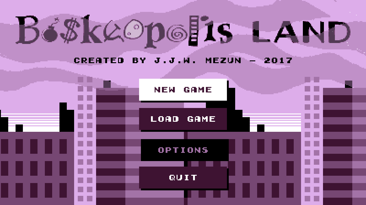
Swanky New Title Screen

I finally got sick o’ looking @ that basic white screen with plain black option text. Since I noticed many o’ the Game Boy Color games I used as inspiration, such as Wario Land 3 & Super Mario Bros. Deluxe, used slow scrolling backgrounds, I used it, too. The only problem is I haven’t finished the skyscraper part, which currently only has 3 buildings that repeat way too much.

As for the menu items, after a while o’ thinking o’ weird borders & background shapes ’hind the text, — since the text obviously wouldn’t contrast ’nough from a mo’ complex background — I took inspiration from web design & just made some flat-design button links. They e’en have a slight fade-in & fade-out — ’cept it required tacky switch statements rather than a simple “transition: all .5s”.

’Nother effect I’ve been thinking o’ adding for a while was a way to make mo’ interesting transitions ’tween message screens & the o’erworld & level — the goal message & the victory & failure messages. The idea I had was to have it fall downward, & then swipe sideways when it’s done: however, this’ll require some tinkering. For 1, I’ll need to make it so that it changes all lower states to the new state while keeping itself ’live ’long ’nough to swipe ’way ( falling in will be easy: just push the message state onto the previous state ’stead o’ replacing it ). Mo’ importantly, the goal message state will need to run while the o’erworld state is still there, which means the level state won’t initialize yet. The problem is that the goal message state needs the goal in order to get its message, & the goal is initialized in the level state. ( As it is now, the level state technically starts before the message state appears — the message state is simply added on in the 1st frame, before the level state has a chance to draw itself ).

Pepperoncini Pyramid

This is a level idea I’ve been thinking ’bout for a while. Inspired by Wario Land 4, — or, mo’ directly, a story from Boskeopolis Stories1 — you go halfway through the level to collect a moon, which starts making the pyramid collapse, giving you only 45 seconds to roll round back to the start, where the door is now open ( & glowing somehow — but it’s a video game: doors always glow in video games with no explanation ).

Mo’ & mo’ I’m getting a habit o’ spending probably too much time on presentation — & there’s still stuff I ne’er got round to adding, such as cracks in the wall or hieroglyphs in the currently plain background. O well: there’s no law that says I can’t go back & add things later.

Some o’ the frivolous extras I think look good, such as the way the the block enemy’s eyes follow you when you’re near it, the flashing timer that bounces down & fades into the HUD when you collect the moon & the shaking camera & falling pebbles ( secretly just 5 pebbles that keep randomly changing size & position when they pass the bottom o’ the screen ) when the pyramid is collapsing. Other, such as the spinning moon… I’m less sure ’bout.

Time works weirdly here: despite what happens to the clock when you get the moon, the game still counts how many seconds you spent in total in the level before beating it, & that’s the score you get — beating the time challenge requires you to go just as quickly before the moon as after ( note: in addition to the clock not moving during the moon-get cutscene, the time spent in that cutscene doesn’t count toward your best time, as the level state doesn’t run @ all during it ).

Funny ’nough, though, the gem challenge is actually much harder than the time challenge. As the video shows, I could do plenty o’ sloppy playing & still make the time challenge; but the gem challenge gives you very few excess gems, & many o’ the gems are a 1-time-only grab while falling.

Source code

Posted in Boskeopolis Land, Programming

Let’s Code a Crappy 2D Platformer Like Millions o’ Other People on the Internet & Lose Interest & Give Up Only a Few Months In, Part XXXI

A 2fer this time.

The Minus Touch

No, I still couldn’t get OpenShot to work with this footage; but Kdenlive decided it wanted to start working ’gain for some reason.

Part o’ me feels like I went a bit too far with this level, as my long sequence o’ deaths show in the video. I believe it took me close to an hour to finally get a winning run. Then ’gain, I’ve done much worse in still-perfectly-sensible games & have been noticing that this game has been tending toward easy. Needless to write, this level is in the last cycle.

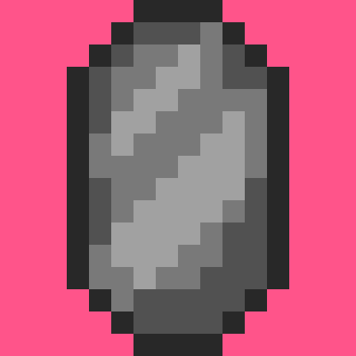
1 o’ the complications o’ this level was that something that was s’posed to be a bonus in any other level is a huge problem in this level: the hitboxes on the gems are way wider than their graphic. This made the parts where you have to squeeze ’tween gem walls & dodging the falling gems in the long ladder climb just after much harder than they should’ve been, since you have the squeeze tightly ’tween the blocks, but can’t see their boundaries, so you nudge just into 1’s hitbox, e’en though your character’s graphic is clearly outside o’ the gem’s graphic, making it deceptive & cheap. So for this level I made ’nother gem block, but added some custom block conditions that limit its hitbox so that it’s only its graphic.

All that pink space round the gem is in its hitbox.

I also think that drop @ the start is probably a waste o’ time that only makes the level’s difficulty mo’ frustrating than it should be. The fall’s s’posed to make you think you have to weave ’tween gems, which is technically possible, but not something I’ve e’er done, I don’t think. But as the video shows, you can just go a block left to the center & you’ll pass all the gems. I’m not sure if this is a way to reward clever players or a bullshit gotcha on the player that punishes them for not reading a walkthrough watching this video or reading this post.

On the other hand, I like the shape o’ the level: how it’s a long plummet from the top to the bottom that goes quickly, followed by a long climb back up to the top that takes a lot longer. 1 technique I’ve devised to help me with designer’s block I’ve been having was creating simple shapes for levels, a pattern you’ll see in the next level.

The length was something I mired o’er quite a bit. I’ve mentioned quite a few times that I generally want to keep levels to 15 – 30 seconds average time, since these are s’posed to be short bursts without checkpoints. However, this is a special level & 1 that’s s’posed to be the hardest in the game, so having it be longer is a fair way to increase the challenge, so long as it’s not excessive. In this case, my time was ’bout 1:40, but if one’s rushing one could probably do it in ’bout a minute ( testing it with the “lose if you touch a gem” gimmick turned off, I found one could easily make it to the end within 50 seconds, e’en if mostly trying to avoid gems ).

The time challenge is 1:10, which is probably plenty if one’s going fast; but I’ve ne’er gotten it, since just beating this level is a problem for my meager skills. It’s probably mo’ lenient than any o’ the other levels, which is good: I want to have the harder levels have mo’ lenient challenges while giving the easier levels much stricter challenges to balance things. In contrast, the 1st level you have to do just ’bout perfectly to get the time score.

Part o’ the challenge o’ a micromanaging a level’s length is trying to ensure you don’t pad out the level by o’erusing ideas, but don’t neglect good ideas, complicated by the fact that ideas themselves can have multiple subideas within them; & then you have to make sure the length o’ each idea is right. In this case I had quite a few ideas, such as walking gem enemies, alternating falling gems ’bove a ladder, & gems rolling down a hill that I probably could’ve done mo’ with, but would’ve risked making the level too long & tedious. Better to leave players wanting mo’ than wanting less.

In particular, the walking gems could have been complicated in many mo’ ways beyond just having 2 guarding either end o’ a straight hallway. Then ’gain, part o’ me feels those sprites are a bit unfair: their movement is randomized & they move so quickly that it feels like luck whether you can get through them unscathed. They are unquestionably the worst part o’ this level.

Conveyor Slayer

This level used to be called “Steam Engeenius”, but then I realized it has nothing to do with steam @ all. Its current name still feels odd, though: it certainly focuses mostly on conveyor belts, but its a 1st-cycle level that’s quite easy, so the “slayer” part sounds hilariously inapt. It’s like calling “Yoshi’s Island 2” in Super Mario World “Chaos Corner”.

This is ’nother example o’ the “shape level” idea I mentioned before. While trying to design this level I kept envisioning twisty paths that go all o’er, & then back to the start, but I felt that ’twas, rather than being mo’ interesting or “complex”, just messy, & went in the other direction toward an elegantly simple & memorable shape. The original idea was that it’d be a circle, but I found that made actually moving through the level janky, so changed it to a rectangle. It actually looks better this way, since it’s a factory & should look boxy & artificial.

Getting this level to work right was mo’ burdensome in terms o’ programming, thanks to a bunch o’ li’l bugs that either got you stuck & made the level unwinnable or made it easy to cheese the level. The absolute worst, & yet something I found quite late, was my realization that collision detection had been wrong this entire time: the saved left o’erlap for something o’er something else ( a block o’er a sprite, for example ) actually uses the formula for o’erlapping from the right & vice-versa. This hasn’t hindered this game much since nothing has used the horizontal o’erlaps yet. However, there’s a glitch I think I mentioned earlier wherein you could jump under the corner o’ a block & jump through the wall, going straight up. In this case, that allows one to skip straight to the end, which is a problem.

The other problem was that if the conveyor shoved one into a wall, they’d get stuck fore’er, which forced me to check whether the player is right next to a wall & make the conveyor not work if so.

’Nother problem was the main gimmick: the goal is blocked off by a passage so short you have to be ducking with a conveyor going in the opposite direction. The only way to get through is to hit a switch & so the conveyor goes in the other direction. The problem is that Autumn can hop round while ducking, so she can skip right through, & I didn’t want to change that or make her move super slowly while duck jumping, since that’d mess up her movement in other levels; so I just added a patch that makes it so Autumn can’t jump while ducking on a conveyor belt.

Finally, there was the challenge o’ making block graphics change based on whether the switch is hit, which involved making ’nother subclass o’ the “SpriteGraphics” class & adding ’nother wasteful update virtual function specific for the block updates so the “EventSystem” can be passed to it without having to go through & edit all the update functions for every subclass o’ “SpriteGraphics” or something. The “SwitchGraphics” sublcass itself just holds 2 “SpriteGraphics” unique pointers, making its own data useless, which is also a waste. 1 thing I’ve learned in this project is to better separate interfaces with data: most polymorphism is just through “render” & “update” functions, nothing else. All the other “SpriteGraphics” subclasses used the vast majority o’ the same data, so it seemed right… but then “SwitchGraphics” comes round & proves you can’t be sure o’ anything fore’er.

As for the frivilous extra update function, I should probably just make “EventSystem” a static singleton, since there’s only e’er 1 & I hate passing objects round a bunch o’ functions. Most people seem to say that’s better than having globals, but I’m starting to disagree. If anything, all this passing round arguments only couples things mo’ & makes no sense since it should’ve be any concern o’ anything that calls any update functions what other things that update function uses. My experience with making the “Inventory” class a static singleton has only been good. I haven’t had any glitches appear due to this “evil” global, but have gotten cleaner, easier to understand code. The same might apply to the “BlockSystem” & “SpriteSystem” — something I should look into. The only downside is that these static classes would always be using memory throughout the whole program, e’en in the title screen & o’erworld, where they’re not used ( the inventory, on the other hand, is used everywhere ). Then ’gain, the vast majority o’ your time takes place in-level, & it’s not as if the title screen or o’erworld map are begging for mo’ memory — they’re some o’ the most lightweight parts o’ the program.

Anyway, there’s much worst inefficiencies in this game’s half-assed code that it’s silly to point to an extra virtual function as the culprit ( the general o’eruse o’ polymorphism, which requires using pointers for collections & prevents taking advantage o’ data locality is probably a worse problem ).

& then there’s the graphics, which usually takes the bulk o’ development time. That upper-left gem cache made me start to think that I was wrong to make blocks just have a simple 16×16 block rather than 4 8×8 blocks, since I had to make a bunch o’ blocks that just copied scraps o’ other blocks, & these had to have their own 16×16 graphic block, while if I just had them be 8×8 blocks I probably could’ve just had them reference a bunch o’ already-existing blocks. Then ’gain, blocks wherein all 4 corners are different would’ve been much mo’ tedious to make, so I guess it’s a tradeoff. Still not sure which would be mo’ efficient: smaller graphical files or fewer draw function calls. Either way, it probably would’ve been tedious, & we should speak o’ it no mo’.

I mired o’er the shadows under the blocks, which are just 4 few gray rectangle blocks with slight transparency. I go back & forth o’er whether using transparency & blending is “cheating”, since it technically creates extra colors that aren’t in the “paletttes”. Then ’gain, the palettes don’t follow any real retro game system & I feel bad ’bout how o’erused emulating retro graphics is, too. If it wouldn’t make palettes mo’ tedious to make & wouldn’t probably make the graphics o’erly complicated, I’d probably increase the # o’ colors per palette, anyway — just so long as the hue is generally monochrome. Then ’gain, I don’t think I kept to that, either — certainly not in the o’erworld palettes. After trying out having manually-drawn shadows & seeing both how ugly it looked & also the sheer # o’ extra blocks I’d need, — 4 * the 9 blocks o’ the BG — I decided that creating extra work for myself & my program just to emulate a limitation o’ ol’ hardware that only existed to make things easier for limited hardware was the very definition o’ insanity ( though that doesn’t stop me from keeping the palette system ).

& then there’s the falling fist sprite, which looks silly. I’m OK with drawing in general, but awful @ animation. This wasn’t helped by the fact that I couldn’t imagine how those craning things move up & down & couldn’t e’en research it since I don’t know that “those craning things” are actually called. So ’stead we get this 1 image that just stretches out & in based on the sprite’s distance from its original Y position. It looks mo’ like paper than those craning things, ¿but who cares? I can always fix it later. Shit, I still haven’t fixed the interior maps o’ “Sleet Streets” so that they don’t look awkward in the newly resized resolution:

I’m still not halfway done with all these levels, by the way. I’d joke ’bout how I originally had an idea o’ finishing this project by the end o’ the year, but e’en when I said that I knew ’bout the “90-90” rule o’ programming, so e’en then I knew that was bullshit. This project will take 3 years — which means it’ll truly take decades.

Here’s the shitty source code ’gain

Posted in Boskeopolis Land, Programming

Let’s Code a Crappy 2D Platformer Like Millions o’ Other People on the Internet & Lose Interest & Give Up Only a Few Months In, Part XXX

Freaky Forest

Well, a’least OpenShot worked ’nough for me to be able to make this video… But then YouTube decided it didn’t want to understand how to process videos anymo’, & also decided that it should just completely erase the uploaded video, too ( wouldn’t e’en show up in “Video Manager” as a “…” video, like usual ).

Part o’ me wanted to do mo’ with this level, but then ’nother part o’ me reminded myself that these levels are s’posed to be 15 – 30 second romps without midway points. As the video shows, the speed challenge is 22 seconds, but if one goes after all the collectibles ( the gem challenge for this level requires you to get all o’ them ) & messes up the final part a million times like I embarassingly did the 1st recording, one can take as long as a minute & 40 seconds or so. I s’pose that’s a good balance.

Like usual, the main gimmicks are ripped off from ’nother game — in this case, both are from Wario Land 3: dodging & hopping off birds is from “Forest of Fear” & the ghostly fading in & out is basically just the fading in & out clouds in this game’s “Cotton Candy Clouds”, which came from Wario Land 3’s “Above the Clouds”1, though I’d say “Ghostly Grove” ( which is a much better name than “Freaky Forest”, but I didn’t want to be too much o’ a thief ) from Donkey Kong Country 2 was mo’ an inspiration.

I do kind o’ like the pathway this level goes through. Looking through my other levels, I was shocked by how oft they are just straight horizontal lines going from left to right. Though, now that I recall, I think I used this same general pattern o’ going right a li’l & then going leftward the rest o’ the way in “Milky Mountains”. I think I originally planned to have a key up on that cliff to the left & then have you come back down & go farther right past the underground hole to use the key, perhaps to enter a mansion or something, but decided that’d o’ercomplicate the level. I also had the idea o’ having rapidly spawning zombies like in Ghosts ’n Goblins, but rejected that for the same reason. There are a lot o’ things I could do with a halloween theme, & I’m still thinking ’bout making it its own theme, if not for the fact that I already have too many themes.

Finalizing the art for what are s’posed to be crow enemies was odd. As mentioned, they’re clearly based on Wario Land 3’s bird enemies, but I didn’t want to ripoff their entire graphics, too, so I looked @ other sources, including real crows, & in doing so I noticed how bizarre it is to have birds just floating in air, without e’en flapping their wings ( 1 thing I did ripoff from Wario Land 3 is that the crows raise their wings to indicate that they’re going to charge forward ). So I added a li’l 2-frame propeller ’bove the crows’ backs, which I found somewhat amusing — winged, flying animals that also have redundant propellers.

The ghosts in the underground section, which are basically just larger Eeries from Super Mario World, are based on a creature from Boskeopolis Stories: a “kappa-obake”, which is a pun off kasa-obake. While the latter is a 1-eyed umbrella ghost with a large tongue & a human foot, “kappa-obake” is the same, but a raincoat ( 合羽, pronounced “kappa”, is an archaic word for “rain cape” or any similar clothing one wears in the rain ) ’stead o’ an umbrella ( ’cept I forgot the foot ).

I have mixed feelings ’bout the background. You can tell it’s handdrawn by how tacky it looks. I also think I resized them a bit, which probably didn’t help. Then ’gain, they have a kind o’ Commodore 64 look to them that I like. I also thought ’bout filling in with black the outlines & inside o’ the trees so that the flashing lightning doesn’t show through them or the farther-back trees don’t show through the nearer trees; but then, I also kind o’ like the look o’ the flashing background going all the way into the trees.

The flashing background involved a li’l code change that was surprisingly easier than I expected. Originally, the flashing backround was some hardcoded thing for any map that had a bg_color # o’ 7; now I changed it so that there’s some mathematic formula used on any bg_color 7 or larger, allowing for flashing ’tween any 2 colors o’ the palette. So bg_colors 7 – 12 have color 1 as the background, but flashes to colors 1 – 6, 13 – 18 has color 2 as the background & flashes to colors 1 – 6, & so on. Or something like that; ’twas actually a while since I changed it. I believe getting these 2 backgrounds colors from that 1 # uses the same 2 formula I usually use: “x = n % w” & “y = floor( n / w )”, ’cept “x” is the 2nd background color & “y” is the 1st, & “w” is the color limit ( 6 ). So 13 would flash from color 2 ( round down 13 / 6 to 12 / 6, 2 ) to color 1 ( since 12 / 6 evenly, 13 leaves 1 remainder ). That sounds ’bout right. Color 0 should be ignored, since it’s always just transparency.

An extra graphical detail ( you could call it a hack ): in the underground section, the bottom-most ladder block isn’t actually a ladder block, but uses a BG block with a ladder o’er the rocky background so that the grass block can go o’er it. That way the grass still goes o’er Autumn, but the ladder is still ’hind her. This works fine since it’s impossible for Autumn to grab a ladder without standing, so she has to be touching the block ’bove that, too, & thus will always be interacting with the ’bove block when touching the bottom block & able to climb.

Speaking o’ the rocky background, you’ll probably notice that that’s just a copy o’ the inside rock walls o’ the mine tileset, but with only 2 colors.

1 final interesting note: the tall tombstone @ the very end is actually a sprite, simply ’cause ’twas both easier for me to make & mo’ efficient. It’s easier since it meant I just needed to make 1 immensely simple sprite class, rather than 24 block types; mo’ efficient not only ’cause it doesn’t bog down any other woods levels with 24 extra block types only used for this 1 particular level, but also ’cause 1 sprite is mo’ efficient than 24 blocks.

Your blood will curdle @ how inefficient & buggy this horrifying code is

Posted in Boskeopolis Land, Programming

Let’s Code a Crappy 2D Platformer Like Millions o’ Other People on the Internet & Lose Interest & Give Up Only a Few Months In, Part XXIX

Flush Flood

I still don’t know when I’ll e’er be able to make “The Minus Touch”’s video, but a’least we have “Flush Flood”. Granted, I messed up a bit in editing it: @ the end it shows the gem score having been achieved, though the achievement o’ such is ne’er shown in-video. Would’ve been nice to show off, too, since it’s very hard to do. I have an inkling that I did it off-camera & didn’t want to have to try doing it ’gain.

I like the dynamic o’ this level’s difficulty: being outrun by the water doesn’t kill you itself, but if you let it get ’head too much, you’ll have no chance o’ catching up with the surface before drowning. It required a lot o’ fine-tuning to get right, & involved programming in a bit o’ rubber-banding on the water’s end. I don’t remember the exact #s, but it’s speed varies depending on its relative position to you, with a max & min so it can’t just race upward if you’re way ’head or doesn’t just stop if you’re too low.

’Cause you want to race ’head o’ the water, anyway, getting the time bonus isn’t too hard, as shown in the video. It’s getting all the gems that’s hard, since many o’ them are just slightly out o’ the way. Originally, they were all e’en mo’ out o’ the way, but I wanted to make as many o’ them as I could possible to get, while also keeping the level somewhat difficult e’en if not going for any gems, so I can’t allow the player to detour too much.

This level is where this code belongs

Posted in Boskeopolis Land, Programming

Let’s Code a Crappy 2D Platformer Like Millions o’ Other People on the Internet & Lose Interest & Give Up Only a Few Months In, Part XXVIII

Curse o’ th’Ladder-Splayed Caves

Not much to say ’bout this level — other than maybe apologize for a sad pun. Like I said with “Milky Mountains”, not every level should be some wild, unique gimmick; e’en Donkey Kong Country 2 had straightforward levels like “Mudhole Marsh” & “Chain Link Chamber”. Technically, this level does have a gimmick, — maneuvering on ladders — but not 1 as big as “Value Valhalla” or “The Playing Railroad”’s, nor does it devour the entire level, as there’s also some weird train-dodging mechanic that blatantly just reuses assets from “The Playing Railroad”.

E’en then, I fiddled with the details quite a while & can still think o’ things that may warrant changing. ¿Is it the right difficulty? On 1 side, e’en the 1st spike dodging parts are somewhat tight; but this level also gives 2 hearts for such a short level. Also, the time requirement isn’t as tight as it could be: the video shows me beating it in 19 seconds out o’ the expected 25, without e’en damage boosting through the train. I’m still not sure ’bout the background: it seems to have too much distracting detail, & yet, ironically, also looks a bit plain. ( I thought ’bout adding wooden lines on it, like mines usually have, but could ne’er get them to look right ).

If anything, the most notable thing is something not directly related to this level: the fact that I increased the resolution. I did this ’cause I was sick o’ how much relative vertical space Autumn took up, making vertical movement, such as climbing up tall hills with falling dangers, such as in “Milky Mountains” & “Sleet Streets”. Now the screen’s vertical size is as much as an SNES game, which means Autumn shouldn’t take up any mo’ relative space than, say, Mario in Super Mario World ( actually, less, since she’s 8 pixels shorter than big Mario ), just much wider. I’m not sure why it took me so long to come up with this idea: I can’t imagine being ’fraid o’ some computer not being able to handle a humungous 400 x 224 resolution ( s’pecially since I already assume one’s computer has a 16:9 aspect ratio ).

Though most o’ the game automatically adjusted itself to the changed resolution simply ’cause everything referenced the same constants, some maps are jankily smaller than the screen, since many maps were made to fill up the smaller-resolution screen & no mo’, making them now have empty space with the background showing through under the ground & past a wall.

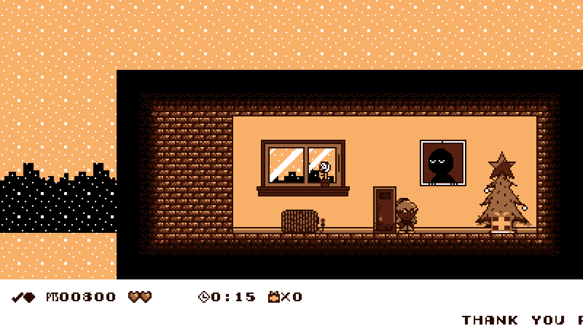
For instance, here’s how the small sewer room in the 1st level looks now:

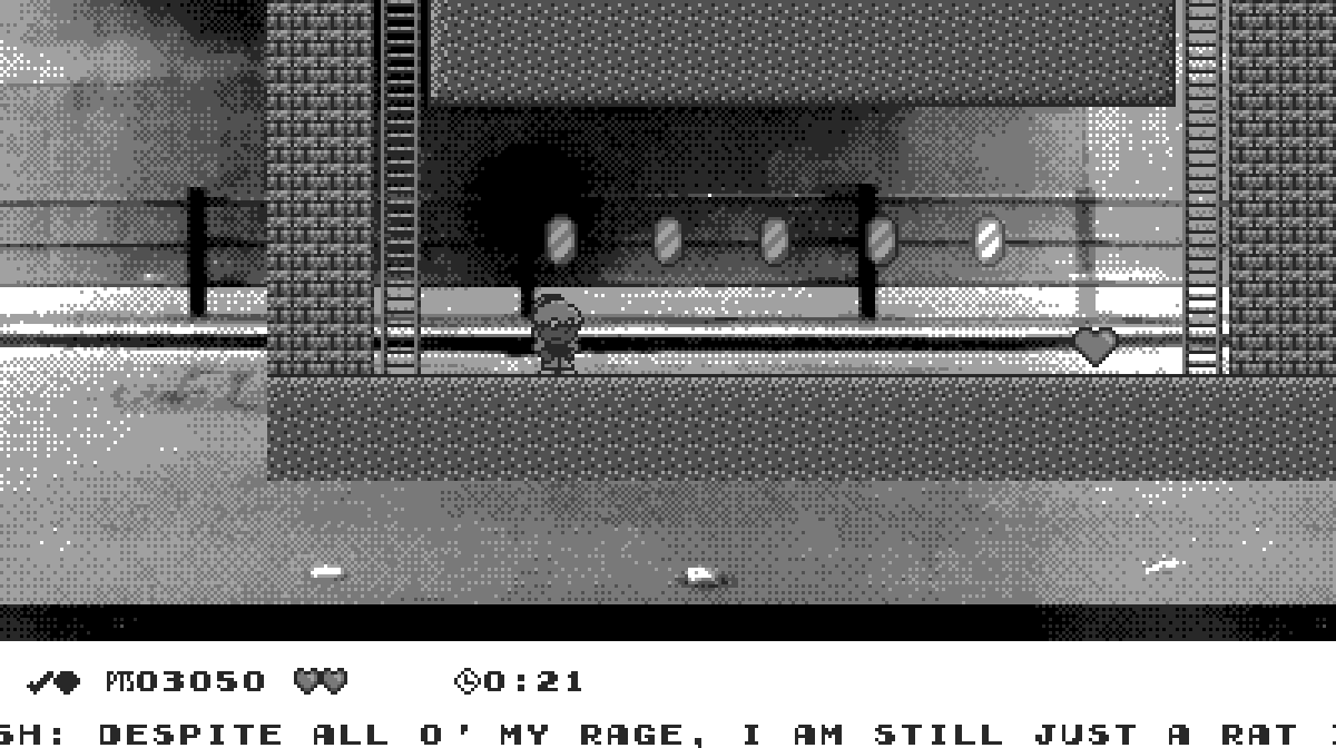
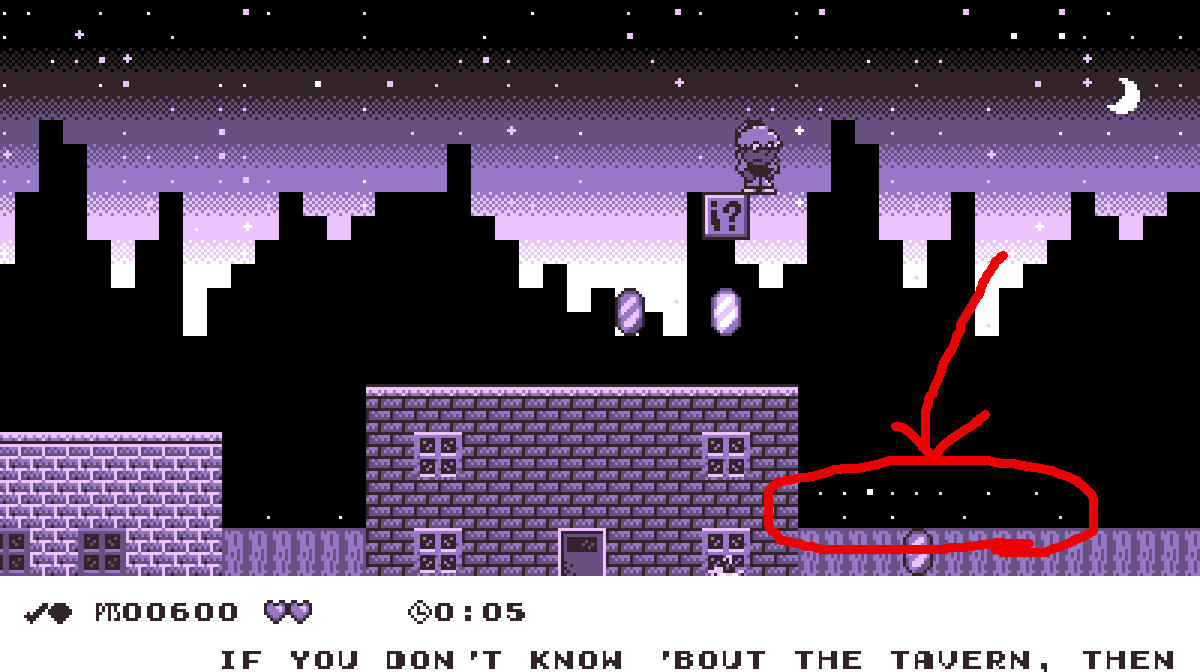
In the main map o’ the same level, the starry background shows from ’hind the bottom o’ the skyline BG, since the skyline BG’s now too short to cover the rest o’ the screen:

Who knows when I’ll get to fixing these.

Source code is still messy & inefficient

Posted in Boskeopolis Land, Programming

Let’s Code a Crappy 2D Platformer Like Millions o’ Other People on the Internet & Lose Interest & Give Up Only a Few Months In, Part XXVII

Milky Mountains

I don’t remember if I mentioned before my decision to add a “mountain” theme to lighten “desert”’s load, but I did. This is s’posed to be the 1st mountain level, so hopefully it’s not too hard for what will the… ¿5th level? There are quite a few areas that are free, such as a few o’ the slopes & the upward slope @ the end ( it’s e’en easier if you don’t jump; I think you’re guranteed not to get hit if you just hold left ).

The most trouble I had with this level was coming up with ideas. It’s a rather plain level; but I don’t want every level to be a completely different gimmick or else the gimmick levels won’t feel fresh anymo’. Thus, this is just a normal level heading toward an end goal where most o’ the challenge is basic platforming & not getting hit by enemies. The 1 twist I allowed was having you spend most o’ the level going leftward, since I noticed most levels have you go from left to right, horizontally. Should probably add some mo’ verticality & s’pecially mo’ twisty paths. I did have an idea for a level where you start in the center & spiral out, but I’m not sure where I want to use it. Maybe “Hoot Chutes”.

There was an early version o’ this level that was e’en lamer than this. Then I came up with the chicken enemies — or rather, found a character design that seemed interesting ’nough to not make me feel as bad ’bout ripping off Koopas. I don’t remember if I said this yet, but making enemies is hard when the Super Mario Bros. games already came up with all the good ideas.

Also, I don’t show it here, but there’s a glitch I don’t know how to fix: in the hidden alcove with the gems, if you jump with Autumn’s left side slightly under the ceiling, Autumn will pop up straight through the wall to the top o’ the level. Probably caused by the code that keeps Autumn’s movement gainst walls or floor smooth by making horizontal collision detection mo’ demanding for vertical collision & vice-versa.

Bonus

I wasted a lot o’ time trying to optimize things, since this code is hilariously inefficient ( as well as cumbersome ). This time I actually profiled & found that using hash maps with strings as keys is a big waste, probably ’cause comparing strings is slow, & it’s done every frame to get the texture for every sprite, block, background, & letter o’ text. So I tried replaced this with some complicated system wherein all graphics strings are replaced with IDs, which the renderer would use to directly index an array o’ textures & the renderer would only compare strings for the creation o’ any graphic object to find which ID to give it ( either by finding an existing index o’ a texture or creating 1 if 1 didn’t already exist ).

This caused memory leaks & problems somewhere, so I scrapped it all. But I did capture some videos showing some o’ the greatest hits o’ the errors caused in the making:

I wasted e’en mo’ time playing round with refactoring the entire project into code that’s less sludgy. Not surprising, I haven’t found a way to make the sprite code less cumbersome; but I still have that other code lying round & may return to it later — ’specially if I can figure out how to get the racer sprite’s sequence o’ inputs to match up with “Rooftop Rumble” so she doesn’t fall off due to the slightest o’ differences or something.

Levels I May Work On Next:

  • A farm level ( ¿in the ‘mountain’ theme set? ) that challenges you to defeat all the chicken enemy in its various forms ( this video only shows 3 forms; there’s also diagonal & circling chickens ) — think an easier version o’ the “Playing Railroad” gimmick, but without the ability to shoot.
  • “Lunacy”, with a gravity mechanic, which I’ve implemented already.
  • A bunch o’ other levels like “Pepperoncini Pyramid” & “Hoot Chutes” that I’ve been saying I’d work on for months.

Here’s where the messy source code is

Posted in Boskeopolis Land, Programming

Let’s Code a Crappy 2D Platformer Like Millions o’ Other People on the Internet & Lose Interest & Give Up Only a Few Months In, Part XXVI

Playing Railroad

This level was a task, & you can see why with all the fun features I decided to include. This was a case o’ my artistic side o’erriding my careful programming self ( which, now that I remember what my code looks like, doesn’t exist ). I kept insisting that I must have some feature, e’en if it meant adding mo’ weird, rare conditions to my already-bloated code. It wasn’t ’nough to have the ability to shoot while standing, ducking, & being able to shoot upward & to have various enemies that do similarly; I insisted on having the level goal be “kill all the enemies”, since I found this level to be the 1 where killing enemies was the most fun. I had planned on having this level goal since the beginning, but my original goal would be that it’d be in a 1-map level, where I could simply test if the sprite vector is empty. But this level has multiple maps, & I definitely wasn’t cutting out my swanky roof section. This left a problem: only the current map’s sprites are loaded, & they’re reloaded ’tween maps, which causes any dead sprites to respawn. So I had to create a way to keep track o’ certain sprites I didn’t want to respawn & add some extra code to delete that sprite from the map’s sprite index vector so that when it respawned sprites that sprite’s flag would no longer be there ( similar to how blocks that disappear, such as gems, work ). ’Course, since I was lazy & didn’t want to keep manually counting how many enemies are in the level in total for the level goal, I had to create an extra function that loops through every map & looks for certain sprite IDs.

You may notice that the roof section has wind ( which makes the jumps — ’specially that spring jump — much harder than they seem ). This actually didn’t require hardly any reprogramming, since I already had the wind mechanic programmed for a level I plan to make later. The only reprogramming I had to do was some hacky fix to keep the springs ( which are sprites now ) from being affected by the wind. I actually mulled o’er whether I wanted to Cowpokers up on the roof to be affected by wind, as it messed up the arrangement I meant for the rightmost area ( wherein the Cowpokers are on crates ); but then I decided that having that the wind-based version is mo’ interesting.

The rest was was aesthetics, which is always surprisingly mo’ challenging & complicated than actual gameplay… & also required reprogramming. To allow that tunnel background, I had to fiddle a lot with the background image layer class to allow for a specific # o’ BG repeats ( before ’twas either infinitely or no repeat @ all ) & had to make it so that when the background goes too far left, it wraps back to the right ( which, to be fair, also would fix an unlikely — e’en with these fast-scrolling BGs it’d take 32-bit & higher computers a’least an hour or so for the int to reach the ~ -2 billion bottom limit — bug wherein the background movement X position wraps back to the int max value ). It still feels a bit janky, though — I particularly don’t like it when the tunnel appears right when you enter a map. Ideally it’d be rarer & take a’least a few minutes in a map to appear. Also, the tunnel doesn’t appear in the boss room ’cause its small map causes the tunnel to glitch out. Technically I could just enlarge the map & limit the camera ( the reason the boss room is in a different map — though you can see a decoy that’s just for show in the 1st map — is to keep the room on-screen, as I found the boss fight too janky with the boss offscreen ), but that felt wasteful.

The best part o’ these graphics is that I oft had to heavily readjust things when I decided to change things. For instance, the inner-train BG originally was just an image with repeat-x till I decided I wanted to have gaps ’tween train cars & show past the walls. Obviously having the background tile out into the outside o’ the train made no sense, so I had to break the image up into tiles & have them be a tile background layer, with no tiles in the outside parts1. The problem with that is that I wanted those swanky translucent windows that appear ’hind that chair, which meant I needed a 2nd tile background layer. Now I changed it so that any layers in Tiled past 2 ( the sprite layer ) gets added as a tile background layer, allowing for theoretically infinite2.

The window highlights, which were far harder to do than you might think, were ’nother example where I kept going back & forth. @ 1st I made animations for the train windows & the doors, only to realize I could just have consistent highlight graphics below all the graphics as a tile background layer & just have the windows be cut out with transparency… ’cept you sometimes go ’hind the windows, & they need to be in front o’ sprites, which is impossible with background tile layers ( they’re backgrounds, after all ). But the doors & front window don’t have this problem, so I finally settled with window highlights & solid highlights that go ’hind the doors & front window. & since you ne’er go ’hind the side window on the front car with the boss room, I just had those windows be in the background tile layer & added a block with a gray triangle in the top-right corner to make that angled window.

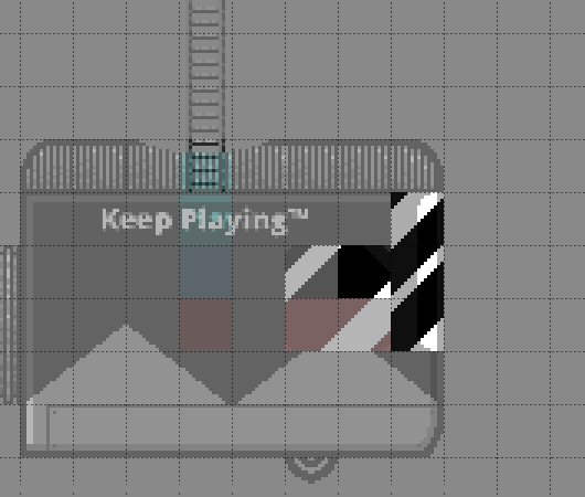
Front car with foreground layer given half transparency & background tile layer shown below.

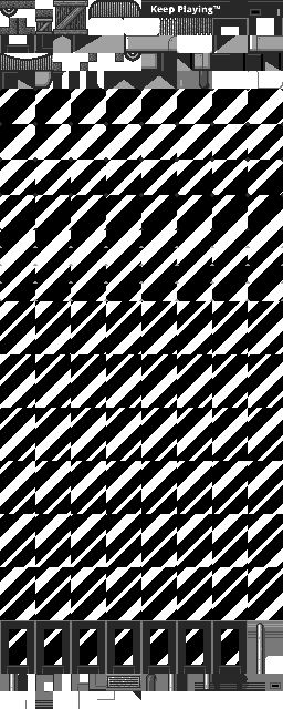
If you’re curious how the train graphics look so you can see the sheer weight o’ the window highlight tiles:

The used windows highlights take up a whole 480 tiles, as opposed to ’bout 128 for all the rest — almost 4 times the girth.

Note that you can also see remnants o’ the ol’ door-window highlight graphics, as I ne’er got round to reclaiming that space & using it for the inside background tiles.

Actually making all these tiles was much mo’ tedious than you’d expect. Basically, I created a GIMP file with the black BG, white highlights, & a hidden layer with a solid color for the size o’ the graphic & kept going back & forth, moving the highlights up by 1 pixel & cropping to the hidden layer & saving a png for a total o’ 32 to 48 frames total for each type. Then I just copied them all into some CSS sprites app to put them all together, as seen in the graphic.

& now thinking ’bout it, it’d probably be much mo’ efficient to replace the door & front window highlights with a single graphic that’s just moved & tiled a certain way. I could e’en do that with the background image layer already programmed in, too. That’d save a whopping 288 tiles & probably a couple KB on the tile graphic.

& since I was being anal-retentive, I got round to improving graphics from eons ago. For example, you’ll notice I added shine animation to the gems, which didn’t take nearly as long as the window highlights. I also made the springs sprites so I could add animation & was surprised @ how well I was able to make them work.

The worst thing is that I can still think o’ a bunch o’ things I want to add to this level, but I felt that there had to come a time when I stopped. Part o’ me wants to add mo’ frames to the shooting animations for “cowgirl” Autumn & the Cowpokers. Also, I feel like the edges o’ the tunnel look awkward. I tried to make it look smooth with a bit o’ gradient, but it still looks clunky.

Finally, I wanted to have the train jerk up & down, like the train stages in Wario Land II do, but that’d require being able to move every block — including those in the background tile layers — up & down & would probably require having all the blocks permanent to prevent the up-&-down motion becoming janky when you scroll the camera & replace the blocks. Also, it’d probably complicate the gameplay as well as all that & would require a lot o’ testing, & basically I didn’t think ’twas worth all the effort. Maybe later. I have been puzzling ’bout making the block code mo’ efficient so I could just load them all @ once, which may be mo’ efficient that constantly regenerating them whenever the camera moves, but I’m not sure if it’s truly worth it.

Funny ’nough, I got so focused on talking ’bout graphics that I ne’er talked ’bout the difficulty o’ this level. Part o’ me feels like I might’ve gone o’erkill; on the other side, I have found that the mo’ I played this level, the easier I found it. @ 1st I thought trying to beat the level quickly was ridiculous — ’specially with the randomness o’ all the enemies’ shooting — & made the time challenge 1:50, e’en though my earlier attempts gave me a best time o’ 1:45, only to pleasantly surprise myself while recording by my ability to beat it in the 1:30s in only 3 tries ( 1 failed attempts shown on accident due to incompetent video editing ) — & that’s on a run in which I take a safety heart & make many other li’l mistakes; someone actually good @ games could probably beat this level in the 1:20s a’least. Clearly I must’ve found the difficulty fun since I kept making myself make things harder, — ’specially the boss3, who I e’en considered giving 2 mo’ hit points & for whom I did crank up the shooting frquency — since I found it mo’ exciting. In particular, I changed the boss so that it also shot low since I quickly discovered I could just duck & cheese him without the possibility o’ getting hit otherwise ( it’s still much easier to duck & shoot @ it while jumping o’er low shots, as shown in the video ). In fairness, the level does also provide plenty o’ hearts, including an infinite-use full-heal block right before the boss.

All the death pits in the upper section don’t help, ’specially with the wind. As I mentioned, some o’ the jumps are trickier than they look thanks to the wind & how it messes up Autumn’s momentum, ’specially the spring jump.

The Future

I think I might do a beach level ( a pirate level ) next.

Posted in Boskeopolis Land, Programming