The Mezunian

Die Positivität ist das Opium des Volkes, aber der Spott ist das Opium der Verrückten

Boskeopolis Land: Let’s Code a Crappy 2D Platformer Like Millions o’ Other People on the Internet & Lose Interest & Give Up Only a Few Months In, Part XXXXV: Gravity, Hypocrisy, & the Perils o’ Being in 3D

Gravity, Hypocrisy, & the Perils o’ Being in 3D

I’m surprised this made it past the rejection bin. This started as an idle, silly idea that I planned to procrastinate to the sequel, ’specially due to the rigidity o’ this game engine, thanks to me to being a terrible programmer who was an e’en terribler programer when I started mo’ than 2 years ago. However, I figured out an easy way to do it by just adding some flags to hide all the blocks, make all the sprites invisible, & then just create a background that draws everything seen in this level. This is thanks to the MapLayer class being ridiculously flexible: it’s basically just an update & render virtual method.

This level & associated classes all have “Doom” in their name, but they should truly be called “Wolfenstein3D”, as this level uses the much simpler raycasting method that that game uses, rather than Doom’s mo’ complicated ( & mo’ powerful ) BSP trees. Raycasting works better for this game’s engine, as it works well with grid-based maps, which this game engine uses, whereas Doom’s system is based on lines which can be @ any angle ( & thus can have walls that aren’t all @ 90° angles, as Wolfenstein 3D & this game have ). That’s fine for me, since this is just 1 level & it’s s’sposed to have a retro look. I can tell you that I’d worry ’bout how primitive the 16-pixel block textures ( smaller than Wolfenstein’s, actually, but the size o’ blocks in this Mario-inspired engine ) look stetched out before I worry ’bout perfectly square walls. Since this works well with grid-based maps, I can just use a regular grid-based map & keep their usual behavior. This pseudo-3d gimmick is nothing mo’ than a visual gimmick o’er a normal isometric 2D level — basically just “Maybe I’m a Maze”, but with simpler, slower enemies that you can kill off. The walls are just regular solid blocks, the gems & hearts are the same gem & heart blocks used in all the other levels, & thus I didn’t have to add any new behavior there. Only the hero, enemy, & bullet sprites needed much new behavioral programming, & that was mostly to handle moving in various angles.

For those curious, the gist o’ raycasting is that you calculate a ray for each vertical stripe o’ the screen measuring the distance ’tween the nearest solid block on the grid & the player ( to be mo’ accurate, a point on an invisible line perpendicular to the player & a li’ in front o’ the player to prevent a strange fish-eye perspective ) & using that distance to calculate how tall that line o’ wall should be, with larger distances giving shorter lines & shorter distances giving longer lines, simulating walls shrinking in the distance. ’Course, there’s many other complications, like applying a texture to these lines ( in my case, I just calculate which texture X it should have & just stretch the texture block o’er the height o’ the line, which is mo’ efficient for SDL & GPU than manually calculating each pixel ), creating perspective textures on the floor & ceiling ( it’s a blur to me how I did this, though I do remember that the #s for the ceiling & floor are the same, just using a different offset for different textures ), & adding in “objects”, like the crab enemies, the bullets, the gems, & hearts & cutting out parts that are hidden ’hind walls ( this was actually the hardest part ). Since I have no idea what I’m doing for e’en basic programming, it’s obvious that I relied on learning how to do this nonsense from other sources, with this tutorial as a major influence, as well as Fabien Sanglard’s excellent in-depth study o’ Wolfenstein 3D’s source code, The Black Book of Wolfenstein 3D, which is what inspired this idea in the 1st-place ( though Wolfenstein 3D used so much assembly & so many arcane optimizations that most o’ its code wouldn’t work well for my project ). I did, however, twist the code I copied a lot so that it’s now virtually impossible to recognize, sometimes for petty anal-retentive reasons ( I don’t like free variables that change round a lot ) & some for optimization reasons, due to the difference ’tween low-memory computers that these guides were aimed for & modern computers with their strange GPUs & SDL with its immensely limited GPU control compared to OpenGL.

I ran into many subtle bugs ’long the way, ’cause this 3D-like business, e’en if just a graphical illusion, is far beyond what I’m used to. For instance, I don’t think my high school or my joke o’ a college I went to taught trigonometry, so I was just going off vague memories. ( I still don’t know what sine & cosine do, but I know I remember I used it for calculating angles on the shmup level I still haven’t finished yet, so it makes sense here ). & then I would just rely on trying things out & seeing what happens. The last bug I ran into was when I changed the shooting so that the bullet appeared a block or so in front o’ the player when shooting, so the bullet starts @ a size you’d expect to come from the slingshot & not @ the size o’ the screen ( which would make it look like Autumn is shooting rocks bigger than she is ), only for it to start @ the sides o’ the player when pointing in certain angles ( which makes e’en less sense, visually ). When creating this, I set the bullet to be an offset from the player’s center, which seemed most balanced; turned out, simply changing it to the x & y position ( which is the top left ) made it work exactly as expected. This still makes less sense to me.

For a long time before that, both bullets & the player moved in weird angles. This was less obvious for the player, since you can’t see them; for the longest time, I just thought ’twas just my imprecise angling while playing. I finally realized the cause was that the acceleration & velocity system I use for regular 2D movement doesn’t work with this strange angled movement. For those who don’t already know, almost all sprites move by setting acceleration, which is added to velocity every frame, which gets capped @ a set top speed, & that velocity is added to position. This works great for, say, 2D platformer movement ( & is, in fact, how movement in Mario games works — though they oft have weird acceleration oscillations for reasons I don’t understand ). However, for angled movement, this, with the velocity cap, creates a subtle problem: if your angle is so that you move mo’ on 1 axis than the other, then that axis’s speed will be greater than the other axis. However, due to the speed cap ( which is necessary to keep you from going just zipping through everything ), after the bigger axis reaches the speed cap before the other axis, the other axis keeps gaining speed till it reaches the same cap, which gradually transforms all non-straight angles ( all angles that don’t have the lesser axis as exactly 0 ) to 45°. This, logically, causes the very effect I could see from the beginning: veering parabolas. The level as shown just has constant speed for the player & bullet sprites, which fixes this ( though, an example o’ this game engine’s stupid built-in rigidity, ’cause I have it built into the core sprite class that collision detection relies on the built-in velocity properties to work, I do still have to set velocity, or else do a bunch o’ work creating a new collision detection just for this level ).

The 1 exception to this fix are the crab enemies: they still fall under the ol’ movement glitch, as you can see by their weird sideways movement in the video. I did this on purpose as I prefer this movement for them — it fits their crablike nature perfectly. The only bug with them is why I have crab enemies in a dungeon. The answer: I can’t think o’ an enemy design I like better than them & they have a simple animation that isn’t a headache to depict.

The challenge offered by the crab enemies is interesting to me: since this is a 1st-cycle level, I made this level very easy. The crabs aren’t very fast & you have to basically try to get hurt if you see 1 coming up to you & can’t shoot it down before it touches you. That is if you’re not racing round with strafing ( like in most games with 3D movement, strafing is quicker than just moving forward, which is why I move like a Goldeneye 007 speedrun in the time challenge part o’ the video ); if you are, they can sneak up on you when you can’t see them clearly.

Since this level is so easy, I didn’t feel any qualm with forcing the player to explore the whole maze & collect every gem in the level to get the gem challenge. But man can it take long, & makes me wonder if I should’ve picked a less monotonous song for this level ( “Boskeopolis Underground” had this same problem ). I was not happy when recording this video & actually dying to a crab somehow when halfway through attempting this, making me do it all o’er ’gain.

The time challenge, meanwhile, is easy if you know the strafing trick, ‘cause I didn’t want to force players to figure out such an obtuse trick to complete the game.
Source code

Posted in Boskeopolis Land, Programming

Boskeopolis Land: Let’s Code a Crappy 2D Platformer Like Millions o’ Other People on the Internet & Lose Interest & Give Up Only a Few Months In, Part XXXXIV: Through the Sharp Hawthorn Blow the Winds

’Cause everyone loves wind gimmicks.

Those who have been paying attention to these posts since their earliest entries ( surely nobody ) would recall that I had been working on a level with this gimmick, forest theme, & palette since near the start, but couldn’t be arsed to finish due to other levels shoving it aside. ’Cept for the longest time, ’twas called “Windy Woods”, which was too unbearably cliché for me ( & “Gusty Glade” was already used by Rare ). Sick o’ so many Rareware alliteration names & puns, I stuck with an age-ol’ Shakespeare quote, showing no regard for the fact that this level has no hawthorns, & that such a name would better fit a bramble sky level than a forest level.

Thanks to using such a long name, I finally forced myself to stop being a slob & update the o’erworld inventory & level select screens to accommodate larger level names, which was done through giving the level names in both an extra row. As o’ now, this looks weird to me; hopefully I’ll get used to it ’ventually.

This was also a level, ’long with “The Minus Touch”, that I’d always planned to be 1 o’ the most challenging levels in the game ( though not nearly as challenging as “The Minus Touch” ). This can be seen in the 20-minute video, wherein, for once, I didn’t edit out the deaths @ all, so viewers can see all o’ my many failures ( since I already did the many-deaths cut for “The Minus Touch” ).

Trying to make a difficult level can be difficult itself since it can be hard to tell whether difficulty is legit or cheap. In particular, I worry ’bout the birds & the bouncing spike balls being beginner’s traps, since it’s hard to see them before they strike. But then, ¿isn’t challenging players to have quick reflexes perfectly legitimate? There’s also a spike ball near the start that you can’t see till it’s already falling ( ironically, just after a fake spike ball that doesn’t fall @ all ) — unintentionally, since it doesn’t fit in the camera from so high up. I left it in since it’s extremely unlikely a player will get hit by it since there’s no reason to just stand under it & ’cause I thought ’twas funny to have a spike ball fall after where you’d expect it to fall. The graphics may also be crowded, making it hard to make things out. The limited palette doesn’t help.

In the end, I chock this level up to be a Rareware level ’long the etchings o’ “Lightning Lookout” or, perhaps closer, “Gusty Glade”. Hell, a’least I made sure my wind mechanic stays perfectly consistent throughout the whole level.

Since the level is hard ’nough to beat ( by my low standards a’least ), I didn’t put much stress on the gem & time scores. I filled the level with gems, making its 20,000 ₧ requirement easy to meet if you wait round grabbing most o’ it in all the big caches. As the video shows, you can beat the time score by 6 seconds, which surprised me. I didn’t put much effort into trying to beat the time score when I 1st set it &, as the video shows, I was able to spontaneously figure out a way to easily slip past the bouncing spike fruit. I’ll still keep the time score, though, since it’d be refreshing to have a time score that isn’t as stringent as possible. They’re made for ordinary players, not professional speedrunners.

I’ll note that playing any other level after playing this level too much feels weird, since I’ve found I adjusted to the wind & found Autumn’s newfound lack o’ resistance o’erbearing & would way o’ershoot jumps.

Posted in Boskeopolis Land, Programming

Boskeopolis Land: Let’s Code a Crappy 2D Platformer Like Millions o’ Other People on the Internet & Lose Interest & Give Up Only a Few Months In, Part XXXXIII: Catahoneycombs

I delayed this video ’cause I felt this level may have too much content — &, in particular, too many gimmicks — for just 1 level & considered splitting it into 2 levels, which would conflict with my theme system, since I already had 3 mine levels & no other theme where this level would fit, e’en in a game that already stretched level themes beyond their logical boundaries ( quite a hefty problem for a game revolving round revolving level themes, which needs meaningful level themes for the cycling o’ said level themes to have meaning ).

I mentioned in an earlier post that I prefer to have multiple li’l gimmicks in a level than 1 all-encompassing level gimmick so that the level doesn’t feel too 1-dimensional; however, too many gimmicks either bloat the level too long ( & I feel most games have levels that are too long ) or leave some gimmicks underused, which I fear may happen here, particularly with the sticky floor gimmick. Other than a few places near the beginning that simply show without telling how sticky floors work without risk, the sticky ground is only used in 1 small section in the middle o’ the level challenging you to dodge Pufferbees while traversing sticky floor. This can be ’splained by the fact that I didn’t consider adding this gimmick till late in this level’s development: originally, this level went straight from that 1st platform with a white ant on it to the next.

’Twas mainly this gimmick I planned on cutting out into its own level, while leaving this level as ’twas originally. But in addition to not having ’nother level slot for ’nother beehive level, I came to the conclusion that there probably wasn’t much else to do with the sticky floor gimmick. Plus, I don’t think ’twas a particularly enjoyable gimmick to stretch much longer, either.

’Sides, the other gimmicks in this level aren’t strong ’nough to hold a whole level. The honey bubbles that form this level’s predominant gimmick1 are just floating water, & the honey falls are just vertical lines o’ water with greater downward force. I didn’t e’en bother to eliminate the oxygen mechanic o’ these water blocks, which I considered, but then declined, since I didn’t feel it worth the effort & felt the oxygen element added an extra complexity to these simple gimmicks, ’specially to the honey falls, adding a bit o’ extra challenge to getting all those gems down there. Meanwhile, the white ants are just a new enemy type that could hardly be called a “gimmick”. Also, I considered taking them out, since, as the video was nice ’nough to show, they glitch out sometimes for reasons I still haven’t figured out. It can’t be due to some blocks not spawning messing up their block detection, as the “blocks_work_offscreen” flag is turned on so that the square-formation bees near the beginning are already moving when you get there ( a necessity if you don’t want the 1st jump to be free & you want to ensure the bees are always in sync with each other ).

Recording this level’s video went surprisingly great: I was able to get it all in 1 take. That’s rare & surprising for a level so tricky — with so many tight jumps where it’s easy to just nick a bee or spike — that I’m considering moving this up from the 2nd cycle to the 3rd & putting “Curse o’ th’Ladder-Splayed Caves” in the 2nd cycle ’stead. The only true hitch was the obligatory level error remaining during recording: the white ant that spins off its platform into space.

I was ’specially surprised I got the time score 1st try, since I flubbed up so much, including the part where I miss the initial bee space due to brain flatulence & waited there a whole second like a buffoon. A’least I was able to show that with quick but tiny jumps you can go through the middle section with honey floor & bees without pausing, as I detest when game’s make you stop. Also, I think I miscalculated the gem score: as the video shows, e’en if you don’t collect every gem, it’s still easy to get mo’ than 10,000₧, while the score requirement is only 9,000. I should bump it up to 10,000.

This level’s music, by the way, is not by the elusive public domain composer Kevin MacLeod, who made most o’ these songs I used, but by Lobo Loco & came from my other main repository for free music ( well, Creative Commons, which works fine for me, since my game is on Creative Commons, too ), freemusicarchive.org. None o’ MacLeod’s songs fit a beehive theme particularly well — which you can’t blame him for, since it’s a rare level theme. I thought searching “bees” in Free Music Archive would be a far fetch, ’specially since, unlike MacLeod, that website doesn’t focus on video game themes. So you can imagine my surprise when I heard Lobo Loco’s “Save the Bees” & heard exactly what I wanted. It reminds me a lot o’ the “Flight of the Zinger” song from Diddy’s Kong Quest, used in that game’s beehive levels, which is exactly what I was thinking o’ when imagining what I wanted this level’s song to sound like.

This source code is so bad it gives me hives

Posted in Boskeopolis Land, Programming

Boskeopolis Land: Let’s Code a Crappy 2D Platformer Like Millions o’ Other People on the Internet & Lose Interest & Give Up Only a Few Months In, Part XXXXII: Good Ship Lifestyle

For once the layout & programming took mo’ time than the graphics — probably ’cause much o’ the graphics are reused from other “pirate” themed level. & for once this is actually pirate themed & not a beach or bathtub.

It’s hard for me to get difficulty right ( or I fail to get it right ), since I’m bad @ games, so I can’t tell if I made a level too ridiculous or if I just suck. ¿Does dodging some o’ these anchor bullets require luck or just sharp eyes & reflexes? I considered lengthening the minimum shoot delay, since it seems like the most seemingly unfair hits were when it shot just after shooting, but decided not to, since I figured I was just reacting too slowly.

Anyway, the gem & time scores are lenient & I’m quite sure all o’ the trouble I had gathering the footage for this day’s video was due to sloppy playing. The time video here particularly shows that off, as after near flawless playing through the 1st half I flop round as if my fingers were covered in butter & hesitate as if I developed Alzheimer’s & still make the time score — though right on the last second.

The ladder shafts & the final stair climb are so saturated with anchor bullet sprites that it caused slowdown, so I had to fiddle together some optimization tricks. The 1st 1 I did had nothing to do with sprites, but eased the level’s run load so much that it made up for it: many o’ the tiles are background tiles, & I noticed that none o’ those tiles animated or changed. I’ve realized for a while that drawing all these li’l blocks is probably 1 o’ the most inefficient things this game does, since it calls the SDL_RenderCopyEx function for each block, which valgrind has consistently told me is slow. ( This is what led me to realize many updates ago that loading a small image & tiling it for a background is slower than manually tiling it into a large image & just loading & drawing that large image once per frame ). So I created a branch o’ the background tile code & created ’nother version that @ the beginning creates a texture o’ all the level’s background tiles & just draws the portion o’ that that’s on the screen every frame, turning what could be o’er 200 SDL_RenderCopyEx calls per frame into just 1 per frame.

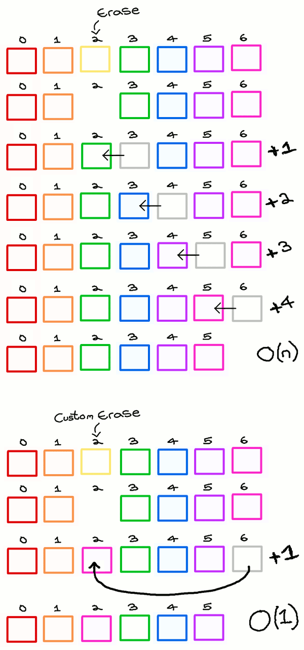
That seemed to get rid o’ the slowdown. But I still wasn’t sure or satisfied, so I made 1 other quick & easy optimization that was actually relevant to sprites & I should’ve fixed a while ago. When a sprite is killed off, it’s simply erased from the vector o’ sprites. I’ve read on the internet that vector’s erase method shifts all entries after the deleted entry backward to fill the space & still maintain the order o’ entries. Unfortunately, I don’t care ’bout sprite order — it’s arbitrary, anyway, based on whatever order the map reader finds them, which isn’t tied to the order the player is likely to find them. Moreo’er, this is slow — I believe worst-case O(n). So I changed it so that it now just replaces the data o’ the sprite to be deleted with the final sprite’s data & then just pop off the final sprite.

I must confess I didn’t come up with this idea myself, but learned it from this chapter on “Object Pools” o’ the book Game Programming Patterns. In fact, I’ve known ’bout it for years & used it in earlier programs I’ve made, which is why I said I should’ve used it earlier.

As an extra maybe-optimization that didn’t hurt is I set the sprites vector to reserve 50 spots @ the beginning to hopefully avoid going past the size o’ the vector & having to slowly reallocate memory, move the data, & delete the ol’ data. When considering this optimization, I considered changing the vector to a classic C array, since I wasn’t sure if vector e’en allowed you to delete any entry without automatically shifting other entries; but realized it didn’t matter, since the sprites are held as unique pointers, so I could just release the last entry’s data & reset the unique pointer o’ the sprite to be deleted to that data. I decided to stay with vector for the greater size flexibility it gives. I prefer the balance o’ safety & speed I can get by having a vector with a moderate # o’ space reserved so that having to enlarge the vector is unlikely, but still gives me the chance to enlarge the vector if absolutely needed, for some rare outcome that I can’t predict.

’Course, the fact that sprites are held as pointers & not data itself means that this vector can’t take advantage o’ data locality, — which I also, coincidentally, 1st learned ’bout from a chapter o’ Game Programming Patterns — which is also a rather big inefficiency. However, fixing that would take a lot mo’ work — I would basically have to refactor all sprite code so that it uses discriminating unions — which are both racist & socialist, so neither side o’ the political spectrum likes them — ’stead o’ polymorphic sprites. In hindsight, I would’ve preferred using discriminating unions for this & a few other reasons, but it’s too late; so we’re stuck with slow & stupid polymorphic classes. I could think o’ many other optimizations I could make, some big & some so small it’d be a waste o’ time — & some big, but would require me to reprogram large parts o’ the game’s integral code. This isn’t so much “fix all inefficiencies I can think o’”, which would make this project take decades to finish, but “fix inefficiencies that are obvious & ridiculously easy to do”. I’ll save these bigger ideas for the sequel, where I can start from scratch. Now I want to just get this sloppy mess finished & out o’ my sight.

Anyway, these optimizations not only seemed to clear all slowdown in “Good Ship Lifestyle”, they also seemed to fix the slowdown that has been in “Value Valhalla” for probably o’er a year. ( Didn’t fix most o’ the sprites disappearing after a loop, though ). Why this happens, I can’t understand, since this level has neither any background tile layers nor sprites that are deleted.

& I must say, this level’s music is a true banger. This time it isn’t by Kevin McLeod, but by a band called Blue Wave Theory, found on Free Music Archive, released under Creative Commons ( & thus OK for me to use ). It’s surprising how much high quality music you can find for free — which is great for people like me with absolutely no musical talent.

Final Fun Game: Try & find the minor graphical ( technically, level-design ) flaw I made & didn’t notice till after I already recorded the video this time.

Here Is Where the Bad Polymorphic Classes Can Be Found

Posted in Boskeopolis Land, Programming

Boskeopolis Land: Let’s Code a Crappy 2D Platformer Like Millions o’ Other People on the Internet & Lose Interest & Give Up Only a Few Months In, Part XXXXI: Dark Sahara

I finished this level a while ago — I just forgot to do a video on it till now. I think I was planning to do a bit mo’ graphical polishing. The volcano enemies still don’t look so good, & I just noticed while looking o’er the video that its fireballs sometimes go ’hind the cliffs due to some graphical shenanigans o’ how those cliffs work. Also, I waffled o’er what color I wanted this level to be. @ 1st it was bright yellow; but then I realized a desert being bright yellow @ night didn’t make sense & that I already have plenty o’ yellow in this game.

I’m not so hot on this level. It’s probably way too derivative o’ Doki Doki Panic / US Super Mario Bros. 2. Furthermo’, the bird-riding makes most o’ the level basically an autoscroller & the fireballs the volcano enemies spit out are random. Ironically, it’s ’cause Super Mario Bros. 2’s Pansers, whom this volcano enemy is obviously ripped-off o’, works the same way that I argued that ’twas all right. But I’m still not sure if I just have slow reflexes or if this is just unfair. I actually hope for the former, since I’d rather be bad @ playing video games than designing them.

I also got to steal from myself by taking that bird enemy’s graphics from 1 o’ the sprite comic episodes o’ Boskeopolis Stories. That makes this enemy & their mechanic technically inspired by a comic inspired by a video game. So Boskeopolis Land is the equivalent o’ Street Fighter: The Movie: The Game, or whatever it’s called.

The gem score, like many o’ the recent levels I’ve made, allows a few gems leeway, since getting all the gems is pain ’nough as it is. The time score isn’t much, either, since much o’ this level is autoscroll & gives you li’l control o’er how fast this level goes.

Man, this level sucks. I should’ve stuck with the idea o’ ripping off the bull level from the Rabbit Rampage game, ’stead. A’least nobody cares ’bout that game, so nobody would notice my plagiarism. Hell, e’en the name sucks: I don’t e’en think this level’s environment is saharan.

Downloading this code will infest your computer with malware till you get 999,999,999 points in this game.

Posted in Boskeopolis Land, Programming

Boskeopolis Land: Let’s Code a Crappy 2D Platformer Like Millions o’ Other People on the Internet & Lose Interest & Give Up Only a Few Months In, Part XXXX

It’s been long since last update, but that was ’cause I for no known reason waited till I got these 4 levels sorted through. Thus this update took long ’cause it’s 4 updates in 1.

Foul Fowl Farm

The 1st mountain level, as the music & background hint. I originally planned to have it be the 2nd mountain level, with “Milky Mountains” as the 1st, but I’ve found this level to be much easier than that level, & it fits better, difficulty-wise, like that. It doesn’t fit as well theme-wise, since it’s strange that a straightforward mountain level would be 2nd & the level that twists the theme a bit comes 1st, but that’s not as important. Plus it’s a bonus to start strange, so the audience doesn’t get bored before the good stuff comes. Always put the best 1st & last & the weakest in the middle; & though I don’t consider “Milky Mountains” to be bad, I consider it on the lower end, & worse than “Foul Fowl Farm”.

This was, indeed, a level that took much mo’ time drawing the graphics than coding it, since the goal gimmick was already mostly coded for “Playing Railroad”. I e’en had to make a program to generate the tiles for the barn roofs, since they comprise to many blocks for me to have the patience to do that manually.

However, it did take mo’ recoding than it appears. 1 lame thing I had to do was make copies o’ all the Pollo no Noko enemies, since the originals respawn after they die — & need to stay that way for “Milky Mountains” to still work right. In this level, that clearly can’t fly, since you could just respawn & killing the same chicken. E’en if my counter was smart ’nough to account for that, which would be mo’ effort than just copying & pasting, it would be annoying for the player to have to remember which chickens they’ve already bopped. Much simpler to just keep bopped chickens bopped.

I also had to create a new slope template, since the 1 I I’d just made for “Stormy Skyscrapers” only accounted for different slope widths, while the barn roof needed a super steep slope 2 blocks high. Since ’twas so different, trying to wrangle the already-existing slope template wouldn’t have been worth it, so I just created a new template.

It seems I was mo’ lenient with the time scores with these levels, since the video o’ my winning attempt to get the time score is full o’ weird flubs. The gem score, however, requires you to get all o’ them, which is fair, since this is a short & easy level.

Frostbite Mines

I was mixed on this. For a while I wanted to make a spiral-shaped level as part o’ my strategy o’ basing level maps ( more o’ less ) on simple shapes; & as simple as this level is, I like how it works. You may notice that a common strategy I play is to sometimes give levels 2 gimmicks when 1’s too modest1, so the level isn’t too pedestrian. In this case, just sliding under spikes & dodging falling snowballs by themselves aren’t compelling ’nough for their own levels; but mixed into 1 level gives the level mo’ depth. It feels mo’ like Donkey Kong Country 2 & less like Donkey Kong Country 3.

However, this & the next ice level I’ll write ’bout uses up all the ice level ideas; & I still wanted to have a snowy mountain level. That’s why I waited till I finished the other ice level to confirm whether I wanted these both. ’Twas during this time that I came to my solution: just move the ice mountain level to the mountain theme. However, this pushes me into deciding ’tween mo’ levels: the ice mountain vs. that dumb level where you just don’t press anything for 30 seconds vs. the volcano level idea vs. ’nother desert level I’m working on ( since all o’ these ’cept the ice mountain could potentially be desert levels ). But that choice is easier.

Technically, I finished this level’s graphics last, since I decided to use the ice-mine blocks I made for “Chillblain Lake” ’stead o’ the regular mine blocks. But the main design was made 2nd. Besides, as I’ll rant ’bout, I neglected to finish the graphics o’ the next 2 levels.

’Cause this is a rather difficult level for this game, this is a 4th-cycle level. It’s easy to be a li’l off on your budging when near spikes or next to the falling snowball to get a li’l too close & taking a hit, & there are no hearts. That said, this is 1 o’ the few short 4th-cycle levels.

I think I intentionally made the time score for this level somewhat lenient, since it’s a rather difficult level, as I usually do. I think the gem score lets you miss ’bout 1 gem ( which, sadly, doesn’t include the 250 bright gem @ the bottom o’ the slope o’er spikes ).

The Amazon Jungle

This is not a jungle level, but what is planned to be the 2nd factory level. The name is based on a 2-part pun based on the warehouse company Amazon that the city near to me, Seattle, has a love-hate relationship with for being a great job-creator for jobs that are miserable to work & a classic novel, The Jungle, known for its gruesome depiction o’ factories, which inspired regulatory acts by the Theodore Roosevelt administration in the US. I fiddled with names that involved the word “warehouse”, including the truly dreadful “Warehouse o’ London”, which makes no sense, since this game obviously takes place in the fictional city o’ Boskeopolis, not a real British city. I finally decided that the current name is mo’ clever than any hokey Rareware alliteration on “Warehouse”.

The level is mainly based round moving trucks carrying what I s’pose are packages. I actually made these sprites a while ago for a city level I rejected; but ’stead o’ having packages on their backs, they had… whatever the backs o’ big trucks are called. I think they were called “Anguri Trucks”, based on the Japanese way o’ saying “angry”, for some reason. They’re basically just Mega Moles from Super Mario World that are a danger if they run into you, but can help you by giving you a moving platform o’er spikes. Not only is it a ripoff o’ that, but making them trucks is clearly inspired by the VIP rom-hack series, which changed the Mega Mole graphics into some obscure truck meme.

I find this level questionable, mainly due to all the parts that slow you down, such as the part where you have to ride the truck & the part where you have to stay ’tween 2 trucks in a long line o’ trucks to slowly make your way to the end. I don’t like autoscrollers, as they make you wait, & waiting is boring. I guess these aren’t too bad, since you don’t have to wait too long ’tween actions for the riding section, & it’s not long, & you have to constantly time your budges forward to keep yourself from falling too far back & hitting the truck ’hind you or going too far forward to hit the truck ’head o’ you, so you’re not just waiting. Plus, one could take the long line section as a satire on traffic jams — an idea I’ll admit I just came up with now. A’least they’re broken off with free platforming sections.

I’m also not sure how to feel ’bout that section that kills you if you stay on the truck as it lets it rise up. I tried to indicate that it’s death by putting a skull in the background there; but that just makes one wonder why it’s e’en there. The obvious answer is as a joke — but it’s still weird. O well: better games got ’way with worse bullshit.

Since this level constrains your movement so much, I know I intentionally made the time score lenient, as seen by my still-winning flubbed-up video. Like “Frostbite Mines”, the gem score lets you miss a few gems, but not many.

I always hate it when I spend so much time trying to make sure the presentation o’ a level is as polished as I can make it before making these presentations & being able to move on, only to realize after already making the video that I didn’t finish everything. ¿How could I forget to put a string on that package that raises you to the top? Actually, I didn’t e’en notice that till I noticed that the package lacked any kind o’ shading & realized that I ne’er got to polishing that sprite @ all: I just drew the simplest design that looked like a package I could & commensed with making it work how I wanted ( as is wise to do: e’en worse is wasting time polishing design for something you later realize doesn’t work & must be tossed aside ), only to forget to do the polishing part.

Chillblain Lake

Though I originally planned to make this a 3rd-cycle ice level, I may make this a 2nd-cycle — or e’en 1st-cycle — level & move “Frigid Frigates” to the 3rd cycle, since I feel like it’s harder than this level. E’en “Ice Box Rock”, which is in the 1st cycle, might be harder than this level.

This level is heavily inspired by Wario Land 3’s “E2 The Frigid Sea” green treasure, wherein you start out with water, giving you access to the chest, but not the key, so you have to go hit a switch to turn the water into solid ice, giving you access to the key, but not the chest, which means you have to go back & hit the switch 1 mo’ time. As arrogant as it feels to say, I feel my design is better than Wario Land 3’s, since there’s less backtracking: in Wario Land 3, you go through the same path twice to the switch, while this level makes you go in a figure 8, with the 1st path to the switch in the water that leads to the chest, & thus blocked off after turning the water to ice, & the path to the key going onward to the switch in ’nother way.

I particularly like the way the 2nd path leads to a cliff o’er the switch. When you 1st reach the switch, you’ll likely see it, ’specially if you grab the tantalizing gems ’bove the switch. But you can’t reach up there ( nor can you reach the very topmost tantalizing gem ). It’s only on the way back to the switch through the other way that the player learns the mystery o’ the cliff too high to reach & can finally nab that too-high gem.

The diamond was originally just in an alcove on the key side o’ the water, sort o’ parallel to the main path in the chest side o’ the water. However, I felt that was still too easy to find. I wanted to involve the water-ice gimmick in some way, so I made it so that you couldn’t quite reach the diamond ’bove the water, but could with the ice. But then I remembered that ice is solid, so you can’t go through it to reach the diamond. So I made a somewhat secret passage ’bove the spikes @ the end o’ the curve upward & made a ladder passage ( which, unlike “Stormy Skyscrapers” & “Foul Fowl Farm”, has a top that you can climb up to, but can’t climb down, making it 1-way ) back up to the curve, since the ice path is still blocked off. My only problem with this is I don’t think this passage is secret ’nough. I pushed it back ’nough so that you couldn’t see the other side o’ the wall with the kind o’ natural camera you’d have when you reach the spikes; but as you jump up the curve on the normal path to the switch, you’re guranteed to see the secret passage opening.

You may notice the sliding under spikes gimmick from “Frostbite Mines” used here, but in a much easier, shorter way. That is ’nother technique I use sometimes: gimmicks reused in later levels in much less prominent ways as either a short tutorial for the real threat, as used here, or mixed with ’nother gimmick as a mo’-challenging twist on the gimmick, as seen in “Crying Lightning” with the fading-in & fading-out cloud platforms from “Cotton Candy Clouds” ( a gimmick that was also taken from Wario Land 3 ) mixed with the chasing lightning cloud enemy for a short bit, challenging the player to time jumps gainst the 2 gimmicks simultaneously ’stead o’ just 1.

Sick o’ the mine blocks used in so many levels already, I made an icy version, mixing the ice tops o’ the ground blocks from “Frigid Frigates” with the mine blocks, which I then decided to add to “Frostbite Mines”. I also changed the also-o’erused rocky mine background ( I’m still not sure if I’ve finished that background or if I’m going to ’ventually try adding wooden frames to it ) to a background totally not heavily based on a Wario Land 3 background from the same level this gimmick was taken from, but I didn’t use that background in “Frostbite Mines”, ’cause I found ’twas too hard to see with that level’s much brighter palette, made brighter by the white fog. I also opened the roof & added sunlight streaming in from the top. I e’en made this level’s name “Chillblain Lake”, ’stead o’ its original name, “Chillblain Caves”, which is mo’ fitting, since this level’s main focus is the lake shifting back & forth from being liquid or solid. All this is a way to try minimizing the mines aspect o’ this level, since it feels weird having half the ice levels be mine levels, too, when we already have 3 mine levels.

Despite all this polish, I realized too late that I ne’er bothered to make the fish enemies have mo’ than 1 animation frame or not look like something I sloppily drew out in a couple seconds, which is what I definitely did. Worse: this isn’t e’en a new enemy, but 1 I made way back for “Soupy Sewers”. Why I still haven’t given that enemy worthwhile graphics is beyond understanding.

However, I did think to make these fish boppable underwater, as the video shows, proving that I took my critique ’bout not being able to hit enemies in water levels being a contributing factor to those levels’ popular hatred in my article ’bout Super Mario Bros. Deluxe to heart for my own game.

I just realized I’ve been forgetting to update the readme, so this readme was publicly revealing planned bugfixes I’d already solved for months.

Posted in Boskeopolis Land, Programming

Boskeopolis Land: Let’s Code a Crappy 2D Platformer Like Millions o’ Other People on the Internet & Lose Interest & Give Up Only a Few Months In, Part XXXIX ( Stormy Skyscrapers )

Stormy Skyscrapers

It’s a good thing I didn’t promise anything specific, ’cause I ended up completing a completely unmentioned level. ’Cept, if you paid attention, you might have seen clues o’ the idea ’hind this level lurking in the background since my 5th post. I’m surprised I hadn’t shown off mo’: for the longest time I’ve had an unfinished city map with a grayscale palette, a few Hydrant enemies, & a long spike pit with horizontal & vertical moving platforms, with the plan o’ the level being mainly vertical.

None o’ that map made it into the current 1, which I started working on sometime last month, inspired by my playing Super Mario Bros. Deluxe, as I oft do during September, for some reason, & finding ’nother gimmick to steal. In this case, I basically completely ripped off the… ¿teeter-totter platforms? I don’t know what they’re s’posed to be called, but they’re called “weight platforms” in the game’s code. The 1 notable difference is the improved rope graphics, that was a pain to get to work right.

This level is heavily inspired by World 4-3 in Super Mario Bros., which I think is my favorite level in that game. However, the thin mushroom platforms are replaced by skyscrapers. I wanted this level to have a retro platformer feel, which is why it has a grayscale palette: much as mushrooms are sort o’ the natural, normal setting for Mario, urban landscapes are the natural, normal environment for Boskeopolis, — which is a city, after all — which is why it’s the 1st setting o’ each cycle.

The paper plane enemies, which grab you & drag you back to the start if you don’t struggle out o’ them quickly ’nough, are a riff on the randomly generated Bullet Bills. I thought making them drag you backward a bit was a nice way to balance having an extra projectile to dodge while not making it too hard to avoid being killed — while also rewarding you for being a fast button masher for struggling out o’ their grip. Then ’gain, some might find this mo’ annoying, ’specially when there’s an infinite healing heart block in the middle o’ the level. This is s’posed to be a 2nd-cycle level, so it shouldn’t be too difficult. It should be just a notch ’bove the 1st level.

I can’t remember exactly, but programming in the weight platforms probably took the most time out o’ everything, & became a barrier when I stumbled ’pon a bewildering glitch that caused 1 o’ the platforms to not budge, no matter how much I stepped on it ( but did work for the other 1 ), no matter how much I rolled back my code or recompiled it. Finally, I narrowed down the culprit in the silliest way: technically, ’twas caused by changing the map, which was why no amount o’ rolling back code fixed this bug — ’twas a bug that had been round since the start, but hidden till I added a block right ’tween the platforms. To make the platforms work, e’en when 1 is off-screen, I made the actual sprite go all round the limits o’ where the platforms can go till they fall. Thus, the block ’tween them was interacting with them & trying to block them from going downward. The fix was to simply turn off block interaction for that sprite, since they clearly didn’t need it.

I was updating this sprite up to near the end o’ developing this level. As I was demoing collecting gems in the level, trying to determine what I should set the gem score to be, I realized I’d ne’er implemented gaining points when breaking the platforms.

A’least the weight platforms sprite doesn’t seem to have much ugly kludge code, & I actually bothered to comment it properly.

The next boundary I ran into was, surprisingly, the gorilla sprites spawned by the big barrel sprite, an obvious reverse paean to Donkey Kong — the same problem I ran into on for “Ice Box Rock”, but far trickier to fix, since the platforms they walked o’er were sloped. @ 1st I just kept the level with the blocks_work_offscreen flag checked in the hopes that it wouldn’t be too slow, like “Rooftop Rumble”, which also has the option. I e’en tried optimizing the map by making all o’ the building blocks that weren’t the roofs background tiles, since you can’t interact with them, anyway. But, predictably for a much bigger level, there was noticeable slowdown. For, not only did this level have mo’ blocks than “Rooftop Rumble”, it had far mo’ sprites — sprites that all needed to interact with blocks, which was the point o’ making the blocks work offscreen in the 1st place. We’re talking ’bout up to 20 sprites, as opposed to “Rooftop Rumble”, which only has 2 sprites.

Surprisingly, I was able to optimize the handling o’ blocks when offscreen, so that the level seems to work in perfect speed now. ’Twas clear to me that the main problem was that every sprite was testing interaction with every block — 20 sprites times hundreds o’ blocks. The trick was to limit the blocks checked per sprite to only blocks near ’nough to actually be probably candidates. @ 1st I sat round thinking o’ complex patterns o’ dividing maps into screens, only to realize that that wouldn’t help when sprites enter the dividing line ’tween screens, till I tried a much simpler solution.

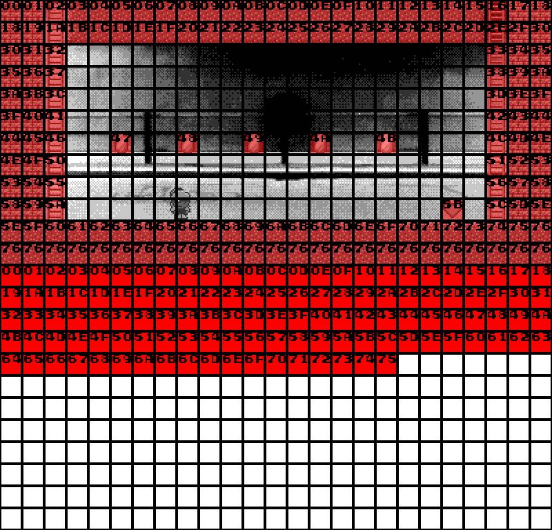
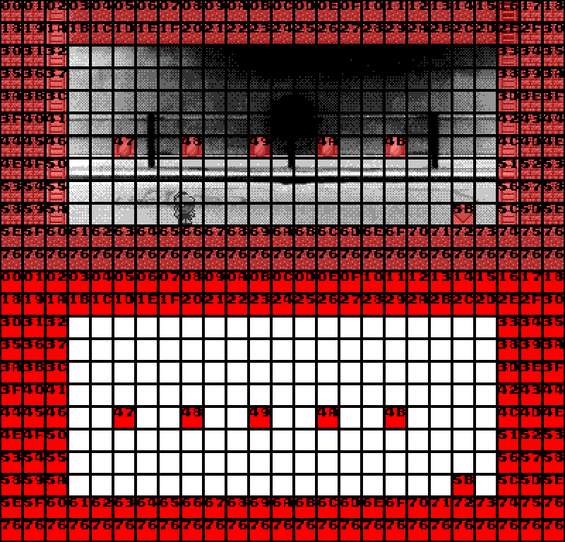
The way the block list works normally is that non-null blocks are added to the end o’ the list as they’re sequentially scanned from the map array, from top to bottom, left to right. Since empty tiles ( 0 in map data ) are ignored to save memory, & since no maps don’t have large gaps o’ empty tiles, the sequence o’ blocks in the block list have no relevance to their position, as shown below:

The position for each block is held in each block, & thus each sprite needs to test each block to see if they’re colliding.

Visual comparison o’ block data rendered based on position & data as its held in array:

The solution was to change it so that all tiles, including empty tiles, are added to the block list. This creates a consistent pattern ’tween the map & block list, like so:

Doing this, we can calculate where in the map a block will be by its location. We can be sure, for instance, that a block whose index into the block list has a remainder gainst the map width o’ 0 will have 0 as its x position value. Indeed, this is obvious when we remember that the blocks get their position in the 1st place from their position within the map’s block list.

Thus, rather than testing every block for each sprite, we only need to test blocks within a range o’ a block or so ( I picked 3 blocks @ a whim ) ’bove to below & left to right. Thus, the loop changes from

for ( Block& block : blocks )
{
    block.interact( sprite, ... );
}

to

const int first_x = floor( sprite.xPixels() / PIXELS_PER_BLOCK ) - 3;
const int first_y = floor( sprite.yPixels() / PIXELS_PER_BLOCK ) - 3;
const int last_x = ceil ( sprite.rightPixels() / PIXELS_PER_BLOCK ) + 3;
const int last_y = ceil ( sprite.bottomPixels() / PIXELS_PER_BLOCK ) + 3;

for ( int y = first_y; y < last_y; ++y )
{
    for ( int x = first_x; x < last_x; ++x )
    {
        const int n = y * map.widthPixels() + x;
        Block& block = blocks_[ n ];
        block.interact( sprite, ... );
    }
}

When I was 1st testing this out, I actually started by changing the rendering code to this, based on the hero’s position, which, when I figured it out, gave this cool effect where only the blocks right round the hero sprite appeared.

In hindsight, this is an obvious optimization: trading space for time, which is usually beneficial on modern computers with mo’ memory than it has processing power to use optimally. I think I thought adding mo’ blocks to memory was slower ’cause levels with the blocks_work_offscreen flag checked on were slower. But that was ’cause it had to process mo’ blocks, not just ’cause it had to keep them in memory.

This makes me think it might be mo’ efficient to use this kind o’ code with regular levels where only the blocks on screen & just round are live, ’specially since it would be less o’ a memory burden, being a few extra blocks ( probably barely mo’ than a kilobyte o’ extra memory ).

After that, the only snag was a slight bug with that paper airplane sprite: I thought it’d be cheap if you could get hurt by enemies if the paper airplane happened to move you through them, so I made the paper airplane sprite turn off the hero sprite’s ability to interact with sprites while in its grasp. The problem is, that meant the paper airplane sprite itself couldn’t interact with the hero sprite. The solution rather janky, but works: give the paper airplane sprite a pointer to the hero sprite it can keep @ all times &, when it sets the hero sprite to be grabbed, use the hero sprite’s pointer while updating to handle moving the hero & letting go.

In making the girder blocks, I did have to make a flatter slope than I had before. This gave me the ’scuse to finally stop screwing round & clean up the slope blocks, which I’ve mentioned before, were hackily copied & pasted from class to class. So these classes wouldn’t have to waste, like, a couple whole precious bytes out o’ the billions available, I made a single templated class with direction, steepness, & position within its slope ( since flatter slopes require mo’ blocks to form a complete slope ) as template arguments. The great thing ’bout this was that it not only cleaned the code, it made making the new flatter slope blocks ridiculously easy: I just had to quickly calculate some new #s to push into the template, & then it just worked perfectly. Turns out programming’s easier when you don’t do a hacky job o’ it.

Since the graphics are mostly reused, there wasn’t much to do there, & the girder & platform blocks were so simple, they took hardly any time to draw. In fact, I actually drew some fancy bridge blocks that I decided not to use till the very end o’ the level, preferring the plain building graphics ’stead. Using these familiar city graphics to replace the mushroom towers felt like a better parody than using some unfamiliar graphics. Plus, it allowed for layering towers o’er each other, like after the 1st pair o’ weight platforms.

Something I tried to emulate from the original Super Mario Bros. was making it so that while the weight platforms could help in certain ways, including getting gems & the hidden diamond, you wouldn’t have to wait for them to slowly move in order to just beat the level: if you play it right, you can hop straight from platform to platform in this level ( & in World 4-3 o’ Super Mario Bros. ) with minimal delay. Actually, I don’t know what happened, but somehow this level became easier to do quickly, as I easily got 18 seconds on my 1st try in this video, which took many tries before, which was why I set the time limit to 20 seconds. I should maybe change it to 18. However, I want some leeway, as this level can be kind o’ cheap with those randomly generated paper plane enemies.

In the process o’ making some o’ these code changes, I also made some other simple code refactoring. For instance, the same insight that led to turning the slope blocks into a templated class, probably from some C++ books I was reading, led me to realize that the Counter class, used in many places, could be a template.

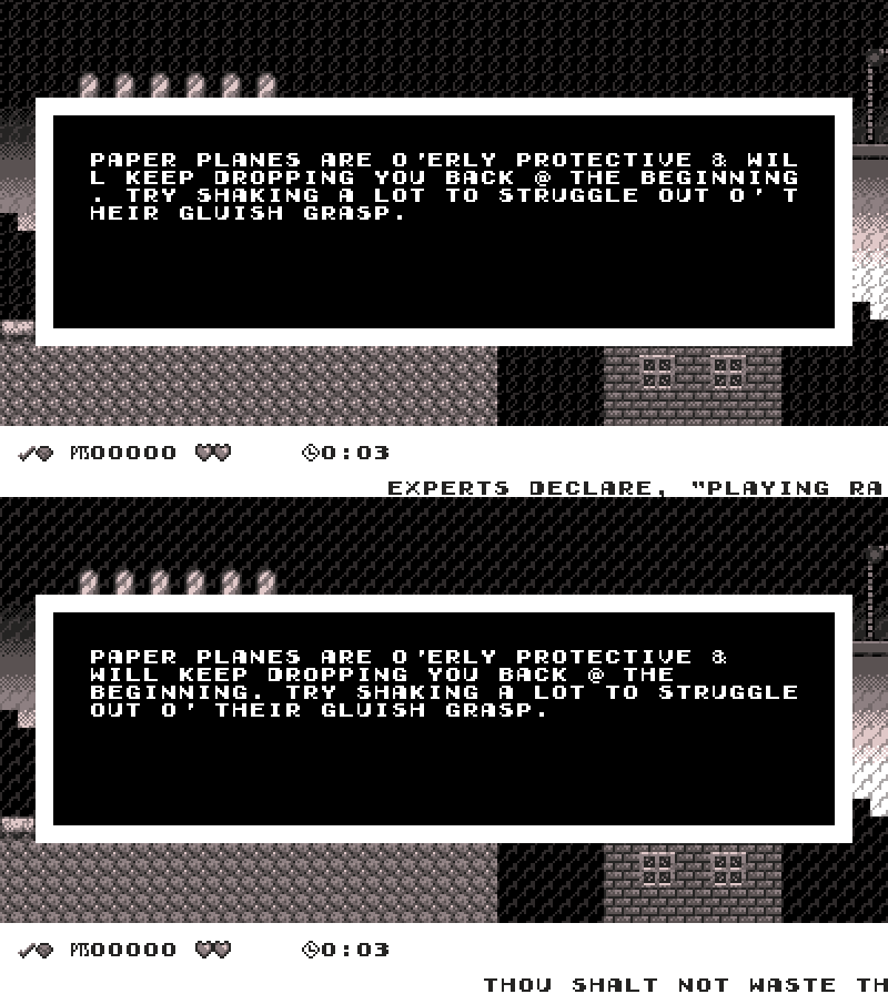
I also finally got round to adding an autoformatter for text, such as the text that appears in message blocks. Before, to keep them formatted, I had to manually calculate where to put line breaks, as it would naturally just go to the next line when it ran to the end, e’en if ’twas in the middle o’ a word. Now, it runs the text through a function that checks if the letter @ the start o’ each line after the 1st is a space or line break, & if so, it eliminates it, if it’s a different character ( which means it’s a word that spans ’tween lines ), it goes backward till it finds a space & replaces that space with a line break so that the word spanning 2 lines starts @ the next line.

Here is a before & after shot that demonstrates this:

So for this message, the algorithm stops on the 1st letter o’ the 2nd line, sees it’s not a space or newline & goes backward till it reaches the next space, right before the “W” in “will”. It then replaces that space with a newline, causing the next letters, “will” to be printed on the 2nd line, as shown.

It’s probably not the most efficient algorithm, but that’s fine, since it only runs once @ the beginning o’ a level.

I hope to finally get round to other code refactorings, but I have to be conscious o’ my time, ’specially as I grow older & become e’er mo’ senile.

¿& who knows what the future holds?

This code is still sloppy as a hippo & probably won’t compile on your computer.

Posted in Boskeopolis Land, Programming

Boskeopolis Land: Let’s Code a Crappy 2D Platformer Like Millions o’ Other People on the Internet & Lose Interest & Give Up Only a Few Months In, Part XXXVIII ( Boskeopolis Underground )

¿How long have I put off this post? I believe I was close to done with this level’s general design not long after my last post, & ‘pon just checking was surprised ‘twas only a month ago, e’en though it felt like much longer than that. Good: the longer life feels, the slower comes death. In fact, I distinctly remember I was finished before the end o’ that SGDQ thing. Thus, most o’ July was spent refining this level’s graphics, which always takes the longest, & irrelevantly creating options screens ‘cause I was getting tired o’ playing these levels with a keyboard.

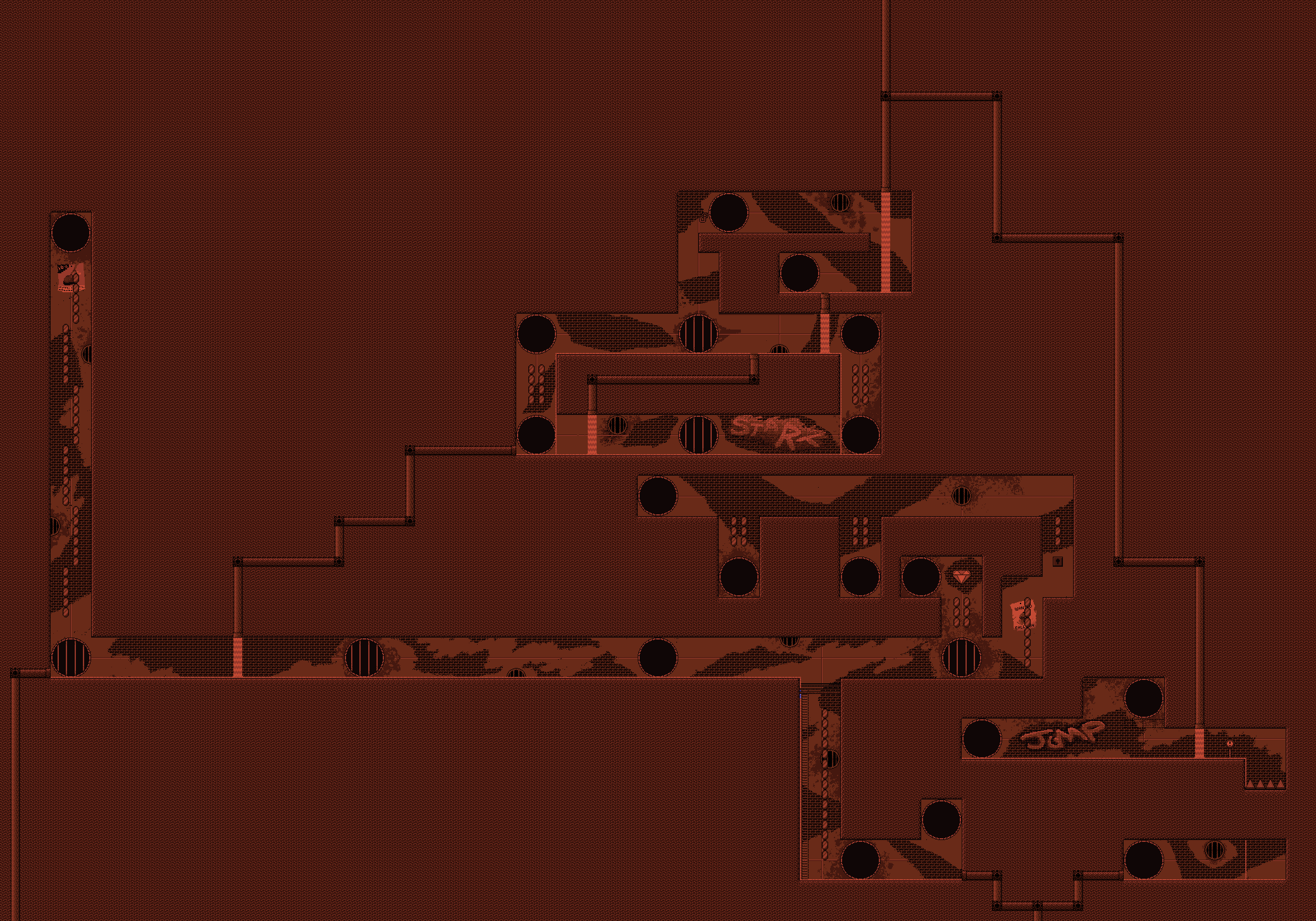
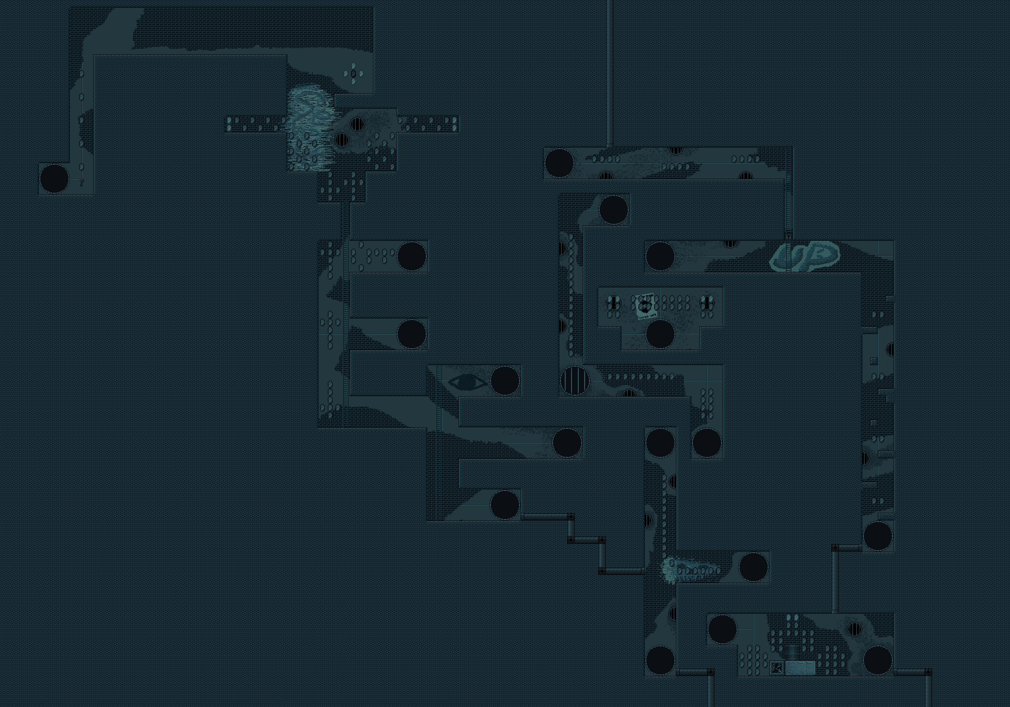
As the video shows, this level is a rather long maze level1 wherein you go back & forth ‘tween 2 rooms through sewer holes. As the maps below show, the sewer holes correspond to each other — using a sewer hole literally changes your map without changing your position @ all.

This time I didn’t bother editing the video, since it wouldn’t cut out much to be worth how awkward the abrupt cuts would look. ( The downside to my smoothing out the graphics &, ‘specially, adding audio is that it makes it harder to make clean-looking cuts: before the fade-outs & music, those message screens made cuts stupidly easy ). I tried to double-dip the 1st showing o’ the level with getting the gem challenge, but kept making mistakes grabbing gems, forcing me to go back round. Unlike most levels, I made this 1 force you to get every gem to beat the challenge. This is balanced by the level itself being calm & easy to beat, once you figure it out, ‘specially for what’s planned to be a 4th-cycle level. There aren’t e’en any enemies, so it’s literally impossible to die in this level. “Soupy Sewers” is harder ( ‘pon recently playing it & “Flush Flood” I’ve found that it’s harder than that level, too, which was less intentional ). I don’t mind it being a bit o’ a breather level before what I plan to be mo’ challenging levels following.

While I like how subtly winding most o’ the middle part o’ the maze is, I don’t know how to feel ‘bout the hidden key: it feels a bit cheap. The fake spike trap, too. Granted, it’s such an obvious hoax, since it’s the kind o’ trap that’s impossible to fall in accidentally; but making seemingly solid blocks act move-throughable as a puzzle always feels somewhat cheap to me.

Also, I feel like I might’ve made these rooms too rectangular. It’s not as if I didn’t have the sloped blocks already I could’ve used; the map’s just so packed together that I felt I couldn’t do it without having parts bump into each other. That said, looking @ it now, I could’ve had some o’ the vertical parts have sloped parts. I probably should’ve had that long block-climbing section have slopes ‘stead, since that part’s bland, anyway.

I love how I went all out to put all the moving water detail & the detailed background, only for much o’ it to be hard to see due to the darkness. Some may feel making things too dark is a cheap gimmick & that I should be deprived o’ a Twinkie, but this level has no serious platforming challenge, so it’s not much o’ a burden, & I actually despise Twinkies. A’least I added that pointless spotlight @ the last minute. I once planned on having a mines level with a “race to hit switches to keep the lights on” gimmick, but wisely decided that that gimmick is o’erused & obnoxious. “Blackout Basement” is 1 o’ the most bullshit levels in Donkey Kong Country.

This time I didn’t bother making a looping or tiling background, but just made a big image that fits each entire map. This made making the background easier in terms o’ logistics as I didn’t have to think ‘bout how to make it seamlessly repeat without being obvious that it’s repeating or do a bunch o’ complicated layers o’ backgrounds or create dozens o’ useless blocks to add li’l details like the posters & graffiti — ‘twas as simple as just drawing a picture, with no programming calculations needed @ all. I was surprised this level runs as smoothly as it does ‘cause o’ this. I’m not exactly sure how SDL’s textures work ( the downside to black-box encapsulation, as many stern C, & ‘specially assembly, programmers bemoan ), but I know the way the image files themselves work, by being PNGs with large parts o’ each image not being filled in ( parts ‘hind sold blocks ), the image files aren’t as heavy as they could be @ that size.

The graphics that took the most work was that sewer hole transition animation. Worse, it required me to add complex code that verges on entangling spaghetti. In my defense, I did try to isolate the code to the EventSystem class as much as possible; but I still had to add an otherwise needless render function to the EventSystem to be called by the LevelState every frame, though it’s only used in 1 level, & did had to add some extra code to the PlayerSprite class to take it into consideration. Also, now that I think ‘bout it, the EventSystem class is looking eerily like a God class. & as the wise programmer Bakhunin said, if there exists a God class, we’ll have to kill it2.

On the other end, it did save me from having to painstakingly add every warp point to the level document: since I had to add an extra, heavily-reprogrammed version o’ the warp code to deal with all the differences, I could easily change it so that it just changed your map without changing your position. This also made warping smoother as your corresponding position in the other map is the exact same, by the pixel, rather than being a specific position in the middle o’ the corresponding sewer hole regardless o’ where you were position on the other side before warping.

‘Nother boring detail: in order to minimize memory waste for this 1-level thing, I made the sewer hole code — it’s image information & such — a pointer to an object so it wouldn’t increase the size o’ the union it’s in too much. But for a while I messed this up in a subtle way, though easy to solve point: I made sure to clean up the pointer whenever the EventSystem object is reset, but forgot that sometimes it isn’t reset but straight-up eliminated through RAII when leaving a level ( the solution being the typical RAII solution o’ a destructor ). This is why it’s good to test with valgrind a lot.

Actually, valgrind brings the final point o’ my process: finally implementing the options screen. For the last year or so I’ve been focusing mostly on just completely the levels & planning to implement these other things when the main content was done, but I got sick o’ having to use a keyboard when playing all the time, & for some reason decided to make an options screen to remap keyboard & controller controls ( as well as save & load these mappings from a config file ), & before that a way to change screen resolution through options. I’ve been thinking o’ doing more o’ these other things to better use time wasted in designer’s block, as there’s still a bunch o’ things I want to implement, like shops in the o’erworld that sell things from extra hit points, bonus levels, improved oxygen, & other things. In fact, I’ve just thought it’d be fun if, after beating the game, you could buy Goldeneye 007 style cheats that could make you ridiculously faster or give you a double jump or other things ( which would disable getting time & gem scores when using them, ‘course ). You could say this ultimately comes from a transition in my expectations for this project: from a mindset that wants to ensure I stay focused & actually finish this project to an acknowledgement that I’m definitely finishing it @ this point & a desire to optimize the use o’ my time.

Actually implementing the joystick didn’t take too much time this time ‘cause I already did it before, I just commented it out ‘cause it causes a memory leak, a’least according to valgrind, that I can’t fix — it seems to be on SDL’s end, not mine. After wasting way mo’ time that I’m happy ‘bout trying to upgrade SDL on my computer, I’ve come to accept it. You could debate whether it’s a true memory leak, since it’s a single “loss” o’ memory that will ultimately be cleaned up by the OS when the program is closed. Memory leaks are only truly meaningful when they’re a repeated loss o’ memory, since that is what leads it to actually cause problems: creeping loss o’ memory till you ‘ventually run out.

However, the 1 serious problem is that I still need to watch out for my own memory leaks, which do still fall into this problem; but ‘cause valgrind is whining to me ‘bout SDL’s joystick code, it clouds my own memory leaks. My solution this time is simply to keep all joystick code ‘hind compiler codes so I can temporarily turn off joystick functionality when testing for memory leaks. The only downside is that for some reason I have to clean & recompile my whole project whenever I want to make this compiler change. You’d think just deleting the object files for the input & main files would suffice, since they’re the only files that acknowledge any o’ this code. All everyone else knows is some function that returns some entry to some array that is no mo’ tied to the joystick code to key presses, with the controls options knowing ‘bout some other functions that send some abstract enum value corresponding to an action to the input & taking in strings from input. No one else e’en knows that “joysticks” or “key presses” exist.

Below is a video demonstrating the new exciting options screen:

As usual, I had to remake this video many times ‘cause I kept noticing subtle aesthetic flaws like missing sound effects or not-perfectly-spaced text.

Anyway, all that matters in all this is that I 100% kept my promise & did “Boskeopolis Underground” next, & e’en kept it @ that name, though I did consider renaming it to something like “Septic Labyrinth” or “Gutterly Annoying”, since “Boskeopolis Underground” sounds rather bland & the reference will probably be lost on everyone. But those other names sounded e’en stupider, & the last thing we need is ‘nother alliteration name. I’ve gotten sick o’ those. Yeah, it’s a cute reference to Rare — but sometimes cute references just fall into laziness, ‘specially the “Food Place” pattern ripped off from Kirby. That’s a cute reference when you do it in literature; but in video games, then it just becomes incestuous. Honestly, I’m thinking o’ renaming a bunch o’ the levels I’ve already done with lame names like “Milky Mountains” or “Soupy Sewers”.

No promises for what’s next, though, as I’m working on a few new things simultaneously. However, close candidates are “Dark Sahara”, the 3rd-cycle desert level & last I need to develop, & “Good-Ship Lifestyle”, the 4th-cycle pirate level. For the former I’m still thinking ‘bout how I want it to end, & I’ll probably finish it 1st; the latter has the much mo’ arduous roadblock: I’m thinking o’ giving it a boss, which’ll involve a lot o’ complicated programming. Then ‘gain, I may separate the boss as a separate “level” — not the least ‘cause I don’t want a player to have to go through the whole level & boss in 1 life & would rather avoid adding midpoints just for 1 level. I still want to finish “Petrol Pond Place” & maybe “Mt. Volcocoa” this summer, but still haven’t figured out how I want them to be designed. With “Petrol Pond Place” I toyed with a tube you could move round in, but found trying to implement it difficult with this game’s rather rigid block-based collision detection that make walls thinner than 16 pixels infeasible ‘less I add or change a lot o’ code.

Posted in Boskeopolis Land, Programming

Let’s Code a Crappy 2D Platformer Like Millions o’ Other People on the Internet & Lose Interest & Give Up Only a Few Months In, Part XXXVII

Fortune Beach

( Formerly “Banana Beach” ).

The logical process I went through to come up with this level: 1st I used the idea o’ secret passageways in the sand that fade into view when you touch them, ripped straight off from Wario Land 4. However, I quickly figured out that basing an entire level on hidden passageways that fade in isn’t interesting. Since I had the gimmick, though, & due to the laidback nature o’ beach levels, I decided to focus this level on exploring & collection. Since having just 1 goal @ the end didn’t fit that well, I though o’ having multiple collectables that all had to be collected to beat the level — most likely in treasure chests. However, I already did that for “Sleet Streets”. So I ripped off that Zelda level in Super Smash Bros. Melee & had only 1 random chest out o’ all o’ them have the goal, while the rest just had money. Then, finding that still not ’nough, I decided to tack on water currents just to hide goals. Maybe I should actually use these in a mo’ developed way in ’nother level ( where, I have no idea, since it wouldn’t fit into the other water levels I have planned, a harbor & a pirate level ).

The fading-in passageways & water currents were simple to implement. Technically, I already implemented the former in “Mart Cart Madness” to hide a shortcut there, but that was implemented in a completely different & hacky way with just a specific custom sprite. This level uses a much mo’ flexible foreground layer that just checks if the player is touching any o’ its blocks & either fades in toward max opacity if not & fades out to absolute transparency if yes. The water currents just subtract a certain # from your character’s X position & does some other stuff like changing that # or also killing your X velocity depending on whether you’re ducking or on the ground based on playing round trying to break it. I’m sure some clever speedrunner could still figure out how to break it, but trying to perfectly prevent that kind o’ glitching is both futile & no-fun-zone. My philosophy has always been that if someone finds a way to break through my rudimentary tests, then they deserve that victory. There’s already still that glitch where you can zip up certain solid blocks if they’re a short height ’bove the ground & you jump into the leftmost edge, which I found could be used to cheat & get a diamond early in ’nother level I’m developing & will probably show off when I get to that level.

As always, the random chest mechanic was taped on. Then ’gain, I did have to get rid o’ that whole “using variables for something else” thing for the treasure chest sprite used in the last level I made, “Crying Lightning”, since in order to reuse the chest-opening code, I had to move that code to a treasure chest sprite that they both inherit, rather than in that weird treasure-opening player sprite. Handling the random selection o’ treasure chests is through a dumb static variable, which is probably a waste o’ memory, since I think that variable will take up space throughout the whole game. An improvement would be to use 1 o’ EventSystem’s miscellaneous variables used for the boss gate in “Reading Railroad” & the moon timer in “Pepperoncini Pyramid”; but I would have to make up ’nother variable for the other. Plus, I would have to change that variable to make it work, & that would mean changing the boss gate & moon sprites & recompiling them, & I don’t feel like doing that now, so that’ll be for later. This is, like, #2515901 down the list o’ most useful optimizations.

Actually, speaking o’ glitches, through the development o’ this level I stumbled ’pon an astounding glitch — most astounding in how long it’s been here without my noticing. For some reason, Autumn would regain oxygen when in that left corner o’ the underwater area with the chest & in that hidden underwater gem cache just ’bove it. ’Ventually I narrowed it down to a single mistyped letter: “X” ’stead o’ “Y”. The code for determining whether Autumn’s mouth was below the surface o’ the water for water blocks wasn’t using her Y value, but her X value. @ 1st this befuddled me how this didn’t completely screw up oxygen in levels with water, but then I realized that every other level with water blocks1 was far mo’ horizontal than vertical & had water far ’nough ’head that the bottommost blocks were guaranteed to be less than your X value, making them essentially just make you lose oxygen if you’re touching them2. Since the difference ’tween touching a block & having your face ’bove the water is subtle, it’s a lot easier to see why I ne’er noticed.

This was a fun level to make. Many o’ these levels are simple, short, & linear, which most o’ the time better fit this game’s simple gameplay; but I generally prefer mo’ open-ended levels with multiple paths, & this mechanic gave me a perfect ’scuse to do so. Though I find it amusing that such a wide-open level can be beaten in 5 seconds, if you’re lucky.

Which brings me to what I wouldn’t necessarily call the worst o’ this level, so much as the part that makes me feel guilty: as the video shows, have fun getting the time score for this level. Thanks to this gimmick, you have a 1 / 5 chance o’ it being possible, & you still have to not play too sloppily, ’specially if you want to avoid getting hurt @ all. But a’least they’re short, quick failures, & these failures likely won’t lose you gems like actual deaths. An idea I entertained was changing the chosen chest from being ultimately based on C’s rand function to being based on something like the animation frame on the water in the o’erworld, but that’s an minute detail for later — & anyway, I plan to change how the water animation is programmed later for optimization reasons, so that would be a complete waste o’ time to do it now.

The gem challenge was harder than I expected, thanks to all those gems down there in the underwater section & Autumn’s impatient lungs. Part o’ this is how long it takes, with such a big level with so many gems scattered round — in the video it takes me nearly 2 minutes; & I know where everything is. Actually, that’s not true: hilariously, as I was playing this, I forgot ’bout a cache o’ 1,000 gems ’hind the rightmost chest, in that hidden cave wall. Thanks to that, the gem challenge is mo’ lenient than I expected, which counteracts this gem challenge’s difficulty.

I’m still thinking ’bout where I want this level. I think currently the plan was that “Tubboat Blues” would be a Cycle-1 level & this a Cycle-2 level, but I’m thinking o’ switching them round. “Tubboat Blues” has many mo’ threats in the form o’ the many Peanutbutterfish infesting the waters; but “Fortune Beach” is bigger & requires mo’ exploration, while “Tubboat Blues” could be beaten in a straight path. On the other side, “Fortune Beach”’s difficulty is primarily its gem & time challenges, while just beating it could, if one’s lucky, require just a few hops o’er blocks, chomps, & 2 crabs to the left. So most likely, this will be a Cycle-1 level & “Tubboat Blues” will be moved to the 2nd Cycle.

I’m almost 100% certain the next level I show off will be “Boskeopolis Underground”, ’less I rename that level, in which case technically I’ll still be breaking my promise3. That level’s already done, in terms o’ basic structure; I’m just sprucing up its graphics ( the most time-consuming part for the kind o’ person afflicted with the perfectionism o’ wanting their game to look as good as, say, Kirby’s Adventure or the Mega Man games, but doesn’t quite have the skills to actually pull it off ).

Also, I’ve just realized as writing this that I keep forgetting to show that link to the Github where this code is kept. That’s OK: it’s probably unreadable by this point. I have this ironic problem where I generally don’t write comments ’cause it’s better to have the code be self-explanatory, & then don’t make the code self-explanatory, completely killing the ’scuse I had for not writing the comments.

Read this game’s unreadable code

Posted in Boskeopolis Land, Programming

Let’s Code a Crappy 2D Platformer Like Millions o’ Other People on the Internet & Lose Interest & Give Up Only a Few Months In, Part XXXVI

Crying Lightning

No, I hadn’t taken a break — it just took this long to complete something. I think I’ve been hinting a few times in previous updates that I was s’posedly close to done with this level; & indeed, most o’ the general level layout had been completed, save adding in extra gems & a few extra crevices ( including the diamond, which I realized late in development I’d forgotten to put into this level ).

As usual ’twas the aesthetics that took the longest time. Foremost was that fancy treasure-chest-opening animation, which seems simple, but took a whole day off to accomplish. As always, this involved many silly hacky code that gives the illusion that this is a sane world. To keep my sanity & not gunk up the player sprite’s code with a bunch o’ code that 99% o’ the time is irrelevant, starting the chest-opening animation replaces the player sprite with a totally different sprite in the same place with the same direction. The rest is a series o’ moving the sprite round & changing its graphics frame. & ’course, the sequence o’ movements are handled the same way I code just ’bout everything else, a simple finite state machine switch statement.

The mo’ hacky part o’ this code is that, due to the limitations o’ polymorphism & being so cheap in memory that I didn’t want to waste precious frames on dynamic cast or extra variables, I use the treasure chest’s top_speed_ & start_speed_ members to handle how much the top half o’ the treasure chest is open & how high up the keycane is. Hey, they’re not used anywhere else; they might as well pull their own weight. Speaking o’ the keycane: it’s actually bigger than the bottom half o’ the chest, so I had to shrink it & make it grow as it rises till it reaches full height so its bottom doesn’t poke out from below the chest.

You’ll note @ the end o’ the time-score run that I was able to end the level before the animation finished. Though I do, indeed, want swanky animations so this game looks halfway professional, I insist on not having it slow gameplay too much as so many games do.

& then there was the sound effects, the last jingle being the only thing I crapped out in some MIDI player & still sounds weird — mo’ like eerie alien music than a celebratory jingle.

While making the treasure-opening animation, I implemented fade-ins & fade-outs ’tween game states, a long-awaited change, as the transitions before always looked abrupt & jarring.

I have mixed feelings ’bout this level’s difficulty, but I feel they balance themselves. The level’s short ’nough that I feel like it may be a bit too easy for a 3rd-cycle level ( actually, I originally planned to have it be a last-cycle level, but decided to switch it with “Hoot Chutes”, which will definitely be harder than this ). I considered trying to lengthen it, but it’s actually the length I generally aim for for these levels; it just seems short ’cause many levels, ’specially late-game levels, don’t end up that way for some reason. ’Sides, it feels complete the way it is.

Contrariwise, the gem & time scores are a pain to get. For the gem score, it’s ’cause you have to be in certain places, such as ’bove every fading-in-&-out cloud platform & in that tight space just to the left o’ the beginning, which doesn’t leave ’nough space to run ’way from the lightning. Meanwhile, you have to time jumps o’er the fading cloud platforms & the lightning, & unlike normal playthrough, you can’t wait for both to be aligned well. For some reason I insisted on making these scores as anal as possible: the time score is as quickly as I could possibly do, & the gem score requires you to collect every gem.

However, we could say these challenging scores balance the easy normal gameplay. & as I prove in this video, you can beat both the gem & time score without getting hit once ( which is better than some other levels I’ve made can say, such as “Mart Cart Madness”, which, I think, requires a hit just to beat it @ all ).

& despite these mixed feelings, in general I think this level has a solid gimmick, which surprised me, as I had misgivings ’bout it @ 1st. I was surprised by how fun ’twas to figure out how to get all the gems & get to the end without any delays while maneuvering round the lightning. You’d be surprised by how subtly different timing can make going into that left crevice @ the beginning go from a guaranteed hit to narrowly dodging the lightning. Unlike most gimmicks I lazily program, this one has no randomness, too: the lightning’s on & off durations are always the same length o’ time. I also like how the cloud monster’s momentum works: it’s faster than you, obviously, since otherwise you could just outrun it; however, it’s acceleration is worse than yours, so it takes a long time to turn round & chase back after you.

Looking @ it now, the only weakness I think this level has is that the diamond is in a rather lame place; but my other idea, having you get it by reaching some high place just left o’ the 2 rows o’ cloud platforms in the middle o’ the level from bouncing on a cloud, was e’en lamer. My logic for this hiding place was to hint @ it with the hiding place @ the beginning & the way you have to go through clouds squeezed together like that @ the rightmost end o’ the level. Also, it’s right @ the end as a way to “challenge” you not to be to hasty & grab the treasure chest being looking round.

The next level I’m almost done with is “Boskeopolis Underground” — which would complete all 4 sewer levels. However, that still needs a lot mo’ sprucing up. Also, I’m almost always wrong ’bout what level I’ll finish next, so expect a completely different level next.

Posted in Boskeopolis Land, Programming