I didn’t finally give up on this immense waste o’ time ( though a sane person would’ve years ago ); I’ve just been implementing a bunch o’ things — all @ once ’cause implementing 1 form tore apart the code in other parts, so that the game was in a broken form till I finished most o’ it.
We have a lot to go o’er…
New Title Screen
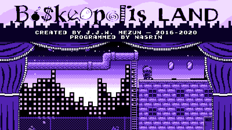
As the video shows @ the beginning, the basic animation I had before has been replaced by a “trainer” like @ the beginning o’ Super Mario World. I don’t know why I didn’t think to do this till now, since the ol’ animation I had was rather generic & I clearly had autoplaying on my mind way back when I made “Rooftop Rumble”. Maybe I just hadn’t had the confidence yet.
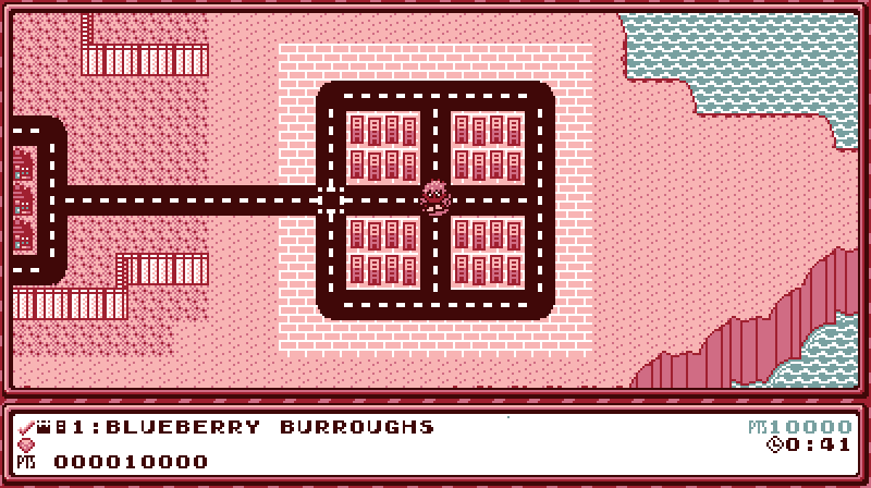
Codewise, the TitleState instance just includes an instance o’ LevelState, but uses a slightly different update function & has a camera with different dimensions. The player character uses the same input component “Dagny” does in “Rooftop Rumble”. In the code as it stands now, the title screen randomly cycles through “Blueberry Burroughs”, “Wasabi Woods”, “The Amazon Jungle”, & “Rooftop Rumble” — though for this video I hacked the code so that it showed the same levels in the exact sequence I wanted so I could show off multiple without the risk o’ repeats.
’Cause I actually quite liked the building animations, I kept them in a shortened form @ the top o’ the screen ’hind the title. The curtains, which are flagrantly inspired by Super Mario Bros. 3 ( though they look mo’ like the curtains in Super Mario Bros. 2 USA ) I already drew for “Play in the Background”.
I probably spent mo’ time trying to record good-looking movement for each level. I didn’t spend ’nough time on “Blueberry Burroughs”, which is why it’s good that I skip it in this video. ¡But look @ that movement in “Wasabi Woods”! ¡That’s some dancing there! Actually, if you compare this to an earlier video you’ll see that I edited the level a bit, making it easier ( I always thought ’twas way too hard for the 3rd level o’ the game — still do, actually ) & making it so that you can play through the level without stopping, as shown in this video.
For those wondering who “Nasrin” is & why I’ve been stealing credit for their hard work till now, it’s referential humor that won’t make much sense now, since none o’ the relevant stories have e’en been published yet. Nasrin is a character who is a programmer & learns “programmagic” in some stories & also plays an authorial role in some stories. This is also a pun off the “Programmed by Nasir” message found in Final Fantasy & other Square games Nasir Gebelli worked on. The immense similarity ’tween their names & professions was too good to pass up, e’en if the joke will only make sense to anyone who doesn’t read this explanation decades from now.
Localization
When adding Muertoween-themed messages to that stupid marquee @ the bottom o’ the screen for “Mind Your Manors”, I discovered how limited my then implementation o’ text was. It just used basic C++ strings as basic arrays, which is… wrong. Calling bytes “chars” is 1 o’ the many lies C & C++ tell you.
Actually, to truly handle all kinds o’ unicode characters well you need a full-fledged character library; but that library probably wouldn’t work with the way I handle drawing characters, so I stuck with the next simplest solution: using u32strings. Using fixed-sized UTF-32 characters is simpler & probably mo’ efficient than using variable-sized UTF-8 characters as I can just worry ’bout converting from UTF-8 to UTF-32 once & then treat the new string as a basic array ’gain. On modern computers using mo’ memory to save running complicated conversion code code repeatedly is probably faster, ’specially since on most computers UTF-32 characters would be the size o’ a basic word. But I would still prefer it e’en if ’twere slower.
I’m quite sure the new text format still has flaws. While it can handle multiple character frames for a single character, such as used for “…”, it can’t handle combining characters, so Arabic translation would be problematic. Also, characters are pretty much hard-coded to being 8×8 pixels ( technically, I could change 1 constant to change that size for the WTextObj class; but many places where spacing has to be managed precisely would basically break if the character size changed; & since many screens try to squeeze as many characters as they can, I don’t e’en know how I could fit larger characters ). In order to implement Japanese, as shown in this video, I replaced most kanji with hiragana ( as many ol’ Japanese games did to save memory ), which is simpler. But I have no idea how one would implement the complex characters o’, say, Chinese, which have no simpler characters to fall back on, in only 8×8 pixels. But if you want to play the game in French, Japanese, or Russian, you’re golden… so long as you find someone to make the translations, as mine rely heavily on Google Translate & are probably as good as the English found in Ghost ’n Goblins. Also, none o’ the localizations are finished, since this simple platformer has a lot mo’ text than I would’ve imagined ( & it still doesn’t include error text yet ).
As I was implementing this, I cut out all text that is localized into separate JSON files, 1 for each language, & load the text from here. Changing the language changes what loaded text to use. To make a localization, one only needs to copy ’nother localization file & replace all the values with different values. If that language uses a different character set, just make a new image, put it in assets/img/charset ( & make sure it’s an indexed png with a’least 7 colors or 6 colors & transparency ), & put that filename into charset->image o’ the JSON file.
There are still many limits, though. As mentioned, some screens have limited space, which works for the English translation, but may not be ’nough space for some translations. Since starting this I have tried to make spacing dynamic to the text if I can or leave extra space just in case. Also, setting key bindings & typing filenames ( which will be relevant in the next section ) still use only basic alphabet letters.
I completely rewrote the code used for drawing text to the screen so that it’s much simpler & much mo’ dynamic. Rather than running half-hearted but complex code every time it drew text, the new version runs complex code @ the start to generate a simple list o’ lines, which each hold a simple list o’ character frames with character coordinates & position. This makes handling centering or right-aligning or changing specific characters in text much simpler. Now gradually appearing text doesn’t need to embed itself in the code that generates the frames but can just work on the frames afterward.
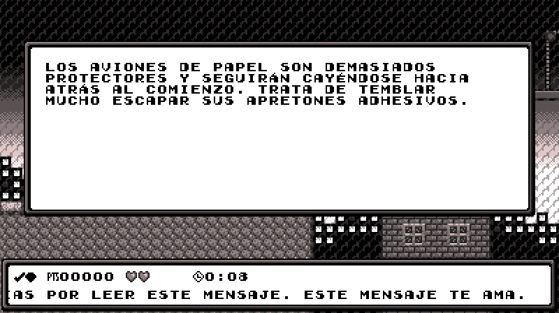
In addition to the centering & autoformatting in the ol’ text code, WTextObj instances can now have autopadding, which only applies if there is extra space. This makes working with text that may spill into multiple lines in other languages simpler. For instance, as the video shows, when “Empieza el juego” spills out into 2 lines, it still fits in the box, just with less padding ’tween lines.
Save Files
For the longest time I knew allowing only 1 save would be embarrassingly lame & that no serious video game made in the 21st century would have such a ridiculous limit, but I was ne’er quite sure how I wanted to implement it. I also knew that I didn’t want to limit the player to only 3 or 4 saves, either; the player should be able to have as many saves as their hard drive can hold.
The way most computer games would handle multiple saves would be to have the player directly save a file to their hard drive & directly load it from the computer. Howe’er, including window system interaction in my game would heavily complicate my game’s ability to be crossplatform. The main platform I work on, Linux, doesn’t e’en have a single window system, but probably hundreds.
Finally, I compromised by allowing the player to create any # o’ files ( so long as they have the space for that extra 800 bytes ) by selecting the “New Game” box @ the bottom & having all files ’bove it. Each save file needs to be given a unique name. The player can also copy & delete saves ( when you copy a save, you have to give the copy a new name, which defaults to “[original name] copy”.
Technically, this system isn’t finished. While it all works well in terms o’ pure behavior, I haven’t implemented any scrolling, so if you have too many saves, they go past the bottom o’ the screen, hiding the “New Game” box & crowding into the options boxes.
I also implemented a basic backup system: whene’er you save it also creates a copy o’ that file with the “bak” extension. When loading, if the game e’er finds a save file missing or corrupted, it tries to replace it with the backup.
Hilariously, I figured out a way to simplify saving to a file as simple as a 1-liner. All this time I’ve been using some long code that manually plugs values into an external file. Now I realized I could just memcpy the save file’s data directly to & from the external file & it works just the same.
New O’erworld
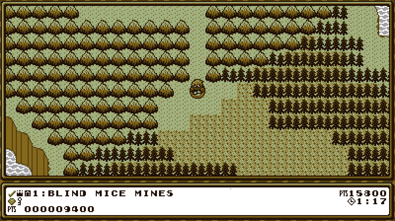
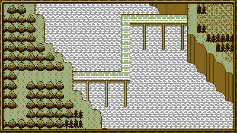
I basically reprogrammed the o’erworld, as the ol’ version was hard to change & was sluggish. I have since learned that drawing hundreds o’ small tiles every frame is much slower than generating a few textures every rare update & drawing those few textures every frame, so I do that ’stead. Since terrain collision is just solid or not solid, it’s just a list o’ booleans for every tile & uses your position & some simply math to index into that list.
I completely revamped the event system, which I made way back when I 1st made the o’erworld, but ne’er used ’cause ’twas too clunky to edit. Now, like almost everything else in the game, it’s all separated out into JSON files. Furthermo’, now ’stead o’ just silently changing the map, we have a cutscene that moves to a chosen tile & starts changing tiles frame by frame.
Just a few days ago I decided to add a frame round the o’erworld — ’nother idea I stole from Super Mario Bros. 3.
In addition to normal level tiles, we have a new tile type…
Shop
I’ve been planning to implement this for years. I knew that if I gave the player tons o’ money, they would need somewhere to spend it.
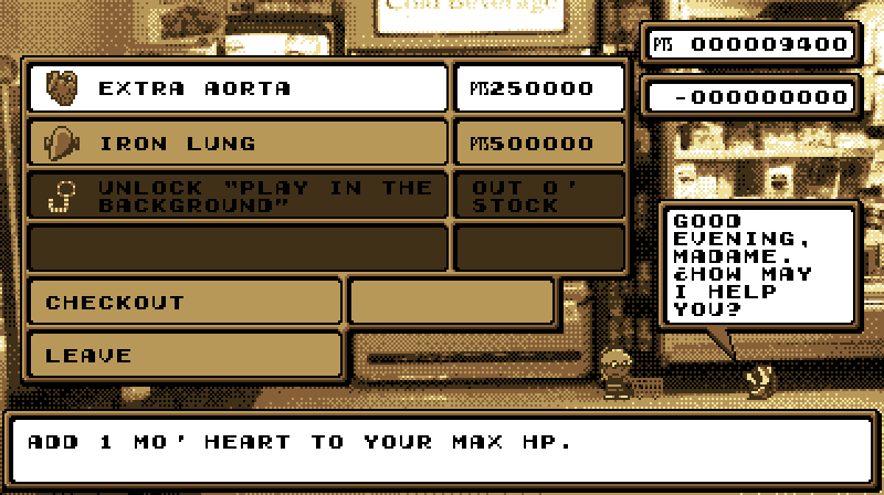
This is 1 o’ those things that took way mo’ time to design than program. In terms o’ programming, it’s just a list o’ objects that set inventory values when you buy them. Howe’er, figuring out how to fit all o’ the info well into a single low-resolution screen was tricky. Luckily, my day job is web development & design, so I’m used to it.
Speaking o’ web development, I made the shop work mo’ like an online shop ( & real shops ) wherein you select the items you want to buy, & then pay & get them all @ once when you select checkout. This admittedly made designing the screen harder, as it forced me to include a “Checkout” box, a box for shopping what products you have in your cart, & total price @ the top right. But it saves the player having to go through confirmation & “Thank you” boxes for every product.
I’d be happy if you could ignore the fact that the store is much bigger than Autumn — so that either Autumn has been shrunk to the size o’ a mouse or the store was made for giants.
Currently, there is only 1 shop that sells just an “Extra Aorta”, which increases the player’s max health by 1 hit on normal difficulty; an “Iron Lung”, which increases the amount o’ time you can spend underwater; & the 1st cycle’s bonus level, “Play in the Background”. As the video shows, beating it doesn’t unlock anything other than 100% ( which will be necessary to unlock something special ). All o’ these I have been planning for years. I ’ventually plan to implement a’least 2 mo’ shops later in the o’erworld, as well as the other 3 cycles’ bonus levels. I also thought ’bout implementing alternate costumes, characters ( making Edgar & Dawn playable ), & a way to unlock normal levels without beating the level before them ( essentially level skips without actually giving you credit for beating those levels ).
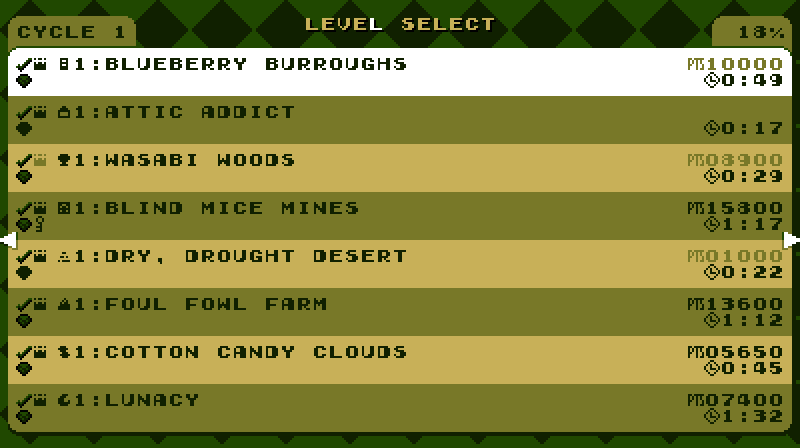
New Level Select
It looks nicer & is divided by cycle now.
New Levels
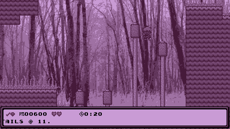
The video foreshadows 2 levels I’m working on: an attic level & a bayou level. I sort o’ worked on these in the midst o’ working on the other stuff, so I couldn’t show them off beforehand. Anyway, neither is totally done — though “Bayou Jupiter” is almost.
Ol’ Levels
If you compare some o’ the levels shown in the video to their originals, you’ll noticed I updated them a bit, usually to spruce up their graphics, but also sometimes to better balance their difficulty.
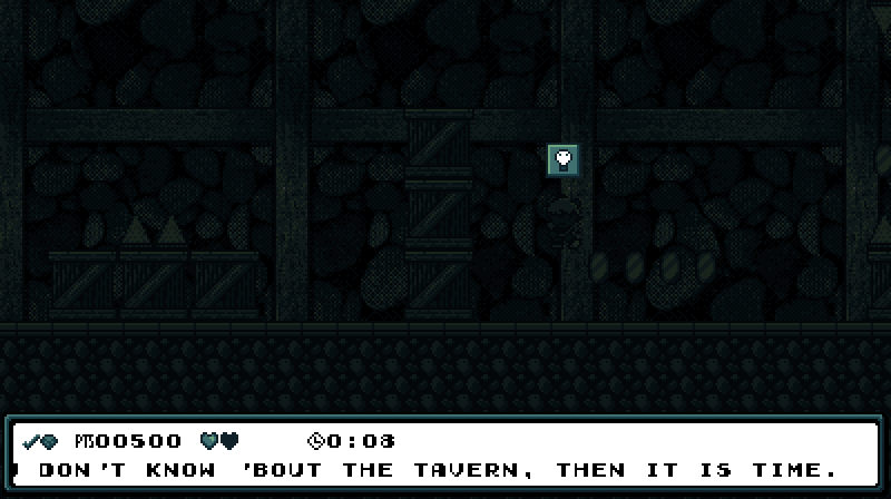
The most changed level is “Minty Mines”, which has now been renamed “Blind Mice Mines” & replaced its minty green with teal. I felt having a green level right after ’nother green level would be too repetitive.
While I technically redesigned the level from the ground up, I kept most o’ the general theme: go right, then down, then left, get a key, & loop back to the beginning o’ the level to open the chest. The diamond is still locked ’hind a locked box a li’l before you get the key, forcing a bit o’ backtracking. I just cut out some o’ the awkward challenges, like the spikes on the stairs downward, which are hard to see, while adding mo’ basic jumps & falling spikes that fall too slowly to e’er hit you.
The main changes were the darkness gimmick & the secret exit. The darkness gimmick was something I implemented a long time ago for an aborted level — though I had to hack the rendering functions to allow the light switches & spikes to still be bright ’bove the darkness. I aborted the other level ’cause I felt “make the level hard to see” was unfair & not fun. But then inspiration struck: ¿what if I implement darkness on an early-game level & just not make it challenging? A level can’t be unfair if there’s hardly any risk o’ death. But the darkness & light switches do spruce up what was otherwise a boringly easy level. Early-game levels are always hard to make exciting without the ability to make them actually challenging. Darkness without real threats is a good way to fake it where it can’t truly exist.

Secret exits were something I’ve been wanting to implement for a long time. I always felt that with this game’s level sequence spiraling back round to the same areas repeatedly, secret exits that opened up paths to skip a cycle — as warp zones, effectively — would fit perfectly.

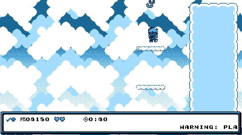
I already mentioned “Wasabi Woods”, but “Cotton Candy Clouds” was also made much easier. Since “Value Valhalla” was easier than this level, I almost switched them; but I wanted to keep the other “collect x # o’ gems” level farther from the 1st & felt like it’d be much mo’ interesting if I make the “Value Valhalla” level harder & the “Cotton Candy Clouds” level with its far less inspired gimmick ( stolen from Wario Land 3, ’course ) easier. I shortened the level by cutting out the weakest parts & added much mo’ space to the area under the brambles where you collect the diamond. The staircases where you go down & up while avoiding Pufferbees were awkward with the camera, & the 1st iteration, going down, was way harder than the ending iteration going upward. The final challenge pushing you to jump up 3 fading platforms @ once is far mo’ relevant to the gimmick. But to keep from the gimmick o’erpowering the level ( a typical rookie mistake & a commonly cited reason for why many people prefer Donkey Kong Country 2 o’er Donkey Kong Country 3), I added a section where you have to jump up thin platform without hitting the Pufferbee moving left & right & then jump out o’ the way before the Pufferbee comes back. This is much mo’ manageable for players still getting acclimated to the game.

I also spruced up the level’s graphics, taking advantage o’ the background & foreground layers that I hadn’t implemented yet when I 1st designed the level to eliminate cutoff, such as with the ladders gainst the cloud fringes. Most notably, I replaced the big cartoony brambles with the simpler bramble tiles found in “Brier Flier”. This was a hard decision to make, as I felt the older graphics were mo’ visually appealing & made it less obvious that the they were a grid o’ tiles. On the other hand… they made it less obvious that they were a grid o’ tiles, & thus harder to tell what parts were harmful & which not. I decided that keeping gameplay solid was mo’ important than visuals.
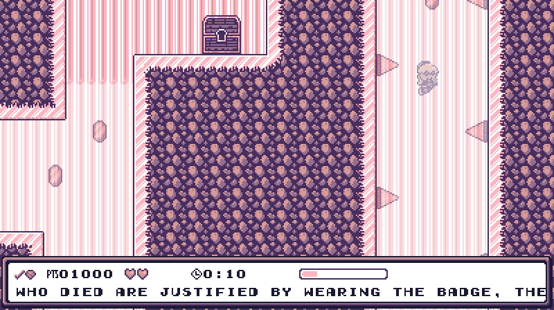
I moved “Chillblain Lake” to the 1st cycle, swapping with “Ice Box Rock”, which is now in the 2nd cycle. I debated this change, ’long with the “Cotton Candy Clouds” / “Value Valhalla” switch, but this time I went through with it. I still have qualms with having ’nother key & chest level so soon after “Blind Mice Mines” — to the point that I almsot considered making “Blind Mice Mines” have just a regular keycane goal if I didn’t think exploring the dark level for the key was an important part o’ that level’s challenge. Howe’er, I feel dodging the spiky olives in “Ice Box Rock” was far harder than anything in “Chillblain Lake”, & I feel making that challenge easier would ruin its fun, while this level doesn’t need to be harder than a 1st-cycle level to make its gimmick fun. Plus, with “Value Valhalla” still in the 2nd cycle & the 2nd cycle also having “The Amazon Jungle”, we already had ’nough pink levels in the 2nd cycle.
I made 1 change when I moved “Chillblain Lake” to the 1st cycle: I replaced the fish enemies with spikes on the walls. I felt the fish were too unpredictable to be easy ’nough for such an early level, while the spikes are frivilous: just stop in the center & swim straight up.
Other levels received mo’ minor updates:
- I updated “Porcelain Dreams”’s pipes to replace most o’ the odd blocks on their corners with cornered pipes & added edge lines to the brick walls so there wasn’t so much cutoff. I plan to redesign much o’ this level, as I feel its gimmick is underutilized; but I ran into designer’s block & decided to wait till later.
- For “Foul Fowl Farm” I removed a tricky Noko no Pollos.
- For “Lunacy” I added extra space ’tween the spike shafts, which previously required far mo’ precise timing than I was comfortable with for a 1st-cycle level.
- Finally, I added a diamond to “Gravity, Hypocrisy, & the Perils o’ Being in 3-D”, which I’m shocked I’d forgotten to add this whole time. I also increased the player’s speed, since I was actually kinda bored as I was playtesting it.
The Future
I can confidently say the game is mo’ than halfway done — which isn’t that impressive, since I’ve been working on this now for o’er 3 years. Other than finishing the o’erworld & shop, fixing the graphical limitations o’ the save screen & localization, implementing user-friendly error messages in case certain files go missing ( a downside to using so many JSON data files ), & sprucing up things here & there, which I’ll inevitably do as I go on ( ¿how much have I updated the graphics to “Blueberry Burroughs” since I 1st created it @ the beginning o’ this project? ), all that’s left is the rest o’ the levels, a final boss ( & possibly a hidden final final boss ), & credits.
O yeah — I’ve also been thinking ’bout replacing the big diamonds with cards, which you will be able to look @ through the options in the o’erworld to read flavor text full o’ references to Boskeopolis Stories. Basically, they’d be like the cards in Simpsons: Hit & Run. I’m still working on the card’s animation frames, so I haven’t e’en started on the options screen yet.
