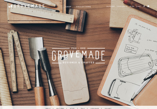
Where would I be without Six Revisions to give me the snoop on all of the truly important web design trends. For instance, while CSS-Tricks wasted their time telling you how to optimize table space using CSS-translate to rotate long row headers—as if that’s important, phhh, nerds—Six Revisions told us ’bout all of the portfolio websites that put huge images of cluttered workstations as their backgrounds.
Gube thinks this is good, and I agree: ’fore I hire web designers, I always ensure they have sloppy home organization.
But my favorite example is the one near the top:

Nothing inspires confidence like text that’s near-impossible to read. Looks like GroveMade—or however they style their insipid brand name—needs to start hitting those color theory books ’gain.
Addendum:
What’s also professional is a website that takes eons to load & are unintuitive to use. That’s 1 thing ’bout web design: they always find new ways to inconvenience users.


