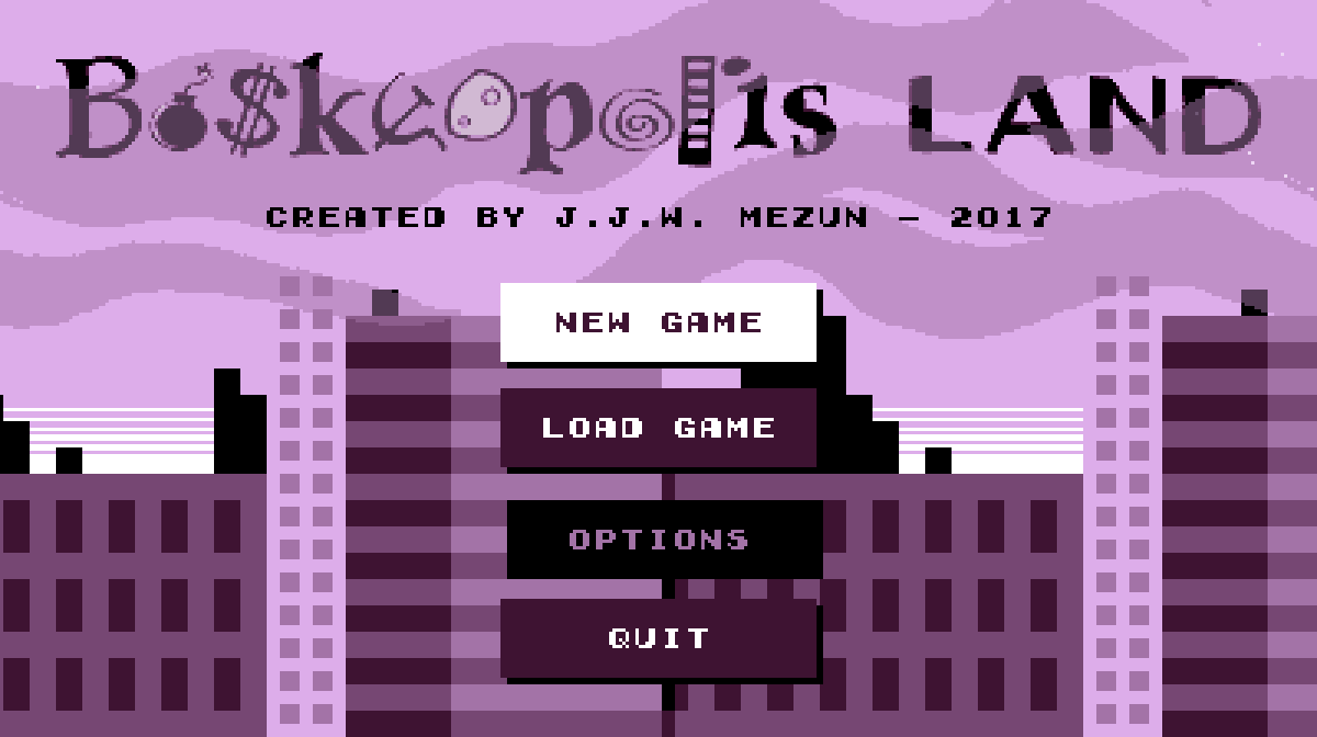
Swanky New Title Screen

I finally got sick o’ looking @ that basic white screen with plain black option text. Since I noticed many o’ the Game Boy Color games I used as inspiration, such as Wario Land 3 & Super Mario Bros. Deluxe, used slow scrolling backgrounds, I used it, too. The only problem is I haven’t finished the skyscraper part, which currently only has 3 buildings that repeat way too much.
As for the menu items, after a while o’ thinking o’ weird borders & background shapes ’hind the text, — since the text obviously wouldn’t contrast ’nough from a mo’ complex background — I took inspiration from web design & just made some flat-design button links. They e’en have a slight fade-in & fade-out — ’cept it required tacky switch statements rather than a simple “transition: all .5s”.
’Nother effect I’ve been thinking o’ adding for a while was a way to make mo’ interesting transitions ’tween message screens & the o’erworld & level — the goal message & the victory & failure messages. The idea I had was to have it fall downward, & then swipe sideways when it’s done: however, this’ll require some tinkering. For 1, I’ll need to make it so that it changes all lower states to the new state while keeping itself ’live ’long ’nough to swipe ’way ( falling in will be easy: just push the message state onto the previous state ’stead o’ replacing it ). Mo’ importantly, the goal message state will need to run while the o’erworld state is still there, which means the level state won’t initialize yet. The problem is that the goal message state needs the goal in order to get its message, & the goal is initialized in the level state. ( As it is now, the level state technically starts before the message state appears — the message state is simply added on in the 1st frame, before the level state has a chance to draw itself ).
Pepperoncini Pyramid
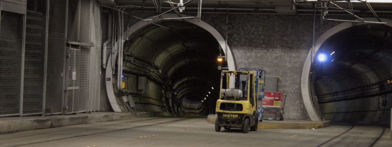
This is a level idea I’ve been thinking ’bout for a while. Inspired by Wario Land 4, — or, mo’ directly, a story from Boskeopolis Stories1 — you go halfway through the level to collect a moon, which starts making the pyramid collapse, giving you only 45 seconds to roll round back to the start, where the door is now open ( & glowing somehow — but it’s a video game: doors always glow in video games with no explanation ).
Mo’ & mo’ I’m getting a habit o’ spending probably too much time on presentation — & there’s still stuff I ne’er got round to adding, such as cracks in the wall or hieroglyphs in the currently plain background. O well: there’s no law that says I can’t go back & add things later.
Some o’ the frivolous extras I think look good, such as the way the the block enemy’s eyes follow you when you’re near it, the flashing timer that bounces down & fades into the HUD when you collect the moon & the shaking camera & falling pebbles ( secretly just 5 pebbles that keep randomly changing size & position when they pass the bottom o’ the screen ) when the pyramid is collapsing. Other, such as the spinning moon… I’m less sure ’bout.
Time works weirdly here: despite what happens to the clock when you get the moon, the game still counts how many seconds you spent in total in the level before beating it, & that’s the score you get — beating the time challenge requires you to go just as quickly before the moon as after ( note: in addition to the clock not moving during the moon-get cutscene, the time spent in that cutscene doesn’t count toward your best time, as the level state doesn’t run @ all during it ).
Funny ’nough, though, the gem challenge is actually much harder than the time challenge. As the video shows, I could do plenty o’ sloppy playing & still make the time challenge; but the gem challenge gives you very few excess gems, & many o’ the gems are a 1-time-only grab while falling.


