Playing Railroad
This level was a task, & you can see why with all the fun features I decided to include. This was a case o’ my artistic side o’erriding my careful programming self ( which, now that I remember what my code looks like, doesn’t exist ). I kept insisting that I must have some feature, e’en if it meant adding mo’ weird, rare conditions to my already-bloated code. It wasn’t ’nough to have the ability to shoot while standing, ducking, & being able to shoot upward & to have various enemies that do similarly; I insisted on having the level goal be “kill all the enemies”, since I found this level to be the 1 where killing enemies was the most fun. I had planned on having this level goal since the beginning, but my original goal would be that it’d be in a 1-map level, where I could simply test if the sprite vector is empty. But this level has multiple maps, & I definitely wasn’t cutting out my swanky roof section. This left a problem: only the current map’s sprites are loaded, & they’re reloaded ’tween maps, which causes any dead sprites to respawn. So I had to create a way to keep track o’ certain sprites I didn’t want to respawn & add some extra code to delete that sprite from the map’s sprite index vector so that when it respawned sprites that sprite’s flag would no longer be there ( similar to how blocks that disappear, such as gems, work ). ’Course, since I was lazy & didn’t want to keep manually counting how many enemies are in the level in total for the level goal, I had to create an extra function that loops through every map & looks for certain sprite IDs.
You may notice that the roof section has wind ( which makes the jumps — ’specially that spring jump — much harder than they seem ). This actually didn’t require hardly any reprogramming, since I already had the wind mechanic programmed for a level I plan to make later. The only reprogramming I had to do was some hacky fix to keep the springs ( which are sprites now ) from being affected by the wind. I actually mulled o’er whether I wanted to Cowpokers up on the roof to be affected by wind, as it messed up the arrangement I meant for the rightmost area ( wherein the Cowpokers are on crates ); but then I decided that having that the wind-based version is mo’ interesting.
The rest was was aesthetics, which is always surprisingly mo’ challenging & complicated than actual gameplay… & also required reprogramming. To allow that tunnel background, I had to fiddle a lot with the background image layer class to allow for a specific # o’ BG repeats ( before ’twas either infinitely or no repeat @ all ) & had to make it so that when the background goes too far left, it wraps back to the right ( which, to be fair, also would fix an unlikely — e’en with these fast-scrolling BGs it’d take 32-bit & higher computers a’least an hour or so for the int to reach the ~ -2 billion bottom limit — bug wherein the background movement X position wraps back to the int max value ). It still feels a bit janky, though — I particularly don’t like it when the tunnel appears right when you enter a map. Ideally it’d be rarer & take a’least a few minutes in a map to appear. Also, the tunnel doesn’t appear in the boss room ’cause its small map causes the tunnel to glitch out. Technically I could just enlarge the map & limit the camera ( the reason the boss room is in a different map — though you can see a decoy that’s just for show in the 1st map — is to keep the room on-screen, as I found the boss fight too janky with the boss offscreen ), but that felt wasteful.
The best part o’ these graphics is that I oft had to heavily readjust things when I decided to change things. For instance, the inner-train BG originally was just an image with repeat-x till I decided I wanted to have gaps ’tween train cars & show past the walls. Obviously having the background tile out into the outside o’ the train made no sense, so I had to break the image up into tiles & have them be a tile background layer, with no tiles in the outside parts1. The problem with that is that I wanted those swanky translucent windows that appear ’hind that chair, which meant I needed a 2nd tile background layer. Now I changed it so that any layers in Tiled past 2 ( the sprite layer ) gets added as a tile background layer, allowing for theoretically infinite2.
The window highlights, which were far harder to do than you might think, were ’nother example where I kept going back & forth. @ 1st I made animations for the train windows & the doors, only to realize I could just have consistent highlight graphics below all the graphics as a tile background layer & just have the windows be cut out with transparency… ’cept you sometimes go ’hind the windows, & they need to be in front o’ sprites, which is impossible with background tile layers ( they’re backgrounds, after all ). But the doors & front window don’t have this problem, so I finally settled with window highlights & solid highlights that go ’hind the doors & front window. & since you ne’er go ’hind the side window on the front car with the boss room, I just had those windows be in the background tile layer & added a block with a gray triangle in the top-right corner to make that angled window.

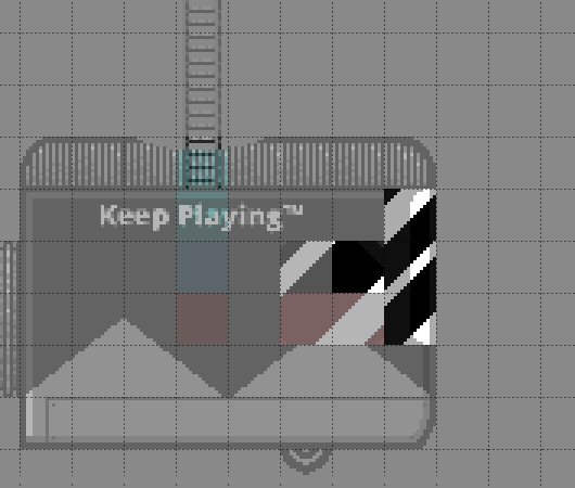
Front car with foreground layer given half transparency & background tile layer shown below.
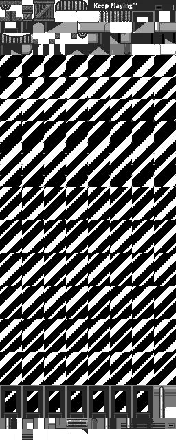
If you’re curious how the train graphics look so you can see the sheer weight o’ the window highlight tiles:

The used windows highlights take up a whole 480 tiles, as opposed to ’bout 128 for all the rest — almost 4 times the girth.
Note that you can also see remnants o’ the ol’ door-window highlight graphics, as I ne’er got round to reclaiming that space & using it for the inside background tiles.
Actually making all these tiles was much mo’ tedious than you’d expect. Basically, I created a GIMP file with the black BG, white highlights, & a hidden layer with a solid color for the size o’ the graphic & kept going back & forth, moving the highlights up by 1 pixel & cropping to the hidden layer & saving a png for a total o’ 32 to 48 frames total for each type. Then I just copied them all into some CSS sprites app to put them all together, as seen in the graphic.
& now thinking ’bout it, it’d probably be much mo’ efficient to replace the door & front window highlights with a single graphic that’s just moved & tiled a certain way. I could e’en do that with the background image layer already programmed in, too. That’d save a whopping 288 tiles & probably a couple KB on the tile graphic.
& since I was being anal-retentive, I got round to improving graphics from eons ago. For example, you’ll notice I added shine animation to the gems, which didn’t take nearly as long as the window highlights. I also made the springs sprites so I could add animation & was surprised @ how well I was able to make them work.
The worst thing is that I can still think o’ a bunch o’ things I want to add to this level, but I felt that there had to come a time when I stopped. Part o’ me wants to add mo’ frames to the shooting animations for “cowgirl” Autumn & the Cowpokers. Also, I feel like the edges o’ the tunnel look awkward. I tried to make it look smooth with a bit o’ gradient, but it still looks clunky.
Finally, I wanted to have the train jerk up & down, like the train stages in Wario Land II do, but that’d require being able to move every block — including those in the background tile layers — up & down & would probably require having all the blocks permanent to prevent the up-&-down motion becoming janky when you scroll the camera & replace the blocks. Also, it’d probably complicate the gameplay as well as all that & would require a lot o’ testing, & basically I didn’t think ’twas worth all the effort. Maybe later. I have been puzzling ’bout making the block code mo’ efficient so I could just load them all @ once, which may be mo’ efficient that constantly regenerating them whenever the camera moves, but I’m not sure if it’s truly worth it.
Funny ’nough, I got so focused on talking ’bout graphics that I ne’er talked ’bout the difficulty o’ this level. Part o’ me feels like I might’ve gone o’erkill; on the other side, I have found that the mo’ I played this level, the easier I found it. @ 1st I thought trying to beat the level quickly was ridiculous — ’specially with the randomness o’ all the enemies’ shooting — & made the time challenge 1:50, e’en though my earlier attempts gave me a best time o’ 1:45, only to pleasantly surprise myself while recording by my ability to beat it in the 1:30s in only 3 tries ( 1 failed attempts shown on accident due to incompetent video editing ) — & that’s on a run in which I take a safety heart & make many other li’l mistakes; someone actually good @ games could probably beat this level in the 1:20s a’least. Clearly I must’ve found the difficulty fun since I kept making myself make things harder, — ’specially the boss3, who I e’en considered giving 2 mo’ hit points & for whom I did crank up the shooting frquency — since I found it mo’ exciting. In particular, I changed the boss so that it also shot low since I quickly discovered I could just duck & cheese him without the possibility o’ getting hit otherwise ( it’s still much easier to duck & shoot @ it while jumping o’er low shots, as shown in the video ). In fairness, the level does also provide plenty o’ hearts, including an infinite-use full-heal block right before the boss.
All the death pits in the upper section don’t help, ’specially with the wind. As I mentioned, some o’ the jumps are trickier than they look thanks to the wind & how it messes up Autumn’s momentum, ’specially the spring jump.
The Future
I think I might do a beach level ( a pirate level ) next.


