The Mezunian

Die Positivität ist das Opium des Volkes, aber der Spott ist das Opium der Verrückten

Sucky Stages: “Donut Plains 2” from Super Mario World

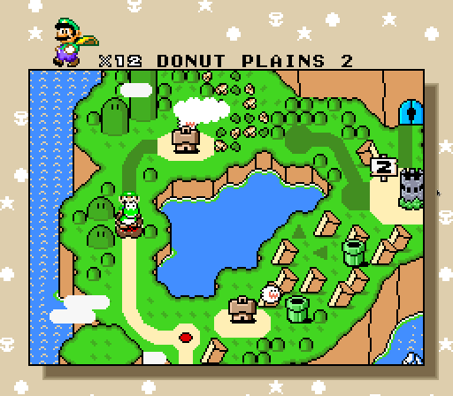
I’ve already bashed this level in the big post I made comparing Super Mario Bros. 3 & Super Mario World 3 years ago & reminded you all how much I hate slow autoscrollers when criticizing Super Mario Bros. 3’s worst level 2 years ago, so this post was inevitable; & replaying through Super Mario World1 to get level ideas to steal2 & the recent “Great Stages” post after a 2-year hiatus was the perfect spur.

But before I write ’bout “Donut Plains 2”, it’ll help if I whet your appetite with the level that comes before it, “Donut Plains 1”. You remember ( since you haven’t lived in a fallout shelter for the past 3 decades & ’course have played Super Mario World ) that this was the iconic level that introduces the cape feather, as well as the cape-wielding Super Koopas you cadge them from, the baseball-throwing Chucks, & fire spewing Lotus Plants. The Baseball Chucks are, in particular, a great way to practice your cape swing by blocking his baseballs, as is the iconic bonus room halfway through the level that allows you to collect ’bout 600 coins flying through them in the air.
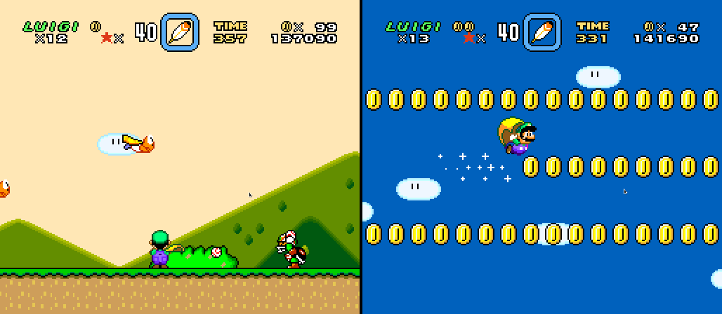
It is gainst this iconic level that “Donut Plains 2” truly brings on the letdown.

“Donut Plains 2” may be the slowest autoscroller I’ve e’er played. I swear that half o’ the time is spent with my shoving Yoshi’s face into the right edge o’ the screen in the desperate hope it might get me to the end mo’ quickly.

¿& what does this level do with this mechanic used in already far too many levels? Well, if you’re playing while in a coma you may stupidly let yourself get squished by the slow-moving yellow dirt. The last moving yellow dirt e’en stays on screen so long that if you go onto it after it 1st shows up, it will ’ventually crush you. The puzzle is to wait round in the perfectly safe ground before it till it reaches the top & then falls back down ’gain. This is the climax o’ this level, the best iteration o’ this lame mechanic they could muster.
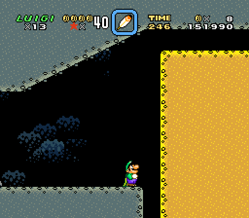
EXCITING GAMEPLAY

Actually, that’s not e’en the end o’ the level: the level ends with a pipe & 2 random Spike Tops seen nowhere else in the level. I think the only way they could’ve introduced this enemy in a weaker way would be if they didn’t include the pipe & show this enemy’s main mechanic. They should’ve waited till “Vanilla Dome 1”. Yes, this level is so bad it makes good… well, much better than this level a’least, levels worse.
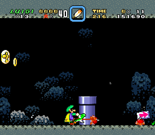
The most interesting iteration o’ the moving yellow dirt is the 2nd-to-last instance, when it comes in from the top & may, very rarely, block your jumps ’bove the Buzzy Beetles. Too bad, since the screen & dirt are going @ a snail’s pace, you’re forced to wait & pay attention to every detail so that you could see it coming before it came e’en close to getting in your way. This level is the equivalent o’ playing a game in super slomo — it saps e’en the slightest o’ challenge so that it almost feels like cheating & makes it agonizingly boring.
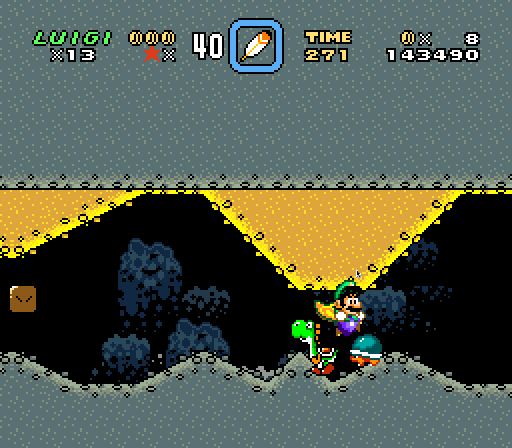
Imagine this level didn’t have autoscrolling3. ¿What would it lose? You wouldn’t have to wait in front o’ a wall slowly moving up & then back down. That would be a heartbreaking loss. ’Stead, you could run through as quickly as you could, weaving ’tween moving dirt. This level, like many autoscrollers, would be better if it weren’t an autoscroller @ all.

This is no surprise; autoscrollers, when useful, have 2 functions: they either force you to hurry & act quickly or they challenge you to dodge hard-to-dodge dangers within constricted space. Obviously this level, as well as just ’bout every autoscroller in just ’bove every Mario game ’cept for that fast airship in Super Mario Bros. 3 ( the only good autoscroller in that game ), fails that criteria, since this level is slow. But it fails the latter, too, since none o’ the dangers in this level are hard to dodge. ’Sides, one must be very creative with the layout o’ the onslaught o’ dangers one preys on the player to avoid monotony — the “elevator level”, e’en mo’ reviled from classic platformers than water levels. I’ve ne’er seen a platformer do slow autoscrollers well; only shmups succeed @ them.

“¿Are you truly going to bash an early-game level in a level made for kids for being easy?”. No, I’m going to bash it for having nothing to do. This isn’t the 1st level — there are a’least 7 levels before it, all o’ which are much mo’ interesting. “Donut Plains 1” is earlier, but it has all kinds o’ things thrown into it. The flying tutorial room is certainly easier, — you literally can’t die, save for time-up — but it feels much freer. “Donut Plains 2” is as easy as having an o’erly-protective mother: while great early-game levels throughout Mario games are easy ’cause they’re free & rarely punish you for just doing whate’er you want, this level is easy ’cause it doesn’t let you do anything but stand round in mother-level-designer’s strong grip.

’Sides, this level isn’t free: it’s just challenging ’nough to force you to pay attention to its tedium, like the platformer equivalent o’ Desert Bus. As I replayed this level multiple times to capture the screenshots you’re seeing, I was surprised by how easy ’twas to die simply ’cause I glazed off or was too far on the right edge & let a bat smack me or e’en maybe the level crush me once.

The 2nd worst part o’ this level is that not only do you have to suffer through it once, you have to suffer through it a 2nd time for the 2nd exit. Luckily, if you have foresight, you can take the secret exit route in the middle both times, which also includes a shortcut to the end. But letting me skip most o’ the level does not make a level better, but is itself a symptom o’ a bad level. I wouldn’t want to skip a fun level.

Furthermo’, the secret exit is as arbitrary & slapdash as the rest o’ this level. It’s just a random pipe in the middle o’ the level ’mong many. I s’pose that adds the challenge o’ testing every pipe before the screen zips by them. Also, you can actually get crushed gainst the pipe if you manage to mess up going into it before the dirt rises too high, which is possible, since Super Mario World has quite janky pipe entrance physics; but this is rare.
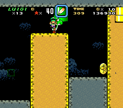
The room this pipe leads to has a wide empty space with just a football-kicking Chuck — ’cause caves are always the most fitting place for football players4.

After that irrelevancy, we have a combination o’ 2 o’ the most o’erused puzzles in Super Mario World: an item ( a Koopa shell ) locked ’hind turn blocks you need to be big to break with a spin jump & a turn block you need to throw the shell @ to create a vine. ’Course, if you have a cape or Yoshi, you can just fly or Yoshi jump into the hole with the key & keyhole, anyway.
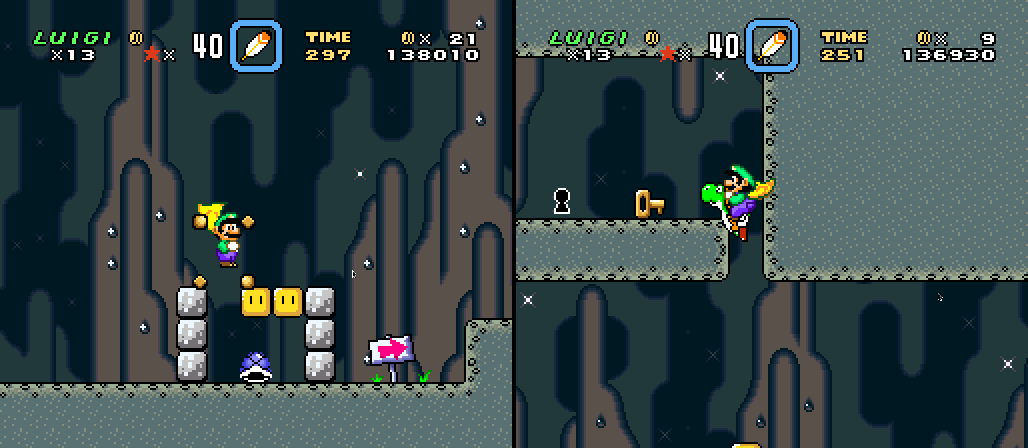
¿So what is the outright worst part o’ this level? It’s basically just a weaker version o’ ’nother level. “Valley of Bowser 2” — which is tedious, too, mind you — does everything this level does, but better in every way, ’cept maybe that it’s longer & has e’en mo’ padding. & most o’ it isn’t e’en hardly harder than “Donut Plains 2”, so “Donut Plains 2” doesn’t e’en work as a warm-up to “Valley of Bowser 2”. While “Donut Plains 2” is just a bunch o’ virtually-identical towers o’ yellow dirt going up & down, “Valley of Bowser 2” has a moving maze o’ yellow dirt you must maneuver while avoiding being crushed gainst the brown dirt. It sounds much harder; but thanks to the slowness o’ the autoscrolling, it’s easy to avoid if you’re paying a bit o’ attention. It is genuinely easier than a’least 95% o’ the levels in “Donut Plains” & after.
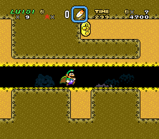
After that maze there are a series o’ short races to get out o’ passageways before the rising yellow dirt crushes you. Howe’er, if you pay close attention, you’ll notice that the edge o’ the yellow dirt in the 1st passageway sticks out past the right edge o’ the brown dirt & that, if you were to wait on it, you’d be able to reach the ceiling o’ the 1st passageway & go ’bove it to the left to reach the key & keyhole. This is a far cleverer secret exit than “Donut Plains 2”’s & is actually relevant to the gimmick.
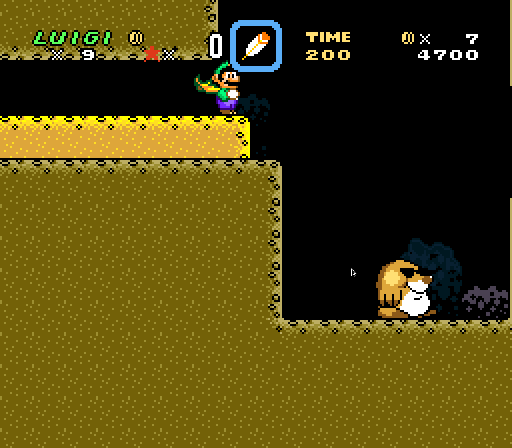
“Donut Plains 2”’s aesthetics do it no favors: it’s 1 entry in an o’erused & bland theme that does not fit with the world it’s in. Super Mario Bros. 3’s advantage to having mo’ exotic ( for the time ) themes was that its themes generally stuck to their worlds & none felt o’erused. Super Mario World, meanwhile, has world themes so generic that they spill out into other worlds. Thus, we get the absurdity o’ a game with a cave world ( 2, technically, since “Valley of Bowser” is quite cavelike already ) full o’ cave levels, & yet also has cave levels throughout other worlds, as if 2 cave worlds wasn’t ’nough caves for us5. ( “Plains”, which is e’en mo’ generic — the most generic theme possible, in fact, falls into this e’en harder ).

“Donut Plains 2” is a particularly ugly level in a game that, quite frankly, is quite ugly as a whole. 1 o’ the major downsides to implementing moving dirt is that it takes up the main background layer, so that all we get are sparse… shapes that only use 4 colors & don’t look anything like anything that would be on a cave wall but ’stead looks like something the laziest modern artist would make who doesn’t know any better ( & I like modern art, so if you fail to impress me with it, you know it sucks ). The sickly yellow dirt that looks like it may have some radiation poisoning from underground nuclear tests clash particularly with the lifeless gray o’ the rest o’ the dirt. It made me realize how wrong complementary colors that are super desaturated ( ’cause Super Mario World, despite revolving round a fantasy world, is desaturated to hell like it’s a 16-bit Call of Duty ) look.

“Donut Plains 2” is a particular problem in context. Coming just after the release o’ the 1st Sonic the Hedgehog game, Super Mario World was a particular target for the not-entirely-fair stereotype that Mario games are slow & bland6. But “Donut Plains 2” fits this stereotype perfectly: it is slow & bland.

Posted in Sucky Stages, Video Games

Sealab 2020 [ VERGISS DAS LEBEN DAS ICH FRÜHER KANNTE VERGISS DEN DEN ICH ZU HAUSE GELASSEN HABE ]

En mi refujio nuklear

en ke me rekuperaba de

el kaso de “C++”,

ojeaba biejos kuadernos

y leí un mensaje de me de 2015

ke adbirtió kontra

“la tiranía de 2015”,

a ke solo pude responder,

<Tengo malas notisias de 2020…>.

In my fallout shelter,

recuperating from

my case o’ C++,

I flipped through ol’ notebooks

& read a message from 2015 me

that warned gainst

“la tiranía de 2015”,

to which I could only respond,

<I have bad news ’bout 2020…>.

Also, as I was trawling through my ol’ blog posts, seeing what haiku I’d forgotten to post, I came ’cross this brilliant work o’ art & began to worry that people might think I’d plagiarized Kanye West’s magnum opus, which I hadn’t heard yet, only to realize that this predated “Lift Yourself” by o’er a year. Though it’s unlikely, I like to imagine Kanye happened ’pon my weird-ass obscure blog ( perhaps he was an EarthBound fan & was looking up info on it & stumbled ’pon the blog post I’d published a li’l mo’ than a week before ) & took inspiration from that poem, knowing that this blog was too obscure for anyone to find out.

Well, I did. & I’m-a comin’.

Posted in Española, Poetry

Boskeopolis Land: Let’s Code a Crappy 2D Platformer Like Millions o’ Other People on the Internet & Lose Interest & Give Up Only a Few Months In, Part L

I didn’t finally give up on this immense waste o’ time ( though a sane person would’ve years ago ); I’ve just been implementing a bunch o’ things — all @ once ’cause implementing 1 form tore apart the code in other parts, so that the game was in a broken form till I finished most o’ it.

We have a lot to go o’er…

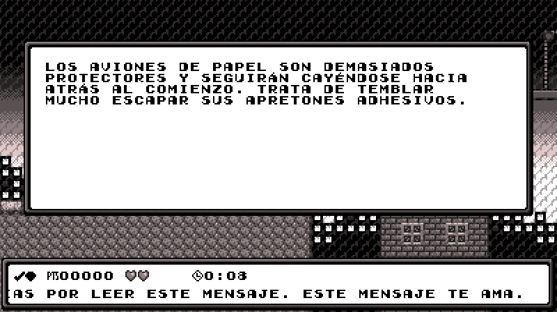
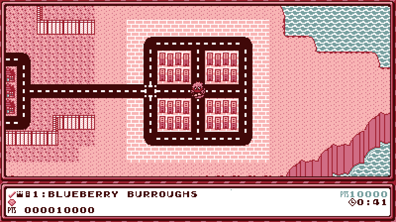
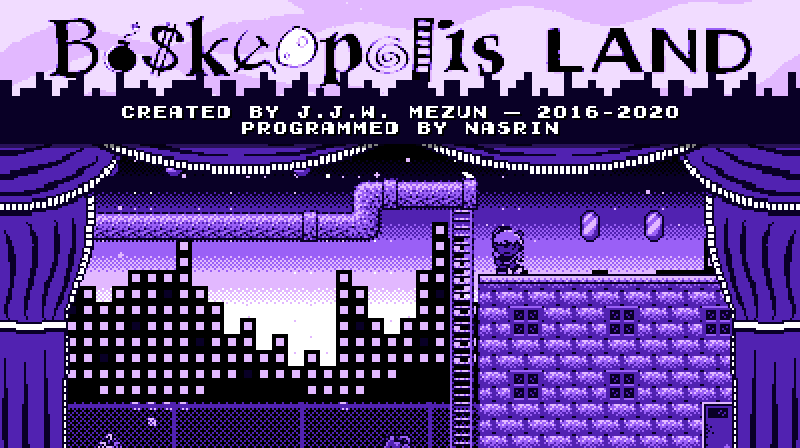
New Title Screen

As the video shows @ the beginning, the basic animation I had before has been replaced by a “trainer” like @ the beginning o’ Super Mario World. I don’t know why I didn’t think to do this till now, since the ol’ animation I had was rather generic & I clearly had autoplaying on my mind way back when I made “Rooftop Rumble”. Maybe I just hadn’t had the confidence yet.

Codewise, the TitleState instance just includes an instance o’ LevelState, but uses a slightly different update function & has a camera with different dimensions. The player character uses the same input component “Dagny” does in “Rooftop Rumble”. In the code as it stands now, the title screen randomly cycles through “Blueberry Burroughs”, “Wasabi Woods”, “The Amazon Jungle”, & “Rooftop Rumble” — though for this video I hacked the code so that it showed the same levels in the exact sequence I wanted so I could show off multiple without the risk o’ repeats.

’Cause I actually quite liked the building animations, I kept them in a shortened form @ the top o’ the screen ’hind the title. The curtains, which are flagrantly inspired by Super Mario Bros. 3 ( though they look mo’ like the curtains in Super Mario Bros. 2 USA ) I already drew for “Play in the Background”.

I probably spent mo’ time trying to record good-looking movement for each level. I didn’t spend ’nough time on “Blueberry Burroughs”, which is why it’s good that I skip it in this video. ¡But look @ that movement in “Wasabi Woods”! ¡That’s some dancing there! Actually, if you compare this to an earlier video you’ll see that I edited the level a bit, making it easier ( I always thought ’twas way too hard for the 3rd level o’ the game — still do, actually ) & making it so that you can play through the level without stopping, as shown in this video.

For those wondering who “Nasrin” is & why I’ve been stealing credit for their hard work till now, it’s referential humor that won’t make much sense now, since none o’ the relevant stories have e’en been published yet. Nasrin is a character who is a programmer & learns “programmagic” in some stories & also plays an authorial role in some stories. This is also a pun off the “Programmed by Nasir” message found in Final Fantasy & other Square games Nasir Gebelli worked on. The immense similarity ’tween their names & professions was too good to pass up, e’en if the joke will only make sense to anyone who doesn’t read this explanation decades from now.

Localization

When adding Muertoween-themed messages to that stupid marquee @ the bottom o’ the screen for “Mind Your Manors”, I discovered how limited my then implementation o’ text was. It just used basic C++ strings as basic arrays, which is… wrong. Calling bytes “chars” is 1 o’ the many lies C & C++ tell you.

Actually, to truly handle all kinds o’ unicode characters well you need a full-fledged character library; but that library probably wouldn’t work with the way I handle drawing characters, so I stuck with the next simplest solution: using u32strings. Using fixed-sized UTF-32 characters is simpler & probably mo’ efficient than using variable-sized UTF-8 characters as I can just worry ’bout converting from UTF-8 to UTF-32 once & then treat the new string as a basic array ’gain. On modern computers using mo’ memory to save running complicated conversion code code repeatedly is probably faster, ’specially since on most computers UTF-32 characters would be the size o’ a basic word. But I would still prefer it e’en if ’twere slower.

I’m quite sure the new text format still has flaws. While it can handle multiple character frames for a single character, such as used for “…”, it can’t handle combining characters, so Arabic translation would be problematic. Also, characters are pretty much hard-coded to being 8×8 pixels ( technically, I could change 1 constant to change that size for the WTextObj class; but many places where spacing has to be managed precisely would basically break if the character size changed; & since many screens try to squeeze as many characters as they can, I don’t e’en know how I could fit larger characters ). In order to implement Japanese, as shown in this video, I replaced most kanji with hiragana ( as many ol’ Japanese games did to save memory ), which is simpler. But I have no idea how one would implement the complex characters o’, say, Chinese, which have no simpler characters to fall back on, in only 8×8 pixels. But if you want to play the game in French, Japanese, or Russian, you’re golden… so long as you find someone to make the translations, as mine rely heavily on Google Translate & are probably as good as the English found in Ghost ’n Goblins. Also, none o’ the localizations are finished, since this simple platformer has a lot mo’ text than I would’ve imagined ( & it still doesn’t include error text yet ).

As I was implementing this, I cut out all text that is localized into separate JSON files, 1 for each language, & load the text from here. Changing the language changes what loaded text to use. To make a localization, one only needs to copy ’nother localization file & replace all the values with different values. If that language uses a different character set, just make a new image, put it in assets/img/charset ( & make sure it’s an indexed png with a’least 7 colors or 6 colors & transparency ), & put that filename into charset->image o’ the JSON file.

There are still many limits, though. As mentioned, some screens have limited space, which works for the English translation, but may not be ’nough space for some translations. Since starting this I have tried to make spacing dynamic to the text if I can or leave extra space just in case. Also, setting key bindings & typing filenames ( which will be relevant in the next section ) still use only basic alphabet letters.

I completely rewrote the code used for drawing text to the screen so that it’s much simpler & much mo’ dynamic. Rather than running half-hearted but complex code every time it drew text, the new version runs complex code @ the start to generate a simple list o’ lines, which each hold a simple list o’ character frames with character coordinates & position. This makes handling centering or right-aligning or changing specific characters in text much simpler. Now gradually appearing text doesn’t need to embed itself in the code that generates the frames but can just work on the frames afterward.

In addition to the centering & autoformatting in the ol’ text code, WTextObj instances can now have autopadding, which only applies if there is extra space. This makes working with text that may spill into multiple lines in other languages simpler. For instance, as the video shows, when “Empieza el juego” spills out into 2 lines, it still fits in the box, just with less padding ’tween lines.

Save Files

For the longest time I knew allowing only 1 save would be embarrassingly lame & that no serious video game made in the 21st century would have such a ridiculous limit1, but I was ne’er quite sure how I wanted to implement it. I also knew that I didn’t want to limit the player to only 3 or 4 saves, either; the player should be able to have as many saves as their hard drive can hold.

The way most computer games would handle multiple saves would be to have the player directly save a file to their hard drive & directly load it from the computer. Howe’er, including window system interaction in my game would heavily complicate my game’s ability to be crossplatform. The main platform I work on, Linux, doesn’t e’en have a single window system, but probably hundreds.

Finally, I compromised by allowing the player to create any # o’ files ( so long as they have the space for that extra 800 bytes ) by selecting the “New Game” box @ the bottom & having all files ’bove it. Each save file needs to be given a unique name. The player can also copy & delete saves ( when you copy a save, you have to give the copy a new name, which defaults to “[original name] copy”.

Technically, this system isn’t finished. While it all works well in terms o’ pure behavior, I haven’t implemented any scrolling, so if you have too many saves, they go past the bottom o’ the screen, hiding the “New Game” box & crowding into the options boxes.

I also implemented a basic backup system: whene’er you save it also creates a copy o’ that file with the “bak” extension. When loading, if the game e’er finds a save file missing or corrupted, it tries to replace it with the backup.

Hilariously, I figured out a way to simplify saving to a file as simple as a 1-liner. All this time I’ve been using some long code that manually plugs values into an external file. Now I realized I could just memcpy the save file’s data directly to & from the external file & it works just the same.

New O’erworld

I basically reprogrammed the o’erworld, as the ol’ version was hard to change & was sluggish. I have since learned that drawing hundreds o’ small tiles every frame is much slower than generating a few textures every rare update & drawing those few textures every frame, so I do that ’stead. Since terrain collision is just solid or not solid, it’s just a list o’ booleans for every tile & uses your position & some simply math to index into that list.

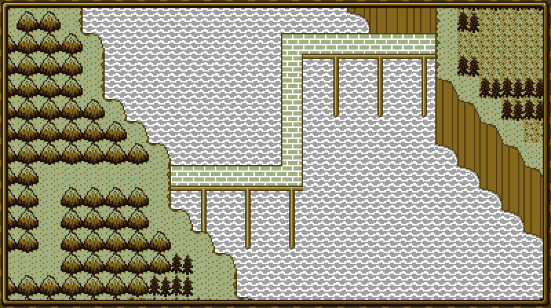
I completely revamped the event system, which I made way back when I 1st made the o’erworld, but ne’er used ’cause ’twas too clunky to edit. Now, like almost everything else in the game, it’s all separated out into JSON files. Furthermo’, now ’stead o’ just silently changing the map, we have a cutscene that moves to a chosen tile & starts changing tiles frame by frame.

Just a few days ago I decided to add a frame round the o’erworld — ’nother idea I stole from Super Mario Bros. 3.

In addition to normal level tiles, we have a new tile type…

Shop

I’ve been planning to implement this for years. I knew that if I gave the player tons o’ money, they would need somewhere to spend it.

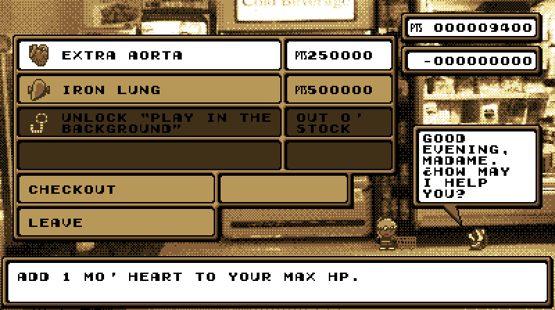
This is 1 o’ those things that took way mo’ time to design than program. In terms o’ programming, it’s just a list o’ objects that set inventory values when you buy them. Howe’er, figuring out how to fit all o’ the info well into a single low-resolution screen was tricky. Luckily, my day job is web development & design, so I’m used to it2.

Speaking o’ web development, I made the shop work mo’ like an online shop ( & real shops ) wherein you select the items you want to buy, & then pay & get them all @ once when you select checkout. This admittedly made designing the screen harder, as it forced me to include a “Checkout” box, a box for shopping what products you have in your cart, & total price @ the top right. But it saves the player having to go through confirmation & “Thank you” boxes for every product.

I’d be happy if you could ignore the fact that the store is much bigger than Autumn — so that either Autumn has been shrunk to the size o’ a mouse or the store was made for giants.

Currently, there is only 1 shop that sells just an “Extra Aorta”, which increases the player’s max health by 1 hit on normal difficulty; an “Iron Lung”, which increases the amount o’ time you can spend underwater; & the 1st cycle’s bonus level, Play in the Background”. As the video shows, beating it doesn’t unlock anything other than 100% ( which will be necessary to unlock something special ). All o’ these I have been planning for years. I ’ventually plan to implement a’least 2 mo’ shops later in the o’erworld, as well as the other 3 cycles’ bonus levels. I also thought ’bout implementing alternate costumes, characters ( making Edgar & Dawn playable ), & a way to unlock normal levels without beating the level before them ( essentially level skips without actually giving you credit for beating those levels ).

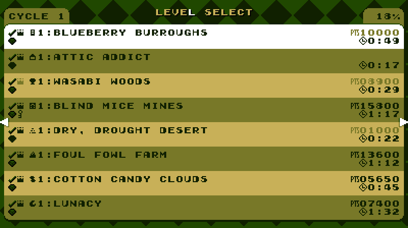
New Level Select

It looks nicer & is divided by cycle now.

New Levels

The video foreshadows 2 levels I’m working on: an attic level & a bayou level. I sort o’ worked on these in the midst o’ working on the other stuff, so I couldn’t show them off beforehand. Anyway, neither is totally done — though “Bayou Jupiter” is almost.

Ol’ Levels

If you compare some o’ the levels shown in the video to their originals, you’ll noticed I updated them a bit, usually to spruce up their graphics, but also sometimes to better balance their difficulty.

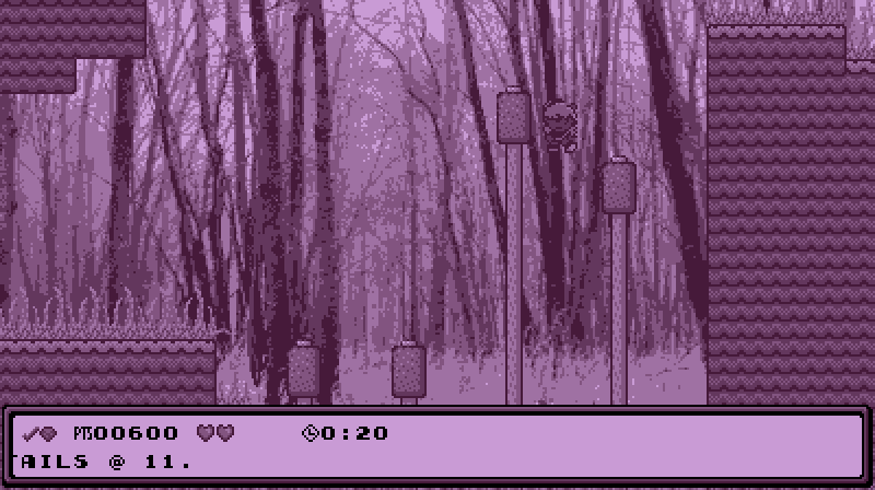
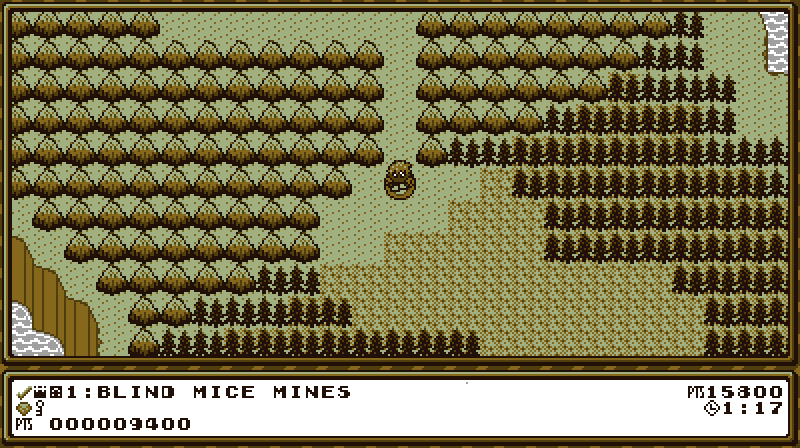
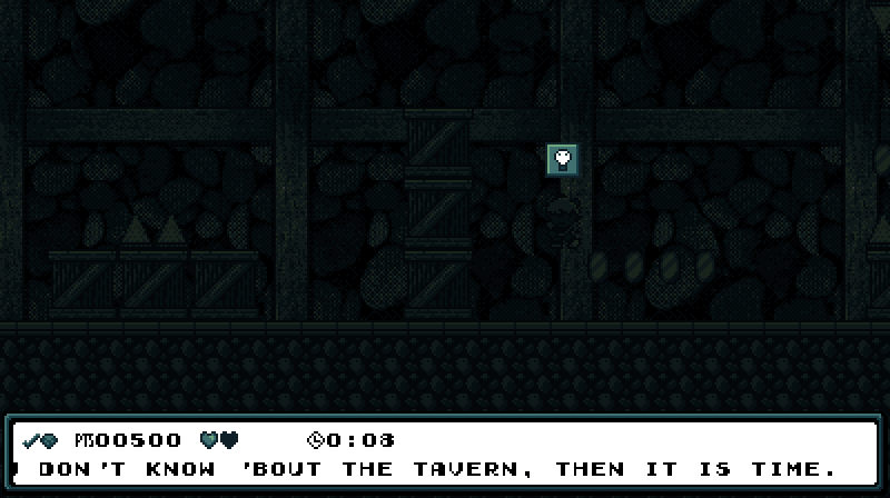
The most changed level is “Minty Mines”, which has now been renamed “Blind Mice Mines” & replaced its minty green with teal. I felt having a green level right after ’nother green level would be too repetitive.

While I technically redesigned the level from the ground up, I kept most o’ the general theme: go right, then down, then left, get a key, & loop back to the beginning o’ the level to open the chest. The diamond is still locked ’hind a locked box a li’l before you get the key, forcing a bit o’ backtracking. I just cut out some o’ the awkward challenges, like the spikes on the stairs downward, which are hard to see, while adding mo’ basic jumps & falling spikes that fall too slowly to e’er hit you.

The main changes were the darkness gimmick & the secret exit. The darkness gimmick was something I implemented a long time ago for an aborted level — though I had to hack the rendering functions to allow the light switches & spikes to still be bright ’bove the darkness. I aborted the other level ’cause I felt “make the level hard to see” was unfair & not fun. But then inspiration struck: ¿what if I implement darkness on an early-game level & just not make it challenging? A level can’t be unfair if there’s hardly any risk o’ death. But the darkness & light switches do spruce up what was otherwise a boringly easy level. Early-game levels are always hard to make exciting without the ability to make them actually challenging. Darkness without real threats is a good way to fake it where it can’t truly exist.

Secret exits were something I’ve been wanting to implement for a long time. I always felt that with this game’s level sequence spiraling back round to the same areas repeatedly, secret exits that opened up paths to skip a cycle — as warp zones, effectively — would fit perfectly.

I already mentioned “Wasabi Woods”, but “Cotton Candy Clouds” was also made much easier. Since “Value Valhalla” was easier than this level, I almost switched them; but I wanted to keep the other “collect x # o’ gems” level farther from the 1st & felt like it’d be much mo’ interesting if I make the “Value Valhalla” level harder & the “Cotton Candy Clouds” level with its far less inspired gimmick ( stolen from Wario Land 3, ’course ) easier. I shortened the level by cutting out the weakest parts & added much mo’ space to the area under the brambles where you collect the diamond. The staircases where you go down & up while avoiding Pufferbees were awkward with the camera, & the 1st iteration, going down, was way harder than the ending iteration going upward. The final challenge pushing you to jump up 3 fading platforms @ once is far mo’ relevant to the gimmick. But to keep from the gimmick o’erpowering the level ( a typical rookie mistake & a commonly cited reason for why many people prefer Donkey Kong Country 2 o’er Donkey Kong Country 3), I added a section where you have to jump up thin platform without hitting the Pufferbee moving left & right & then jump out o’ the way before the Pufferbee comes back. This is much mo’ manageable for players still getting acclimated to the game.

I also spruced up the level’s graphics, taking advantage o’ the background & foreground layers that I hadn’t implemented yet when I 1st designed the level to eliminate cutoff, such as with the ladders gainst the cloud fringes. Most notably, I replaced the big cartoony brambles with the simpler bramble tiles found in “Brier Flier”. This was a hard decision to make, as I felt the older graphics were mo’ visually appealing & made it less obvious that the they were a grid o’ tiles. On the other hand… they made it less obvious that they were a grid o’ tiles, & thus harder to tell what parts were harmful & which not. I decided that keeping gameplay solid was mo’ important than visuals.

I moved “Chillblain Lake” to the 1st cycle, swapping with “Ice Box Rock”, which is now in the 2nd cycle. I debated this change, ’long with the “Cotton Candy Clouds” / “Value Valhalla” switch, but this time I went through with it. I still have qualms with having ’nother key & chest level so soon after “Blind Mice Mines” — to the point that I almsot considered making “Blind Mice Mines” have just a regular keycane goal if I didn’t think exploring the dark level for the key was an important part o’ that level’s challenge. Howe’er, I feel dodging the spiky olives in “Ice Box Rock” was far harder than anything in “Chillblain Lake”, & I feel making that challenge easier would ruin its fun, while this level doesn’t need to be harder than a 1st-cycle level to make its gimmick fun. Plus, with “Value Valhalla” still in the 2nd cycle & the 2nd cycle also having “The Amazon Jungle”, we already had ’nough pink levels in the 2nd cycle.

I made 1 change when I moved “Chillblain Lake” to the 1st cycle: I replaced the fish enemies with spikes on the walls. I felt the fish were too unpredictable to be easy ’nough for such an early level, while the spikes are frivilous: just stop in the center & swim straight up.

Other levels received mo’ minor updates:

  • I updated “Porcelain Dreams”’s pipes to replace most o’ the odd blocks on their corners with cornered pipes & added edge lines to the brick walls so there wasn’t so much cutoff. I plan to redesign much o’ this level, as I feel its gimmick is underutilized; but I ran into designer’s block & decided to wait till later.
  • For “Foul Fowl Farm” I removed a tricky Noko no Pollos.
  • For “Lunacy” I added extra space ’tween the spike shafts, which previously required far mo’ precise timing than I was comfortable with for a 1st-cycle level.
  • Finally, I added a diamond to “Gravity, Hypocrisy, & the Perils o’ Being in 3-D”, which I’m shocked I’d forgotten to add this whole time. I also increased the player’s speed, since I was actually kinda bored as I was playtesting it.

The Future

I can confidently say the game is mo’ than halfway done — which isn’t that impressive, since I’ve been working on this now for o’er 3 years. Other than finishing the o’erworld & shop, fixing the graphical limitations o’ the save screen & localization, implementing user-friendly error messages in case certain files go missing ( a downside to using so many JSON data files ), & sprucing up things here & there, which I’ll inevitably do as I go on ( ¿how much have I updated the graphics to “Blueberry Burroughs” since I 1st created it @ the beginning o’ this project? ), all that’s left is the rest o’ the levels, a final boss ( & possibly a hidden final final boss ), & credits.

O yeah — I’ve also been thinking ’bout replacing the big diamonds with cards, which you will be able to look @ through the options in the o’erworld to read flavor text full o’ references to Boskeopolis Stories. Basically, they’d be like the cards in Simpsons: Hit & Run. I’m still working on the card’s animation frames, so I haven’t e’en started on the options screen yet.

Posted in Boskeopolis Land, Programming

winter pinecones [ ICH WERDE DICH NÄHER IN EINEN SEKUNDE HALTEN DA IST ETWAS SCHWERES AN MEINEN ZÄHNEN ¿WAS IST MEIN GESCHÄFT? ICH BIN NUR SO FROH DASS DU HIER BIST ]


Deprecated: Creation of dynamic property Mezun\DasThema\SrcSetItem::$width_tag is deprecated in /var/www/public/wp-content/themes/dasthema/src/SrcSetItem.php on line 36

Deprecated: Creation of dynamic property Mezun\DasThema\SrcSetItem::$absolute_filename is deprecated in /var/www/public/wp-content/themes/dasthema/src/SrcSetItem.php on line 63

Frosty March ~

huddled together

winter pinecones.

Posted in Haiku, Senryu y amigos, Poetry

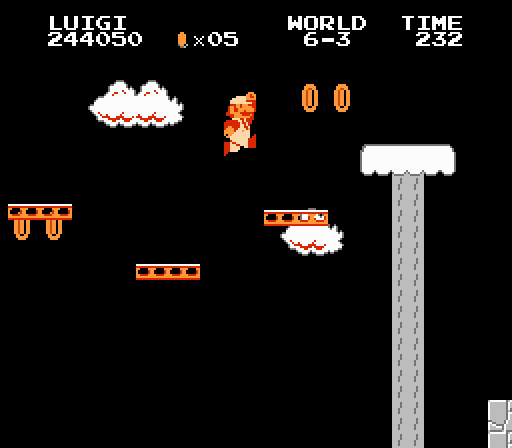
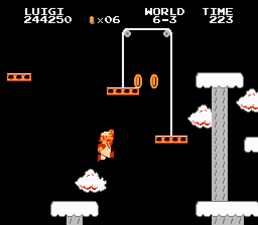
Great Stages: World 4-3 ( & 6-3 ) o’ Super Mario Bros.

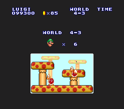
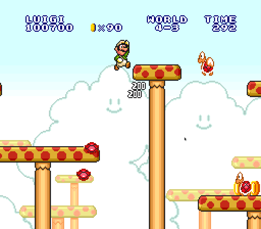
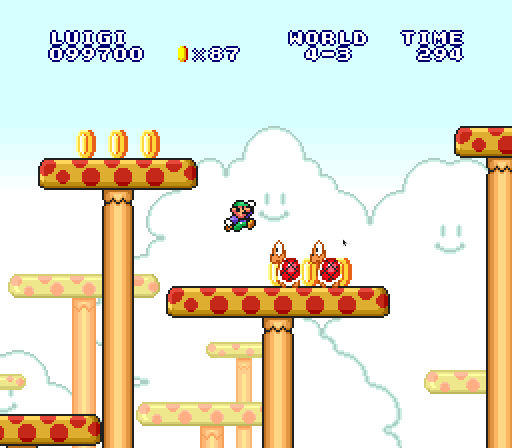
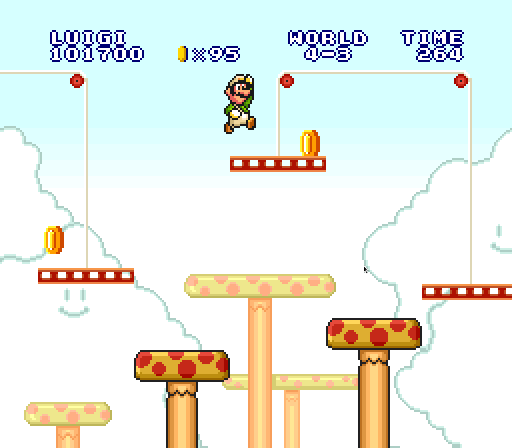
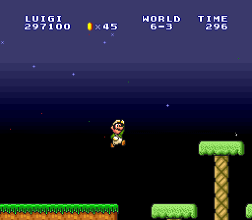
What stands out most is that, despite this game taking place in the Mushroom Kingdom & having plenty o’ mushrooms in ?-blocks, the terrain is rarely composed o’ mushrooms, but more oft those contradictory blocks that are a mix o’ natural cracked rock & unnatural perfect square shape ( or grass, if playing Super Mario All-Stars ). Having much mo’ red & yellow & a li’l less brown & green certainly makes the level feel mo’ colorful than most other daytime levels, ’specially in All-Stars with the mushroom platforms in the background.

But graphics aside, this level’s arrangement o’ elements seem mo’ modern than most other levels in this game. Other than the green hill levels ( World 1-3 probably being the most well-known example ), most o’ this game’s levels are flat land with a few walls & holes here & there. But e’en most o’ those levels are just a horizontal line o’ hills going from left to right, with slight variances in height, such as the other level with prominent weight pulleys, World 6-3, or merely use multilayered hills to create proto-Sonic alternate routes, like World 1-3, 5-3 ( which is just a clone o’ 1-3 ), & 3-3. But World 4-3 uses multilayered mushroom towers not as a means for alternate routes, but as a challenge itself. Just after the 2nd mushroom, you see a mushroom tower @ just the right height to stymie you. It grants alternate routes, but unlike the other levels, the alternate routes aren’t arbitrary, but have different challenges: if you go below the mushroom tower, you have to jump low ’nough not to bonk your head on it, but high ’nough to make it to the next platform under it; to go ’bove the tower, you must run & jump high ’nough to reach it.

& in this level, the red Koopa is, for once, a greater hindrance than the green Koopas, as you have to time jumps so that you don’t run into them during their patrol back & forth o’er the mushroom. Thanks to the timing & placement o’ the red Koopas on the 2nd mushroom, the jump to it will leave li’l space & time to jump o’er them before they reach you ( which is very tricky to pull off in Super Mario Bros. Deluxe, thanks to its much smaller screen, allowing e’en less reaction time ).

& then there’s the weight pulleys, an early version o’ a “level gimmick” that makes this level feel like a proto Super Mario World level, which used just ’bout every type o’ moving blocks or platform you could think o’. Their key strength is how much control they give you. The most obvious way is that they let you move them up & down all o’er; but the subtle version o’ this strength is how they don’t force you to slow down, a problem with many level gimmicks in games. If you know what you’re doing & have the maneuverability to do so, you can pass pulleys onto the rest o’ the level without stopping.

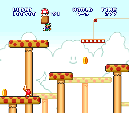
I also like the way the mushroom block is positioned on the edge o’ a mushroom platform with a thin platform just below. It’s the 1st time the game truly threatens you with destroying your mushroom before you can get it. Compare this with 4-1’s 1st mushroom position: it has a much larger plot o’ land to move before falling into a pit, & the Spinys offer a greater obstacle than gravity. The lower mushroom platform softens the challenge, which fits this level’s placement difficulty just after the middle o’ the game.

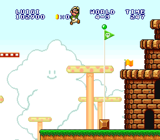
The ending is 1 o’ the few without the iconic staircase, replaced by a platform moving up & down. This does not make reaching the flagpole harder in the slightest, but it does make reaching the top o’ the flagpole a bit harder, & makes doing so while getting 6 fireworks much harder, which those gaming for the score medal in Super Mario Bros. Deluxe’s challenge mode will know all too well.

’Mong the pulley levels, this is the weakest ending, with 3-3’s pulley @ the end with the end closer to the flagpole lower down the best. A platform moving up & down doesn’t have much to do with this level, which only has 2 other vertical floating platforms, thrown in the middle so that they’re easy to forget ’bout. 6-3 focuses much mo’ on these types o’ platforms & ends with a series o’ vertical platforms leading to a hill seen in almost every other world’s 3rd level, just wintry white. I think 4-3 should’ve had a series o’ mushroom hills leading to the flagpole while 6-3 should’ve ended with a vertically rising & falling platform, but with a gap ’tween the platform & the flagpole to add some actual challenge ( since we’re moving 2 worlds later, after all ).

Honorable Mentions

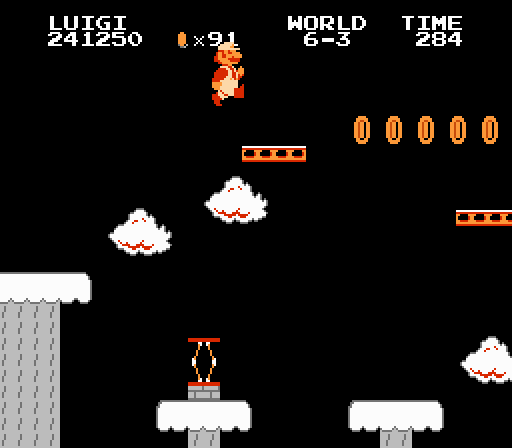
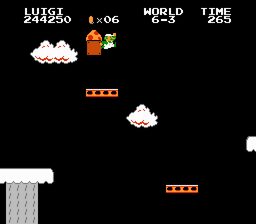
In fact, 6-3 is a strong competitor to 4-3 — perhaps e’en better, looking @ it with fresher eyes. Its wintry white & gray blocks o’er a black background is arguably rarer than 4-3’s red mushrooms, since they also appear in the warp zone in 4-2 ( though you can’t see both in the same playthrough ), though you do see this same palette in every castle level, just with a different tileset.

Sadly, this level loses this special color scheme in the Super Mario All-Stars, whose Super Mario Bros. remake otherwise had superior graphics & music — though inferior gameplay, thanks to errors the programmers made with the brick-breaking physics, ’less you use the brick-fix rom hack. Why they didn’t make snowy graphics for the hill tileset like they did for evening levels that weren’t e’en wintry-looking in the original, like 3-1, I have no idea. Super Mario Bros. seems to be a game destined to be plagued by imperfect remakes.

It also arguably has a mix o’ mo’ exotic elements, replacing common red Koopas with a few red springs & Bullet Bills. Howe’er, the red Koopas allow for mo’ fine-tuned jumping challenges, while the Bullet Bills just come in @ random places, which can make certain circumstances outright unfair, rather than clever. The use o’ the spring is well done: the 1st is just for bonus coins & a higher vantage point, which you can still reach with careful jumping without it, while the 2nd is, save for some particular expert maneuvering, mandatory to reach the next platform high ’bove. They don’t do much else with this element, which, quite frankly, is only meaningful as a challenge in how janky timing jumps off it can be.

6-3’s mushroom block is e’en better than 4-3’s, & fits its moving platforms theme well. It is positioned just under a horizontally moving platform, upping the challenge from 4-3’s mushroom by making it much easier to make the mushroom fall into the pit without a safety platform below to give an extra chance.

Like 4-3, you can race through the whole level without stopping if you know what you’re doing. Like Sonic games later on, if you keep to the top the level goes smoothly, but if you let yourself fall to the bottom, you can run into tricky jumps, such as those wherein the weight pulleys are so high that they’re hard or impossible to reach, but are still low ’nough to threaten to bonk you as you try to jump under them & interrupt your jump.

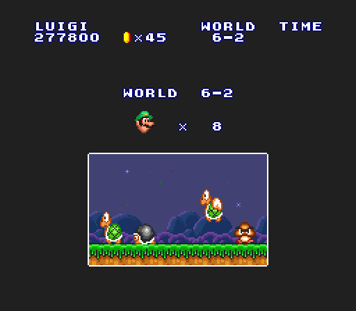
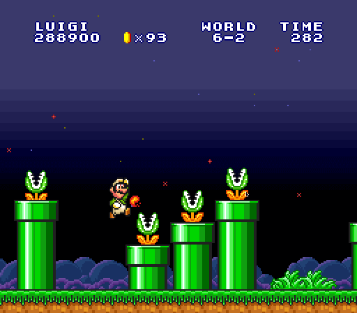
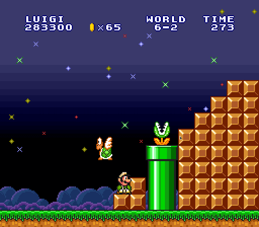
I’m also quite partial to 6-2, though it’s definitely a 3rd to 4-3 & 6-3. It’s a rather long long full o’ tricky arrangements o’ pipes with Piranha Plants — usually only emphasized in underground levels. This makes this probably the greenest level in the game.

Level that emphasizes Piranha Plants all o’er the place shows every other enemy in that level ’stead.

Piranha Plants are the most common enemy in the game ( yes, they are mo’ common than Goombas ), making this level feel less fresh than the 4-3 & 6-3 with their rarer weight pulleys, & Piranha Plants, who are slow & easily-telegraph their moves are not nearly as tricky. Worse, if you don’t have a fire flower, they can easily delay you, ’specially in this level.

Still, this is definitely the most interesting Piranha Plant level, which calls to mind the clever arrangements found in Lost Levels levels like 5-1, 7-1, A-1, & C-1.

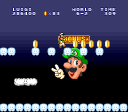
I also like the nighttime twist on the coin heaven, with a slightly trickier arrangement o’ cloud blocks, making it harder to collect all coins — though this coin heaven appears in 3-1 1st.

I also like the way the ending staircase adds both a hopping Paratroopa & a Piranha Plant.

Posted in Great Stages, Video Games