A 2fer this time.
The Minus Touch
No, I still couldn’t get OpenShot to work with this footage; but Kdenlive decided it wanted to start working ’gain for some reason.
Part o’ me feels like I went a bit too far with this level, as my long sequence o’ deaths show in the video. I believe it took me close to an hour to finally get a winning run. Then ’gain, I’ve done much worse in still-perfectly-sensible games & have been noticing that this game has been tending toward easy. Needless to write, this level is in the last cycle.
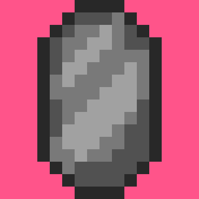
1 o’ the complications o’ this level was that something that was s’posed to be a bonus in any other level is a huge problem in this level: the hitboxes on the gems are way wider than their graphic. This made the parts where you have to squeeze ’tween gem walls & dodging the falling gems in the long ladder climb just after much harder than they should’ve been, since you have the squeeze tightly ’tween the blocks, but can’t see their boundaries, so you nudge just into 1’s hitbox, e’en though your character’s graphic is clearly outside o’ the gem’s graphic, making it deceptive & cheap. So for this level I made ’nother gem block, but added some custom block conditions that limit its hitbox so that it’s only its graphic.

All that pink space round the gem is in its hitbox.
I also think that drop @ the start is probably a waste o’ time that only makes the level’s difficulty mo’ frustrating than it should be. The fall’s s’posed to make you think you have to weave ’tween gems, which is technically possible, but not something I’ve e’er done, I don’t think. But as the video shows, you can just go a block left to the center & you’ll pass all the gems. I’m not sure if this is a way to reward clever players or a bullshit gotcha on the player that punishes them for not reading a walkthrough watching this video or reading this post.
On the other hand, I like the shape o’ the level: how it’s a long plummet from the top to the bottom that goes quickly, followed by a long climb back up to the top that takes a lot longer. 1 technique I’ve devised to help me with designer’s block I’ve been having was creating simple shapes for levels, a pattern you’ll see in the next level.
The length was something I mired o’er quite a bit. I’ve mentioned quite a few times that I generally want to keep levels to 15 – 30 seconds average time, since these are s’posed to be short bursts without checkpoints. However, this is a special level & 1 that’s s’posed to be the hardest in the game, so having it be longer is a fair way to increase the challenge, so long as it’s not excessive. In this case, my time was ’bout 1:40, but if one’s rushing one could probably do it in ’bout a minute ( testing it with the “lose if you touch a gem” gimmick turned off, I found one could easily make it to the end within 50 seconds, e’en if mostly trying to avoid gems ).
The time challenge is 1:10, which is probably plenty if one’s going fast; but I’ve ne’er gotten it, since just beating this level is a problem for my meager skills. It’s probably mo’ lenient than any o’ the other levels, which is good: I want to have the harder levels have mo’ lenient challenges while giving the easier levels much stricter challenges to balance things. In contrast, the 1st level you have to do just ’bout perfectly to get the time score.
Part o’ the challenge o’ a micromanaging a level’s length is trying to ensure you don’t pad out the level by o’erusing ideas, but don’t neglect good ideas, complicated by the fact that ideas themselves can have multiple subideas within them; & then you have to make sure the length o’ each idea is right. In this case I had quite a few ideas, such as walking gem enemies, alternating falling gems ’bove a ladder, & gems rolling down a hill that I probably could’ve done mo’ with, but would’ve risked making the level too long & tedious. Better to leave players wanting mo’ than wanting less.
In particular, the walking gems could have been complicated in many mo’ ways beyond just having 2 guarding either end o’ a straight hallway. Then ’gain, part o’ me feels those sprites are a bit unfair: their movement is randomized & they move so quickly that it feels like luck whether you can get through them unscathed. They are unquestionably the worst part o’ this level.
Conveyor Slayer
This level used to be called “Steam Engeenius”, but then I realized it has nothing to do with steam @ all. Its current name still feels odd, though: it certainly focuses mostly on conveyor belts, but its a 1st-cycle level that’s quite easy, so the “slayer” part sounds hilariously inapt. It’s like calling “Yoshi’s Island 2” in Super Mario World “Chaos Corner”.
This is ’nother example o’ the “shape level” idea I mentioned before. While trying to design this level I kept envisioning twisty paths that go all o’er, & then back to the start, but I felt that ’twas, rather than being mo’ interesting or “complex”, just messy, & went in the other direction toward an elegantly simple & memorable shape. The original idea was that it’d be a circle, but I found that made actually moving through the level janky, so changed it to a rectangle. It actually looks better this way, since it’s a factory & should look boxy & artificial.
Getting this level to work right was mo’ burdensome in terms o’ programming, thanks to a bunch o’ li’l bugs that either got you stuck & made the level unwinnable or made it easy to cheese the level. The absolute worst, & yet something I found quite late, was my realization that collision detection had been wrong this entire time: the saved left o’erlap for something o’er something else ( a block o’er a sprite, for example ) actually uses the formula for o’erlapping from the right & vice-versa. This hasn’t hindered this game much since nothing has used the horizontal o’erlaps yet. However, there’s a glitch I think I mentioned earlier wherein you could jump under the corner o’ a block & jump through the wall, going straight up. In this case, that allows one to skip straight to the end, which is a problem.
The other problem was that if the conveyor shoved one into a wall, they’d get stuck fore’er, which forced me to check whether the player is right next to a wall & make the conveyor not work if so.
’Nother problem was the main gimmick: the goal is blocked off by a passage so short you have to be ducking with a conveyor going in the opposite direction. The only way to get through is to hit a switch & so the conveyor goes in the other direction. The problem is that Autumn can hop round while ducking, so she can skip right through, & I didn’t want to change that or make her move super slowly while duck jumping, since that’d mess up her movement in other levels; so I just added a patch that makes it so Autumn can’t jump while ducking on a conveyor belt.
Finally, there was the challenge o’ making block graphics change based on whether the switch is hit, which involved making ’nother subclass o’ the “SpriteGraphics” class & adding ’nother wasteful update virtual function specific for the block updates so the “EventSystem” can be passed to it without having to go through & edit all the update functions for every subclass o’ “SpriteGraphics” or something. The “SwitchGraphics” sublcass itself just holds 2 “SpriteGraphics” unique pointers, making its own data useless, which is also a waste. 1 thing I’ve learned in this project is to better separate interfaces with data: most polymorphism is just through “render” & “update” functions, nothing else. All the other “SpriteGraphics” subclasses used the vast majority o’ the same data, so it seemed right… but then “SwitchGraphics” comes round & proves you can’t be sure o’ anything fore’er.
As for the frivilous extra update function, I should probably just make “EventSystem” a static singleton, since there’s only e’er 1 & I hate passing objects round a bunch o’ functions. Most people seem to say that’s better than having globals, but I’m starting to disagree. If anything, all this passing round arguments only couples things mo’ & makes no sense since it should’ve be any concern o’ anything that calls any update functions what other things that update function uses. My experience with making the “Inventory” class a static singleton has only been good. I haven’t had any glitches appear due to this “evil” global, but have gotten cleaner, easier to understand code. The same might apply to the “BlockSystem” & “SpriteSystem” — something I should look into. The only downside is that these static classes would always be using memory throughout the whole program, e’en in the title screen & o’erworld, where they’re not used ( the inventory, on the other hand, is used everywhere ). Then ’gain, the vast majority o’ your time takes place in-level, & it’s not as if the title screen or o’erworld map are begging for mo’ memory — they’re some o’ the most lightweight parts o’ the program.
Anyway, there’s much worst inefficiencies in this game’s half-assed code that it’s silly to point to an extra virtual function as the culprit ( the general o’eruse o’ polymorphism, which requires using pointers for collections & prevents taking advantage o’ data locality is probably a worse problem ).
& then there’s the graphics, which usually takes the bulk o’ development time. That upper-left gem cache made me start to think that I was wrong to make blocks just have a simple 16×16 block rather than 4 8×8 blocks, since I had to make a bunch o’ blocks that just copied scraps o’ other blocks, & these had to have their own 16×16 graphic block, while if I just had them be 8×8 blocks I probably could’ve just had them reference a bunch o’ already-existing blocks. Then ’gain, blocks wherein all 4 corners are different would’ve been much mo’ tedious to make, so I guess it’s a tradeoff. Still not sure which would be mo’ efficient: smaller graphical files or fewer draw function calls. Either way, it probably would’ve been tedious, & we should speak o’ it no mo’.
I mired o’er the shadows under the blocks, which are just 4 few gray rectangle blocks with slight transparency. I go back & forth o’er whether using transparency & blending is “cheating”, since it technically creates extra colors that aren’t in the “paletttes”. Then ’gain, the palettes don’t follow any real retro game system & I feel bad ’bout how o’erused emulating retro graphics is, too. If it wouldn’t make palettes mo’ tedious to make & wouldn’t probably make the graphics o’erly complicated, I’d probably increase the # o’ colors per palette, anyway — just so long as the hue is generally monochrome. Then ’gain, I don’t think I kept to that, either — certainly not in the o’erworld palettes. After trying out having manually-drawn shadows & seeing both how ugly it looked & also the sheer # o’ extra blocks I’d need, — 4 * the 9 blocks o’ the BG — I decided that creating extra work for myself & my program just to emulate a limitation o’ ol’ hardware that only existed to make things easier for limited hardware was the very definition o’ insanity ( though that doesn’t stop me from keeping the palette system ).
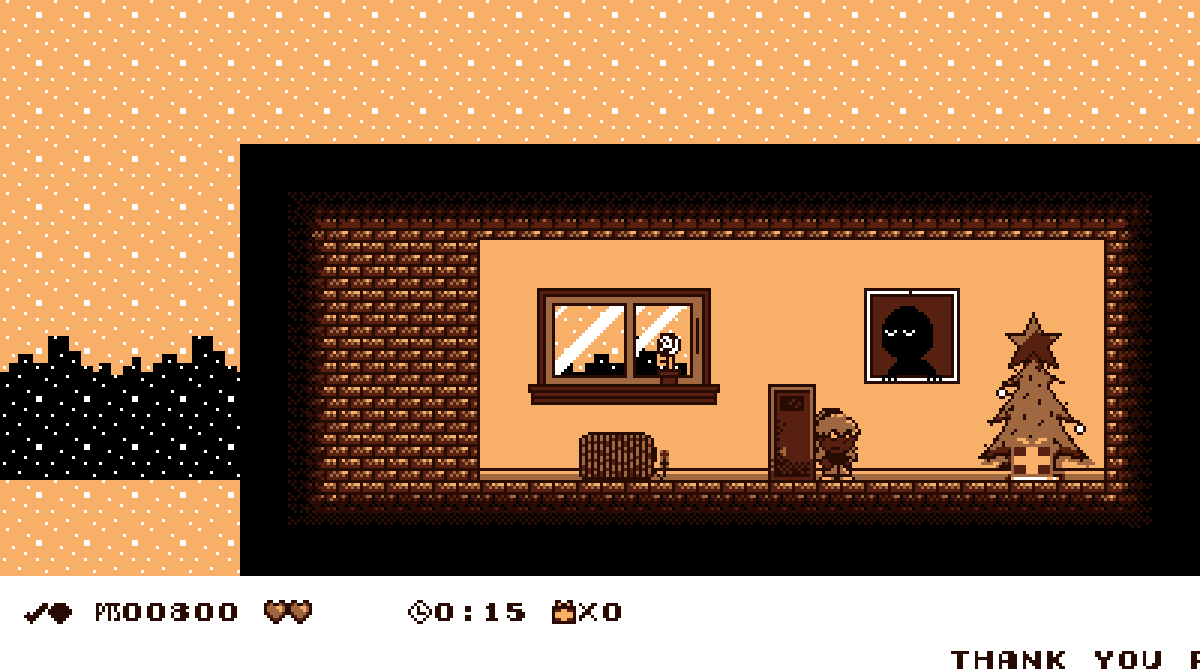
& then there’s the falling fist sprite, which looks silly. I’m OK with drawing in general, but awful @ animation. This wasn’t helped by the fact that I couldn’t imagine how those craning things move up & down & couldn’t e’en research it since I don’t know that “those craning things” are actually called. So ’stead we get this 1 image that just stretches out & in based on the sprite’s distance from its original Y position. It looks mo’ like paper than those craning things, ¿but who cares? I can always fix it later. Shit, I still haven’t fixed the interior maps o’ “Sleet Streets” so that they don’t look awkward in the newly resized resolution:

I’m still not halfway done with all these levels, by the way. I’d joke ’bout how I originally had an idea o’ finishing this project by the end o’ the year, but e’en when I said that I knew ’bout the “90-90” rule o’ programming, so e’en then I knew that was bullshit. This project will take 3 years — which means it’ll truly take decades.


