Curse o’ th’Ladder-Splayed Caves
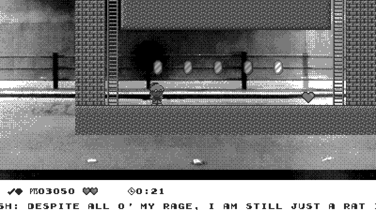
Not much to say ’bout this level — other than maybe apologize for a sad pun. Like I said with “Milky Mountains”, not every level should be some wild, unique gimmick; e’en Donkey Kong Country 2 had straightforward levels like “Mudhole Marsh” & “Chain Link Chamber”. Technically, this level does have a gimmick, — maneuvering on ladders — but not 1 as big as “Value Valhalla” or “The Playing Railroad”’s, nor does it devour the entire level, as there’s also some weird train-dodging mechanic that blatantly just reuses assets from “The Playing Railroad”.
E’en then, I fiddled with the details quite a while & can still think o’ things that may warrant changing. ¿Is it the right difficulty? On 1 side, e’en the 1st spike dodging parts are somewhat tight; but this level also gives 2 hearts for such a short level. Also, the time requirement isn’t as tight as it could be: the video shows me beating it in 19 seconds out o’ the expected 25, without e’en damage boosting through the train. I’m still not sure ’bout the background: it seems to have too much distracting detail, & yet, ironically, also looks a bit plain. ( I thought ’bout adding wooden lines on it, like mines usually have, but could ne’er get them to look right ).
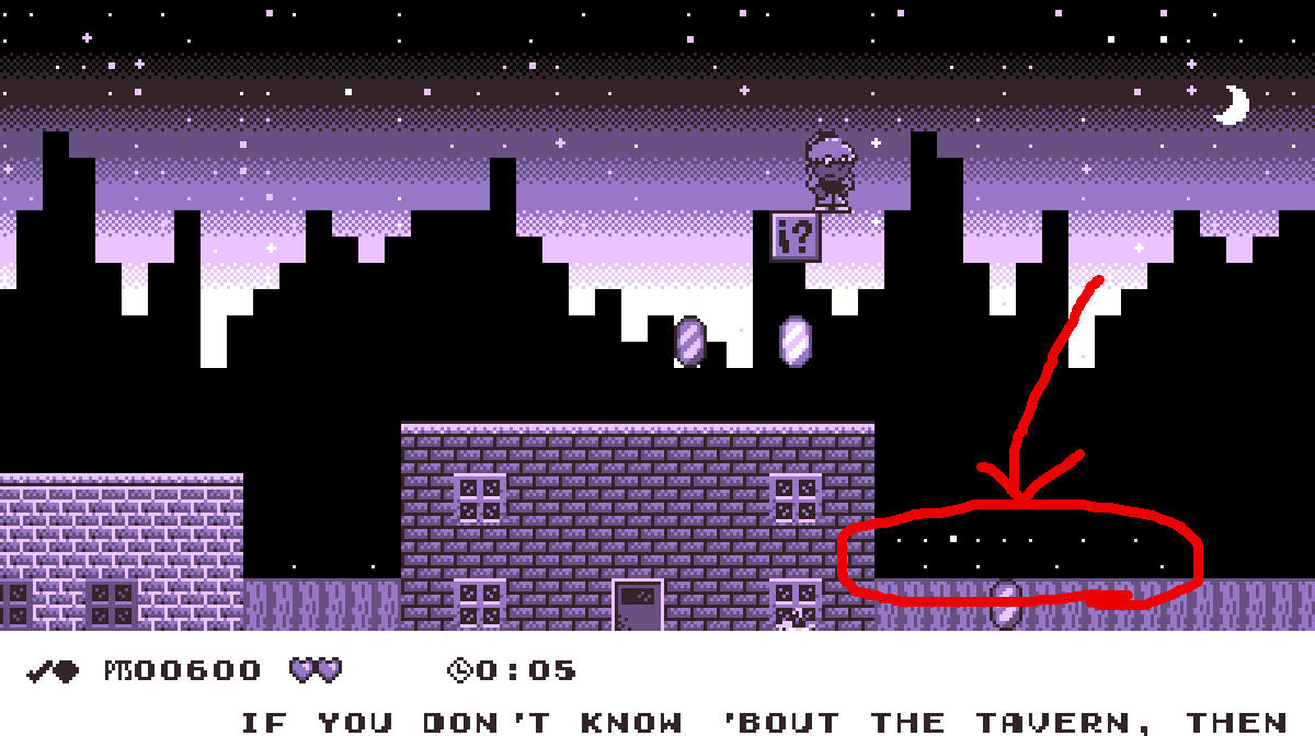
If anything, the most notable thing is something not directly related to this level: the fact that I increased the resolution. I did this ’cause I was sick o’ how much relative vertical space Autumn took up, making vertical movement, such as climbing up tall hills with falling dangers, such as in “Milky Mountains” & “Sleet Streets”. Now the screen’s vertical size is as much as an SNES game, which means Autumn shouldn’t take up any mo’ relative space than, say, Mario in Super Mario World ( actually, less, since she’s 8 pixels shorter than big Mario ), just much wider. I’m not sure why it took me so long to come up with this idea: I can’t imagine being ’fraid o’ some computer not being able to handle a humungous 400 x 224 resolution ( s’pecially since I already assume one’s computer has a 16:9 aspect ratio ).
Though most o’ the game automatically adjusted itself to the changed resolution simply ’cause everything referenced the same constants, some maps are jankily smaller than the screen, since many maps were made to fill up the smaller-resolution screen & no mo’, making them now have empty space with the background showing through under the ground & past a wall.
For instance, here’s how the small sewer room in the 1st level looks now:

In the main map o’ the same level, the starry background shows from ’hind the bottom o’ the skyline BG, since the skyline BG’s now too short to cover the rest o’ the screen:

Who knows when I’ll get to fixing these.


