The Mezunian

Die Positivität ist das Opium des Volkes, aber der Spott ist das Opium der Verrückten

Great Stages: World 6-5 o’ Super Mario Bros. 3

Introduction

I’ve always been interested in appraising level design for various reasons:

  1. Levels were always my favorite part o’ video games & level design was the part o’ game development that interested me the most.

  2. It’s not focused on as much by most reviewers as what seems to me much mo’ shallow elements o’ a game, such as story or aesthetics ( ne’er mind the fact that the average video game praised for its story comes nowhere close to the storytelling quality o’ great literature, while literature can’t come close to doing what well-designed levels can ).

  3. A lot o’ the work I find online is, not to poison the well to make my own pitiful work look good, not good. I don’t mean that they have bad opinions — that their conclusions are “wrong” — but that they don’t bother to go into detail on the “why” — the most important part. Most just say their favorite or least favorite levels & leave it @ that; others give shallow reasons like “too hard / too easy”.

The problem is, whenever I try to make some grand series appraising every level o’ a game, I can ne’er finish it. Mainly ’cause, honestly, most levels in every game aren’t worth writing ’bout. ¿What’s there to say ’bout that 2nd tank level in Super Mario Bros 3.?

Thus, I’m cadging a chip from some random YouTuber & just writing ’bout particular levels worth writing ’bout, ’cept with words ’stead o’… words o’er video, ’cause video-editing is ’bout as palatable as having my wisdom teeth yanked out. Technically, I already did that with my hyperbolic article ’bout that terrible level, C-3 o’ Lost Levels, eons ago. So let’s balance that out with a good level.

Super Mario Bros. 3 – World 6-5

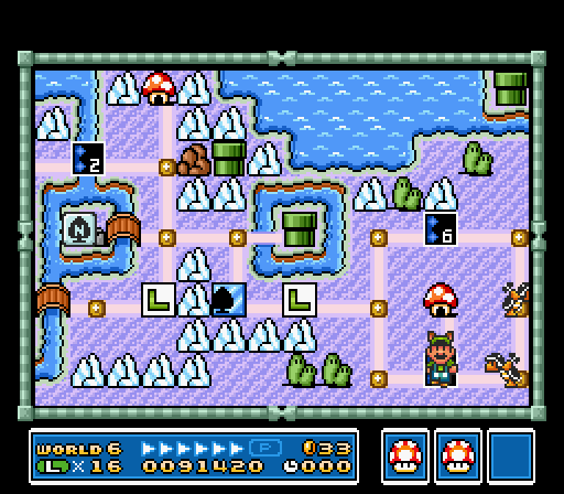
Map courtesy o’ KingKuros @ The Video Game Atlas.

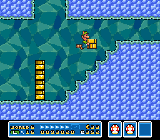
I’ll start by defending an oft-criticized level. World 6-5 is that infamous cave level wherein you have to get a Raccoon Leaf ( if you don’t already have 1 ), grab a Koopa shell, & fly up into an alcove & throw the shell to kill some Nipper Plants blocking the way to the pipe to the end o’ the level. This is 1 o’ those levels that’s “bad” ’cause it’s challenging. Worse: it’s not challenging in the typical “keep trying pixel-perfect jump till you robotically learn it through muscle memory”, but a puzzle that requires creative thought.
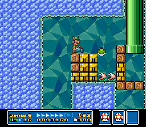
But it’s 1 that’s perfectly fair & intuitive. Once you find out the level wraps round, you know there’s an alternate way to win. There’s also a high chance that just before it loops, you’ll get a Raccoon Leaf; if not, there’s ’nother respawning ?-block with a Raccoon Leaf just after where the pipe drops you off @ the start o’ the cave. The game has consistently taught you that you can reach different areas by flying; ¿why shouldn’t it finally expect you to have to fly to beat a level by now? Eventually, flying round, you’ll find the alcove with that tantalizing other pipe, blocked by Nipper Plants. Whether you already realize you can’t attack them with your tail from ’bove or learn it the hard way, you’ll ’ventually run out o’ options up here & ’ventually have to go back down to search for mo’ answers, & ’ventually you’ll notice that conspicuous lone Koopa in a sea o’ Buster Beetles.
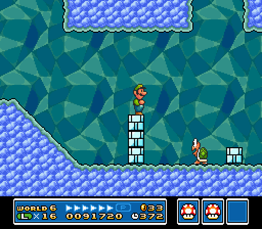
This Koopa lived a cruelly monotonous existence ’fore Luigi took him out o’ his misery.

Despite this level’s challenge, it’s nice ’nough to ne&rs

Actually, e’en the many Buster Beetles & the weirdly special throwable bricks they toss @ you work well. In addition to providing many ways for them to make you lose your Raccoon Leaf, challenging you to defend 1 o’ the keys to victory, they focus the level on the issue o’ throwing, which hints to you that throwing something @ the Nipper Plants is the answer. You may e’en try flying up with a throw block & fail, — or maybe succeed: I’ve ne’er tried, actually — only to later stumble ’pon the lone Koopa.
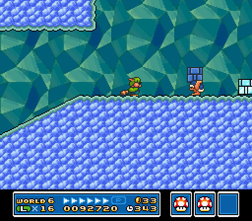
Despite this level’s challenge, it’s nice ’nough to ne’er completely screw you out o’ it — ’less you die, ’course: @ the end o’ the main path there’s a perpetually-respawning ?-block with a Raccoon Leaf before a pipe that leads back to the start. So e’en if you get hit & lose a Raccoon Leaf, you can always get ’nother. Koopa shells, ’course, also respawn ’pon entering & exiting a pipe, in case you accidentally kill the only Koopa.
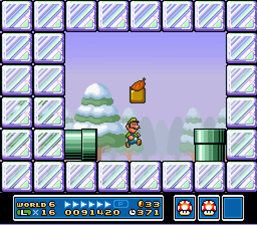
I think this level shows a prototype for Super Mario World’s generally superior puzzle-based level design. It feels right up there with the kind o’ memorable puzzles like Yoshi-jumping under the goal post o’ “Cheese Bridge Area” or bringing a Yoshi to the end o’ “Valley of Bowser 4” so you can lick the key through the solid blocks. But it also has Super Mario Bros. 3’s brevity & focus, whereas Super Mario World levels sometimes had a tendency to be o’erly long & have jarring, unfocused, irrelevant extra parts — you know, those side rooms that don’t fit, like that pointless coin snake in “Donut Ghost House”, that P-balloon cave section in the underwater level, “Donut Secret 1”, or that outside section with the single flying Hammer Bro in the otherwise underground level, “Chocolate Secret”. Thus, this level combines the best elements o’ Super Mario Bros. 3 & Super Mario World’s level design.
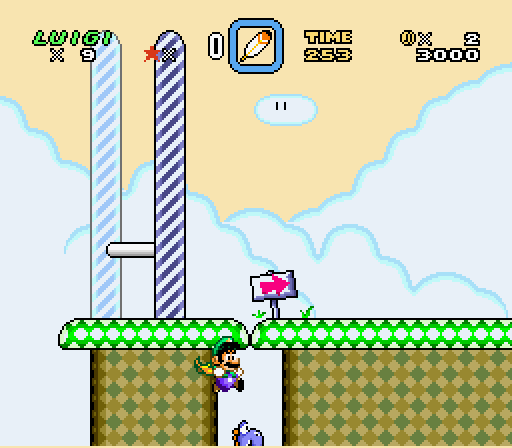
It can also be rather fast-paced if you know what you’re doing. E’en if you start small, you can pop in the pipe near the beginning to grab a Mushroom, & then grab a Raccoon Leaf in the ?-block in the cave. Then just dodge all the enemies to the Koopa & fly up to win. Super Mario World, & some levels in Super Mario Bros. 3, infamously had a tendency to have ploddingly slow levels, as Sonic ads relished pointing out, ’specially Super Mario World’s puzzle levels. The fact that the aforementioned puzzles from World required you to get to the end o’ relatively long levels a 2nd time to get the 2nd exit doesn’t help. I almost mentioned the secret exit to “Valley of Bowser 2”, with its subtle clue that you can stay on the edge o’ 1 o’ the rising blocks you’re s’posed to be running from to reach a secret area ’bove the room… but that exit requires you to go through a direly long & slow autoscroll section, which should ne’er be encouraged. That this level was able to have a creative puzzle without needing to bog down the player’s momentum makes it deserve extra puntos.
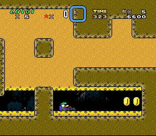
If this level has anything you could call a flaw, it’s that, other than the graphics, it doesn’t truly fit the icy theme o’ its world. I guess the throw bricks look kind o’ icy… but these have appeared since World 3, & they don’t make sense as ice blocks. ¿What ’bout ice makes it mo’ susceptible to being picked up & thrown? & if they’re s’posed to be ice, ¿why aren’t they affected by fire when other ice blocks are?
But that’s the most anal-retentive o’ complaints, & there’s something to be recommended in a li’l mid-world variety. It’s not as if this level is jarringly contradictory to the ice theme; it’s just theme-neutral & could fit in any world.

I probably mentioned it already in my big article comparing Super Mario Bros. 3 & Super Mario World, but I consider World 6, ’long with 7, to be the high point o’ Super Mario Bros. 3’s level design, with tricky, clever block arrangements, so it does fit in that way. A’least it fits better than the 2 underground water levels in this world ( whose existence admittedly undermines my “high point” point before ).
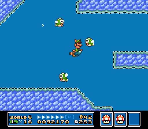
Swimming while taking pictures is bad for your health.

Posted in Great Stages, Video Games

The Nostalgic Double-Standard o’ Difficulty

After o’er a decade o’ ne’er truly playing a Wii1, I got 1, & having tried the Wii Mario games, — the Super Mario Galaxys & New Super Mario Bros.: Wii Bootleg Ourselves — I’m amused by the indignant scoffing o’ grown-adult Mario fans who grew up with the series & feel the need to measure their own dick by criticizing these games for being “pathetically difficult” all throughout el entrered2. I would agree that these games are, indeed, pathetic, but not due to any lack or non-lack o’ difficulty.

There are a few reasons I find this amusing. 1, I thought society evolved past the ideas that a game’s quality came from its difficulty. ( Mario Paint is absolute shit: you can’t e’en lose. ¿What kind o’ liberal everyone-wins garbage is this? )

But the most amusing part is something I thought everyone knew, but apparently everyone forgets: Mario games have always been “baby-easy”. Super Mario World lets you just ’bout fly o’er everything with a cape, or if not, usually a blue Yoshi; Super Mario Bros. 3 drowns you with so many lives & powerups that you’ll run out o’ room before you finish the game, & throws fire flowers & raccoon leaves @ you throughout levels. E’en the original Super Mario Bros. was easy for its time. I can think o’ literally only 6 NES games I can beat, & Mario games make up a full 4 o’ those.

Mario fans apparently forget this ’cause they still remember playing those games as, well, babies, while now as grown-ass adults they whine that the games still aim for that target demographic.

E’en Miyamoto apparently forgot this, as he “admitted” that he regretted making the 1st New Super Mario Bros. “too easy”, when he should regret intentionally sabotaging it & the whole series ’cause he hates 2D games & doesn’t want to work on them. Seriously: nobody who directed Super Mario Bros. 3 makes games these bad on accident.

But ’cause I’m a scientist in game-hipster-dialectical-analysis o’ the highest caliber, I shall prove to you, objectively, that those ol’ “hardcore” games that Mario fans are talking ’bout — Super Mario Bros. 3, Super Mario World, Super Mario 64 — e’en the original Super Mario Bros. — are, in fact, easier than these shitty not-new-anymo’ Wii Mario games & that these games are shitty for completely different reasons.

For New Super Mario Bros.: Wii Have No Artistic Value this’ll be easy, thanks to the fact that it rips off Super Mario Bros. 3 so much ( without understanding what made those elements it stole work in its own context — i.e. fucking up ripping them off ).

A few comparisons:

Super Mario Bros. 3 has its ice world world 6; New Super Mario Bros. Wii Put Mo’ Thought into these Belittling Subtitles than they Did in the Actual Game has it in world 3.

New Super Mario Bros. Wii Are Tired o’ these Subtitles has a wind-based level in world 2. The only classic Mario game with wind is Lost Levels — & it’s 1 o’ the most controversial aspects o’ that game. ¿What drugs were Nintendo on when they put a wind section in world 2?

Harder enemies appear generally earlier in NSMBW than earlier Mario games. Hammer Bros. & Bullet Bills, which were a formidable late-game enemy in the original Super Mario Bros., & which appear a bit later in Super Mario Bros. 3, 1st appear by world 3 @ the latest in NSMBW.

¿Remember those infamously “hard” levels in Super Mario Bros. with the hopping fish o’er bridges in World 2-3 & 7-3? Well, NSMBW is such a pansy game that it has a level like that in World 4, but with falling donut blocks ’stead o’ a sturdy bridge. Meanwhile, that hardcore game, Super Mario World, had you hopping o’er slowly hopping dolphins that can’t hurt you o’er safe water with a spiky fish giving itself a heart attack chasing you @ the speed o’ snail.

NSMBW randomly decides that waggling the Wii dick doesn’t do anything, making it impossible to pick up propeller blocks or frozen Dry Bones, ’cause the Wii is an amazing system & Nintendo was too braindead to figure out how to make a basic fucking button do that e’en though every classic Mario game was able to; all classic Mario games have actually functioning controls. To be fair, the original New Super Mario Bros., & presumably its sequel with its Golden Fire Flower that wrecks economies & makes Ron Paul commit sepeku, also had fully-functioning controls, so this was probably just a Wii problem. I don’t know ’bout the Wii-U, since I ne’er bought 1, & apparently hardly anyone else did, so we can chock up New Super Mario Bros. Wii-U & its millions o’ Luigi-fueled rom hacks & Super Mario 3D World as “games nobody cared ’bout”3.

Also, admittedly, I didn’t play past World 4, ’cause Zzzzz… So maybe the game becomes ridiculously easy afterward. I wouldn’t put it past them. Look, I try to be comprehensive, but I just spent hours trudging through the 2 Galaxies & almost doing Galaxy 1 twice ’cause o’ its dumbass 100% bullshit. Demanding I play New Super Mario Bros. Wii comprehensibly is like saying I have to play every game on the Jaguar to know it sucks: we all know that game sucks. It’s not like New Super Mario Bros. Wii suddenly starts revolutionizing gaming in World 5. Also, I’ve watched entire gameplays o’ this game, so I kinda know it doesn’t.

Literally the only thing I could think o’ that NSMBW did that was easier than Super Mario World was that it saved the amount o’ lives you have. I was e’en shocked to remember that they actually e’en kept the 90s-era save-game limits, which is funny, ’cause Donkey Kong Country Returns & Super Meat Boy didn’t need that, e’en though those games are actually good hard games. It’s almost as if using save-game limits as an attempt to create “difficulty” is pathetic & stupid.

Some may defend these with the idea that NSMBW is for people used to the classic Mario games, which is why it uses late-game elements earlier. This is basically a way to say that NSMBW is a romhack. 1: this doesn’t contrast my point, only argues that it’s a “good thing” that NSMBW is harder, which is irrelevant; 2: ¿why didn’t Super Mario Bros. 3 or Super Mario World, which came nearer after their predecessors, need to aim for creating an “extra challenge” ( without the “extra” part ) for “Mario veterans”, as if playing Mario games is anything close to fighting in war-torn countries.

Saying that New Super Mario Bros. Wii Still Can’t Believe We Put a Fucking Wind Section in World 2 sucks ’cause it’s not mo’ like some dumb kaizo rom hack makes no sense. It doesn’t suck ’cause they didn’t put in mo’ Hammer Bros.; it sucks ’cause it doesn’t have hardly anything “new” in it.

& then we have the Super Mario Galaxies vs. Super Mario 64, where I’ve read throughout the internet that Galaxy is s’posedly the “easiest” o’ the 3D games for such sane reasons as 1 guy not being able to waggle his N64 controller to give Mario a bit mo’ air in Super Mario 64 &… most who just don’t give a reason, it’s just received “wisdom” spread onward like STDs. Like before, I can objectively prove this wrong:

People criticize Super Mario 64 for the 100-coin stars being too “hard” to get; but name 1 star in which you had to not only collect 100 coins, but do so within a time limit while every floor crumbles under you or starts flipping its shit.

Name a single star in Super Mario 64 ( or Sunshine ) that didn’t allow you to get hit a single time.

Name a single time holding downward makes you go forward in Super Mario 64 or Sunshine or any game, actually. Seriously: they were drunk when they programmed the controls for the Galaxy games.

For fuck’s sake, Super Mario 64 lets you heal yourself fully just by jumping in water.

Granted, you could say that the Super Mario Galaxy games are simpler than 64 & Sunshine in that its just a dumb action game that makes you go straight ( just shown @ a stupid angle, ’cause o’ wacky gravity cinematics ), while 64 & Sunshine actually had puzzles & exploration & depth. That’s a mo’ accurate explanation for why the Galaxy games suck — but it wasn’t ’cause they didn’t make you collect every purple coin in Luigi’s Purple Coin Catastrophe or didn’t have lava rocks randomly fall everywhere… Which they did do in a star in Super Mario Galaxy 2 & in a level in the 1st New Super Mario Bros.

Stupidly ’nough, Super Mario Odyssey actually is easy ( & yet is actually good, unlike just ’bout every Mario game made for the Wii ), but Miyamoto claimed that it’s for the “hardcore” players, unlike Galaxy. It’s a good thing Miyamoto clearly designs games based on his intuition & not his analytical skills.

Posted in Video Games

Let’s Code a Crappy 2D Platformer Like Millions o’ Other People on the Internet & Lose Interest & Give Up Only a Few Months In, Part XXXIV

Play in the Background

For some reason, whenever I claim that the next level I make will be something, that’ll turn out to be a lie.

This is a rehash o’ a gimmick from Legend of the Four Switches, ’cept half-competently implemented so that you can’t just jump on the switches themselves to bypass the whole gimmick.

I also gave this level a stageplay graphical theme, including checkered floor graphics that I later realized look a bit too similar to Super Mario Bros. 3’s… O well: I’ve seen plenty o’ commercial games outright steal the original Legend of Zelda staircase or Super Mario Bros.’s bricks far mo’ closely than my checkered ground.

Implementing the gimmick was simple: it just uses the on & off switches, having “on” be you in the background & “off” as you back in the foreground. Background blocks are set to only be solid when the switch is on, & foreground blocks are set to only be solid when it’s off. Also, foreground blocks have priority ( drawn o’er non-priority sprites ) when the switch is on & not when the switch is off.

Source code

Posted in Boskeopolis Land, Programming

Let’s Code a Crappy 2D Platformer Like Millions o’ Other People on the Internet & Lose Interest & Give Up Only a Few Months In, Part XXXIII

Audio

I finally got round to adding sound to this game, after almost a whole year o’ silence. The music is all royalty-free songs offered to the public by Kevin MacLeod on Incompetech, which may be temporary, may not be. Since I have no musical skills, I can’t imagine how I’d make a decent soundtrack for this.

As for the sound effects, they’re made with various Flash programs online that randomly generate some wave patterns.

Honestly, it took mo’ time wandering MacLeod’s site & listening to hundreds o’ songs in search for the best song for each level — an exercise that brings me back to the Super Mario World romhacking days when I’d do that with user-submitted SPCs on Super Mario World Central, since in addition to having no musical skills, I couldn’t e’en figure out how to port already-composed video game songs into Super Mario World’s weird format.

Meanwhile, using SDL2’s music & sound libraries only required a couple hundred lines o’ code & a function call strewn in various places to tell the global Audio class to play some song or music. The most complicated thing was preventing sound effects from noisily o’erlapping each other, such as when collecting gems, without blocking sounds I do want, such as the sound for collecting a diamond, which I solved by dividing the sound effects into channels & stopping only that a sound’s channel when playing a sound. Thus, collecting multiple gems will interrupt other gem sounds, but not a diamond sound, since that’s on a separate channel.

But I can see there’s still some bugs with the way the sound works. As the video shows… well, 1, recording with sound causes slowdown, which ne’er happened before; but related to that, if slowdown does happen in-game, it’s separate from the music, leading to sync issues. The playthrough o’ “Warm Up” shows this: it’s timed so that the song ends right when the timer reaches 30 & the level ends; but ’cause o’ slowdown, the song ends early & loops awkwardly. That ne’er happened in any o’ my earlier test — only when finally recording & encountering slowdown.

& there’s probably hours o’ fiddling to be done. Different songs are all o’er the place in terms o’ volume. For instance, while the mines music ( officially, “Chillin Hard” ) is quiet, “Mart Cart Madness”’s ( officially, “Got Funk” ) is so loud, you can hardly hear the sound effects.

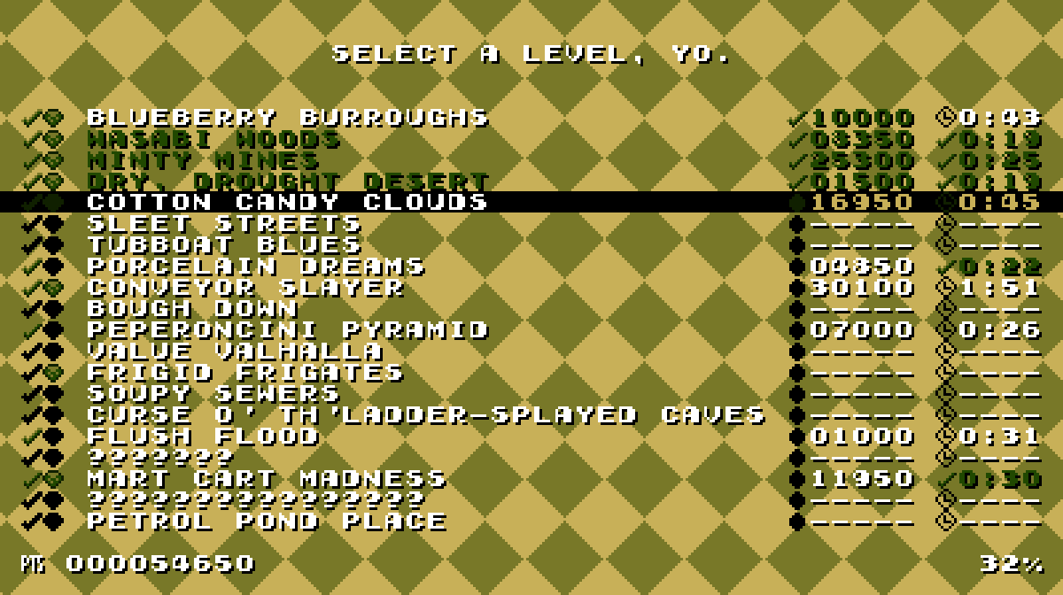
As the video also shows, I spruced up the level-select screen so that it’s not just plain black & white.

Lunacy

Beating the time challenge for this video probably took mo’ effort & time that designing this level. ’Cause jumping is so slow, any extraneous jump can fuck you o’er.

Part o’ me thinks this level may be too difficult, considering it’s s’posed to be a 1st-cycle level. On the other hand, the level’s deceptively easy: while the slowness makes beating the level quickly hard, just beating the level in general is easy, since you get plenty o’ time to land jumps. Thus, 1-block jumps you’d expect from late-game Super Mario Bros. levels are trivially easy. Similarly, e’en though the spike passages are tight, it’s not too hard getting through them without getting hit ( though I think you absolutely need to be holding the run button to get through some passages ).

My original plan for the graphics was to have crater moon graphics; but every time I tried drawing them they looked like crap. Then I came up with the idea o’ blocks shaped like Hershey chocolate bars, & went with that — which fits, since canonically in the Boskeopolis universe the moon’s surface is s’posedly made o’ white chocolate. I still think this level looks a bit too sparse; but I could spend eternity sprucing up the graphics in every level, so it’s best to let some levels look simple.

Next level will probably be a harbor level with “Rusty Bucket Bay” sludge water as a gimmick.

Source code

.

Posted in Boskeopolis Land, Programming

UPDATE: Grumpy Ol’ Mezun Rants ‘Bout these New Remakes & the Glory Days o’, like, a Couple Years Ago

Actually, in my defense, from what I’ve seen, Super Mario Odyssey looks so good it might e’en rival Super Mario 64, which is god-tier — something I’m writing a huge article ’bout, which you should expect sometime within the next 5 years maybe. So Nintendo has shown that they can not fuck things up when they actually make new things. I say “from what I’ve seen” ’cause o’ an ol’ policy I’ve followed my whole life, & shall continue to do — a policy I’ve tried to teach my young nephew when the bourgeosie’s crafty sugary candy o’ consumerism consumes him himself: ne’er buy a system less than a year after it comes out. Shit, I just recently tried out the original Wii last month for a mere $60 — & you suckers paid a couple hundred for it a mere decade ago.

But our subject isn’t that, but shitty remakes — to be specific, shitty remakes that I haven’t actually played, but are shitty in terms o’ aesthetics — & I’m reasonably sure they’re just the same games ’neath the new paint.

See, I love remakes that somehow manage to be aesthetically worse than their originals, since the 1 thing you’d expect new technology to add is better graphics & higher-quality sound. I don’t know if I’ve mentioned it yet, but I oft laughed @ how pitiful those new Yoshi’s Island games — the DS 1 with its utterly forgettable music & cheap graphics or that 3DS 1 with the fucking kazoos. I marveled @ how these new-fangled games sucked so hard, they looked worse & sounded much worse than a game that came out in 1995 for a system that had a mere 3.58 megahertz & a mere 128 kilobytes. It made me wonder why they e’en bothered to make a new version o’ a game that, clearly, is perfectly good as it is. If Yoshi’s Island looks better & sounds better than games that pass the condiments today, ¿how could it be called “outdated” in any way?

The same applies to 2 recent Mario remakes: Mario & Luigi: Superstar Saga + Bowser’s Minions ( ’nother example o’ Nintendo’s newfound love for awkward game titles ) & Mario Party: the Top 100.

The former replaced the original Mario & Luigi’s expressive & beautiful cartoon graphics — a surprising rarity in Mario games, which are usually either pixelated or polygonal — that made the series stand out with cheap polygonal graphics that look like ripoffs from New Super Mario Bros. I can’t wait till they finally remake Paper Mario with its shabby, outdated flat graphics so that it’ll be mo’ consistent with modern Mario games — i.e. look just like all the others with no heart or personality o’ its own.

Lots o’ people, e’en up to reviewers like @ Destructoid ( when they can pull themselves ’way from talking ’bout wanting to fuck Shantae — ne’er live it down ), have noted that character expressions are mo’ generic: Toads’ eyes no longer pop out when they become frightened in the opening cutscene, Peach’s tears are mo’ generic…

Now, the thing is, they could’ve improved this game’s graphics by actually keeping to the heart o’ the game’s aesthetics. ¿Imagine how this game’s graphics would look if it had high-resolution handdrawn graphics? What we got is just a sad rehash o’ an ol’ argument I thought had died: “Duh, it’s polygons, so it’s better ’cause that’s mo’ ‘advanced”’.

But I do have to ask, ¿did we truly need a remake o’ Superstar Saga? ¿When did this game come out? ¿2003? ¿Do we truly need to remake a game every 15 years, ’specially when the technological increases that s’posedly warrant them are getting diminishing returns? ¿What was wrong with the orignal Superstar Saga? It’s just seemed like such a strange decision that came out o’ nowhere.

Mario Party: the Top 100’s different in that it’s not necessarily a remake so much as a greatest hits compilation o’ minigames, a celebration o’ Mario Party’s long history just a year before its 20-year anniversary o’ the 1st game’s December 1998 release ( maybe I should do a retrospective on that series next year ). They apparently e’en brought back Minigame Island, which was a mechanic they dropped since the 2nd game for reasons I can’t comprehend.

That said, Metacritic gives it middling scores ( granted, I question how selective their “critic” choices are, as many o’ them I’ve ne’er heard o’, & quite a few can’t write coherent English ) & I saw some obnoxious Game Grumps ripoffs say it’s not good, & it seems like they have good reasons. Also, the game costs $40, which is hilariously ridiculous in a world where I can get games with much mo’ depth off Steam for $10 – $20.

But I’m mostly aiming my ire @ the remixed music. Since this game remakes minigames from all the ol’ Mario Partys ( ’cept DS & Advanced, which is bullshit, as the latter was awesome & the former a’least had good minigames ), logically it remixes the songs that played in those minigames. Well, not truly “logically”, since they came from N64 & after systems, which had perfectly good sound quality. Nintendo were wise when they didn’t change Super Mario 64 or Ocarina of Time’s music in their remakes: they were perfect the way they were.

What amazes me ’bout the remixed music is that they usually sound technologically inferior, as if from a less powerful system than the N64. The music in the 1st 2 Mario Partys sounded like natural music — no beeps or bips. But the new music makes it sound mo’ technoish — that generic technoish sound that’s infected most modern cheap Mario games.

Let’s look @ the 1st abomination I saw: “Blue Skies Yonder” — the original & the modern version. The original sound like real instruments & evokes a slightly country feeling with its whistles. It’s the kind o’ song you play when you’re, say, riding up a mountain on train tracks. ¿You know what goes great with that mood? Fucking techno. & yet, that’s precisely what the modern version added. I want to emphasize ’gain: the original sounds like real instruments. The modern legit sounds like a MIDI version. ¿How the hell does a remake on a much mo’ powerful console make a song sound mo’ like a MIDI?

Other songs are mo’ mixed. In the modern version o’ “Going for Coins”, I like the bass, but the horns are so pathetically tepid.

Also, it’s probably pointless to bring this up, since the change happened games ago, but the parrot announcer from the original games is far better than the hokey new voice actor they have, who sounds like just some executive working @ the company.

Posted in Video Games

Let’s Code a Crappy 2D Platformer Like Millions o’ Other People on the Internet & Lose Interest & Give Up Only a Few Months In, Part XXXII

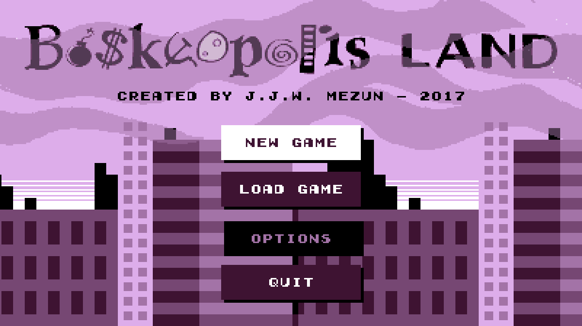
Swanky New Title Screen

I finally got sick o’ looking @ that basic white screen with plain black option text. Since I noticed many o’ the Game Boy Color games I used as inspiration, such as Wario Land 3 & Super Mario Bros. Deluxe, used slow scrolling backgrounds, I used it, too. The only problem is I haven’t finished the skyscraper part, which currently only has 3 buildings that repeat way too much.

As for the menu items, after a while o’ thinking o’ weird borders & background shapes ’hind the text, — since the text obviously wouldn’t contrast ’nough from a mo’ complex background — I took inspiration from web design & just made some flat-design button links. They e’en have a slight fade-in & fade-out — ’cept it required tacky switch statements rather than a simple “transition: all .5s”.

’Nother effect I’ve been thinking o’ adding for a while was a way to make mo’ interesting transitions ’tween message screens & the o’erworld & level — the goal message & the victory & failure messages. The idea I had was to have it fall downward, & then swipe sideways when it’s done: however, this’ll require some tinkering. For 1, I’ll need to make it so that it changes all lower states to the new state while keeping itself ’live ’long ’nough to swipe ’way ( falling in will be easy: just push the message state onto the previous state ’stead o’ replacing it ). Mo’ importantly, the goal message state will need to run while the o’erworld state is still there, which means the level state won’t initialize yet. The problem is that the goal message state needs the goal in order to get its message, & the goal is initialized in the level state. ( As it is now, the level state technically starts before the message state appears — the message state is simply added on in the 1st frame, before the level state has a chance to draw itself ).

Pepperoncini Pyramid

This is a level idea I’ve been thinking ’bout for a while. Inspired by Wario Land 4, — or, mo’ directly, a story from Boskeopolis Stories1 — you go halfway through the level to collect a moon, which starts making the pyramid collapse, giving you only 45 seconds to roll round back to the start, where the door is now open ( & glowing somehow — but it’s a video game: doors always glow in video games with no explanation ).

Mo’ & mo’ I’m getting a habit o’ spending probably too much time on presentation — & there’s still stuff I ne’er got round to adding, such as cracks in the wall or hieroglyphs in the currently plain background. O well: there’s no law that says I can’t go back & add things later.

Some o’ the frivolous extras I think look good, such as the way the the block enemy’s eyes follow you when you’re near it, the flashing timer that bounces down & fades into the HUD when you collect the moon & the shaking camera & falling pebbles ( secretly just 5 pebbles that keep randomly changing size & position when they pass the bottom o’ the screen ) when the pyramid is collapsing. Other, such as the spinning moon… I’m less sure ’bout.

Time works weirdly here: despite what happens to the clock when you get the moon, the game still counts how many seconds you spent in total in the level before beating it, & that’s the score you get — beating the time challenge requires you to go just as quickly before the moon as after ( note: in addition to the clock not moving during the moon-get cutscene, the time spent in that cutscene doesn’t count toward your best time, as the level state doesn’t run @ all during it ).

Funny ’nough, though, the gem challenge is actually much harder than the time challenge. As the video shows, I could do plenty o’ sloppy playing & still make the time challenge; but the gem challenge gives you very few excess gems, & many o’ the gems are a 1-time-only grab while falling.

Source code

Posted in Boskeopolis Land, Programming

AUXILIARY: Moderate Liberals Known for Utter Fucking Unbelievable Failures Slightly Less Failures

A bit late ’cause it’s an odd year &, seriously, nobody cares ’bout odd years, ’specially not the hip kids, who probably care mo’ ’bout Mayor Pauline & her city o’ freakish uncanny valley realistic humans in that new-fangled Mario game than Seattle’s mayor being replaced ’cause he touched kiddies in their hoo-haws.

When I say “slightly less failures”, I mean the Democrats took o’er Virginia & Washington… state ( not to be confused with the Washington people actually care ’bout ), which they already mostly owned, anyway. Republicans still, ’course, control all 3 branches o’ the federal government.

Virginia is the main focus, ’cause nothing else important has happened. Virginians hated Republicans so much that they elected a transgender & filthy socialist just to piss on them. The former has, predictably, led some to question how Christianity, a religion that’s lasted multiple millenia, will survive the existence o’ exactly 1 lowly state legislator who’s trans, which is reminiscent o’ that time Christianity vanished after gay people & rock ’n roll spontaneously appeared in the 1960s or after they let in those filthy Gentiles with their unsnipped dicks.

’Course, this ( very miniscule ) turn-round should be expected: voters are notoriously fickle & generally turn gainst the party in power1 ’cause it gives them the delusion that they’re radicals raging gainst the machine & not sad ordinary people who couldn’t o’erthrow a bossy cellphone.

Still, with victories by such Democrats as a Goldman Sachs financier ( WARNING: link contains obnoxious video that plays without warning ) ( gainst Chris Christie, that infamous New Jersey governor that nobody liked, ’cept as a target for mockery @ how unlikeable he is — so, Hairpiece before Hairpiece ), a Clinton fundraiser who will soon be Virginia’s new governor, & Democrat Jenny Durkan, Seattle’s 1st woman mayor & heavily funded by Comcast, CenturyLink, AT&T, & Amazon gainst ’nother woman who was actually mo’ left-wing, we can see the key to Democrats’ success: spend much mo’ money. That’s always been Democrats’ main strategy for getting America’s rich o’erlords to give them elections: just convince them Democrats will also give them everything they want without being as dangerously self-destructive as Republicans ( “Filthy Capitalism without the Dumbassery” could be their tagline ).

’Course, there will always be naysayers on ours necks telling us there are still problems with our beloved loser party, as well as all our secrets to our crush in a Stewie-like voice. For instance, we have this “autopsy”, which is just some pundit saying things we already know: Democrats care mo’ ’bout money than people & lowerclass people aren’t so fond o’ them anymo’. Meanwhile, Breitbart — & you owe me for stepping into that cesspool o’ popup ads & tacky clickbait web design — handles this election with straight-up denial: their home page had mo’ references to the 2016 election than to this 1, as if that wasn’t a whole year ago, & therefore ancient & irrelevant.

O yeah, & I guess Ohio & Maine will get public health care & Ohio passed a bill forcing pharmaceutical companies to lower the price on their much-needed pain medicine in this torture hole known as planet earth, cheating these companies out o’ the money they themselves earned on their own hard work lobbying the government for free funding grants. But that’s not as sexy as… um, ¿what else was accomplished ’gain? ¿Democrats finally got their “You’re pretty good, too” trophy?

Also, apparently the “Involuntarily Celibate” subreddit has been banned, which may be a victory for liberals, I guess, but is definitely a victory for good taste. For those blissfully unaware o’ it, ’twas a place for people to publicly whine ’bout not getting sex — the most vital thing to human existence if you’re a middle-class white male with a well-off family that gives you infinite economic support. “¡It’s fucking torture, being ‘forced’ to live in security & comfort & not being able to fuck any woman I want!” ’Cause just paying a prostitute or jerking off is pathetic, unlike whining in public ’bout not getting sex “only” ’cause they’re s’posedly fat & ugly while bashing s’posedly fat & ugly women & making up misogynist conspiracy theories while outright admitting that it’s based on emotional problems & not rational reasons, which is the epitome o’ dignity.

Tune in next year when we’ll hopefully see the Democrats stop being utter fucking failures & actually win back the house & senate so they can go back to backstabbing the lower classes & then lose goodwill for the dozenth time, leading to the election o’ that Milo Yapalopolis guy to presidency so he can touch all o’ America’s children in their hoo-haws ( edit for fairness: but only if they’re gay & still have sex organs2. Milo does have standards, & I respect him for that ). After all, if America doesn’t have their vicious cycle o’ Coke vs. Pepsi elections, ¿what do they have anymo’?

Posted in Elections, Politics

Let’s Code a Crappy 2D Platformer Like Millions o’ Other People on the Internet & Lose Interest & Give Up Only a Few Months In, Part XXXI

A 2fer this time.

The Minus Touch

No, I still couldn’t get OpenShot to work with this footage; but Kdenlive decided it wanted to start working ’gain for some reason.

Part o’ me feels like I went a bit too far with this level, as my long sequence o’ deaths show in the video. I believe it took me close to an hour to finally get a winning run. Then ’gain, I’ve done much worse in still-perfectly-sensible games & have been noticing that this game has been tending toward easy. Needless to write, this level is in the last cycle.

1 o’ the complications o’ this level was that something that was s’posed to be a bonus in any other level is a huge problem in this level: the hitboxes on the gems are way wider than their graphic. This made the parts where you have to squeeze ’tween gem walls & dodging the falling gems in the long ladder climb just after much harder than they should’ve been, since you have the squeeze tightly ’tween the blocks, but can’t see their boundaries, so you nudge just into 1’s hitbox, e’en though your character’s graphic is clearly outside o’ the gem’s graphic, making it deceptive & cheap. So for this level I made ’nother gem block, but added some custom block conditions that limit its hitbox so that it’s only its graphic.

All that pink space round the gem is in its hitbox.

I also think that drop @ the start is probably a waste o’ time that only makes the level’s difficulty mo’ frustrating than it should be. The fall’s s’posed to make you think you have to weave ’tween gems, which is technically possible, but not something I’ve e’er done, I don’t think. But as the video shows, you can just go a block left to the center & you’ll pass all the gems. I’m not sure if this is a way to reward clever players or a bullshit gotcha on the player that punishes them for not reading a walkthrough watching this video or reading this post.

On the other hand, I like the shape o’ the level: how it’s a long plummet from the top to the bottom that goes quickly, followed by a long climb back up to the top that takes a lot longer. 1 technique I’ve devised to help me with designer’s block I’ve been having was creating simple shapes for levels, a pattern you’ll see in the next level.

The length was something I mired o’er quite a bit. I’ve mentioned quite a few times that I generally want to keep levels to 15 – 30 seconds average time, since these are s’posed to be short bursts without checkpoints. However, this is a special level & 1 that’s s’posed to be the hardest in the game, so having it be longer is a fair way to increase the challenge, so long as it’s not excessive. In this case, my time was ’bout 1:40, but if one’s rushing one could probably do it in ’bout a minute ( testing it with the “lose if you touch a gem” gimmick turned off, I found one could easily make it to the end within 50 seconds, e’en if mostly trying to avoid gems ).

The time challenge is 1:10, which is probably plenty if one’s going fast; but I’ve ne’er gotten it, since just beating this level is a problem for my meager skills. It’s probably mo’ lenient than any o’ the other levels, which is good: I want to have the harder levels have mo’ lenient challenges while giving the easier levels much stricter challenges to balance things. In contrast, the 1st level you have to do just ’bout perfectly to get the time score.

Part o’ the challenge o’ a micromanaging a level’s length is trying to ensure you don’t pad out the level by o’erusing ideas, but don’t neglect good ideas, complicated by the fact that ideas themselves can have multiple subideas within them; & then you have to make sure the length o’ each idea is right. In this case I had quite a few ideas, such as walking gem enemies, alternating falling gems ’bove a ladder, & gems rolling down a hill that I probably could’ve done mo’ with, but would’ve risked making the level too long & tedious. Better to leave players wanting mo’ than wanting less.

In particular, the walking gems could have been complicated in many mo’ ways beyond just having 2 guarding either end o’ a straight hallway. Then ’gain, part o’ me feels those sprites are a bit unfair: their movement is randomized & they move so quickly that it feels like luck whether you can get through them unscathed. They are unquestionably the worst part o’ this level.

Conveyor Slayer

This level used to be called “Steam Engeenius”, but then I realized it has nothing to do with steam @ all. Its current name still feels odd, though: it certainly focuses mostly on conveyor belts, but its a 1st-cycle level that’s quite easy, so the “slayer” part sounds hilariously inapt. It’s like calling “Yoshi’s Island 2” in Super Mario World “Chaos Corner”.

This is ’nother example o’ the “shape level” idea I mentioned before. While trying to design this level I kept envisioning twisty paths that go all o’er, & then back to the start, but I felt that ’twas, rather than being mo’ interesting or “complex”, just messy, & went in the other direction toward an elegantly simple & memorable shape. The original idea was that it’d be a circle, but I found that made actually moving through the level janky, so changed it to a rectangle. It actually looks better this way, since it’s a factory & should look boxy & artificial.

Getting this level to work right was mo’ burdensome in terms o’ programming, thanks to a bunch o’ li’l bugs that either got you stuck & made the level unwinnable or made it easy to cheese the level. The absolute worst, & yet something I found quite late, was my realization that collision detection had been wrong this entire time: the saved left o’erlap for something o’er something else ( a block o’er a sprite, for example ) actually uses the formula for o’erlapping from the right & vice-versa. This hasn’t hindered this game much since nothing has used the horizontal o’erlaps yet. However, there’s a glitch I think I mentioned earlier wherein you could jump under the corner o’ a block & jump through the wall, going straight up. In this case, that allows one to skip straight to the end, which is a problem.

The other problem was that if the conveyor shoved one into a wall, they’d get stuck fore’er, which forced me to check whether the player is right next to a wall & make the conveyor not work if so.

’Nother problem was the main gimmick: the goal is blocked off by a passage so short you have to be ducking with a conveyor going in the opposite direction. The only way to get through is to hit a switch & so the conveyor goes in the other direction. The problem is that Autumn can hop round while ducking, so she can skip right through, & I didn’t want to change that or make her move super slowly while duck jumping, since that’d mess up her movement in other levels; so I just added a patch that makes it so Autumn can’t jump while ducking on a conveyor belt.

Finally, there was the challenge o’ making block graphics change based on whether the switch is hit, which involved making ’nother subclass o’ the “SpriteGraphics” class & adding ’nother wasteful update virtual function specific for the block updates so the “EventSystem” can be passed to it without having to go through & edit all the update functions for every subclass o’ “SpriteGraphics” or something. The “SwitchGraphics” sublcass itself just holds 2 “SpriteGraphics” unique pointers, making its own data useless, which is also a waste. 1 thing I’ve learned in this project is to better separate interfaces with data: most polymorphism is just through “render” & “update” functions, nothing else. All the other “SpriteGraphics” subclasses used the vast majority o’ the same data, so it seemed right… but then “SwitchGraphics” comes round & proves you can’t be sure o’ anything fore’er.

As for the frivilous extra update function, I should probably just make “EventSystem” a static singleton, since there’s only e’er 1 & I hate passing objects round a bunch o’ functions. Most people seem to say that’s better than having globals, but I’m starting to disagree. If anything, all this passing round arguments only couples things mo’ & makes no sense since it should’ve be any concern o’ anything that calls any update functions what other things that update function uses. My experience with making the “Inventory” class a static singleton has only been good. I haven’t had any glitches appear due to this “evil” global, but have gotten cleaner, easier to understand code. The same might apply to the “BlockSystem” & “SpriteSystem” — something I should look into. The only downside is that these static classes would always be using memory throughout the whole program, e’en in the title screen & o’erworld, where they’re not used ( the inventory, on the other hand, is used everywhere ). Then ’gain, the vast majority o’ your time takes place in-level, & it’s not as if the title screen or o’erworld map are begging for mo’ memory — they’re some o’ the most lightweight parts o’ the program.

Anyway, there’s much worst inefficiencies in this game’s half-assed code that it’s silly to point to an extra virtual function as the culprit ( the general o’eruse o’ polymorphism, which requires using pointers for collections & prevents taking advantage o’ data locality is probably a worse problem ).

& then there’s the graphics, which usually takes the bulk o’ development time. That upper-left gem cache made me start to think that I was wrong to make blocks just have a simple 16×16 block rather than 4 8×8 blocks, since I had to make a bunch o’ blocks that just copied scraps o’ other blocks, & these had to have their own 16×16 graphic block, while if I just had them be 8×8 blocks I probably could’ve just had them reference a bunch o’ already-existing blocks. Then ’gain, blocks wherein all 4 corners are different would’ve been much mo’ tedious to make, so I guess it’s a tradeoff. Still not sure which would be mo’ efficient: smaller graphical files or fewer draw function calls. Either way, it probably would’ve been tedious, & we should speak o’ it no mo’.

I mired o’er the shadows under the blocks, which are just 4 few gray rectangle blocks with slight transparency. I go back & forth o’er whether using transparency & blending is “cheating”, since it technically creates extra colors that aren’t in the “paletttes”. Then ’gain, the palettes don’t follow any real retro game system & I feel bad ’bout how o’erused emulating retro graphics is, too. If it wouldn’t make palettes mo’ tedious to make & wouldn’t probably make the graphics o’erly complicated, I’d probably increase the # o’ colors per palette, anyway — just so long as the hue is generally monochrome. Then ’gain, I don’t think I kept to that, either — certainly not in the o’erworld palettes. After trying out having manually-drawn shadows & seeing both how ugly it looked & also the sheer # o’ extra blocks I’d need, — 4 * the 9 blocks o’ the BG — I decided that creating extra work for myself & my program just to emulate a limitation o’ ol’ hardware that only existed to make things easier for limited hardware was the very definition o’ insanity ( though that doesn’t stop me from keeping the palette system ).

& then there’s the falling fist sprite, which looks silly. I’m OK with drawing in general, but awful @ animation. This wasn’t helped by the fact that I couldn’t imagine how those craning things move up & down & couldn’t e’en research it since I don’t know that “those craning things” are actually called. So ’stead we get this 1 image that just stretches out & in based on the sprite’s distance from its original Y position. It looks mo’ like paper than those craning things, ¿but who cares? I can always fix it later. Shit, I still haven’t fixed the interior maps o’ “Sleet Streets” so that they don’t look awkward in the newly resized resolution:

I’m still not halfway done with all these levels, by the way. I’d joke ’bout how I originally had an idea o’ finishing this project by the end o’ the year, but e’en when I said that I knew ’bout the “90-90” rule o’ programming, so e’en then I knew that was bullshit. This project will take 3 years — which means it’ll truly take decades.

Here’s the shitty source code ’gain

Posted in Boskeopolis Land, Programming

Nihilly, the Nihilist – My 1st Dumb Program

The 1st real1 program I e’er remember writing was in what I thought was C++, but was closer to C. The header includes were C-style & none o’ my programs used classes ( though there is a C-style struct ) or STL. The only thing “C++” ’bout this program was that it had a CPP extention & didn’t put “void” in empty parameter lists. Nonetheless, I was confused by these 2, since I called this folder “C++” & remember reading a ( quite terrible )2 book on C++ @ the time.

There was no particular inspiration. When I was a teen I’d oft check out wildly different nonfiction books from my local library. ’Twas in a songwriting book that I learned that imperfect rhymes are better than perfect, since they’re generally fresher ( none o’ that moon-june shit ); ’twas in a podcast book I learned ’bout Audacity; ’twas @ the end o’ an ol’ For-Dummies book ’bout YouTube that I got to read the writer pontificate ’bout how to survive in an apocalypse ( I think the For-Dummies books let writers write whatever the hell they wanted in the last few chapters ); & ’twas in Game Programming All in One that I truly 1st learned how to program, round the spring & summer o’ 2009, I think.

I used to have this idea that a simple “enemy chases you & hurts you if it touches you” was the best simple game idea to do 1st. I think I got the idea from reading ’bout Atari founder, Nolan Bushnell’s, 1st program on some ancient computer, which I read ’bout in yet ’nother nonfiction book, The Ultimate History of Video Games, by Steven L. Kent, a hefty 600+ page book that I highly recommend. Thus, this was the gameplay o’ my 1st game, “Nihilly the Nihilist”… or “Nilly”. I was ne’er consistent on that part. Also, I always pronounced it “Nilly” till I finally learned the proper way to pronounce “nihilist”. You were chased by somewhat KKK-looking guys with white bandanas wrapped round their faces & deep black holes for eyes called “Fucksters”. You can see that this was an immensely edgy fox-&-chicken game worthy o’ Edmund McMillen.

That’s ’bout it for art design. I couldn’t comprehend such arcane concepts as programming backgrounds ( I think I was so paranoid ’bout resource use for some reason that I feared redrawing so many graphics every frame or something — I don’t know. I also thought objects were resource intensive & should only be used for “big” things, whatever those were, for some reason. You can probably see that I still thought o’ computers as some magic too powerful to use without discretion ); therefore gameplay was played o’er plain purple. Not sure what that purple was s’posed to represent — other than a way for hackers to figure out how to steal my passwords, ’course. The title screen was just whatever font Allegro decided, apparently, o’er blue background — presumably inspired by ol’ Final Fantasy games. Maneuvering menus was programmed through a bunch o’ lock integers acting as booleans ( & global, to boot, for some reason ) so that 1 button press wouldn’t cascade through all the options.

If you look @ the linked code, you’ll see that I had a strange method o’ indention. Interestingly, I still used the Allman for braces, though conditional statements & function calls would randomly fall out o’ this pattern. Mo’ importantly, you’ll notice that I didn’t quite understand functions very well. I seemed to view them as simply a means o’ dividing game states, & nothing mo’, while blissfully copypasting large chunks o’ code. Also, for some reason I made every function return an int, e’en though none o’ them are used for anything. Each frame o’ each sprite is just it’s own graphic file plopped right into the big “gameplay” function. @ the time, I certainly didn’t know what the “*” next to the “BITMAP” type was for, but I dutifully copied & pasted it there as the book told me to do.

As a larf, I downloaded Allegro 4 & compiled this program. Unsurprisingly, it’s utterly broken. Content stretches far past the end o’ the screen & everything runs ridiculously fast, like a 90s game that comes free with Cap’n Crunch cereal. I guess that’s to be expected when I was too naive to understand the whole complexity o’ framerate maintenance & I test my software on a 169MB-RAM laptop that was mo’ than a decade ol’ e’en back when I had it ( how I miss you, Grape Faithful ). Also, Valgrind told me it had 16 whole bytes o’ leaked memory, which is, oddly, less than an empty program programmed in D, apparently — a’least on my computer.

As part o’ my nostalgic research, I actually tracked down the book I learned from, which is apparently on GitHub. There I learned that the writer said he was writing his code as C++ projects with mostly plain C to keep his code from sucumbing to C++’s object infection, STDs, & colon cancer. I also learned that apparently the GameCube & Game Boy Advance SDKs, or whatever, used GCC. He also hilariously recommends readers to actually learn C before starting, which I didn’t do.

There were a few other programs I made round this time, too. In my language arts class @ the time I had to memorize the work, the chapter, & the speaker of certain quotes from works like Macbeth & The Waste Lands, so I made some quiz program that showed my amazing understanding o’ functions by having each question have its own function — there was no fucking way that version o’ me would understand the complexities o’ passing string pointers & concatenating them with the parts o’ the question that didn’t differ ’tween questions. I think I did figure out how to have tree tiles based on multidimensional arrays in 1 program. But none o’ it went anywhere, & I soon lost interest & didn’t come back to programming till 2014.

View e’en worse code than Boskeopolis Land.

Posted in My Crimes Gainst Art, Programming